CAP 6 CAP 6 - Art Submissions

Status
Not open for further replies.
I made a recolor too, Thanks anyway Dragonknight!
But I prefer this version actually:


I think that the concept fits very well with Water/Fighting pokemon. And the colors too.
Thanks for the comments!

I like it better beltless, but maybe you could try making the tail look more metal like.
 

CyzirVisheen

Am I poplar yet?
is a Top Artist Alumnusis a Forum Moderator Alumnus
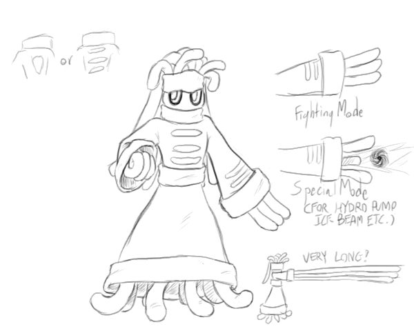
Okay, after a few crashes in Photoshop, I have line art of my two designs

I added the lines on the arms to resemble cuff links on a chinese fighter's outfit. Also, I'm debating whether to keep the symbol on its chest as was, or change it to lines similar to the ones on the arms. Also, random notes on the side.

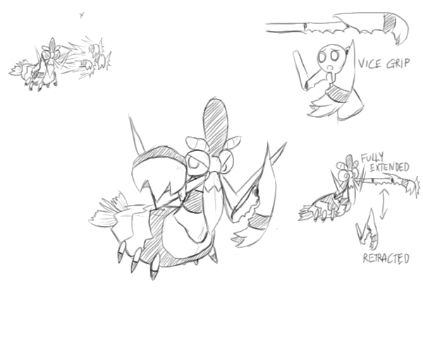
Okay, I pretty much have it down. Its hands/claws are pretty complex mechanically, but they work both as fists, as illustrated on the upper left hand image, and as claw grips, as illustrated on the upper right hand image. Also you can get an idea as to how compact its claws/hands can actually become.

Again, suggestions etc. are welcome.
 

DougJustDoug

Knows the great enthusiasms
is a Site Content Manageris a Top Artistis a Programmeris a Forum Moderatoris a Top CAP Contributoris a Battle Simulator Admin Alumnusis a Smogon Discord Contributor Alumnusis a Top Tiering Contributor Alumnusis an Administrator Alumnus
Moderator
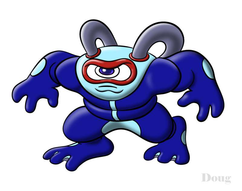
I changed the hands on my Scuba Wrestler design.


The new hands are actually based on real scuba gloves, which are kind of like mittens, but they have two "fingers". This worked out well for the design, because it makes the hands look more "hand-like", but prevents the hands from looking too much like human hands (which is something I was trying to avoid with my first version).

I think this looks better. Thanks for the suggestion from those that pointed out the problem with the previous hands.
 

My concept is based from the lowly wading bird the stork. It was meant as a sort of brother Pokemon to Blaziken and as a way of justifying flying based attacks which would be helpful against most CAPs. It's also not the most obvious creature to fill this role so this should appeal to anybody who likes oddball concepts. It's still subject to be edited as shown when its wing feathers were more rough: Link
This is my favorite so far. I love the concept of this one, nice work Wyverii.
 
There are a lot of nice submission to choose from, so it will be an hard task for the voters.
From my point of view, I like a lot Caladbolg and Atyroki. The latter may look like Medicham, but I find them awesome anyway.
I'd vote for cartoons' artwork if only for the animation^^ Really, the way it knocked out Blissey and Zapdos was amazing lol. However, I find it a bit too... simple, somehow. Im not saying that it is too simple to be "legit", Stratagem was not different in that regard, but my preference still goes to Caladbolg and Atyroki.
Sadly, even if I always appreciated both the artworks and the sprites of Wyverii, I don't like that much his submission. I find it to be... maybe too realistic. I know there's not a defined style for these artworks, but still I cant help having a negative feeling looking at that art.
DJD is nice, too, and probably, if Calad and Aty had not posted what they had actually posted, it would have my vote.
For the other artworks, there are some nice ones, but I didnt find anyone of them enoughly impressive to make me mention them now. Anyway, good job to all^^ I can grant you I would not be able to do anything better than any artwork posted here.
 
I made a recolor too, Thanks anyway Dragonknight!
But I prefer this version actually:


I think that the concept fits very well with Water/Fighting pokemon. And the colors too.
Thanks for the comments!
I LOVE this design and would most definitely vote for it if you removed the war paint. The colors look good, very natural, earth like - like something that would actually be alive if it were to exist - and completely fit the concept, the new stance (more balanced) makes it look much more like a fighting type, and I really love the tail not being held in the hand.

Apart from the war paint, this is perfect.

Edit: I also sort of agree with what Time Mage (vvv) said about the tail.
 
This pose is great, but I think you could improve the tail. The thickness is very variable, and too uniform considering its length. It would look much more natural if it started thicker and started getting narrower until halfway its length, when it would remain the same until the trident end.


@Doug: Your design looks much, much better now. I still like other designs better, but now nothing looks particularly strange to me about yours, it's just a matter of preference.
 
Sadly, even if I always appreciated both the artworks and the sprites of Wyverii, I don't like that much his submission. I find it to be... maybe too realistic. I know there's not a defined style for these artworks, but still I cant help having a negative feeling looking at that art.
Her submission. It's very well thought out as with previous entries but I think some people will be put off by the very strong Flying type aspects of the design.

Wyverii I would love to see some supporting material showing your fighting stork in some action poses, emphasising the Water/Fighting aspects of the design.

Cartoons - I love your squid/starfish but it was the animations that sold it to me. Piledriving Syclant and Tyranitar onto Heatran was Classic!
I think a few more colored poses would greatly help convince people who think it looks too simple.

Caladbolg - Very smart design, I've enjoyed seeing its evolution. I'd say the black war paint is so dark against the pale design that it stands out too much at the moment. Maybe experiment with a few different colours and shades.

Cyzirvisheen - Your mantis shrimp reminds me Alot of Crawdaunt - maybe too much. Either change the pose or focus on your Anemoninja which is Brilliant. I can't wait to see it with brightly coloured 'hair'.

DougJustDoug - Well thought out design as per usual but I'm not drawn to it. I see the Water/Fighting typing but I am not getting a strong sense of character. Maybe a few action shots would help convey more of a personality. Also It's So ugly! Hehe. On the plus side it's brilliant how you've managed to incorporate the goggles/mask - Again :-) Best part of the design with the creepy eye.

aragornbird - Brilliant - could become my favourite design if coloured and maybe with a few other poses. Such a good idea. water... fighting... pirate - DOH!
 

I've made the battlestork more bulky and added a side view. An additional back view and action poses will be made to accompany these two. I might make an animation afterwards if I have time but since this project is going so fast I wouldn't count on it.
 
I coloured the fishie but its still pretty basic, and I think I'll try some other colour schemes and maybe add some details to it.

 
^ I really like the betta. Maybe you can add more bulk to the fish so it doesn't look so thin and fragile?

OH and the Battlestock is fabulous. Maybe you can add an emblem or something to its arm to make it look more fighting
 
Fantastic Wyverii! Not much else to say!

Estranged that's wkd - I was originally thinking siamese fighting fish and would love to see this design get more polished so it can compete with the very high standard of artists on CAP.

My suggestions would be to 1) make the face have more of an expression, maybe a grim smile - look at various pics of Finding Nemo to get some inspiration for fishy faces, and 2) make the fins more fist-like, something more like Lugia's wings. 3) it's up to you, but i'd make the colours even bolder maybe by adding in a 3rd main colour such as green which would make it look less simple as it's currently a very simple colour-scheme - imagine it sprited.
 

Okay, I pretty much have it down. Its hands/claws are pretty complex mechanically, but they work both as fists, as illustrated on the upper left hand image, and as claw grips, as illustrated on the upper right hand image. Also you can get an idea as to how compact its claws/hands can actually become.

Again, suggestions etc. are welcome.
Is it just me, or does this look VERY similar to Crawdaunt?
 
OMFG Caladbolg, you are pretty good. congrats.

but the tail dont seem to fit the rest of the body, i dont know why, but the style is different. Improve it and you get a free passport to CAP6Art-Land
 

KoA

Sorry, I thought anteaters were real
is an Artist
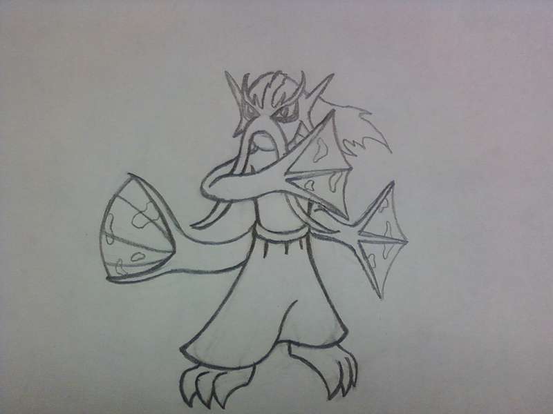
WiP sketch of Merman Warrior Ok so I had to resort to uploading this to Myspace since that's all I can do from my phone. Anywho, this guy was modelled after tessenjutsu, the art of fighting with fans. Rather than giving him unnatural weapons, I modelled his fins and tail after fighting fans. I also fashioned him after an elderly man because an old guy beating your ass is funny. Also I like mermen. If this design gets a decent amount of acclaim, I'll go right on ahead and color this up and bring about a few dynamic poses. As for now, I got some Christmas shopping to do...
 

X-Act

np: Biffy Clyro - Shock Shock
is a Site Content Manager Alumnusis a Programmer Alumnusis a Smogon Discord Contributor Alumnusis a Top Researcher Alumnusis a Top CAP Contributor Alumnusis a Top Tiering Contributor Alumnusis a Top Contributor Alumnusis a Smogon Media Contributor Alumnusis an Administrator Alumnus
WiP sketch of Merman Warrior Ok so I had to resort to uploading this to Myspace since that's all I can do from my phone. Anywho, this guy was modelled after tessenjutsu, the art of fighting with fans. Rather than giving him unnatural weapons, I modelled his fins and tail after fighting fans. I also fashioned him after an elderly man because an old guy beating your ass is funny. Also I like mermen. If this design gets a decent amount of acclaim, I'll go right on ahead and color this up and bring about a few dynamic poses. As for now, I got some Christmas shopping to do...
I can't view this pic KoA... it's redirecting me to www.myspace.com and I don't have a myspace account...

If I were able to view this, I would have made it part of your post for you.
 

TheFourthChaser

#TimeForChange
is a Tiering Contributor Alumnusis a Battle Simulator Moderator Alumnusis a Two-Time Past SPL Championis a Past WCoP Champion
I made a recolor too, Thanks anyway Dragonknight!
But I prefer this version actually:


I think that the concept fits very well with Water/Fighting pokemon. And the colors too.
Thanks for the comments!
I prefer this color over the green one, but I think the green coloring would be a good shiny.
 

Full position set. This lot can be used as reference for markings and colour scheme if this design is picked to go through to spriting. The action poses will be posted separate from this set once complete. There's an addition of wing markings as suggested by NichMcCoolStratus. The stiff feathers on the wings are used to block opposing attacks and slash. (Note: back view is actually a reversed position from the front view. It keeps things consistent.)

The poses coming up will probably be a fighting attack pose, a water attack pose, an "unaware" meditate pose and a defensive pose.

I know this design isn't for everybody especially with the hidden flying element but i'm not in this purely to win. I'm in this because nobody else would (probably) make this type of design. I think that people are a bit too constricted by stereotypes when it comes to design so I do tend to think up odd concepts. As for my current favourite, it is Estranged's fighting fish.
 
So far my two favorites are Wyverii's and Caladbolg's. Both look great and fit the typings. The suggestions I have for the two of you are:

Wyverii: It almost seems like the battle pose has a gut whereas the profile is more bulky in the chest. Maybe try making the battle pose more bulky in the chest area if possible and less bulky in the gut.

Caladbolg: This may just be me, but the head seems a bit like Sceptile's. It may be too late to change that anyway. Also, maybe try adding a little more detail to the chest/stomach region, like scales.

Regardless, both are amazing concepts and I eagerly await the next versions.
 
I think I've found my base...


From that I've made FakeMon so far...


ShrewMon. Hehe.. a very crude version that I doubt I will even bother to touch. I love the design though Big, Bulky, it has to carry its stomach around, and not to mention seemingly powerful.

Edit: Yep, I couldn't draw out legs so I'll let it be for now.
 
Status
Not open for further replies.

Users Who Are Viewing This Thread (Users: 1, Guests: 0)

Top