
locopoke
Banned deucer.
Pretty good, but a little too simple in my opinion. Something's missing..
The best one I've seen up until I saw...

Pretty good, but a little too simple in my opinion. Something's missing..
The best one I've seen up until I saw...
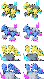


Pretty much finalized the sprites. I'm leaving today and I'm not sure If I'm gonna be back by the deadline so I guess this'll be my preemptive Final Submission post.
Didn't feel like bandwagoning the whole "pink fluff" shiny approach, so I took a new spin on the coloration. Also gender differences are very minute this time around, females just have shorter claws. This ain't enough of an impact to affect the backsprites at all, so they use the same ones for both genders.
This is by far the best one. I feel most of the other ones have too many complexities and Pokemon are mostly designed to have simpler art, which is why I like this one. The cloud and the positioning is perfect.Well, here's the colored version so far.

One objection, could you please give the female sprite cute eyes? ;_;
Well i've done work on the backs. If there's no more objections i'll be making this my final submission. I'll be looking forward to the other entries.
Excellent pose, the only thing I'd change is the furthest head so that it faces forward. Then, it's perfect!DAMN this thing is harder to draw than I'd realized. I've spent like the past 2 hours just trying to get a pose/sketch down. ><;
http://img21.imageshack.us/img21/7628/cap8.png
Lovely, that is a pokemon that I would actually prefer the shiny to the regular type. The back sprite is beautiful. It does a good job of conveying the anatomy of the pokemon without looking ugly.
Pretty much finalized the sprites. I'm leaving today and I'm not sure If I'm gonna be back by the deadline so I guess this'll be my preemptive Final Submission post.
Didn't feel like bandwagoning the whole "pink fluff" shiny approach, so I took a new spin on the coloration. Also gender differences are very minute this time around, females just have shorter claws. This ain't enough of an impact to affect the backsprites at all, so they use the same ones for both genders.
 (no other smiling smileys that don't look dirty/nerdy)
My top 3
Here's the front sprite; I'm now commencing work on the back.
Cyberzero, a little more time would be extremely useful. Myself (and other users I'm sure) face constraints on weekday free time and would appreciate having a Saturday to finish out sprite submissions.
Don't worry, extensions will be given if needed. We're in no rush, but we can't take forever. Since most people are now basically done with the front sprites and are either working on or are done with the back, it'll probably be open a few more days.
Here's the front sprite; I'm now commencing work on the back.
Cyberzero, a little more time would be extremely useful. Myself (and other users I'm sure) face constraints on weekday free time and would appreciate having a Saturday to finish out sprite submissions.


I actually really like this pose. get some good coloring, backsprites, and shineys and you'll have a good entryThis thing is insane. The lineart looks stupid, but mine usually do until I get 'em colored. It also doesn't help that this is my second time doing this (the first time, my computer randomly decided to have no RAM, and wouldn't let me save or copy anything until I restarted.)

I made the left head face forward since a couple people mentioned that. I also made the middle head face upward since I like the way that looks. I do have an alternate lineart with it positioned the original way, though.
Looks great, and I honestly think that this could very well be one of the best sprites here. Just needs some good shading and coloring.This thing is insane. The lineart looks stupid, but mine usually do until I get 'em colored. It also doesn't help that this is my second time doing this (the first time, my computer randomly decided to have no RAM, and wouldn't let me save or copy anything until I restarted.)
I made the left head face forward since a couple people mentioned that. I also made the middle head face upward since I like the way that looks. I do have an alternate lineart with it positioned the original way, though.
I honestly think the shading is a little hard to see. I just saw one solid color at first. I think it would look better if the shading has more distinct. Just a nitpick.
Here's the front sprite; I'm now commencing work on the back.
Cyberzero, a little more time would be extremely useful. Myself (and other users I'm sure) face constraints on weekday free time and would appreciate having a Saturday to finish out sprite submissions.


