
Lol, you are right. I realized what a silly error I had made while trying to argue the opposite. xPEDIT: Beaten by Clawed Nyasu. I guess we are both of like minds on this one... (Nyasu, you said "Actually, the heads only have five horns." I think you meant "four".)

-
The moderators of this forum can be found in the CAP forum staff directory.
-
Welcome to Smogon! Take a moment to read the Introduction to Smogon for a run-down on everything Smogon, and make sure you take some time to read the global rules.
-
Congrats to the winners of the 2023 Smog Awards!
CAP 8 CAP 8 - Part 15a - Sprite Submissions
- Thread starter CyzirVisheen
- Start date
- Status
- Not open for further replies.

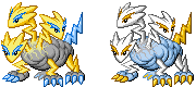
Holy crap. I would have sworn it had five. Now that accuracy is out the window, I guess my sprite is counting on the strength of its pose, lineart, and colorations. Those five horns were a horror to sprite from behind, too.Clawed Nyasu said:Actually, the heads only have four horns.

Ah- your right... I never really noticed... Guess it just didn't stand out until I saw the gap on Doug's...Actually, the heads only have four horns. Only a few of the sprites reflect this, though. Look carefully, and you'll see that the middle horn is actually just the neck zigging up. On the far right head of Cyzir's art, where the neck zigs down, you can see that there is no middle horn.
Since the mechanics of spriting are more kind to positioning the heads above the body, having the neck zig down is an easier portrayal.
But anyway on your sprite, Doug... The gap is still weird...
Could you at least bring out the neck a taad bit? o.o
Or maybe push the two horns together a bit, so its not as wide...?
Edit: Like on Aaragonbird's?
(See head on out right)
Well, not exactly like that. Maybe still with some space, but just a bit less...
Cause it does look quite awkward...


joshe
the best
well, the heads on the back sprite look a little lanky, but I'm not the expert, so someone else will have to do explain this. otherwise well done.
Well here are the back sprites. I'm open to suggestions until about 10:30 PM EST, then I'll have to post the final submission.


wow really amazing front sprites, the necks on the back sprite could use a little work
Well here are the back sprites. I'm open to suggestions until about 10:30 PM EST, then I'll have to post the final submission.

Unless I can make something super awesome by the end of today, AB's has got my vote >>


Hooray, let's use the vaguest words ever in the English language! I'm still open to suggestions for the next two and a half hours, but you gotta be more precise than that.Aragorn, the neck on the head to our right still looks off.

Can we see the shiny backsprite? I think for the backsprite you should make the right neck less straight. It looks off.

Aaaaaaaaand you win.Thanks for the suggestions, people. I took them into account so hopefully it looks better now.

Well, we still have a few hours left.


There have been a myriad of useless posts such as this. Please do not post unless you want to give some constructive criticism to any submissions or would like to submit something yourself.Aaaaaaaaand you win.
The eyebrows on the back's right head doesn't look like a zig-zag in my opinion. The left-bottom part of the zig-zag could be a bit more pointed. It just looks flat IMO.Thanks for the suggestions, people. I took them into account so hopefully it looks better now.
Well, we still have a few hours left.
Looks great otherwise.


The middle neck on your back sprites seems way longer compared to the other necks. Perhaps you can try shortening it just a tad bit?Thanks for the suggestions, people. I took them into account so hopefully it looks better now.
Well, we still have a few hours left.


Thanks for the feedback on my front sprite changes. I have added the following front sprites to my final submission posted earlier:
I also made some tweaks to my back sprites to correspond with the changes to the front sprites, but those changes are not significant enough to warrant re-posting here.
Unless I've made some big mistake, I don't plan to change these sprites any more. Frankly, I'm "sprited out". The only reason I made these latest changes to my fronts, were at the behest of a few users that felt like a few key changes could really make a difference. I will admit, I do like the new front sprites better. But, I don't think I can stand to look at a magnified 80x80 pixel grid any longer. It's been a fun project, but I'm done.
Thanks to all the spriters for contributing to CAP8. All the sprites are wonderful!
- Status
- Not open for further replies.