
-
The moderators of this forum can be found in the CAP forum staff directory.
-
Welcome to Smogon! Take a moment to read the Introduction to Smogon for a run-down on everything Smogon, and make sure you take some time to read the global rules.
-
Congrats to the winners of the 2023 Smog Awards!
CAP 9 CAP 9 - Art Submissions
- Thread starter Plus
- Start date
- Status
- Not open for further replies.


OK, I googled Shoopuf and found this:Am I the only one that, out loud, went "Ridess zee Shoopuf?"

My design:

They have similar coloring(purple, brown)
Maybe I can change the colors a bit, what do you think???

Ah. Sorry if I caught you off guard with my statement. I didn't mean it detrimentally at all. It just reminded me of the Shoopufs, and thus the quote. Perhaps I'm the only one that saw the similarities, having played the game many times.OK, I googled Shoopuf and found this:

My design:
They have similar coloring(purple, brown)
Maybe I can change the colors a bit, what do you think???
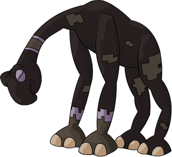
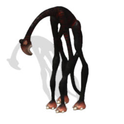
As for you art submission itself, the only thing I would suggest would be to alter the legs a bit. They seem too gangly to me. Almost like he will fall over at any moment. Assuming Klutz would be the ability, that would work well. I doubt that will be the case, however. Also, the head seems almost too heavy. Like the neck can no longer support it, thus why it bends.
]
The big head and slim neck are part of the design, I like the somewhat depressed pose it have(sad=dark XD)
Maybe I can change the legs a bit, but I want it to have big feet on thin legs
EDIT:
I suck at shading :S
It's OK :)Ah. Sorry if I caught you off guard with my statement. I didn't mean it detrimentally at all. It just reminded me of the Shoopufs, and thus the quote. Perhaps I'm the only one that saw the similarities, having played the game many times.
As for you art submission itself, the only thing I would suggest would be to alter the legs a bit. They seem too gangly to me. Almost like he will fall over at any moment. Assuming Klutz would be the ability, that would work well. I doubt that will be the case, however. Also, the head seems almost too heavy. Like the neck can no longer support it, thus why it bends.
The big head and slim neck are part of the design, I like the somewhat depressed pose it have(sad=dark XD)
Maybe I can change the legs a bit, but I want it to have big feet on thin legs
It' back legs do, I'll fix it if it looks too weirddo its legs have two joints?
EDIT:
I suck at shading :S

GreenMamba's, Kai7735's, Cyzirvisheen's, and Doug's designs are quite impressive.

REALLY nice design. I'd stay away from the sepia, and go with a darker version of the more colorful shell. I'd also reccommend that you not use real continents as models, as technically, the Pokemon world is not our own.Yo!, here's my concept pokemon so far. Well two-ish...
http://i4.photobucket.com/albums/y127/ChetRippo/worldturtlepokemon002.png
http://i4.photobucket.com/albums/y127/ChetRippo/worldturtlepokemon001.png
I haven't quite decided which color design I should go with, and any feed back would help greatly.
So basically my design is based of the Ur-turtle, or more comonly called, the World Turtle. With his head hiding in his shell with his glaring eyes sybolizing DARK type, almost sinister, while having his shell decorated like a globe to sybolizing, obviously the Earth, or better yet, his GROUND type.
I placed Lunatone next to him because my idea was that my Pokemon has a sort of relationship with it much like Mantine and Remoraid do. As in like you would need Lunatone and my pokemon's "pre-evolved form" to evolve into what you see up there (And perhaps there would be a different evolved form if it were Solrock).
Any sugestions or comments would be gladly apreciated.
InHell13, your design seems like something out of Spore. Not a criticism, just an observation.

So i'm thinking this is getting pretty close to final submission, might add in some addition material, but the design has seen it's fair share of changes.
pkmn-taicho, I prefer the scratchy-sandy look you had before.
I like the design additions (ribs+tail), but don't enjoy the new colors.
I like the design additions (ribs+tail), but don't enjoy the new colors.
You got me :PInHell13, your design seems like something out of Spore. Not a criticism, just an observation.
My design is based on xZuunasaur's creation, Erickolio
Sorry if it is almost the same
I have to concur with darkchicken here. I much preferred the windswept, sandy color of the original one. While I like the bones, also, I don't particularly like the tail all that much.
So i'm thinking this is getting pretty close to final submission, might add in some addition material, but the design has seen it's fair share of changes.
Do I have people supporting me? xD
Please, I need your comments!
This are the two main designs of Armadillo:
First one
http://img202.imageshack.us/img202/2161/cap9copia.jpg
Second one
http://img38.imageshack.us/img38/4411/dillocapcopia.jpg
Please, tell me:
a) What do you like and what do you dislike of this Armadillo.
b) What I have to change of this design and what I have to keep.
I like the first one the best, maybe you can try the second color scheme on the first design


Okay so I guess the colors didn't go over well.


Frilled Lizard Creature Thingy
...I think I relatively lost the concept I was thinking in this.
That, and the feet and tail are horrendous.
And it doesn't even look that ground or dark-y (though I suppose a bit of color can fix that), but ehhh...
Hell, it almost looks like a dragon.
If I wasn't so terrible and slooowww at drawing, I'd probably start over. Though I suppose I'll run with it.
C+C please?
Taicho, the dots aren't doing it for me either. :/ Sorry.
I honestly prefer the rougher sketches to your current colors.
I honestly prefer the rougher sketches to your current colors.
Final Submission
Okay...since it has 1 in favor and none against, Checkmate it is...
FINAL SUBMISSION:

Checkmate, the Chessmaster Pokemon. Checkmate is an extremely intelligent Pokemon. It is not only intelligent enough to outwit an Alakazam or Metagross, but it also has the telekinetic power to deftly manipulate any of its miniature clay pawns as it desires. It can psychically manipulate the ground beneath it with its baseplate, creating powerful yet local earthquakes. They often play strategy games with others of their kind, as no human or computer opponent has ever stood up to it yet. It may even be capable of manipulating its foes into using their own secondary effects against them.
Secondary Stuff (Man do I have a lot of secondary art...):


And a humorous "warstory" showcasing each of the secondary art pieces: http://www.smogon.com/forums/showpost.php?p=2254733&postcount=486
Note that Checkmate is my artwork's working title. Not trying to jump polls or anything, though if this wins I will still probably submit Checkmate (or some homonym thereof) as a name then.
Please support,
-Torterra-Infernape-Feraligatr-
I'd have to say colours aren't mah strong point.Taicho, the dots aren't doing it for me either. :/ Sorry.
I honestly prefer the rougher skethches to your current colors.
I have to say, I loved the sandy color of your first picture. Give it the same swept up appearance, and make the red more prominent (Not just a few slashes here and there), and I would say I'd love it.I'd have to say colours aren't mah strong point.
The coloring looks far better here, just clean it up, add those bones, and it'll look great!


I might love you for this.Raikizen: Am I the only one that, out loud, went "Ridess zee Shoopuf?"
========
@PkmnTaicho - I liked the messier coloring without the bones a lot better, I thought it looked really awesome and covered everything brilliantly. It also, in some ways, reminded me of this Final Fantasy Esper that I always thought was pretty awesome.
@AragornBird - Not a huge fan of the color version, I liked the pose & everything much better in the shaded version. Maybe go back to some of the original parts of your piece? Of course, it's 1000000x better than I could do =P.

Colored it. Hope it looks kinda better. Though it's still pretty plain, I guess. Any ideas, anyone...?
C+C is very appreciated. Heck, even just pure crit. Bash it to your hearts content if you want to, really.
I'm not unconditionally loving it myself so a straight honest answer just detailing what sucks about it is also appreciated.
... Ugh, I hate those legs.
Thicken the legs, wide thighs, then calves that angle into small hands. Try pulling a Toxicroak on the fingers, making 1-2 of them claws.
EDIT: Also, he could use a forked tongue, and tan, sand-like thighs. Maybe some fangs would be nice.
-Torterra-Infernape-Feraligatr-
EDIT: Also, he could use a forked tongue, and tan, sand-like thighs. Maybe some fangs would be nice.
-Torterra-Infernape-Feraligatr-
- Status
- Not open for further replies.