-
Welcome to Smeargle's Studio! Please be sure to review the studio rules. Feel also free to check out our hub to learn more about this place!Welcome to Smogon! Take a moment to read the Introduction to Smogon for a run-down on everything Smogon, and make sure you take some time to read the global rules.Congrats to the winners of the 2023 Smog Awards!
Yilx first place artist
- Thread starter Yilx
- Start date

Alright... the reason why I don't usually put latest stuff there right away is because DA lags quite alot for me and honestly I'm quite lazy to upload stuff there :IOoooh,
I think you may have outdone yourself there.
Also, may I request that you upload more of your work on DeviantArt?
I need to fav it so i can look at it forever!That....is the best thing...
Reminds me a lot of Zoroark.
Amazing art here, Yilx. Some of the best i've ever seen
I know you're bogged down with requests but i'd like to request a baokkie? he's the fire monkey.
yes and yes; i'm always open for requests, but... like the rest, they're probably going to take a while to finish because of the current backlog.Are you still taking requests? I'd really appreciate on of a Metagross and a Mamoswine locked eye-to-eye in a stare-down. Thanks a million ahead of time if you can
like i said, it's really cute! thanks so much for fufilling my request!Yilx, your cap10 is made into a sprite! :D Just check my topic for it and rate it there plz. I'm very curious to your reply.
also, the sketches for all of the requests are done! i hope i can finish them, though...
I've been meaning to post here for a while but I havent quite got round to it yet ^^; I finally have some spare time so I decided I'll give some comments about your work. I'll focus on one of your more recent pieces since it would take me a mighty long time to comment on all of them xP Also please excuse me as I can be quite detailed in my comments and you shouldn't take heed on half of them ^^; I'd just be interested to know, what programmes do you use for your work? and How do you create the final piece, do you have any videos? and do you use any attachments or do you freehand it with a mouse? I do a lot of drawing off the computer but I can't do anything with a mouse xDDark/Fire Luke
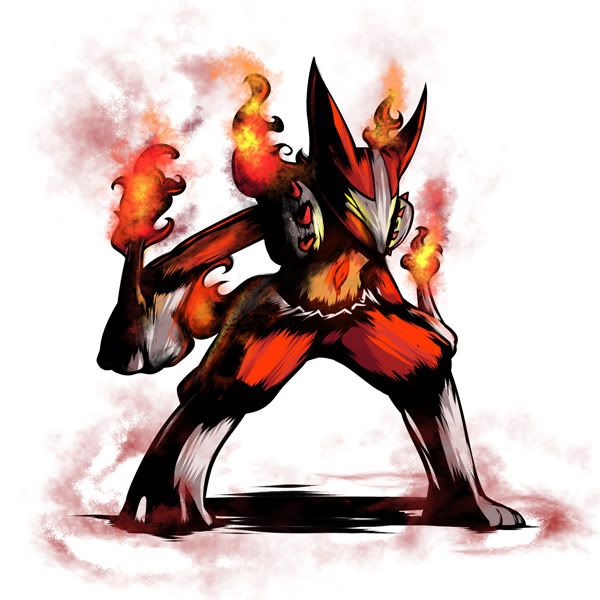
First of all this is fantastic, I don't think I've seen many other people who can execute this kind of artwork in the same way you do, and in such quantities- you smogon people amaze me...
With this lucario re-type you have succeeded where many others would fail- successfully drawing half decent fire that doesn't look completely out of place with the rest of the drawing, it looks great, well done. I also like how you've not only changed his type by changing the colours and adding elements around him, (such as the spikes on his shoulders) instead you have edited him which is something a lot of artists do not do, they simply add to the pokemon without changing the base.
You seem to have to prominent styles, with a few others mixed in. A lot of your graphics involve a lot of movement or 'energy' and you reflect this well in the style of your drawing- there are few bold or straight lines, edges tend to be rough and jagged. However again you have triumphed, an all too common error is for somebody attempting to achieve this effect, is that they over do it. The effect becomes overbearing and distorts the original image, making it hard to draw your focus. You on the other hand perform this very well conssistently, congratulations ^^.
Now im getting to some really rather harsh criticims where im just nit-picking so don't take them to heart, its just advice and considering you're far better at this than I am anyway fell free to correct me if you feel im wrong. Also I do recognies that you are doing these in large quantities and seem rather pressed for time- I can forgive mistakes considering that ;)
Sometimes you have to be careful with slight overlapping of you're colours, you can see on his left hand you have overrun slightly with the orange and it slightly distorts the border where the hand joins the tail, its not a huge mistake you just lose a bit of depth. The same thing also occurs on his right ear, and the spikes on his right shoulder look a bit flat, nevertheless, like i said its nothing big- just nit-picking ;)
Also you have a slight problem with the perspective of his feet, allthough he is standing side on, and his left foot is slightly closer it still looks disproportianate to the right- or vice versa. It doesnt really make too much of a difference, however, because the immediate focus of the viewer is drawn to the upper body and It won't really be that noticeable.
Overall this work is absolutely phenominal, it his hard to find any major faults in your work, the work you do produce is excellent and there are some stand-out pieces with are truly amazing. The fact that you produce it so conssistently and frequently is almost startling ^^ I look forward to more of your work in future, and I'll make sure to check here regularly. Although I'm not sure if i can go into as much depth every time =P
Also If you were looking for a quite challenging piece, could I request you have a go at Ho-oh using sacred fire? I always have trouble with birds, especially the plummage and the effect of fire makes it all the more difficult ;) If you could do it in the same style as lucario but not as dark and maccabre that'd be awesome.
*luvdisc for you* =3
@Precipice: Wow, I wish I could write as much as you did in return, but I'm not very good with words... but, I'm really thankful you put so much thought and time into that comment! Also, I really appreciate the 'critique' part, I'm always seeking to improve myself. Don't worry and don't hold anything back the next time on! absolutely amazing
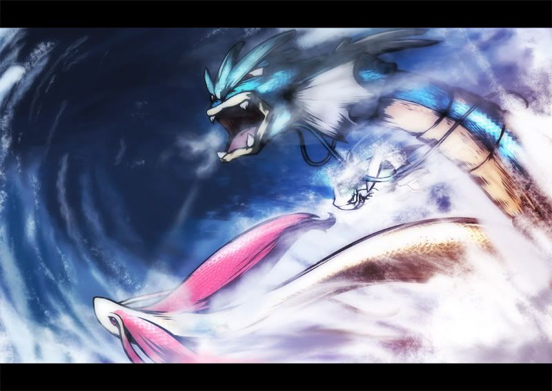
i love how bad ass remoraid looks in that pic
its kinda cool how they seem to be bursting forth from the waves and the clouds at the same time
I tried to give remoraid more of the 'trying to fit in' feeling in the picture...absolutely amazing
i love how bad ass remoraid looks in that pic
its kinda cool how they seem to be bursting forth from the waves and the clouds at the same time
Thanks for the comment :)
EDIT: Also, requests are still open, but... looking at the backlog, you'll have to be prepared to wait for a while if you want one... I just got a pretty big one. Really sorry!
Will do!Amazing pic
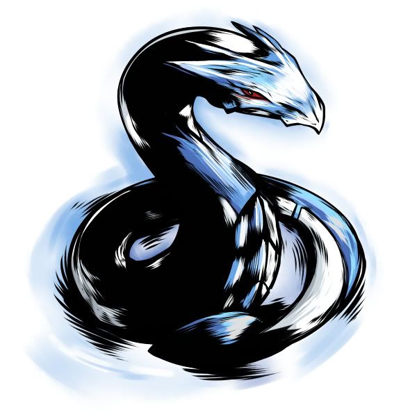
Requesting latios and lucario
...I hope.
Also, here's the Ninja Persian
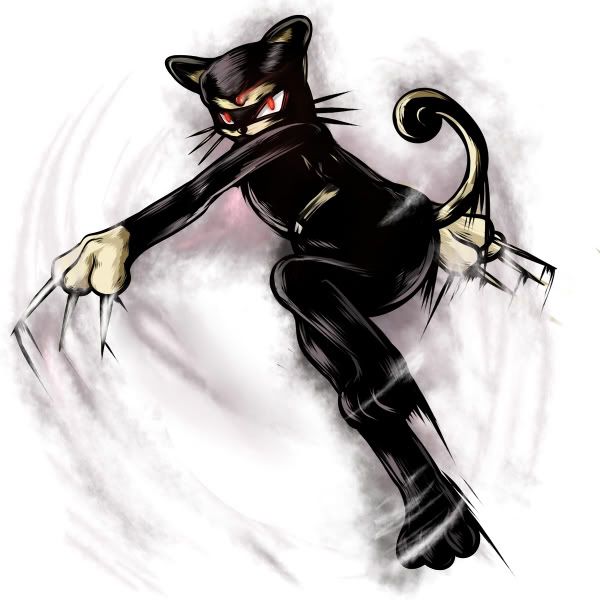
O.oSorry this one took so long!!
Water-types in action.
You've left me speechless ^^;
I love the scaled effect you've done on Gyarados (and milotic), looks really good! The only thing I can see wrong is Gyarados is missing the spikes (fins?) on hsi back, however graphically its pretty much perfect. congrats =D
Also don't feel pressured into doing my request any time soon ^^ i just recommended it as a challenge and it would be nice to have a half decent ho-oh pic to use in some banners xPThose Milotic and Gyarados are so amazing! I love how the Remoraid looks, just like Fatecrashers said.
If I've requested anything and you haven't done it, can you scrap it? I see you kind of have your plate full (haha, scrap, plate). Also wondering how long it usually takes you to draw your pictures (not the huge ones like Gyarados/Milotic but Weavile and whatnot).
Don't worry about anything, I've already done the sketches...Those Milotic and Gyarados are so amazing! I love how the Remoraid looks, just like Fatecrashers said.
If I've requested anything and you haven't done it, can you scrap it? I see you kind of have your plate full (haha, scrap, plate). Also wondering how long it usually takes you to draw your pictures (not the huge ones like Gyarados/Milotic but Weavile and whatnot).
The smaller ones take around 2 hours if I fully concentrate on doing them... the 'big' pictures can take as long as a day if I dwadle while drawing them....Haha, you draw faster than I do and way better.
Oh, well, alright. I just noticed how many requests you had and thought it was pretty big, so yeah. Thanks though. :>
Remember, the keyword is 'fully concentrate' which almost never happens....Haha, you draw faster than I do and way better.
Oh, well, alright. I just noticed how many requests you had and thought it was pretty big, so yeah. Thanks though. :>
I'm usually fooling around on Pokemon Online STILL trying to form a team with Meloetta that functions consistently but it falters. :(
This is fantastic, really! it is what I was looking for!Will do!
...I hope.
Also, here's the Ninja Persian
thanks a lotUsers Who Are Viewing This Thread (Users: 1, Guests: 0)
- ... and 1 more.