CAP 12 CAP 1 - Art Submissions

Status
Not open for further replies.

KoA

Sorry, I thought anteaters were real
is an Artist
Yilx: The leg still seems to be bent out of place for that angle, but it's coming along rather well! I don't know if the impression of hooves as the feet was intentional or not, but I like that alot too!

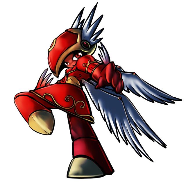
Welp, I finished coloring Arabian Windmon, and I was rather amused lol. About halfway through coloring did I realize that he was rather similar to another beefy fighting type I designed for CaP: Revenankh.

Soooo, I went a did a backstory lol.

Mr. Aramon was out flying about, causing all sorts of mischief on the local villagers out in the desert. He would knock around buildings, blow people around, steal from the villagers, and just overall be a mean lil asshole.

Well one day the townsfolk gathered around and said "We definitely had enough of this fucking shit", and devised a plan to trick the malevolent spirit. When the Aramon drew towards the village again, a young boy was reciting a tale of the village's sacred emblem being out in the desert, and with it comes the rumor of granting untold power. Overhearing this, Aramon set off into the desert in search of the fabled artifact.

Little did he know that lying in wait was a disappointed Thundurus, upset with Aramon's actions. After a long duel between the two, Thundurus got the upperhand and incapacitated Aramon. As he laid there KOed, a vicious sandstorm formed, entombing him under the sand of the desert forever. Or so everyone thought..

Months later, The attacks on the village picked back up again, but were being carried out with much more aggression. People were being hurt, and others being carried off never seen again. The sandstorm did not kill Aramon, rather it gave him new life. As a vengeful Revenankh..

Wooooo!

 
http://img.photobucket.com/albums/v407/Yilx/sigile4_2.jpg

Fixed the legs and made a few more modifications...
Loving this design. I might recommend making the feet into talons however, as the feet as they are now appear more like feet in armored boots and are thus slightly too human.

I know this is unusual, but this design made me think of form changes. This may be post-jumping, but what if the pokemon--it is momentum based after all--had something relating to itself or its ability that would change its form and thus give it momentum versatility? The reason I bring it up is that in Yilx's design, its like the pokemon inside is wearing armor and is thus maybe a little slower but more defensive and then if the armor broke it would faster and less sturdy???
 

Yilx

Sad
is a Top Artist Alumnusis a Smogon Discord Contributor Alumnus
Final Submission


I have no choice but to do this because I don't want to take the risk...

Thanks to everyone for the help. I've deicded to go with her instead of the rabbitcopter because for the love of god I could not find a good colour scheme for it or have the time to draw it's gyro properly.

...there's still a chance, but I'll have to leave that up to the rate things progress.

Yes, I know it looks too human-like and I apologize... I'm still quite torn between the two I did up. She's a kung-fu valkyire that's what she is.

If I come back before the polls are up I'll immediately respond to any feedback and draw up at least a few supporting material posts before it commences.
 
if you saw this original post never mind it. The recolor did enough...I am so voteing for it :3

I still kinda wanna see it in a diffrent pose though.
 

SJCrew

Believer, going on a journey...
is a Tiering Contributor Alumnusis a Battle Simulator Moderator Alumnus
I like how you totally trolled my advice, lol. But the stance does look more karate now than it did originally, so I supposed widening the stance a bit was a good move too.

Don't beat yourself up over not meeting the criteria of a couple of meticulous spectators either. If it's a good design, it's a good design, and I'd rather not see you try to compromise its integrity to make it look more 'Pokemon'. The coloring and shading are fantastic as usual, and I like the idea of a karate valkyrie more than anything else in this thread. I'd be stoked if this little dudette made it to the top.
 

Yilx

Sad
is a Top Artist Alumnusis a Smogon Discord Contributor Alumnus
I like how you totally trolled my advice, lol. But the stance does look more karate now than it did originally, so I supposed widening the stance a bit was a good move too.

Don't beat yourself up over not meeting the criteria of a couple of meticulous spectators either. If it's a good design, it's a good design, and I'd rather not see you try to compromise its integrity to make it look more 'Pokemon'. The coloring and shading are fantastic as usual, and I like the idea of a karate valkyrie more than anything else in this thread. I'd be stoked if this little dudette made it to the top.
It wasn't intentional, I promise!!

Well, I really tried to 'fix' her leg, but in the end I couldn't so I went this direction instead...
 
Hi, I thought that I'd have a go:


Not expecting to win with this one, although if someone wants to do something better along the same lines, I don't mind- I am awful at PS.
 
Most of my details are decided on, now onto the colouring, before I start to work on the art for the final design:
http://i360.photobucket.com/albums/oo47/WillPoweredS/CAPPara4.png

The colours are in no way finalised, so suggestions are welcome, especially as I'm worried it looks too much like a ninjaturtle (though it might be a turtle, I haven't decided). However, I'm fairly happy with the design, so unless there is a major change in what the CAPs abilities are, I won't change that much. I think I'll tone down the glowy blue lines, and remove them altogether from the arms, and also I plan to make a pattern on the wings.

Oh, and flavour text:
It is capable of flying with its large wings, but that is very tiring so it prefers to interlock them and glide.
It goes round in squadrons that are very protective of their territory. They communicate in an odd speech that sounds almost human, but consists only of short, repetitve gibberish phrases.
It has special membranes in it's eyes that allow it to see incredible distances, and pick off foes from afar with accurate energy bursts from it's palms.
Each squadron has a leader who remains at their home. The leader flaps it's wings to create updrafts so it's troops can take off.
They are very tough, and can often survive falling from the sky.
It is believed that their helmets where once the shells of flying turtles from a strange paralel dimension.
They have two known weaknesses: Their large wings cannot be folded, so they make large and vunerable targets. Also, even a slight tap on the back will trigger a strange reflex that stuns their wings and they plummet to the ground.


Edit: I don't think I understand the size rules. Both are under 640*640, and I did the maths to check they were in total under 800*800. What part of the rules did I not conform to? Regardless, I've edited the post back so one of them is shown, one linked. I believe that should be acceptable
 
WPS this is going to sound a little weird, but I have one critque! Colour inside the lines! it's actually really difficult to picture the concept if you bleed the colours like that.

Other then that, I think it's very cool, getting far far away from the "designs with wings" Flying types is nice.
 
Alright, so here is some more edits I've made to Roostermon.
I changed the wings, darked the outline, and shaded it in.
Just a post before I begin on digitally lining and coloring it.
And C&C is welcomed before I begin.
Thanks!


Image size: 480 x 680
 

http://i782.photobucket.com/albums/yy101/SentretLover/bamboomSketchesPNG-2.png?t=1300037475

Ok, so here's some more flying panda artwork. The only notable changes are the readdition of the bamboo shoots on his head and the clouds trailing off his feet. Do you guys like these changes or were they better last time? There are a couple poses of him in the compilation sketches. Any comments or changes?

E: Ok added some more poses and changes.
http://i782.photobucket.com/albums/yy101/SentretLover/bamboomStaffpluschangesPNG.png?t=1300043850

So in this version, he has a bamboo staff. This is to emphasize the grandmaster/sensei appearance and fighting typing. There are three slightly different versions here. A) With staff but without wrist clouds. B) With staff and hunched shoulders. C) Cloud wrists and staff with no hunch.
Which do you guys and gals like best? Does the staff make him too grassy? Personally, my favorite is C.
 
Sentret, I think your last idea is the best one so far. The panda indeed looks a bid bare without the bamboo on its head, and it doesn't look too much like a Grass-Pokémon anyways. I like the idea of it floating around on its own hair. There's only one thing though - I don't really see the Fighting-part (except maybe a Kung Fu Panda reference? lol). However, it does look cool :)


First time submitting anything to a CAP. A little nervous. :x

Is there any way that I can make the outline thicker and more defined in photoshop or GIMP?
 
But I colored it anyways. On Paint, since my SAI skills are about as good as a Primeape's.


What do you guys think about this color scheme?
 
SoIheardyoulikeSENTRET said:
Ok, so here's some more flying panda artwork. The only notable changes are the readdition of the bamboo shoots on his head and the clouds trailing off his feet. Do you guys like these changes or were they better last time? There are a couple poses of him in the compilation sketches. Any comments or changes?
I think the bamboo is distracting from the concept. It draws attention away from the rest of the design and confuses the viewer. Is it part grass or part fighting? That's the sort of thing that happens. I say get rid of the bamboo on the head.

Additionally, I think the small mouth was a huge step in the right direction and really enjoyed that version of the concept. I like the clouds trailing off the feet, since it gives a nice bit of coherence to the concept, but I don't think he should be shown standing on his hair cloud. Again, it's a bit confusing to the viewer if the clouds are part of his feet or not. Pretty much the top-right picture here (without the bamboo) is great.
 
noobiess has an awesome concept for a bulking flying/fighting. I can even see the special sweepiness in the fists coming out of the cloud. Love to see it colored!
 

DarkSlay

Guess who's back? Na na na! *breakdances*
is a CAP Contributor Alumnus
Hey CAP artists! Wanted to stop by to show my support to a few art designs. Everyone's done a great job so far, but these are the ones that stand out to me:

I think the design I like the most right now is the one made by Cartoons!. The "faux-gryphon" idea is brilliant for this concept, and I can aptly see the Flying / Fighting typing within the design without getting a bird thrown at my face. I like the young, cartoon-based design of it, and I feel that it matches a lot of what I see the concept being able to do in the future (both moves and abilities alike). The native-based look is also a very nice addition to the overall look of this design, as Flying / Fighting seems born to go down this route. I like this design very, very much.

Other designs I like include aragornbird's superhero griffin. To me, I think this is one of the most creative ideas to come out so far. I don't like the actual design as much as Cartoons!' design, for instance, but the idea is absolutely enjoyable, and the concept art looks great. I'd just like to see a bit more from the design in terms of dynamic movement.

CyzirVisheen's concept is one of the most visually appealing so far, and it looks very promising. However, for some reason, the background of how this design was made plus the sleek look of the Pokemon and the emphasis on wings makes me think that this Pokemon is extremely fast. I don't necessarily think that CAP1 should give off this notion personally, and while I understand some people may think it doesn't give off this vibe, it's just kind of sticking out for me.

pkmn-taicho321: EDIT: Oh, whoops. Missed that post. That's...a pretty cool design. Didn't expect it. haha Well, both are good, so keep at it!

That's it for now. I'll post later on if anything else comes up or if changes are made. Good work everyone!


Well after scrapping my orginal design due to the huge influx of martial art birds and abandoning my rapier design halfway through due to a special stat bias being decided on I decided to settle on this design here. It's basically designed loosely around the legendary pixies like the emotion trio, Jirachi and Meloetta. Of course without the psychic type and probably without a 600 stat total, not that all forms of the pixies are psychic and have that total.

So yes, the first cutemon I've ever designed for cap. This rare little creature protects itself by enveloping itself scarf-like wings and tail and is known as the freedom Pokémon. It has a strong sense of justice and is a great stratagizer, often winning battles before they even begin.

At the moment the more stand out submissions are from Cartoons, with his delightful faux-gryphon, Cyzir with his hermes mon, Elagune with probably the best of the martial art birds and Doug with his plane. I like seeing variety in designs, sadly flying/fighting is one of the harder ones to pull off.

Edit: Incorperated some changes on advice from IRC.
 
C~Dog's is my favourite so far. To me, it looks very Pokemon-ish and has a very unique design, and fits the typing very well. Keep going with your helicopter idea. I love it.
 

KoA

Sorry, I thought anteaters were real
is an Artist
Ok, Just putting the GargoyleMon idea on the table before I draw out my last design. I figure if all else fails, I can hold onto it for a later CaP :3

 
like the gargoyle Idea, as well as the tornado one. But I think Yilx tops yours (sorry)

@Energy Storm - love the concept, but maybe change the colours a little. The streamlined effect is really awesome...

maybe add fists/blades in somewhere, even if it's like kitsunoh's tail thing...
really awesome, love it
 
Status
Not open for further replies.

Users Who Are Viewing This Thread (Users: 1, Guests: 0)

Top