CAP 12 CAP1 - Part 9 - (Sprite Submissions)

Status
Not open for further replies.
Final Submission:


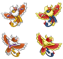
Well I think that's every bit of critique and polishing done now. Nothing left but to make it official. For reference I wanted to change the shiny sprite mostly because it was too close to another person's idea for comfort and the poor guy is getting it stolen enough as it is. I went with the muted shiny, except I made the skin a whitish colour (a rarity in shinys) instead of that sickly yellow.

I think the pose itself is good since I came upon the legs forward approach. It's a neutral enough pose for a flying Pokémon to have to be animated freely. It's got a similar amount of action as Braviary, Archeops or Fearow, etc. So it's interesting enough but not too dynamic. Flyers in general get a little more leeway since flying poses inherently look more action based than usual.

I also tried to make the colours bold, simple and clean as seen in 5th gen. Even within the 5th gen the previous generations of sprites due to their own precedents tend to have more highlights and other bits of shading trickery. Here there's none of that. I've made it feel as much like an actual 5th gen mon as I can do at this moment in time.

A lot of thanks to everybody who participated in helping shape this sprite. Big thanks go to Dusk, alchemator and everybody here that commented. Good luck to the other artists!
 
It's been awhile since I last posted
Anyways here's where I'm at


I'm not sure what happened but for some reason the purple showed up far brighter than when I was working on it. Other than that I think that I made him a little big in comparison to the front sprite. Other than that, these will be my final submissions if nobody can find anything different than the things I already pointed out.
C&C please
 
Steampowered said:
I think you should not leave a white spot on the female's crotch. It highlights it instead of something actually interesting like the face and just the fact that highlighting the crotch looks wrong.
 
Hello. Everyone has such awesome sprites.
I'll be surprised if anyone here knows me, unless you've been stalking the Super Spriting thread lately. I know usually us unknown spriters probably don't stand a chance, but I'm giving it a shot anyway. Here!

The pose took me a while to come up with. Bunch of justifications:
Spread Wings- I figured this best brings out the primary flying type. It also gives a WHAM feeling (who wouldn't spit bricks seeing full-sized Ho-oh?) which would suit a 'mon of Momentum and Intimidate.
Legs- Although it does make the sprite look messy (guide me on this if you will), it's a way to keep the sprite from looking almost as big as a Legendary.
Tail- 'Mon of momentum also needs a bit of elegance for full ownage, and I think this meandering tail works fine.
C+C very much appreciated!
 

CTNC

Doesn't know how to attack
Hello. Everyone has such awesome sprites.
I'll be surprised if anyone here knows me, unless you've been stalking the Super Spriting thread lately. I know usually us unknown spriters probably don't stand a chance, but I'm giving it a shot anyway. Here!

The pose took me a while to come up with. Bunch of justifications:
Spread Wings- I figured this best brings out the primary flying type. It also gives a WHAM feeling (who wouldn't spit bricks seeing full-sized Ho-oh?) which would suit a 'mon of Momentum and Intimidate.
Legs- Although it does make the sprite look messy (guide me on this if you will), it's a way to keep the sprite from looking almost as big as a Legendary.
Tail- 'Mon of momentum also needs a bit of elegance for full ownage, and I think this meandering tail works fine.
C+C very much appreciated!
Gen V sprite tend to be naturally posed instead of posing in action, although though this would be awesome in Gen IV.
 
I really like this sprite, a favourite so far. I'm not sure how to feel about the leg positioning - it's not bad but it's also not great. If it isn't too much work I think it'd be nice to see the sprite with the other leg more visible for comparison. I also think your sprite would still be at a perfectly acceptable size with the leg shifted.

CTNC said:
Gen V sprite tend to be naturally posed instead of posing in action, although though this would be awesome in Gen IV.
Pretty much all flying Pokemon in Gen V have "action poses" similar to this one, see Pidgeot, Archeops, etc. It's pretty much required since Flying is an action after all.
 
Well I have many thing that I need to get through today
Firstly I changed the male and female right wings
Secondly I added tail feathers
Thirdly I removed the awkward crotch spot on the female and replaces it with blue warpaint stripes by the ribs
Fourthly I changed the bright neon purple to a more subtle purple(at least I hope it's a more subtle purple)

The front and the back should be the same size. I can tell outright that they aren't...
 
Nice job! Yeah, I'm getting a definite Gold version Ho-Oh vibe from this sprite, so if that's what you were going for, great job! I do have a few critiques, though:

1. The nose is a bit too big for my taste, and the color is off. It should be bright red, not the pinkish hue you've chosen.'

2. You need to make the outline of the mouth clearer.

3. There should be more white on the edges of the wings. Also, the feathers on the top are too rounded. They look more like big claws.

4. There's something wrong with the purple patch on the left shoulder. The perspective is skewed, and it doesn't have as much white on the border as the right shoulder pad does.

5. The tail. I like the way you've drawn it, but not the way its posed. You can have it meander and curl a bit, but I think it would look better hanging under his body...think Archeops. I also don't like how the real, feline tail is looped over the fake eagle tail. I guess there's nothing physically impossible about that, but I see no reason why a Pokemon would ever pose in such an awkward fashion.

On the plus side - out of all the entries here, I think yours has the best-drawn beak, face paint, hands, and legs. It also does an excellent job at showing sufficient detail without bloating the sprite to Zekrom-like proportions. I also don't mind the action pose. Yeah, it's true that Gen V sprites are generally more neutral, but I can think of a lot of ingame sprites that are posed way more dynamically than any of the entries here. Aerodactly is craning forward and arching his tail over his back, Crobat is so busy flying that he's not even looking at where the opponent should be, and Meloetta's Aria Forme is either using her hair as a kickstand, or about to fall flat on her behind.


"Oh crap, I'm trippping! Well, I suppose this is what I get for cutting off my feet. But what choice did I have? I had to escape that bathroom, or Jigsaw was going to kill me!"
i disagree with 3, 4, and 5

3) too rounded? thus, they look like claws? what? this doesn't make sense. one would think the ROUNDER they are, as opposed to the more JAGGED, they would like LESS like claws. i think the wings are perfectly fine.

4) once again, i disagree. the shoulder coloring/shading is fine.

5) the tail is one of the great parts of this sprite. i love it. there is no change needed.
a hanging tail would GREATLY take away from the intimidating aspect of this sprite.
 
Ok guys, thank you so much for C+C, I was afraid I wouldn't get any ._. but that aside, here's a slightly corrected version.

Welp, here goes McLuvdisc. (before that, I'd like to say that I had not seen the Gold Ho-oh sprite before, heh)
1) Saw the artwork and found that the nose was indeed too large. CORRECTED
2) It was glaring obvious, I can't believe I didn't see it. CORRECTED
3) Uh, I'm not sure what you mean by the edge, sorry...And looking at the artwork, I think this should be about the right sharpness. Agreeing with Guddagudda.
4) Yeah, I was having problems with this one. It doesn't look very much better now,ugh...but still, CORRECTED
5) Well, Archeops's design isn't really to Intimidate, because (I think) this meandering tail gives the impression that it's whipping its tail around slowly, which would...well, Intimidate. I might give it a try though.

As for the feet, I guess it's better to follow Paradox's advice and change it, or do you guys suggest otherwise? I might post it like a bunch of hours later or something, I've got school work to do.

Lastly, I disagree (I hope it doesn't sound mean) that it's a "dynamic pose", I mean, this pose was gathered (no, not fused, it was entirely scratched) from BW Ho-oh, Archeops and Articuno (somewhat) so by right it shouldn't be...dynamic.

EDIT: Thanks, RitterCat. CORRECTED
But did you just cross Rule #9? Or is that for the artists only?

EDIT, TOO: Thanks Andalite, did the real eyes, it looks much more solid. CORRECT'D The beak eyes don't have the same color as the pupils though. I didn't want to change it to dark purple because it gave a very disgusting eyeliner effect. The claw thing seems a good idea but look at the artwork, the claws curl in the same way the wings do. I wanted to apply this to mine.
 
ICC, looks great. Yeh, It's not in any way too dynamic, so that's fine. I'd like to see one with the legs down just a bit, and it'd look a little less cramped. Also, rounding the curve of the tail a bit more would help. Like this (change in red)
 
Just some things I noticed from an artistic point of view, not to be too critical, are:

1: both his eye and the eye on the beak have an outline with part of it colored with the pupil's color. you should try to get rid of the outline, or at least change it so it isn't as obvious

2: the claws on the hand's seem awkwardly positioned. It may just be me, but I think it would look better if they were bending forward, as if it were ready to strike

3: the tail feathers are (if I'm correct) supposed to be on the opposite side of the curling part of the tail
 
This looks a lot better. I wasn't trying to say that your pose was too dynamic; I was more responding to an earlier poster (CTNC) who said your posing wouldn't work because Gen V sprites are generally more neutral. While that's partly true, there are a lot of ingame sprites that are more dynamically posed than yours, and I listed some of them in order to disprove what CTNC was saying.

After reading both your and guddagudda's posts, I understand what you're doing with the tail. You're right, having it whip from side to side like that does make him seem more intimidating...it looks like he's about to pounce! However, I still think there's a correction to be made. The real tail (the feline one) starts out covered by the fake tail (the eagle one), but then loops around behind it. I really don't get why it has to be posed that way. It's like putting on a cape, then tucking it between your legs.

Edit:

3: the tail feathers are (if I'm correct) supposed to be on the opposite side of the curling part of the tail
Yeah, this was what I was trying to say, but andalite put it much more clearly.
 
This looks a lot better. I wasn't trying to say that your pose was too dynamic; I was more responding to an earlier poster (CTNC) who said your posing wouldn't work because Gen V sprites are generally more neutral. While that's partly true, there are a lot of ingame sprites that are more dynamically posed than yours, and I listed some of them in order to disprove what CTNC was saying.

After reading both your and guddagudda's posts, I understand what you're doing with the tail. You're right, having it whip from side to side like that does make him seem more intimidating...it looks like he's about to pounce! However, I still think there's a correction to be made. The real tail (the feline one) starts out covered by the fake tail (the eagle one), but then loops around behind it. I really don't get why it has to be posed that way. It's like putting on a cape, then tucking it between your legs.
Edit:
Yeah, [Andalite's point] was what I was trying to say, but andalite put it much more clearly.
Naw, the dynamic pose thing was to CTNC. I get your point about the tail, but...it's just for the cool factor and adding depth to the sprite. :) I can't think of a better way to put it yet.
By the way, I think Andalite is talking about the feline tail and its two "feathers" that are supposed to face the opposite side. Well, I think I did it quite correctly.
Once again, thanks for C+C.
Next up (tomorrow): Draft of back. EDIT: and extended feet for comparison. =)
 
Re sized the back spite and changed the purple (again)
Hope it woks this time.

old one ----->


Should I keep the wing feathers bunched up like that? Or should I make the feathers more separated and open?

C&C please
 

Focus

Ubers Tester Extraordinaire
Re sized the back spite and changed the purple (again)
Hope it woks this time.

old one ----->


Should I keep the wing feathers bunched up like that? Or should I make the feathers more separated and open?

C&C please
Great job! The feathers look pretty good as is, but it probably couldn't hurt to experiment with the size and spacing of the feathers. It just seems a little too...neat, I guess. I am not sure I'm sold yet on the lack of down on the female sprite. Such aesthetic differences are relatively rare in the fifth generation, and the markedly different female sprite seems to veer a little too far from the concept art, IMO. Still, you did MUCH better than I could have done. Good stuff!
 
Re sized the back spite and changed the purple (again)
Hope it woks this time.

old one ----->


Should I keep the wing feathers bunched up like that? Or should I make the feathers more separated and open?

C&C please
the wings look fine in my opinion. The legs, however, seem a bit long to me. They come too far up on the main body. But that might jus be me. Also, I would have to agree with the idea that your male and female sprites vary pretty extremely.
 
Great job! The feathers look pretty good as is, but it probably couldn't hurt to experiment with the size and spacing of the feathers. It just seems a little too...neat, I guess. I am not sure I'm sold yet on the lack of down on the female sprite. Such aesthetic differences are relatively rare in the fifth generation, and the markedly different female sprite seems to veer a little too far from the concept art, IMO. Still, you did MUCH better than I could have done. Good stuff!
I kind of like the idea of big differences between male and female sprite, but that may just be me ex. Jellicient, Unfezant
And just looking at male and female lions the contrast between male and female with the large majestic mane seemed like a good starting point for Tomohawk and the chest feathers...
Then again it might of worked against me... I don't want to veer to far form Cartoons! original artwork.

Anyways that was my logic behind the male, female split...

If you still feel as though I should make it more subtle after reading this post/argument thing, then please tell me and I will change it

Once again C&C on anything you see here or the sprites
 

DougJustDoug

Knows the great enthusiasms
is a Site Content Manageris a Top Artistis a Programmeris a Forum Moderatoris a Top CAP Contributoris a Battle Simulator Admin Alumnusis a Smogon Discord Contributor Alumnusis a Top Tiering Contributor Alumnusis an Administrator Alumnus
Moderator
I finally got a version of the back sprite that I am reasonably happy with. It was harder than I thought it would be. Here's the current set of male sprites:


I still have some work to do. I have no idea what difference I will make for the female versions. I prefer something subtle, but I don't want it to be imperceptible, like I have on some past sprites. Ideas are welcome.
 
If I recall correctly, the 5th gen pokemon don't have any gender differences except for the Jellicent line and Unfezant. Perhaps it might be better not to have gender differences for Tomohawk?
 
Status
Not open for further replies.

Users Who Are Viewing This Thread (Users: 1, Guests: 0)

Top