CAP 15 CAP 4 - Sprite Submissions

Status
Not open for further replies.
You have accomplished a great deed, paving the way for CAP 4's coming. However, there are still a great deal of people left behind after the art polls, wandering aimlessly in suffering and confusion. You have done a great deal, but there is still much to do. Only those who see a sprite for CAP 4 on the Pokémon Showdown! official battle server can be saved, so you must continue, spreading the word to those who have yet to hear. Their souls are in your hands-you must save them!

Spriters, you are our beacon of hope, our light in the dark... you are our saviors! Once all have been saved, it truly can begin! A future full of unending glory... A world full of happiness, peace and prosperity... Justice, order, law, security... humanity will have all these things in abundance! This is the nature of the eternal paradise brought about the rule of CAP 4...

the Fourteen-Day Playtest!

(Oh, and please do not post animations of your sprites here. This is not a sprite animation contest!)

Rules because this is the Law ending:

Failure to follow the below guidelines will result in the submission being disqualified, the final submission post deleted, and the submitter possibly being turned into a grotesque, horrifying demon.

  • Sprites should be divinely inspired by the winning design from the Art Poll. It does not need to be an exact rendition of every detail of the design; "artistic license" is granted to all spriters. However, drastic deviation from the selected art design is discouraged.
  • All sprites (front and back) can have a maximum size of 96x96.
  • All sprites (front and back) must have a complete, unbroken, distinguishable outline. It does not need to be a black outline, but it must be clearly distinguishable from the adjacent interior colors of the sprite. Do not touch sprites with broken outlines, for they are unclean.
  • No action effects, move effects, environment effects or additional objects can be rendered on or around the pokemon. This is a perversion.
  • Sprites must be in PNG format. Worship no other formats before it.
  • Use 8-bit truecolor (aka 8-bit RGB) or less. This does NOT mean 256 color mode.
  • Use transparent backgrounds.
  • Fusions of other sprites are not allowed, for fusions are perversions of nature. All sprites must be scratch sprites.
  • Do not alter, fuse, recolor or otherwise modify another spriter's submission unless the original artist explicitly gives permission.
  • All sprites (front and back) must use roughly the same size and pose when compared to each other.
"Sprite submissions for the sprite poll will be selected by the Topic Leader, based on preference and feedback in this thread. There is no process for overturning the Topic Leader's decision. If you are not comfortable with this stipulation, then do not make a sprite submission. Do not post any complaints here or in later threads.

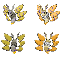
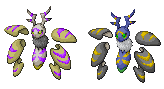
"There are 8 possible sprites:

  • Front Normal Male
  • Front Normal Female
  • Front Shiny Male
  • Front Shiny Female
  • Back Normal Male
  • Back Normal Female
  • Back Shiny Male
  • Back Shiny Female
"In most cases, spriters submit a Front Normal sprite first. Once feedback comes in and the poll nears, they make the other sprites. Animations are not required and will not be used as part of the final product; however, it does add to the "appeal" aspect of your submission. You do not have to make different Male and Female sprites. Since there are only minute differences between most in-game male and female sprites, it’s not very hard to tweak the sprite for a different gender. Some spriters have made noticeable changes between genders, which is also fine. Shinies are just recolors, so that shouldn't pose too much issue.

"Please look at your transparent sprites against different colored backgrounds, not just white. In Pokémon Showdown!, the sprite will be displayed on multiple background colors in holy battle.

"Most importantly, have fun! Good luck to all spriters!"

------------

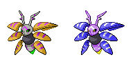
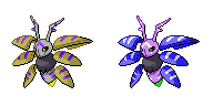
Below is CAP 4 so far:


Name: Risky Business
(formerly "Living On the Edge")

General Description: This Pokémon is very risky to play, but very rewarding if played correctly.

Justification: Many of the Pokémon that are successful in OU are relatively easy to play or have great "safe" options (e.g. U-turn). Yet, many other Pokémon look very powerful, but are less successful than they could be because of some large risks involved (e.g. Hydreigon), and some aren't successful at all (e.g. Honchkrow). This self-balancing concept intends to explore what it takes for a risky Pokémon to be successful, and how much inherent risk a Pokémon can get away with. It should be emphasized that this concept is NOT about luck management, but rather, it is about what the user can afford to do given his/her opponent's options, and vice versa.

Questions To Be Answered:

  • What is the relationship between risk and potential consequences, both positive and negative?
  • What kinds of inherently risky tactics are successful in the OU metagame?
  • Do risky Pokémon need some form of safe options (e.g. switch-ins) to be successful in OU, or can it get away with having few really safe options?
  • How does Substitute, a well-known "safe" move with nearly universal distribution, impact how this Pokémon is built and played?
  • How do existing Pokémon use and deal with risky situations?
  • Can risky Pokémon be played well in the early game, or are they better off put into action later on?
  • How do different playstyles interact with risky situations?
Typing: Bug / Psychic
Abilities: Weak Armour / Illusion / No Guard
Base Stats: 110 HP / 120 Atk / 99 Def / 117 SpA / 60 SpD / 94 Spe
 

bugmaniacbob

Was fun while it lasted
is an Artist Alumnusis a CAP Contributor Alumnusis a Top Contributor Alumnusis a Top Smogon Media Contributor Alumnus
So… I don't really have much to say about sprites.


Go forth and sprite?

CURRENT SPRITE GALLERY – Last updated 10/11/12

CBMeadow


Doran Dragon


DougJustDoug


Ice-cold Claws


Lemondrop


meteor64


Quanyails


QuimicVital


The Reptile


Wyverii


-----

BMB's obligatory Topic Leader footnote gimmick - My Top 15 Arthropods

#6 The Mantis Shrimp


Fascinating Fact said:
Haven't had any marine arthropods yet, have we? And that's surprising, because there are so many good ones. The pistol shrimp can kill fish by snapping its claws to create a shock wave, the boxer crab punches its enemies while holding poisonous sea anemones in its claws, and Japanese Spider Crabs get points for being freaking huge. Supposedly you can fit a horse between its front pincers. But for me, there are some that rank just that little bit higher than others. The mantis shrimp is one of these.

Firstly, it is gorgeous, and utterly adorable. Just look at that face. Secondly, they are so much more powerful than their appearance would suggest. It has the most complicated set of eyes in the entire animal kingdom, and can detect light over a vast spectrum – and their eyesight is pretty damn strong, too. Both eyes are also independent of each other. Their claws are also phenomenally strong – "slasher" claws can gouge human flesh while "smasher" claws are, in some species, strong enough to shatter aquarium glass – and numerous accounts suggest that this occurrence is not merely theoretical. The Peacock Mantis Shrimp, indeed (also the most pretty) has the fastest punch of any animal (50mph), with a force of 200 pounds in every attack.

Apparently they also taste excellent when grilled and served with rice.
 

Quanyails

On sabbatical!
is a Top Artist Alumnusis a Community Leader Alumnusis a Community Contributor Alumnus


First draft. Used Volcarona as a size reference. Might dull the wings' highlights as to not make it too metallic, as well as modify the shiny's color palette.

Edit: Added another shiny palette. It may be too implicit of my inspiration, but hey, it worked for Voodoom.
 
Hooray this is right before my final exams, good thing I did preemptive spriting

(Fairly complete) draft goooo
P.S. I don't know what to do with the fluffy middle (thorax?)
Dangit I keep changing my mind about the shiny colors.
 
@Quanyails- The lines on the wings should be purple

Anyway, your head looks off position. I can see where you trying to get at with it leaning forward, but the body is at a weird angle so it looks off.
 
@Quanyails: The body looks too small, try making it a little larger. However, everything is in proportion, the size of the body and head is just wrong.
 

Bughouse

Like ships in the night, you're passing me by
is a Site Content Manageris a Forum Moderator Alumnusis a CAP Contributor Alumnusis a Tiering Contributor Alumnusis a Contributor Alumnus
ICC, the bottom of the body should match the shields/wings, even in shinies imo.
 

Texas Cloverleaf

This user has a custom title
is a Social Media Contributor Alumnusis a Forum Moderator Alumnusis a Community Contributor Alumnusis a Tiering Contributor Alumnusis a Contributor Alumnusis a Smogon Media Contributor Alumnusis a Battle Simulator Moderator Alumnus
ICC, that is a bad ass sprite, caputres teh design beautifully and makes mothra veeery threatening. Imo the thorax is great as it is, provides a nice focal point and balances out the otherwise lighter colours with its darker shade.

Great sprite.
 

canno

formerly The Reptile
I'm not too happy with the wing/shield shading or the painting, but I really like the body.


Quanyails

On sabbatical!
is a Top Artist Alumnusis a Community Leader Alumnusis a Community Contributor Alumnus


120% scaled and adjusted. Made the blurple more distinct, though it, when next to the yellow, looks reddish.

Too big?

Comments:
  • Ice-cold Claws: I noticed how your shiny sprite has angrier eyes than your normal. I do not think that is intentional. As for the fur; give it some texture if not making it wholly a bundle of lines. dithering a smidge can do. I find it slightly funny that you kept the lopsided horns. :D
  • The Reptile: Well, that's some artistic license applied. I try not to, but that's usually to my disadvantage. The body did come out very nice, especially with how 'enclosed' those stripes make it look. Other than that, I'd apply symmetry (not literal, like a mirror) to the wings. They look rather random and dissimilar from what you currently have.
 
The Reptile, I love the positioning of the wings in your sprite. I had some reservations about the concept appearing to be more ghost than psychic (with the utmost respect KoA) but this placement of the wings just says psychic to me... Its just relaxed like its not actually doing the fighting, exactly how I imagine a psychic pokemon fighting, with its mind rather than body.

Tl;dr Reptile, good job. You have my support.
Same as what Mdevil said. I thought the picture KoZ did looked like a bug ghost type. But, with your sprite, the wings/shields are more spread out making in look like it's controlling them with it's mind. It's wonderful.\

When voting comes out, I'm going for you, The Reptile. ^_-
 
ok guys I was working on my sprite and I...

wait

hold on...


goddamnit, it looks just like volcarona.


can we pretend volcarona doesnt exist?
 
Here are some suggestions/comments for you guys:

Quanyails: Like the size overall, but the body itself could be bigger. I also like how the wings/shield things give it a feel that it's attacking.

Ice-cold Claws: I think you should try to distance the wings/shield things away from the body a bit because in my opinion they look too close. Also the horns look rather lopsided. I really love the shape of the body and the positioning of the wings!

The Reptile: I love it! I love how laid back the body looks, so it looks like the wings are controlled with it's mind. Also love the body and the pattern on it! My favorite so far.
 
tags: estuans interius, ira vehementi

never ever sprited before but I figured why not-


first draft, not sure exactly where to improve on but i know it needs it, also will sort out the white background

edit:

shiny draft, colours may be a bit too radical

 
Ok, so here's my first drafts for the Capmon...


I'm quite satisfied of the results but I still feel it's lacking something...For me, it kinda looks a lil' dull to my taste; the shading/coloring I mean. Also, some lines aren't as refined as I wanted it to be. :/

Any comments, suggestions, or tips?
 
Yo ICC I don't know if this was an intentional choice or not, but the taillight on the regular sprite looks far too green; it should be yellow IMO. It might serve well to swap the taillight colors for the regular and the Shiny around.

Also for the bottom set of wings, I think you could either make the one on our right more pointed or make the one on our left less blunt; at the moment they look imbalanced.

ED: you might also want to make the regular's stripe's blue rather than purple.

other than that, cracking good job!
 
I'd like to add in, just because I do know ICC is colorblind, that the wings are coming off as a bit too red to me in general - the yellow is orange and the purple magenta. Of course, if that's your intended coloration, continue on! Oh, one other thing - I think you should attempt to make the fluff a bit more... messy? It's very round and solid right now.

We'll see if I end up actually finishing some sprites for this one.
 
thereptile's is looking the most like the artwork at the moment, which is great because we finally have an artwork that you can truly see all of the abilities present


I'm a bit of a novice, but I hope this doesn't show it too badly. Quanyails gave me some pointers and fixes, and I think it looks alright. Commentary appreciated!

Might edit in some critique later.
 
Wooo thanks everyone! Thanks Texas!


Made the necessary changes after reading comments and referring to the original artwork...
And yes, the problem I had with the thorax was not knowing how to make it fluffy (now I have a vague idea)

srk I don't know what you're referring to sorry :(
Adams Good suggestion, I actually did that, but I didn't really like it. Apparently the majority's fine with it too so I'll keep this one.
Mos/elementalpenguin damn you guys know me well.

Quanyails: Nice job! The wings look real solid (should they? Weak Armor?).
Personal opinion is that you should make the pupils larger, currently they're a bit small and kind of strange-looking.

QuimicVital: You might want to make the eyes larger buddy. Like put some black pixels around the yellow one. Otherwise it looks slightly odd.
I especially like the upper left wing though!

The Reptile: Ditto with the psychic thing I suppose, but what really stands out is the eyes. Seriously, they're sort of glowing, and that's cool.
But then the middle left wing is bothering me. Is it really supposed to be shaped that way?

Doran Dragon: Dear god this is badass. No one's commenting on your stuff again why?!?
I like the horns I like the fur I like the pose I like everything I can't wait till you color it in.

meteor64: Not bad so far. You might want to make the shading darker, right now they almost blend in with the lighter colors.
You might also want to refer to Arcanine or something to see how to draw and shade fur.

Lemondrop: I do like this one, it's in good shape. The head especially.
Yes, the shading is a bit dull-- I advise you to pick a more saturated color.

CBMeadow: Superb pose. The shading's a bit unconventional, but it suits the pose too, so that's no biggie. Also the expression is good.
However the horns look a little flimsy, I suggest you make them slightly thicker.
 

Bughouse

Like ships in the night, you're passing me by
is a Site Content Manageris a Forum Moderator Alumnusis a CAP Contributor Alumnusis a Tiering Contributor Alumnusis a Contributor Alumnus
If you are trying to be 100% faithful to the design, the "stinger" part of the body (were CAP4 a bee) should match, or at least be muuuuuch closer to matching, the wings.

Currently, you have a tannish color on the wings and a quite bright yellow stinger. While this is totally within artistic license on spriting, it feels unnecessary and, for me at least, is a bit of an eyesore.

Aside from that color issue, though, which I know must be frustrating for a colorblind artist... your sprite is by far my favorite right now.
 
Status
Not open for further replies.

Users Who Are Viewing This Thread (Users: 1, Guests: 0)

Top