
YourFavoriteEgyptian: First: Salaam :) Secondly onto your design: I feel like if maybe you got rid of the legs and made it float something like darkrai that it would really get the pokemon feel you're trying to capture. Also make the arms longer and sag a little more that would help to get it closer to the pokemon feel as well. Although be careful for if you do get rid of the legs and make him float make sure you try all you can to keep him looking like a dark type and not accidentally deviate into a ghost type.

-
The moderators of this forum can be found in the CAP forum staff directory.
-
Welcome to Smogon! Take a moment to read the Introduction to Smogon for a run-down on everything Smogon, and make sure you take some time to read the global rules.
-
Congrats to the winners of the 2023 Smog Awards!
CAP 16 CAP 5 - Art Submissions
- Thread starter Birkal
- Start date
- Status
- Not open for further replies.


Final Submission
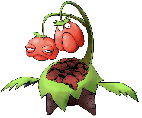

So here we have 'Hecklermon', where every attack is a critical hit!
These guys tend to wander until they find a healthy community of either people or Pokemon and will then spend the rest of their lives living on the outskirts pelting others with their rotten fruit.
In societies Hecklermon 'adopt', social harmony will either collapse from the stress and stench caused by these rotters, or their bonds will be strengthened as the members band together to rid themselves of these pests.
Having many of these Pokemon band together is a known historical cause of crop failures, making them more than mere annoyances if allowed to thrive.
The life cycle of a fruit head is relatively short. A head will thrive and heckle for just a few months before internal putrification causes the head to drop into its 'pouch' ensuring a constant supply of ammunition. A new head will grow in its place quickly, starting off generally good-natured, before being poisoned in demeanor by its other head.

"Hecklermon"
(Rough sketch)
[LEFT]So here we have 'Hecklermon', where every attack is a [I]critical[/I] hit!
These guys tend to wander until they find a healthy community of either people or Pokemon and will then spend the rest of their lives living on the outskirts pelting others with their rotten fruit.
In societies Hecklermon 'adopt', social harmony will either collapse from the stress and stench caused by these rotters, or their bonds will be strengthened as the members band together to rid themselves of these pests.
Having many of these Pokemon band together is a known historical cause of crop failures, making them more than mere annoyances if allowed to thrive.
The life cycle of a fruit head is relatively short. A head will thrive and heckle for just a few months before internal putrification causes the head to drop into its 'pouch' ensuring a constant supply of ammunition. A new head will grow in its place quickly, starting off generally good-natured, before being poisoned in demeanor by its other head.
[/LEFT]
[/CENTER][/QUOTE]
I adore this.
I'm guessing at a reference to these gents...?
[url]http://brucefong.files.wordpress.com/2008/08/grumpy-muppets.jpg[/url]
If so I'm won over. If not I pretty much still am anyway :D

Love Hekcler, though i'm doubting i can see it "pelting" anything, without any range of arms. Brilliant design overall though :D

Boy Snapple you are looking kinda fat today

One of the color schemes submitted to me. For those who don't recall seventh grade mythology, the golden apple was a gift enscribed with to the fairest by Eris, the goddess of discord and strife. She tossed it among the goddesses and through a chain of events led to the trojan war. Seems pretty dark to me! Also, green and silver is one of my favorite combinations.
Thanks to everyone who submitted colors! I might post more idk
also its beautiful cartoons!

Oh wow, that's so brilliant. I love how compatible the concept is with Harvest's recycling theme, too. You definitely have my vote (yet again..........)."Hecklermon"
@Buffalo_Wings: Far too busy of a design... I suggest you remove the face, arms and legs...


wow. these designs look amazing! i wish i could draw on the computer; i do have an idea that has to do with the gorgon of greek mythology...
but i am really loving the creativity here. my favourites are harle's rapier "fortune teller" - ps, i personally prefer the colours on the right, make it look more spooky and dark.
shanimanim's second design (in which the tree has the eyes, dino is rather large, etc) is amazing, too. it looks really unique, but creepy as hell. not to mention totally badass. perhaps to make it less rock type-esque the fruits could be a different colour? they resemble pebbles, to me. perhaps the dino itself could be changed to dark brown or black? either way, excellent job.
i also really love the idea of the adam and eve temptation snake. the design looks great, and definitely fits the dark and grass types well. the references in particular are very cool- i also love that second colouration with the apple for the fairest (saying that reminded me of snow white - i wonder if that's where they got inspiration?)
maybe that colourscheme could be the shiny form? either way, very cool, props to you for thinking of the concept.
...and of course mariguana. classic. just... classic.

Stratos
Banned deucer.
if this means you CAN draw, just not on the computer, scanned sketches are legal. stratagem was a scanned hand-drawn piecewow. these designs look amazing! i wish i could draw on the computer; i do have an idea that has to do with the gorgon of greek mythology...

YourFavoriteEgyptian
Banned deucer.
Is it just me or is this thread dead?
NOT ANYMORE!!!
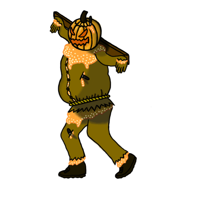
I bring you the new and improved Pumpkinmon! Pumpkinmon now comes with more seeds and a new and improved color scheme for the pumpkin pulp. More knives are also included as well as a buttoned up shirt ready to burst.
Thanks again for the comments. They are much appreciated.

NOT ANYMORE!!!
I bring you the new and improved Pumpkinmon! Pumpkinmon now comes with more seeds and a new and improved color scheme for the pumpkin pulp. More knives are also included as well as a buttoned up shirt ready to burst.
Thanks again for the comments. They are much appreciated.

There are so many strong designs this cycle. Dracoyoshi8, I really like that color scheme. In particular, I thought before that the red apple was a little jarring and didn't fit, but the gold complements the design well (especially with such a metallic silver). This seems like less of an issue now, but have you considered letting the apple be more of a prop than an appendage? Similar to Cubone's bone or Farfetch'd's stick? Might be tough to do what with your CAPmon being a snake.
Bummer, your design also looks great. My only critique, I guess, would be that it's a little too humanoid. It looks like a person wearing leafy garb because the body is humanoid and the "clothes" do appear to be clothes (contrast with mons like Empoleon, which are clothing-inspired but do not seem to be wearing anything).
Bummer, your design also looks great. My only critique, I guess, would be that it's a little too humanoid. It looks like a person wearing leafy garb because the body is humanoid and the "clothes" do appear to be clothes (contrast with mons like Empoleon, which are clothing-inspired but do not seem to be wearing anything).
Reaction to given feedback:
Since some have mentioned that the tropical design is better (xdaylon, rabidchipmunk, forestflamerunner), I'll go with it. Thanks for the feedback!
Forest Troll color scheme
Meanwhile, support art [a bit on the utility movepool]

And a bit of feedback:
@XDaylon: Sorry man, I think Arkeis intends to submit his tiki mon so I won't go that direction. Thanks for the critique!
@Quanynails: Whoa I didn't notice that!*backreads* Sorry about that, honest mistake. However, seeing the drastic difference between your former comment from the latter, I'll try to piece them together and assume that the 'unusual eyes' is what turned you off. The vines on the face are actually the crux of my design, and gives it more character IMO. However I'll try to experiment on what would perhaps make it better. Thanks for the critique!
@Quanynails: Whoa I didn't notice that!*backreads* Sorry about that, honest mistake. However, seeing the drastic difference between your former comment from the latter, I'll try to piece them together and assume that the 'unusual eyes' is what turned you off. The vines on the face are actually the crux of my design, and gives it more character IMO. However I'll try to experiment on what would perhaps make it better. Thanks for the critique!
Since some have mentioned that the tropical design is better (xdaylon, rabidchipmunk, forestflamerunner), I'll go with it. Thanks for the feedback!
Forest Troll color scheme
Meanwhile, support art [a bit on the utility movepool]

And a bit of feedback:
XDaylon: Umm am I correct that he has 3 eyes? Perhaps a different angle would help to understand it better.
Noobiess: Awesome concept, it reminds me of Harley Quinn.
Birkal: I am just as surprised as Agile Turtle on your intended height of cornmon! Its round shape made me assume it was smaller. If it's no too much to ask, I would like to see it make a reaper pose.
nov: I agree with forestflamerunner; the rapid spin sequence made it more dynamic.
Shadowlime: If you want to add the pinstripes, perhaps you can add it on the underbelly?
Rocket Grunt: Your concept is solid. I think it's unnecessary to point out the cleavage since many have stated their opinions already, although if you still want to pursue an emphasis on it, a subtle design akin to nidoqueen's would suffice.
Eol: Awesome design! Be careful on the arms though, the overlaying of the twigs/branches and the leaves seem a bit off to me.
Quanynails: I thought you intended to color the axe edges red, which I think is better.
Cartoons: I have nothing much to say but it's absolutely adorable!
Bummer: It gave me an impression of fruitninja! I really like it, but maybe add a few more colors to make it less monotonous? Looks awesome either way.
Dracoyoshi8: Looks pretty rad! Although to be honest, the face resembles seviper a bit.
Lots of competition, and even though I'm 100% sure mine will suck compared to the others, I present to you...
Scarecrow-mon-thingy-that sucks!
http://i.imgur.com/QKuQUAI.png
Bit of an explanation:
After talking with my friend (AOrtega), he encouraged me to draw a scarecrow. I asked friends if I should, and all of them said yes. So, I thought I would do something original: a scarecrow. Although, it looks like a "Cacturne Incarnation", which I'll most likely try to steer away from while editing. The stitched frown I did while thinking of a dex entry, "It's mouth was sewn shut to keep it's whimpers from being heard." Pretty creepy. The scars on it's face are to make it more dark type, along with it's eyes and the eye on the bottom of the shirt (based on Jirachi's creepy-ass eye). The twigs are for a grass-type feel. The leaves look like the eye on it's shirt, making it even more creepy. The patches I'll most likely end up removing due to feed back from #cap. Now for the fly-traps growing out of it's body; after thinking it through, twigs and leaves are not grass type enough, so I looked for some creepy plants. The first to come up were fly traps, which were both simple to draw, and terrifying. To top the heads off, I added in petals to make it more grass type. As for the legs.. Eh, not fond of them, but I couldn't think of anything else to do for them, so I based them off Roserade's, except shorter.
i'm a horrible artist, but I tried my best. Suggest anything you think I should add, I'll add color eventually. And I have to make it more 3-d I guess..


My design came from my thinking about "whips" and "whipping". In Pokemon, all the whip moves are Grass type, like Power Whip and Vine Whip. But whipping is also a form of punishment, and all the punishment moves are Dark type, like Punishment, Torment, and Payback. I liked how both aspects of our CAP 5 typing could be captured in a single theme, so I came up with this grisly design based on the ideas of whipping, punishment, and medieval torture.
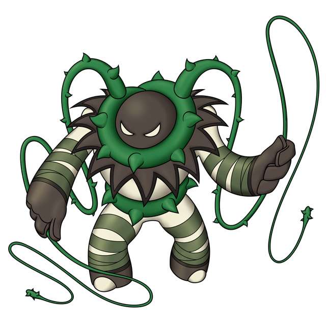
I tried to evoke the image of an executioner or dungeon torturer, hence the black hood-like head and sharp spikes. Obviously the whips are vines with thorns, and additional elements to give an imposing presence. I made the general body structure vaguely simian, but I didn't go too far with that, hopefully just enough to have a hint of animal to it, making you wonder what exactly is lurking underneath that ominous hood and vines.
Overall, I like how this is turning out. I have some backstory and other visual references that I'll share later, if there is interest. Hope you like it!


DougJustDoug: Really like your design. At first glance it's amazing. After reading your description and your reasoning behind the vines I fell in love with your character. Though just something I feel would make your character look cooler; if you put the vines sorta going across his chest like / or X instead of around his neck. I think the vines around his waist are cool but I feel the ones around his neck are awkward.

Well, the Vampire Heart didn't look like a 50 speed bulky attacker, so I guess I fell back on my other design. I decided to base my design off a cactus flower as those symbolize endurance and rarity; certain things that I wanted to convey through her.
The "demonic" symbolism should be quite clear in her design too; I tried to incorporate it together with the pinkish cactus-like colour scheme.
The reason why her eyes look so blind is because of the term, "justice is blind"; I went back to the "equalizer" concept for this, and decided to bring in hints of it through here. I intentionally arranged the facial markings on her to look like glasss because, well... I thought it would be cute.
I'll finish up my supporting art later, but for now I'd like to comment on my favourites thus far;
DougJustDoug don't change a thing. I think yours fits the typing and proposed stats perfectly and it looks amazing as a design. The only thing I can suggest is perhaps a third colour to go along with the neutrals and greens. Red maybe?
Magistrum the personality in yours really shows through the amounts of supporting art you're doing. I don't really have any critic for this, good job!
Bummer you could perhaps make it like that "ninja costume" is more of it's body than worn on, kind of like Shiftry. I know Throh and Sawk pull the same stunt, but... it's all about that "thing".
Cartoons!, you never fail to disappoint. This kind of reminds me of your previous concept, but that's not a bad thing; I could see this using harvest really well and it's a cute and comedic design in general.
Buffalo_Wings do please work on this, it might strike you as plain but I LOVE that face good god!
Doran Dragon I've liked yours since it's first iteration. The bigger wings just make it better. I'd really like to see you polish it!
Rocket Grunt how could you! But I'm not complaining. I know I'm voting for this once the polls roll around.
Birkal you haven't drawn it eating a Cornn Berry yet
mcFlareon I'd really like to see you develop yours more too. The stat spread might not be too kind to this kind of design, though...
Harle I've said this before, but I'll say it again; just work on the proportions a little and yours will REALLY stand out.
Wyverii my favourite out of all the "reptilian" designs. Besides a few perspective quirks that shouldn't be of consequence I think yours is a really cool design.
Mos-Quitoxe WAH HAH HAH
Doug, Tail Whipe isn't Grass =F
In all seriousness, i like it a lot! My only reservation is with the lack of any definition in the eye. I think Pokemon with bland eye designs are bad enough (like Kyurem for example, though it does fit his lore), having no pupil at all just creeps me out a bit much for a Pokemon design. Yes its a dark type, but the only other Dark type who fits this description is Sableye, who has a very specific eye gimmick.
Obviously this is more than likely just me, and a nitpick even at that. but i dunno. Maybe a scar definition on an eye, like Zangoose?
Hecklermon!
My new favorite, nicely done!
My new favorite, nicely done!
Yilx: After reading the description for your pokemon I died. I love the deep amount of symbolism you put into it. As for the design I agree with DougJustDoug, don't change a thing (Though I agree with Doug about the coloring).


Haha, I'm loving Yilx's pineapple and Doug's executioner. I think that the latter might remind people a bit of Ferrothorn with its roundness, but other than that, it's really cool.
It's not actually a whip, it's "tail wag" in Japanese.Doug, Tail Whipe isn't Grass =F


All of these are great, but I'll comment on what I feel to be the best so far.
Yilx: Stylistically and artistically, this is close to perfection, I love it. My only comment is that it's a pity you didn't also develop the other design, it's just as good.
DougJustDoug: Another great design from Doug, as usual. It's rather similar to Ferrothorn in some ways, but it's more like paying homage than ripping off, and I think it makes it better. The flavor of combining the grass type whip moves with dark type torture moves is by far the best of anyone I've seen so far. My only suggestions are to play around with other colors besides white for the main body, and that the feet look a bit stilted.
YourFavoriteEgyptian: While yours isn't quite on the artistic level of Yilx or Doug, it's my favorite. Pumpkinmon fits the ability Harvest quite well, and the pulp coming out like blood evokes both the Grass type and the Dark type. I like your keeping the knife used to carve open the top in its head, that's a nice touch. Besides, if this wins, I already have a dozen Pokedex entries lined up, lol. I would like to see the design sharpened up a bit, and the color scheme made a bit more realistic, but it's great.
I should be able to make an update later today. For now, comments!
Yilx [Pineapple]: I love it SO MUCH. The shape of the pineapple is perfect for an imposing specially defensive slow dark pokemon and the contrasting bright tropical vibe the pineapple creates really rounds out the design. The bright tropical imagery of pineapples also works perfectly for a sun-loving mon and harvest fits right in. I can see a bright yellow / bright green/ dark red-brown color scheme working well (dark brown for the sides of his face / parts of his arms and legs maybe - keeping a dark vibe with bright colours will be the biggest challenge). I do love Cactus girl as well (the pink is beautiful~) but Pineapple fits way better and is more original.
Doug: Really excellent, I think this body type is perfect and the theme is clever. I don't love the colours as they are now - that dull green doesn't go well with the more deep tropical green of the vine. Currently, his head looks a too flat to support that large collar. A more contrasting colour theme would do the design much more justice.
SilverShadow: Way too contrived - too many excessive details and no interesting shapes or proportionality to convey personality. Instead of focusing on excessive detail, work on creating a body shape that makes your design stand out, then add only the most essential details.
Magistrum: Your design has so much promise, but the excessive details just creep me out (in a bad way, not in a good dark pokemon way). All those little tiny vine things are just gross in my opinion! Maybe you could try simplifying the design elements (but you can still stay true to your style and include the beautiful textures you have in your drawings).
YourFavouriteEgyptian: See my comment to SilverShadow. I do really enjoy your colour theme though :)
Bummer: Really awesome, maybe you could bring out the stealthiness to emphasize dark-typing to avoid fighting-type misconceptions, and make his weapons more grass-ey (vines and sharp leaves and such).
Dracoyoshi8: I like this colour scheme much better :)
Cartoons: Completely brilliant, I can't get over how much I love it. The theming is so clever and I love the Muppets reference :) The grass/dark typing seems natural and effortless.
Menshay: I remember in your original post the colours of the plant you were inspired by were not nearly so bright. Try for some more natural tones. You could also bring out grass typing by making his leaf-inspired parts more leafy and dark typing by making him more mischievous looking.
ShadowLime: Hilarious and clever, I think it works. I don't think you need the glowing bits though.
Buffalo Wings: omg eggplantmon. If you could make him a little more imposing and maybe add another design element he would be perfect.
ShyGuy: Feels a bit forced, try playing with proportions to make him have more uniqueness and personality.
Quanyails: I really like the new sketch, looks more dynamic and the proportions are better.
Eol: Has promise but the stick-body doesn't really work.
Doran: I love it a lot, I would love a goat for this concept. The green part still feels a bit busy and forced though.
Rocket Grunt: Beautiful design and your concept sketches are very inspirational, but I don't think a delicate feminine personality is going to work for this CAP. Some of your sketches looked more imposing and dark, maybe go for that angle (maybe like an Ursula vibe !)
nov: I really like this, but I think it would benefit from some stronger antlers and a meaner personality.
flexistentialist: I loved the coloured pencil version, but I think the cthulu design is looking too frail unfortunately. I think you could keep the theme and give it a different silhouette without too much trouble.
noobiess: feels a bit plain but I can't put my finger on why. The arms/hands are a bit boring. Has some potential though!
Shanimanim: This has lots of potential and you've gotten lots of support, but I think the proportions are just too boring right now. The tree's design looks just like a generic tree that kids draw - you could really push its silhouette to be imposing, gnarly, bulky, withered... lots of directions to go. Right now the overall silhouette is very rectangular and plain. Colour contrast would help a lot too.
- Status
- Not open for further replies.