CAP 16 CAP 5 - Art Submissions

Status
Not open for further replies.

Quanyails

On sabbatical!
is a Top Artist Alumnusis a Community Leader Alumnusis a Community Contributor Alumnus
Thank you, Birkal, for the announcement. :)


I was inspired by Cartoons! to make some sketchy animations. Obviously, they are not as skilled as Cartoons!'s, but here's the first I had made to experiment and explain Harvest for treant reaper. It, having roots, can cause a stem that bears fruit to sprout from the ground. It then cuts the berry--in this case, Sitrus--off with one of its blades. I also had some sillier tests (..) that started with a squishy ball and worked outward to a head.

Comments:
  • ShyGuy1221: All righty. Xenomushroom--and Xenomorphs in general--are quite unique as designs. The lizard seems less so with Wyverii's design prevalent, I have to say. :/
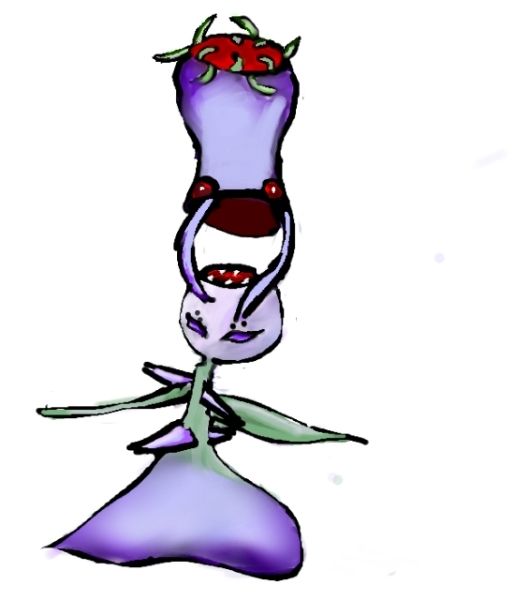
  • Buffalo_Wings: Creepy. O_o You sure have that part of the typing down! You could add a few details--lumps, extra leaves, patterns, to make it less than an eggplant with limbs and a face, though. Otherwise, I fear it is too plain.
  • ShadowLime: Hmm, better. :) Just remember that I, too, work without a tablet. Getting good control of a mouse works just as well (well, sans pressure). I like that combined illusion of a mafioso; it works for the Dark typing! Try the stripes, if they can look natural and like a suit at the same time. The design is very original!
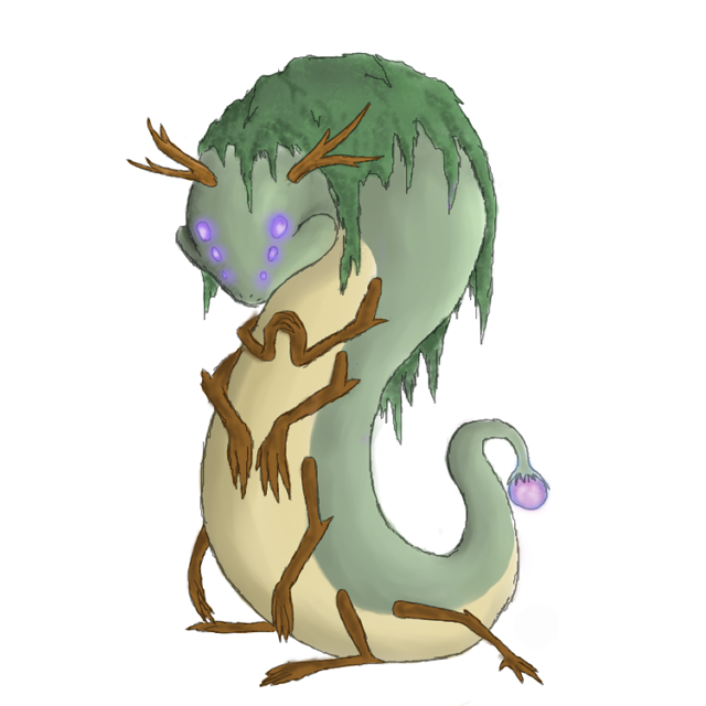
  • Menshay: I'm ambivalent on the eyes' change. It's different than the dot eyes of Mollux, the beady ones of Necturna, or the glowing bulbs of Aurumoth. Are the eyes really teadrop-shaped, or are they just markings? If you'd like the concept to be darker rather than the colors, more concave curves would work. Spikes are also classic for darkness, though they are used frequently.
  • YourFavoriteEgyptian: Great. :) I just wish you had better anatomy on your design, since the arms and legs appear flat, which would make sense with sagging arms, but not with legs that would have to be solid enough to stand. I can digest the rest of its perspective, albeit it does look amateur. I can't suggest much that would help with that unless I give a tutorial of sorts about perspective. :P
  • Cartoons!: Ah, another great, if humorous design and nice supporting animation from you! It certainly works with all of what we've made so far, what with the typing, Harvest, and stats. Would voters understand the subject from the art alone? I, admittedly, didn't realize immediately that the design was based off of Statler and Waldorf, even though I know that pair. Despite that concern, it's great to see your work again! And, ah, wouldn't it be nice if your lovebugs got a second chance to be eligible for being voted upon?
  • Dracoyoshi8: I still like your original palette. o3o That is all.
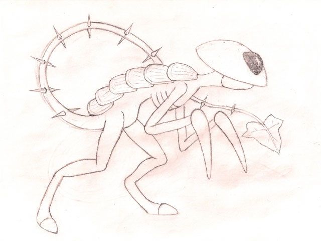
  • Bummer: My, how close that is to a fruit ninja. You also have a tenancy to make monochromatic designs, from what I've seen in the Extreme Makeover thread. Well, color aside, I like the idea of a ninja hiding amidst foliage to Sucker Punch some unsuspecting Latias. It fits the typing, though Harvest is slightly trickier to convey. Ah, well. :P That is the most of my criticism!
  • Magistrum: I know they are, but I just dislike them. :( The other part is that Pyroak already used the wooden armor concept, and I, admittedly, would like variety. That is impossible without making major changes to your design, though, so feel free to ignore this comment if you're dedicated to it. Also, the blades are red on my design. A desaturated red, but still red. If I make them too red, they become too vivid.
  • DougJustDoug: Whoo, this design is quite a lot to take in! It's very intimidating, being obviously physical as an attacker, and showing off the typing perfectly. It may be a bit too much, in my opinion. The design doesn't break any taboo, but it's quite violent. I'm uncertain if it's too much so, though. I don't think you need to change the colors, but spiky vines do feel repetitive with Ferrothorn and Necturna displaying those. That's not bad, seeing as you've incorporated them into the design very well.
  • Yilx: Whoo, something more physical. That's a nice change, I agree with others. Just make sure not to make it too much like a Fighting-type with its masculinity (and I was certain you had some reference to Kenshiro--did I miss it?). Otherwise, I like it!
  • paintseagull: Yeaah, my perception on art means my drawings have less dynamic poses than others, since, for example, a limb stretched too far looks odd if I look at it for more than a few seconds. :/ Apologies for not doing something about that with treant reaper.
  • Calad: The first thing I noticed from the original sketch is that the fruit it has looks quite stuck-on and don't follow the concept. I know Harvest is part of the pokemon, but maybe it could be some buds from that laurel wreath by its horns instead of the leaves on its body? That aside, it conveys both typings well and has the bonus of being truer to Pokemon than some submissions (mine included).
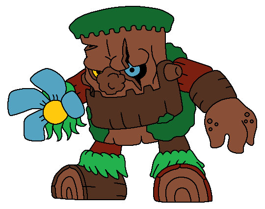
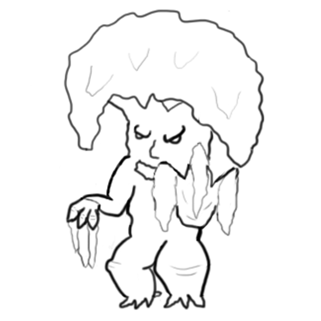
  • KoA: Mmm, nope. Still can't see Grass/Dark. Dark/Fighting or Grass/Fighting is more prevalent. :/ Granted, I love the idea of onis, but the proportions still, in my eyes, imply a Fighting typing.
  • the flexistentialist: I have no critique--just positive comments on your design. Well, I have a concern about spriting it, but I'm sure it can be done. Haha, that Weedle in your supplementary art! :) I do like those drawings for its (almost?) exaggerated despicability. That silhouette against the sun certainly proves its connection to sun while being Dark at the same time!
  • invalio: Your design has obvious biceps. o3o I see Fighting/Grass in this one with those lines in mind (as small as the detail is). Cuts in wood, darker-rimmed or more malevolent eyes, or just making it darker overall should convey the typing more.
  • Cheeno: Ah, a cute design. :) It works, and I'm not sure if it looks like a pre-evolution or not. If it doesn't, great. If it does, it will not be voted on. Mushrooms are nice for Grass/Dark in their entirety, so it's a generically good design. Perhaps a few darker colors could do, but that may go into cliche.
 
Okay, here is the closest thing I have to a final submission:


For people guessing it was a bird, walk the walk of shame to your history class, it is partly based on a 17th century doctor, which used all kinds of pointy tools and herbs for their supposed "medecine", however at the time no one really knew about how the human body worked because the Church prohibited human dissection, so these "doctors" most of the time killed their patients. They also wore those scary beak-masks to protect themselves from the plague and other air-transmitted diseases.

I don't know if it really worked.

It is also partly based on a bog monster and a scarecrow, with the black hoodie and the loooong, plant-based arms.

AAAAAAAAND NOW FOR OUR LITTLE TRIVIA GAME:

Can you guess all the berries CAP5 is using?

I. http://i.minus.com/igAH3NkvDMxMW.png
II. http://i.minus.com/iIOEYSjkEYJn4.png
III. http://i.minus.com/ibt3vHTPERUeA4.png
IV. http://i.minus.com/iA20uoSpT7AN5.png
V. http://i.minus.com/i98XJ8tJC7aeS.png
VI. http://i.minus.com/ibfCulyWRpMfz3.png
VII. http://i.minus.com/ibc3YO5m2tsfia.png
VIII. http://i.minus.com/iw2AIShufwlMl.png
IX. http://i.minus.com/iF6mYn3io4AP0.png
X. http://i.minus.com/iCcnnZJKCZMG8.png
XI. http://i.minus.com/iSSjzcLqGAo73.png

TRY NOT USING ANY GUIDE!!!
 
Welp, Yilx just took everything that my little spikeball could ever dream to be and made it about 100x cooler. Not quite sure what to add at this point, so I'll probably just resubmit mine as a pre-evo or something.
 

alexwolf

lurks in the shadows
is a Forum Moderator Alumnusis a Community Contributor Alumnusis a Tiering Contributor Alumnusis a Top Contributor Alumnus
Wow Eol very nice piece of art! Second favorite so far after Doug's punisher, and the little thing you did with the berries is very cool as well!


Update on Alternate Color Scheme.

Here's a darker colored version that Quanyails requested.

Although the CAP 5 stats suggests it should look bulkier, I intended for it to be smaller looking to make it more sinister and more of a phantom theme. I just imagined that he uses the mushroom as a shield, bowing down and crossing his arms to block special attacks. I'll post support arts later.

------------

@Yilx - I liked the Vampire Heart Flower concept more. Although the Yakuza design was more appropriate because it's more bulky looking.

@Cartoons! - really really good. I love the concept and the color scheme. But it somehow lacks along the "dark-type" department. PLaying with the colors can help with that, but overall, it's great,

@McFlareon - Another great concept. I can feel the dark energies. haha. Although there's something weird about the eyes.

@pkmn-taicho321 - love the sketches so far. still waiting for finalized works though.

@Rocket Grunt - WOW! IT'S CREEPY! In a good way! :D. ONe of my favorite designs. It's like Harlequin mixed grass/dark type.

-----------------

There's a lot of creativity with the CAP 5 submissions. I've enjoyed being a part of this.

Although a lot of artworks may want to work with the eye designs.
 
Final Submission

Well I'm gonna be without internet for the next two weeks, so I'll put this as my final submission.


I tried to make everything a little mushroomier, added some deets, and threw a cute texture on that B. Unfortunately, my hand isn't steady enough to make cool pinstripes. I'd still love feedback to read when I get back, and if the polls aren't up yet, I might do some more changes.

Also, here he is anthropomorphized in a suit:


I guess that counts as supplementary?
 
Hi everybody, after a long time without participating I've decided to try my luck once again in this stage of the Create-A-Pokémon Project:


This is a concept I've nicknamed "Frankenstump's Monster" (har har). Instead of being put together through surgery and animated by electricity, grafting and sunlight were used to create it. Though the pokémon's appearance is based on the iconic Boris Karloff portrayal of Frankenstein's Monster, personality-wise it's closer to the original version from the novel: an intelligent and sensitive creature that, embittered by the rejection it experiences wherever it goes, is out for revenge against the world. I look forward to your comments and suggestions!
 
Cap 5

The Angler Toad, The Gentleman toad


This pokemon is an ambush hunter. Burrowing slightly, this pokemon appears as a small shrub laden with fruit. Each fruit, which is actually one of the toad's warts, produces a powerful soporific; easily knocking out smaller pokemon like rattata and pidgey. If necessary, its powerful jaws are brought to bear.

The mustache vines are highly prehensile; and their fruit further specialized to reproduce anything the toad has experienced.

----

Still working on coloration. Supporting illustrations incoming.
 

YourFavoriteEgyptian

Banned deucer.
Although I have spent a lot of time into my scarecrow idea, I felt that it isn't worthy of a Pokemon design. So instead, I have moved on and bring to you all a new idea.

A quick sketch to get the ball rolling. It is an enchanted willow tree strait out of the murky swamps. So what do you guys think? Is this a better design all around or not worth trying and I should stick to the scarecrow idea? Comments would be greatly appreciated.
 

dwarfstar

mindless philosopher
OldManDugan, that's brilliant. We need more amphibians, and having a Grass-type makes it even better. I was having serious trouble choosing a favorite before, but you've made the decision easy. The one (minor) issue I have is with the pupils - I've never seen semi-stellate pupils on a toad or anything else, although this doesn't have to be realistic lol.
 
Been sketching up a new pose for my Xenomushroom concept.


The plates on its back are supposed to be this type of fungus. Will try to get around to coloring this out tomorrow.
 

Blue Frog

It's lucidity. So clear!
is a Top Artist Alumnus
I'm reposting this since I broke the rules on my last post. I feel really bad about it; I have to read the rules more carefully when I post.

So:


Basically, it's a carnivorous plant that hides in its "vase", which is also sentient. It's beauty attracts other Pokemon, and then it attacks. Notice the mouth on the plant's head and the mandibles on the vase.

Heres what it looks like when its hiding in its vase

Again, I'm very sorry for breaking the forum rules. I won't let it happen again.


There is no way a rabbit is gunna have low speed, so I drew this guy up instead. It isn't really based on anything, I just wanted it to look like a really creepy thing that lives in the deepest darkest part of a deep dark forest. It does produce some purple light, and it produces an odd glowing fruit from its tail. I still feel like it needs a certain something, but I'm not sure what yet.
 

Magistrum

DOITSU NO KAGAKU WA SEKAI ICHI
is a Top Artist Alumnus
I tried to experiment with my capmon's face, because apparently it was commented that the vines were too creepy. I came up with this:

I left the hollow abdomen vine untouched because it embodies my representation of the type equalizer concept --- the spiral. As it was stated, the concept encourages use of underwhelming types while hindering the overwhelming ones. Adding the capmon to the mix triggers change, causing a red swirl of chaos to the otherwise monotonous dark abyss represented by the prevalence of rain in the metagame.

I chose the circular features as a more basic turn from the creepy swirling vines while not straying away too much from the concept. Comments, suggestions and critiques are always welcome!

By the way, these are some of the faces I played around with during the modification process [along with the original]: LINK
 

alexwolf

lurks in the shadows
is a Forum Moderator Alumnusis a Community Contributor Alumnusis a Tiering Contributor Alumnusis a Top Contributor Alumnus
Nice design Magistrum, but i still think it's a tad too creepy for a Pokemon. I would suggest changing the face to the one on the bottom left of your link. With this face you still get the creepy/mysterious vibe, but you have something that resembles a real face much more than the other without also being somewhat disturbing and annoying.
 
I tried to experiment with my capmon's face, because apparently it was commented that the vines were too creepy. I came up with this:

*snippers*
Sweet CAPmon man. I personally prefer the face that you currently have going.

Have you experimented with different body builds? I think he'd also look great with a sort of wider, chunkier body that appears less nimble but more intimidating. Maybe with the neck-leaves flowing down his back like a miniature cape of sorts, filling up empty space in the design to make him look even bigger? Haha geez I'm just rambling now.


A better angle on my design. I think it's time to explain a little about this guy.

They resemble a jack in the box mixed with a snapdragon and are super stretchy. Their glowing eyes do not blink and their movement is quite erratic. They'd be quite difficult for the impatient or nervous trainer to train.

During battle they stand still and use their long body and arms to lash at their foes. Smacking one of their limbs will cause them to recoil then snapback with staggering force. Since they can bend in any direction it is quite difficult to get at their legs and their leaf pouch.

In the wild they'll sit near well traveled paths and blend into the foliage, closing their flower to cover their eyes. They'll mug anybody or anything that happens to pass. If the victim is lucky, they'll only have their valuables stripped, otherwise they will be eaten.

These fellows are quite capricious and difficult to befriend. For those they are friends with, they'll share their hidden stash with. They'll also bring home half eaten creatures and stolen loot for people they like.


Here's what it looks like from various angles. The height of course is left deliberately vague but it's roughly how large I imagine it to look.
 
Welp. I finally gave in and made a smogon account. (I do battling I have a team and everything I promise)

I made a thing:

It's primarily based on Baba Yaga's magical and really weird chicken-legged hut, plus onion domes which are now actual onions. All in all it's very Russian. It may or may not eat small mons which could account for the dark typing but since it's already associated with a child-eating witch it might not need to.

It's also a pretty good dancer so it's great at parties.
 

Yilx

Sad
is a Top Artist Alumnusis a Smogon Discord Contributor Alumnus
Golurkyourself I feel yours is one of the most well-inspired and clever designs in this thread. I feel that you could turn the "side-bulbs" into shoulder pads but still preserve the "onion dome" silhouette and give it slightly longer arms, but it's your choice.
 
My personal favourites so far are Eol, Magistrum, and Yilx

Yilx' one looks as though it could easily take a specs draco without any investment

Eol's concept is quite innovative, although I always thought a 17th-century-witch-doctor-style poke would be part poison

And Magistrum's just looks really cool to me xD
 
Golurkyourself, this is a great design. It's a clever spin on two kinds of architecture, an animal, a folktale, AND the Grass/Dark typing, and yet it still feels completely organic and natural. Awesome work.
 
There are a lot of good designs here! I think my favorite would have to be Yilx's pineapple boss thing. It just looks really cool, and it's designed in a way that I can definitely see the Grass and Dark influence in the artwork. By the way the stats are going, it looks like CAP 5 will probably be a specially bulky Pokemon with decent physical power, which I think this really does well to demonstrate. Of course, this design will obviously fit much better if the stat spread chosen has lower speed, which is still up for debate at the moment. This is my personal favorite overall, but good work to everyone so far on these designs!
 
Status
Not open for further replies.

Users Who Are Viewing This Thread (Users: 1, Guests: 0)

Top