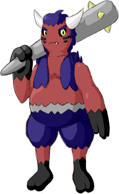
So far I really like Ylix's and DougJustDoug's designs. But that's not to say they're the only good ones! All of you did a fantastic job with the art here. Great work.
-
The moderators of this forum can be found in the CAP forum staff directory.
-
Welcome to Smogon! Take a moment to read the Introduction to Smogon for a run-down on everything Smogon, and make sure you take some time to read the global rules.
-
Congrats to the winners of the 2023 Smog Awards!
CAP 11 CAP 11 - Art Submissions
- Thread starter Fuzznip
- Start date
- Status
- Not open for further replies.
I'll go try that and edit this post with the results. :]@Gun6, so far the design is looking pretty good, though if I were you I would consider changing the yellow on him. Making it black or something would make it look way darker.
EDIT:
Hopefully the quality of this photo isn't too crappy (don't have access to a scanner atm). Togekiss has always reminded me of a cherub or angel, so I thought something demonic would make a good partner for it. I started drawing something with horns, bat wings, and hooves, but then it just looked way too demonic for Pokemon (not like Togekiss looks all that much like an angel anyway). I modified the demon and ended up with this:
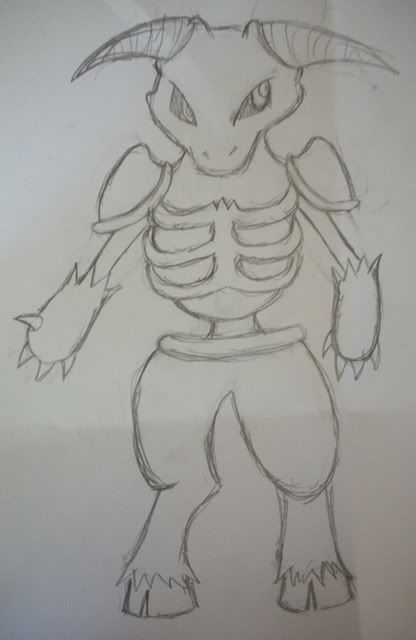
A skeletal minotaur, I guess? (Or an undead Tauros lol.) Its torso is only attached to its lower half by its spinal cord, which gives it more freedom and flexibility when fighting. It's still just a sketch and nowhere close to being final, of course (why does CAP art submission have to start right when the monthly art contest is coming to a close? >_<), so there's still plenty of room for changes. So... critique and comment away!

A skeletal minotaur, I guess? (Or an undead Tauros lol.) Its torso is only attached to its lower half by its spinal cord, which gives it more freedom and flexibility when fighting. It's still just a sketch and nowhere close to being final, of course (why does CAP art submission have to start right when the monthly art contest is coming to a close? >_<), so there's still plenty of room for changes. So... critique and comment away!

(KOB) is one of most relentless fighters in the Pokemon World. It never backs down from a challenge, even if it knows that it's outmatched. But, no matter the odds, it always leaves holes in an opposing team before being KOed. It just loves as pitiful creatures try to escape it's powerful punches. It loves it even more when a tough opponent gets KOed after a round of feints and sucker punches. It literally takes "Punching holes in an opponent's defense" to the next level.
Bring. It. On.
So, this is KOB's (hopefully) final artwork. Its based on a boxer with demon-like features and a demonic boxing helmet. The things extending off of his shoulders are based on the towels boxers use in between fights to wipe off sweat and designed like a cape, to give it an anti-hero feel. With the types of Fighting and Dark, I felt this was one of the best options available though I am horrible at picking color schemes for things. Please, comment on any part of my creation if you have a problem with it or if you like it. I'll be waiting for your response.
Also, please note that his left hand is in the "bring it on" pose. Like you would do to goad an enemy into attacking you. Sorry if you cannot make that out.
Wow...there's a lot of new stuff that's been put out since I left...Very nice ideas guys.
Well since a majority think that Rooster looks too similarly to Blaziken, (even more so when I colored it. SEE Here http://i121.photobucket.com/albums/o235/ckpmax1108/Untitled-3-1.jpg)...I went from avian to a more mammalian alternative....some pages ago, someone suggested a list of things that could be dark(can't remember who though...sorry)...the 'badger' one caught my eye...
So here we go again....tan ta ta ta.... Badger
http://i121.photobucket.com/albums/o235/ckpmax1108/badger.jpg
I carried over a lot of ideas from Rooster to this guy, i.e. the tux (everybody loved it) and the body form.
So whaddya think?
EDIT: Not many people agree Hahaha...looks like Rooster left quite an impact XD
@ZakkiOrichalcum, your design is actually one of my favorites. I'm not really that big of a fan of the Gyarados head as the tail. There are better heads that you could use as tails. However, if you get rid of the Scizor claw on the staff, I just might cry.
@aragornbird, I love all of your designs, but my favorites are the male werewolf and the new one.
@aragornbird, I love all of your designs, but my favorites are the male werewolf and the new one.
I really love the head and face, but the body shape is sort of counter productive to a "fighting" visual. The rooster could use the hour-glass shape and skinnier arms because it came off as scrappy and feisty.Wow...there's a lot of new stuff that's been put out since I left...Very nice ideas guys.
Well since a majority think that Rooster looks too similarly to Blaziken, (even more so when I colored it. SEE Here http://i121.photobucket.com/albums/o235/ckpmax1108/Untitled-3-1.jpg)...I went from avian to a more mammalian alternative....some pages ago, someone suggested a list of things that could be dark(can't remember who though...sorry)...the 'badger' one caught my eye...
So here we go again....tan ta ta ta.... Badger
I carried over a lot of ideas from Rooster to this guy, i.e. the tux (everybody loved it) and the body form.
So whaddya think?
But the large badger head, solid chest, and thick hips have really bulky elements. That's not really an issue, but they produce an awkward fighter when combined with the moderate arms and tiny legs.
I would try either thickening the waist and increasing the size of the arms, or shrink the size of the head. Either way it would probably create a more aggressive body shape.
No matter what you do, I just want to say you've done some awesome work so far.
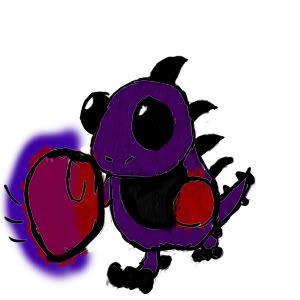
Highly basic design.
@ckpmax
I love the badger and think its one of the dopest designs so far, whereas I really wasn't feeling the rooster (and also the blaziken similarity). I think the one you have now is a kind of lucario-esque poke which fits this CAP perfectly in terms of type and also that it could pull off being special or physically oriented. My only crit is that its legs are a bit stubby. Great job though! (I also don't see any resemblance to garchomp?)
Also @alch that is adorable and awesome
@aragornbird Your new panther looks sweet! It kind of looks like its lacking something right now though, maybe more character in its expression? Its really well drawn anyway and I look forward to your polished version.
First concept: Horn headed warrior thing.


If I may say something, I am currently on holiday and hence away from computers most of the time, so I'll have to make my submission by hand. This isn't a bad thing by itself, but the only scanner I have access to is pretty bad and most pencil drawings are barely visible (if they appear faint, try tilting your screen backwards). The one above was done in marker pen in order for the scanner to read it, so isn't terribly neat, apologies.
Please critique.
I really like your design, Sanglunaria, I can definitely see it as being both dark and fighting, plus it can be special-oriented if it needs to be.
@Gun6, the pokemon looks way darker now, good work.
@ckpmax, the badger is ridiculously awesome. There's something kind of awkward about the legs, but aside from that its amazing.
@ckpmax, the badger is ridiculously awesome. There's something kind of awkward about the legs, but aside from that its amazing.
Everything is so great :O Heres another veryquickie of my concept.
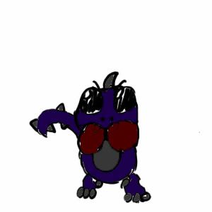

Thanks for your comment, Lucario Guy.I love the design and the faces on the boxing gloves! However, I personally don't like all the yellow - perhaps you could change the shoes and hair green or some other clownish color?
And I don't like the yellow... I only put it for making contrast with the purple.
Definitely the final submission will have the faces on the boxing gloves.
Not many are feeling the love for the badger base....so here's a redone version of it named "Badger MK II"
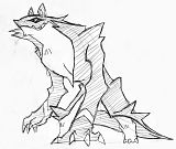
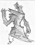
Support Mats:
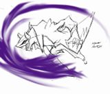
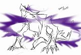
I added in some of what Kitsunine suggested....the stubbiness of the legs can't be avoided. It's too cute to change (-ώ-)
EDIT: Now with support pics and a fully bi-pedal badger pose...XD


Support Mats:


I added in some of what Kitsunine suggested....the stubbiness of the legs can't be avoided. It's too cute to change (-ώ-)
EDIT: Now with support pics and a fully bi-pedal badger pose...XD
Buffalo Wings: You're evil sensei guy is a great design, the only advice I have is to change the colors because the pink color scheme doesn't work on him, and the purple color scheme makes him look part Psychic. Other than that it's a wonderful design!
DougJustDoug: I like your design for the most part, but I think he has way too many "clothes." Sure, plenty Pokemon have clothes (e.g. Machamp, Honchkrow, and Hitmonchan.) but your guy has an entire wardrobe! I'd get rid of the cuff-links and/or the neck tie thingy. Other than that, your design is funky fresh, and I'm looking forward to it's backstory.
Bird: Your design hasn't gotten enough attention! It is beautifully simple design, that really looks like it could be Togekiss's best friend! I'd love to see some more supporting material for this guy!
Caladblog: Your design reminds me why I was so scared of clowns when I was a kid! (Nowadays, I only find them slightly creepy.) As someone else already mentioned, green would work better on your design instead of the yellow. Some supporting material would be great for your guy!
I'm currently working on my own art design, and I should have some up here by tomorrow.
Thanks for your comment, ^^.Caladblog: Your design reminds me why I was so scared of clowns when I was a kid! (Nowadays, I only find them slightly creepy.) As someone else already mentioned, green would work better on your design instead of the yellow. Some supporting material would be great for your guy!
Like I said, I will change the hair color. And I will do some supporting material [These gloves are rocket].
- Status
- Not open for further replies.


