The second and third arts are really interesting. The second looks like the beginning of a Shadow Ball; that in color would be amazing. The third one is quite awesome.

-
The moderators of this forum can be found in the CAP forum staff directory.
-
Welcome to Smogon! Take a moment to read the Introduction to Smogon for a run-down on everything Smogon, and make sure you take some time to read the global rules.
-
Congrats to the winners of the 2023 Smog Awards!
CAP 11 CAP 11 - Art Submissions
- Thread starter Fuzznip
- Start date
- Status
- Not open for further replies.


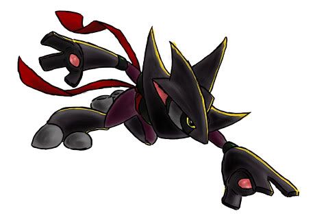
alright, i wanted to post tanuki ninja on his own since other pokemon cannot be included in final submissions anyway, so why not start now?
i have also retooled the fringe, because whilst i liked the idea i don't think i executed it very well
he now has a crescent moon on his "helmet" which connotes his dark type, and is the sort of emblem one might see decorating a traditional samurai helmet

are these improvements? upon adding the crescent i considered changing the darker fur colour to a midnight blue, but i'd like to hang onto these colours (roughly, anyway) since they link the design to the tanuki, or raccoon dog
thanks!

Thank you! I know they aren't really good, but I kind of just wanted to put up some of the sketches I had already done. Anyways, I'll be working on a final piece of supporting material that I hope makes everyone really happy. Expect to see it soon!
@Swaggersaurus: I really like your design, although it is kind of hard to figure out its dark typing. I can see the fighting type but the design itself just seems so light and cheerful and cute. That is really my only problem with this otherwise solid design. Maybe consider adding some darker elements to it or tweaking the coloring to give it a darker feel.
@Swaggersaurus: I really like your design, although it is kind of hard to figure out its dark typing. I can see the fighting type but the design itself just seems so light and cheerful and cute. That is really my only problem with this otherwise solid design. Maybe consider adding some darker elements to it or tweaking the coloring to give it a darker feel.


I really like this one. I would use it for a main base if you are submitting.Here are a couple of sketches that I made for fun this morning. I'm sorry if they are kind of rough, if you guys like any of them in particular I'd be happy t o color them in.
Drawing #2
alright, i wanted to post tanuki ninja on his own since other pokemon cannot be included in final submissions anyway, so why not start now?
i have also retooled the fringe, because whilst i liked the idea i don't think i executed it very well
he now has a crescent moon on his "helmet" which connotes his dark type, and is the sort of emblem one might see decorating a traditional samurai helmet
are these improvements? upon adding the crescent i considered changing the darker fur colour to a midnight blue, but i'd like to hang onto these colours (roughly, anyway) since they link the design to the tanuki, or raccoon dog
thanks!
I agree... I just don't get much of a dark vibe from this guy. His color palette is kind of light and his eyes are just WAY to happy looking. You had one post with an eye study on it and I think some of the others you toyed with originally would work much better...I like the drawing a lot. It's realy cool! I only have some suggestions to make it less of a "light" type and more dark, maybe you should make the light fur just a bit darker, you can't see the darkness much at present, though the cresent moon helped. And also maybe you should open his eyes so you can see the whites and the pupils, it'll look better in my opinion, but that's just my opinion :). All in all great work !

I like it though it looks a bit like a pre-evolution, nevertheless great artwork!My interpretation of a dark/fighting counterpart to Togekiss.
If people like this idea, I'll rework a bit.
I've also got another idea I'ma post up in a bit.
Any feedback is appreciated.
Thanks.
And for swaggersarus, I LOVE the design, it's awesome, but there isn't much dark type in it, the cresent moon made it better but still... You can improve that by making the light skin a bit darker, right now that makes it deffinately not look like a dark type. Another small suggestion is to make the eyes actually open so you can see the whites and pupils, in my opinion it'll look better, but that's just my opinion... Sorry tenisace for posting the whole picture before.. I forgot... Twice. xD

@Zakki- By tribal makeup I mean simple black lines on his arms and stuff. I only suggested tribal makeup so it would be less simple if you used one solid color (which I think should be a brown), but I think he needs a bit more dark type in him.
@Swaggersaurus: I really like your design, although it is kind of hard to figure out its dark typing. I can see the fighting type but the design itself just seems so light and cheerful and cute. That is really my only problem with this otherwise solid design. Maybe consider adding some darker elements to it or tweaking the coloring to give it a darker feel.
I agree... I just don't get much of a dark vibe from this guy. His color palette is kind of light and his eyes are just WAY to happy looking. You had one post with an eye study on it and I think some of the others you toyed with originally would work much better...
alright, this is what i have heard more than anything, so i think a change is definitely in order. i know people have mentioned making the lighter fur darker, and i'd just like to take a moment to explain why i haven't. part of the reason why i think the colours of this design are attractive compositionally is the high contrast of both fur types. if i closed this gap, the design would looks less dynamic, and the idea of a ninja "helmet" and "armour" depicted by the dark fur would be played downAnd for swaggersarus, I LOVE the design, it's awesome, but there isn't much dark type in it, the cresent moon made it better but still... You can improve that by making the light skin a bit darker, right now that makes it deffinately not look like a dark type. Another small suggestion is to make the eyes actually open so you can see the whites and pupils, in my opinion it'll look better, but that's just my opinion...
i think it is still possibly for this design to look dark with that light fur intact, and with this in mind, i've decided to experiment with the colour of the scarf. personally i liked the gold, but i some interesting things have come up through experimentation
i've numbered them all so that it's easier to discuss them (#1 being the original) so let me know what you think! there's a lot to look at and i wanted them at a decent size so i'm going to link:
http://img838.imageshack.us/img838/6388/tanukicolourcompv2.jpg
thoughts? the dual-colour is an experiment more than anything, but i actually think with some tweaking it could look good. so far purples look good to me!
with regard to the eyes, i hear you. i really want to stress that i don't think "dark" types have to look evil or be all black and red etc, but at some point the eyes stopped expressing what i wanted - a sort of mischievous fox-like look - and are instead apparently now just too cute!
i'll post another variety of revised eyes soon, and i might bring back the option of having them open, though personally i like the slanted look
thankyou for so much feedback, it's really helpful and i couldn't refine this design without it! and sorry again for such a huge post aaaa

I personally like #6 Swaggersaurus.

I have to say I humongously love the dual-color one, especially since the crescent moon just doesn't look quite right when it isn't yellow. Although. I'm not sold on that specific magenta-ish color... Perhaps you could try a couple versions with the magenta replaced with the Purple from #5, the Silver from #6, possibly a deeper gray, and maybe even a blue...? *Shrug* I think I'd also be very interested in seeing what a lighter wood-brown (by which I mean a brown between the light brown and dark brown you're already using) would look like too. A light brown would probably blend well with the yellow, actually. You can try out whatever you like, I guess.i've numbered them all so that it's easier to discuss them (#1 being the original) so let me know what you think! there's a lot to look at and i wanted them at a decent size so i'm going to link:
http://img838.imageshack.us/img838/6388/tanukicolourcompv2.jpg
thoughts? the dual-colour is an experiment more than anything, but i actually think with some tweaking it could look good. so far purples look good to me!

I've thought of a lot of concepts for CaP 11 and this is the least ridiculous so here we go I guess lol

It's basically an upside down Togekiss with a few design tweaks. I went with the whole opposite thing because this dude eats up Toge's counters and his typing is very polarized too. I guess you could call the things on its head devil horns (shaped like Togekiss's feet, upside down and all), which perhaps emphasizes a bit of the Dark typing. Wings turned into fistycuffs so he can beat things up. The legs and tail are modeled after the three plumes on Togekiss's head, and it kinda looks he's wearing wrestling boots or something so that works too maybe haha. I figure he's so angry because his face is where Kiss's ass usually is
As you can no doubt tell it's a rough sketch but hopefully this conveys the general gist of my idea
There are a lot of designs I like at the moment... you guys always make it such a hard vote. My favourite is Wyverii's, closely followed by BWings and Cartoons!


Okay, I have taken some consideration into the colour scheme of my character and have come up with this revision. Though I am currently playing with a few small design elements to depict both types better, This is definately a more "dark" Colour even if it is almost monochromatic (at least to me it is)
I added a Purple and darkened down the main armour/body parts. The Purple and the yellow highlights are a nice contrast as is the dark green and the Red of the sash.
I have also come up with 3 new Poses for moves... just for fun. Vacuum Wave, Seismic Toss and Low Kick. I was going to do Bite or Crunch, but I haven't decided if he has a mouth yet.
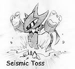
The other ones would not Thumbnail for me at the proper size. How Annoying!
Vacuum Wave - http://i139.photobucket.com/albums/q301/Kukem/DarklorisroughVAC.jpg
Low Kick - http://i139.photobucket.com/albums/q301/Kukem/DarklorisroughLOWKCK.jpg
These designs are slightly altered as I refine it but I will be trying a few more things with him.
@ Swaggersaurus - I think Design 5 is the Darkest of them.... but I agree with the contrast points. The light and darks play off each other nicely. To wash it down would take away from the character. Maybe adding some blue to the brown and altering the scarf to a darker colour is the best way to go without loosing your original intention for the character. A suggestion on the eyes would to give it a more linear look Like a slanted mean closed eye. It may work, who knows? I love the character regardless.


Well, I thought I'd give this a try.. It's supposed to be a werewolf or something along those lines, and this below is just a concept. I think I have the dark type covered, but I'm not so sure about the fighting type elements. All I could think of doing is adding bandages and making it pretty burly, but any suggestions on how to make it look more like a fighting type?? Also, the markings are just as a rough guide on the second image, I did them so bright to contrast with togekiss' markings, which are dark on white, so I did bright on black.


Also, swaggersaurus, why don't you use colour variation 5, with the gold trimming and the head markings similar to variation 7? And keep the brown, otherwise a dark blue might make it look a bit like Lucario. Just a thought =)


Also, swaggersaurus, why don't you use colour variation 5, with the gold trimming and the head markings similar to variation 7? And keep the brown, otherwise a dark blue might make it look a bit like Lucario. Just a thought =)


I think the sharp claws are a good touch, but the left hand has the fingers bent awkwardly; the claws should be outspread given the positioning of the fingers, or they could be less curved toward the center of the palm (try imitating his hand pose, you'll see what I mean). I honestly think that this is one of my favorite entries thus far, so great job on that.darkmattr said:
This is actually a lot cooler now that you've posted the supporting material than I originally thought it would. The current pose you have for the main art obscures a large part of his body and makes it difficult to see the back leg and stuff. I think after looking at the Vacuum Wave pose, it looks really cool. I dislike how the feet appear to be "boulder-like" with the thick circular toes, but the hands appear very metallic with the sharp edges. I think a bit of consistency there would go a long way. Good luck!Kukem said:

I'd greatly appreciate any feedback on my updated vampire. Thank You!


I love the idea! Maybe a halo at the end of the tail.I've thought of a lot of concepts for CaP 11 and this is the least ridiculous so here we go I guess lol
It's basically an upside down Togekiss with a few design tweaks. I went with the whole opposite thing because this dude eats up Toge's counters and his typing is very polarized too. I guess you could call the things on its head devil horns (shaped like Togekiss's feet, upside down and all), which perhaps emphasizes a bit of the Dark typing. Wings turned into fistycuffs so he can beat things up. The legs and tail are modeled after the three plumes on Togekiss's head, and it kinda looks he's wearing wrestling boots or something so that works too maybe haha. I figure he's so angry because his face is where Kiss's ass usually is
As you can no doubt tell it's a rough sketch but hopefully this conveys the general gist of my idea
There are a lot of designs I like at the moment... you guys always make it such a hard vote. My favourite is Wyverii's, closely followed by BWings and Cartoons!
i agree, i miss the crescent being yellow! i've switched out the magenta for the more popular purple (5) in an image at the end of this post with some of your suggestions. someone in the #cap channel helpfully quickly splashed various colours on the scarf to begin with to help me get a feel for alternate schemes and brown actually came out really nicely. the only issue is that to work i think it must be so light that people will not read "dark" again:I have to say I humongously love the dual-color one, especially since the crescent moon just doesn't look quite right when it isn't yellow. Although. I'm not sold on that specific magenta-ish color... Perhaps you could try a couple versions with the magenta replaced with the Purple from #5, the Silver from #6, possibly a deeper gray, and maybe even a blue...? *Shrug* I think I'd also be very interested in seeing what a lighter wood-brown (by which I mean a brown between the light brown and dark brown you're already using) would look like too. A light brown would probably blend well with the yellow, actually. You can try out whatever you like, I guess.
http://img843.imageshack.us/img843/6571/brownc.png
5 certainly seems to be the most popular so far, both here and on irc. i also had the exact same suggestion about the eyes, and the moment i can get this scarf colour hammered down i am going to experiment with that, haha, but yes, a more slanted, mean eye is something i'm going to try@ Swaggersaurus - I think Design 5 is the Darkest of them.... but I agree with the contrast points. The light and darks play off each other nicely. To wash it down would take away from the character. Maybe adding some blue to the brown and altering the scarf to a darker colour is the best way to go without loosing your original intention for the character. A suggestion on the eyes would to give it a more linear look Like a slanted mean closed eye. It may work, who knows? I love the character regardless.
thanks!
thanks for the suggestion, here's the second scarf colours comparison image:Also, swaggersaurus, why don't you use colour variation 5, with the gold trimming and the head markings similar to variation 7? Just a thought =)
http://img801.imageshack.us/img801/2623/tanukicolourcompv3r.jpg
thankyou again for all of your comments everyone!


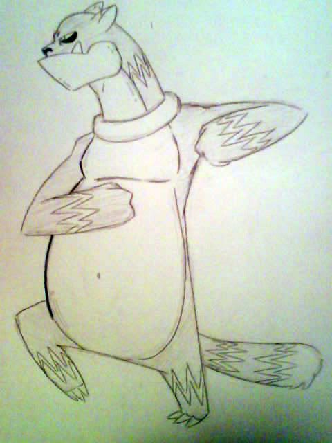
Here's my subbissmion lol i hope you guys like it. i didnt want to go for the standard boxing glove sterotype. I dont really know what my inspiration was....probably a bear,pit bull,and a bager lol. If any body wishes to see more poses ill be glad to draw them. plez share comments!
Swagger, I like b.
@ Tortferngatr:
It's arms are kinda stumpy. But with some refinement I think this could be a good idea.
@ Venator:
I'm imagine this being a sort of purple with red eyes... like a gengar type color scheme. Or dary grey with some sort of brightly colored eyes. Something about it makes me think "ghost type" though... It might be the flowing simplicity about it.
I think I liked it better with out it's shorts. I do like how you made it into a helmet sorta thing.
@Paras Hilton:
I like the design, but I can't tell if the spikes where its head meets it's neck are supposed to be sort of like cloth from a mask or teeth from a skull. I feel like if it's the former, another red scarf around there could help. Otherwise, it reminds me of duskull, and again gives me a "ghost type" vibe.
@ DougJustDoug:
I like this. I've always been a sucker for tophats... So I've gotta just say I really like what you've got going on here. I like the off-white face / grey hands/feet better.
@ Cartoons!:
I like the bumps n boils. Also, the missing tooth is a nice touch.
@ WPS:
I like the idea of the legs being some what ethereal or like springs.
@ Wyverii:
I feel like it's too similar to Lucario. A simple palette swap may help. I suggest changing the blue to something else.
@ ckpmax1108:
I like the idea of a killer chicken. Interesting concept behind it. I feel like the character itself could look a bit more "dark type".
@ chomzloh:
I like the idea. Very nice, simple.
@ Bird:
I like this. I like the idea of the hat being the arms. Jestler... haha... very punny.
@ darkmattr:
I like the color theme after the revisions. The what you did the face/head is very nicely done.
- Status
- Not open for further replies.