CAP 12 CAP1 - Part 9 - (Sprite Submissions)

Status
Not open for further replies.

Focus

Ubers Tester Extraordinaire
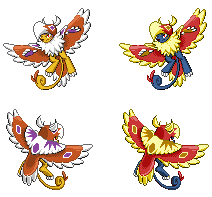
@Steampowered: I do like the idea behind there being a meaning behind the differences between male and female Tomohawk, but I think it might be best to make the differences more subtle in this instance to remain more true to the artwork of Cartoons!. Maybe you could instead just make the mane slightly smaller for the female version rather than making such an obvious gender difference. In the end it is your call, of course.

@DougJustDoug: How about changing the number of feathers on Tomohawk's tail? If not that, then you could try altering the coloration a bit, I suppose.
 
Backsprite finished.

Yeaaaah Energy! I was hoping you wouldn't quit, your frontsprite is one of my favorites! This backsprite looks pretty good too. My only advice would be to make the nose a little smaller and increase the amount of white on the beak...hood...thing. Said beak-hood-thing is also leaning a bit to the right. I know that's what a hood made of feathers would probably do in the real world, but I personally think your sprite would look better if the hood was more rigid.


I still have some work to do. I have no idea what difference I will make for the female versions. I prefer something subtle, but I don't want it to be imperceptible, like I have on some past sprites. Ideas are welcome.
What about slightly thicker chest feathers on the female Tomohawk? You know, like how the female Abomasnow has slightly larger branch-boobs on its chest?

Or you could make the feather-ears on the female Tomohawk smaller. Many in-game Pokemon with horns have this gender difference, and while Tomohawk's feathers aren't technically horns, I think they look similar enough that people would recognize what was going on.

Maybe you could remove the war paint markings from the female Tomohawk? In most Native American cultures, women didn't participate in warfare. Tomohawk's design obviously has a great deal of Native American influence, so this change might make sense. You might be looking for something more subtle, though.

Edit: Wow, did I really just use "branch-boobs" as a word?
 

DougJustDoug

Knows the great enthusiasms
is a Site Content Manageris a Top Artistis a Programmeris a Forum Moderatoris a Top CAP Contributoris a Battle Simulator Admin Alumnusis a Smogon Discord Contributor Alumnusis a Top Tiering Contributor Alumnusis an Administrator Alumnus
Moderator
I updated my backsprites to be more in line with the design Cartoons posted in his supporting art, showing the patterns on the back of Tomohawk's wings and back wing feathers.


For some reason, I had completely forgotten that Cartoons gave us a look at the back, and I was assuming it was all up to us spriters to use our imaginations. I don't mind using artistic license to deviate from the design sometimes, but in the case of this backsprite I wasn't intentionally deviating with my earlier backsprite. I just didn't notice we had some source material to work from. Regardless, it's more like Cartoons design now, and I like it better than what I had before too.

As for gender differences, Objection is correct that BW pokemon don't have gender differences -- except for Frillish, Jellicent, and Unfezant. And those three have very big noticeable differences, unlike the previous gen where subtle gender differences were the norm, and many pokemon had gender differences.

With that in mind, I'm now heavily leaning towards having no gender differences in my sprites. I don't want to recolor the female sprite a la Frillish/Jellicent, nor do I want to make a major structural change for the female or male a la Unfezant. But I do think there is a very clear precedent set with the 5th gen pokemon that small subtle gender differences are no longer done by Nintendo/Game Freak. I have no idea why...
 
Those are fun steampowered! I really like the idea for the female variation, but I feel like it looks a little bit too bland there. The female looks anorexic or something. It might be cool if there were more tattoos on the hidden body, or maybe if you just make the unhidden torso look a little bit thicker/less concave.
 
Hey guys. I'm really, really sorry to come back so late, but seriously, schoolwork is munching my time off.
Anyways. Here's a comparison:
and

I found that later gens don't like shading a lot, they have a technique like adding lighter bits to the end of lines to make it smoother. Or something.
Feet coming up. I promise this time. Coming up in......your...midnight, I think? (yeah, I'm Asian, it's 4pm for me here.)

EDIT:

Personally I don't like it. It's so...straight.
Compare, comment and suggest which one is better!
 
or just make the whole thing wider, it looks squished

Is this...slightly better?

P.S. Just realized I had 17 colors including the transparent color so I erased the dark purple. Now the face paint looks weak. *sigh*

EDIT: If only we can make a mini-poll here. Which one guys, with the feet down or up?
 
@Ice-cold Claws: Raise those feet, for sure! And don't worry about the facepaint, I think it looks fine. Can't wait to see how the shinies come out!

P.S. - Just out of curiosity, what are your thoughts on gender differences for the male and female sprites?
 
Well then, raised it shall be!

As for shinies, so far I've got...

Take your pick. Or, suggest alternatives!
Once this is done, I'll move on to backsprites.

Whoops. EDIT: from the last page, Objection pointed out something I had in mind too, which was that gender differences are only found in Jellicent and Unfezant. Because gender differences were so minor in Gen IV, they've tried to make them very obvious in Gen V. So sadly I'm not making any, because "drastic deviation from the selected art design is discouraged".
 
I like the black feathered one Claws, but I feel like Tomohawk's body color needs a change, maybe try going a light blue or even white.
 
The black winged one is better definitely. I don't necessarily think it needs a color change, but traditionally GameFreak shinies never share the same color palette on the same area I think. It'd work if you just made the skin palette a shade or two lighter or darker I think, but a complete color change could work too. Blue or a Red would look cool for that.
 
Ok, thanks guys. Here they are...


1. Beartic's Ice-blue: Like it, it's the coolest.
2. Magikarp's Orange-red: A bit too dark, don't you think?
3. Its Own White: Very sinister. And very....wrong.
4. Lighter Shade: Looks natural. Like it.

Choose! =]
 
2 or 3!

EDIT: I'm not just saying that too be different by the way, I just like those better XP.
Mmm. 4 could be good too. The blue one just looks weird and unnatural though.
 
Status
Not open for further replies.

Users Who Are Viewing This Thread (Users: 1, Guests: 0)

Top