-
Welcome to Smeargle's Studio! Please be sure to review the studio rules. Feel also free to check out our hub to learn more about this place!Welcome to Smogon! Take a moment to read the Introduction to Smogon for a run-down on everything Smogon, and make sure you take some time to read the global rules.Congrats to the winners of the 2023 Smog Awards!
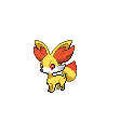
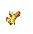
Sticky X/Y Sprite Project
- Thread starter Layell
- Start date
Yes, that does look better (just going to post a stationary version for Layell to put on the google doc):I'm not trying to ignore what you throw at me, the problem is when nobody offers a solution to a problem and I can't find one either.
But regardless, is this any better?

Slightly confused by you saying no-one offered a solution? Siilver offered one on the previous page, not to mention you yourself said my complaints could be fixed in "a couple seconds" - so your argument doesn't really hold up. Either way, I don't intend to argue any further on this, no point getting stressed about it XD
Aside from the colour of the wings (the colours seem a bit too dark, especially since Pinsir's wings are normally translucent), I really like it. Well done :)Made a new Mega Pinsir front and edited the existing back


Thoughts?Last edited by a moderator:uh, is there a better program, more efficient program other than gimp for animating. it always screws up the pixels when rotating parts.
legitimate username salvage pls
http://www.mediafire.com/download/lj5erstozcn3zcz/chesnaught_peieces.xcf
Well, since there can't be two Chesnaught I'll let you take the spotlight. Yours looks more interesting visually.uh, is there a better program, more efficient program other than gimp for animating. it always screws up the pixels when rotating parts.
legitimate username salvage pls
View attachment 4191
http://www.mediafire.com/download/lj5erstozcn3zcz/chesnaught_peieces.xcf
As far as programs, I use Aseprite, but it, like all programs I can think of, also screws with the pixels when rotating. ugh I'm having a hard time making mewtwo Y's tail do the wave for the rare animation >.< Can I get some help with the tail?
EDIT: For the tail wave trying to use the same way thunderus moves his tail just so you dont come up with a completly different tail wag. Gonna keep trying though.Last edited:


Alright, here's my attempt at a backsprite for Wobblebuns's Mega Gardevoir. It's a bit lazy, I didn't even change the folds of the dress much (because honestly, I couldn't think of any improvements, it just happened to work for the back perspective as well as for the front). You may want to fix this up if there's any glaring flaws.
EDIT: Ice-cold Claws, fixed the eye.Last edited:Just interjecting to say that Wobblebuns's Megardevoir is truly breathtaking. The eyes and mouth are well done, as is the dress.
And that's a fine back you've done for it, Legitimate Username. If you could somehow implement the eye shine - as in, that one white pixel in the eye - it would be perfect. I know it's hard from that perspective though.
Theres something that bugs me about the sprite The one thing that really stand out to me is his head. He looks like hes wearing a bicycle helmet. Its just to round. Also the space between his shell and arms doesnt get that big. In its art picture, the shell and arms are touching. Idk. Overall, I think the other sprite shows better detail even though your animation does look better.uh, is there a better program, more efficient program other than gimp for animating. it always screws up the pixels when rotating parts.
legitimate username salvage pls
View attachment 4191
http://www.mediafire.com/download/lj5erstozcn3zcz/chesnaught_peieces.xcf
nice job on gardevoir legit. It looks great! Much grace
and still not having much luck with mewtwo Y's tail... Fletchling


Fletchinder

Talonflame
 Oh nicee princess. Talonflame and fletchling look great but fletchinder seems alittle off. It seems like everyone has trouble spriting him. Perhaps fearow's or staravia's pose might look good on it.


Thibk it would look better flying since its a pigeottoish sized bird. Unless your making it like staravia but if thats what your doing, it looks kinda slanted.
Anyway, I;'m gonna give mewtwo's tail animation a break since I sent the whole day with little success. So decided to animate swepa. Did both the front and back with its regualr and rare animation. I dont even think it moves ingame so i made its movements small. However, think it needs to get its color palette fixed. Well here it is.
Might do scatterbug and finish up the evolution chain.Last edited:
I think the head sticks out a bit too much on the backsprite. While it meshes in well on the front one, it just looks like it's... Too dark? with the outline, in the backsprite. I don't know what's wrong... I hope you understand what I mean.

Alright, here's my attempt at a backsprite for Wobblebuns's Mega Gardevoir. It's a bit lazy, I didn't even change the folds of the dress much (because honestly, I couldn't think of any improvements, it just happened to work for the back perspective as well as for the front). You may want to fix this up if there's any glaring flaws.
EDIT: Ice-cold Claws, fixed the eye. Good stuff by all, can't wait to see more work on the backs of everything updated.
I'm going to be slowing down updates for smogon/PS, to eventually get to a point where I only do one update a week compared to every 2-3 days. We are at a good point in what we have, and when we do weekly updates it allows us to better surprise the players with all the work we can do in only 7 days.

YAY I MADE A BACKSPRITE FOR MEGA AGGRON
Also I finally stopped being a lazy bum and finally put the Front and Back sprites on separate images so other people don't have to split them up! Yay! And the tail looks vastly different from the back because of perspective! Yay... Anywho, as always comments and criticisms are appreciated. Also, I fixed up the shading on the belly along with several other updates. Among which include...

...listening to princessofmusic 's suggestion to move the upper jaw a pixel forward. The one on the right has the jaw edit, the one on the left is more anatomically correct with the source art. I'll leave it up to you guys as to which is better.
Aside from that, comments and critiques are valued as always. Also, not counting the Frogadier side project I'm currently doing, my next big reserve will be for Mega Manectric, so hopefully I'll put some progress into that at the very least by next week or over Thanksgiving break.
gave vivllion her rare animation with a small circular motion. Here she is.
And that mega aggron looks great! I kinda like the jaw edit version. I know the other one is correct but its face just looks so flat. The shading is better but think you should fix it a little on the back sprite since it looks like a straight line. Since the shadow is going over different plates, they probably should have slightly different shadows. Oh and you missed a pixel on his arm horn on his right arm. Besides that, its awesome!As I hadn't seen it, I'll say it now - love the QC for Talonflame.
No issues with the Fletchling sprite either, just think there's a small thing to edit with Fletchinder imo (really like the sprite though) - the body seems to be at an angle to the position of the feet. (to an exaggerated degree - the feet are facing like this: / : whilst the body is like this: --- )
I've had a go at giving it an edit, and this is what I came up with:
The feet seemed a tad too spaced apart for the angle of the body, so I pulled them in a bit. Also C+Ped so the feet were the same (there isn't a great deal of difference in size when viewing the feet from this angle imo).
Definitely prefer the one with the jaw edit. With such a small space to work with, it's very difficult to get everything anatomically correct exactly. Quality work, aXl, as always :)
...listening to princessofmusic 's suggestion to move the upper jaw a pixel forward. The one on the right has the jaw edit, the one on the left is more anatomically correct with the source art. I'll leave it up to you guys as to which is better.
-
...listening to princessofmusic 's suggestion to move the upper jaw a pixel forward. The one on the right has the jaw edit, the one on the left is more anatomically correct with the source art. I'll leave it up to you guys as to which is better.To be fair, I don't mind that (I was considering how to get that bend into the leg having looked at the art myself, but it looked awkward everytime I did it). Though it might not seem evident at first, the angle you have for the body of the sprite is different to the art (the difference is subtle - a few degrees to the right from what I can see), hence why the legs looked out of place (as those are virtually at the angle of the art, sprite limitations permitting).
It's a very good sprite to be honest - entirely up to you if you want to try a flying Fletchinder though :)Actually, surprisingly enough, I already did shorten the length of the tail a few pixels. It really is just that long. For reference, here's the back picture I was working off of from my copy of X and Y.
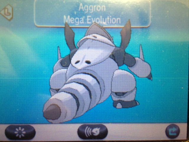
You'd really think it's tail isn't that long from the front, but it's an issue like what I did earlier with Clawitzer, as this thing just has that much depth in its design. But yeah, apparently jaw-edit wins, so I guess that one will progress to PS.
ito I'll look into it and see what I can manage, although don't expect much more from me tonight unless I really motor.
That happend when the wing closes because you probably wouldnt see that section of the wing at that angle. I might be able to make it less noticeable though.What's up with the bottom-right wing of her backsprite? when the wings close it looks like the top section disappears...
wat?
EDIT: The very bottom of the right wing is a more accurate location.Users Who Are Viewing This Thread (Users: 1, Guests: 2)
- ... and 1 more.