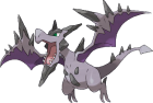
Nice job with the anatomy changes on scizor. It looks much more accurate.
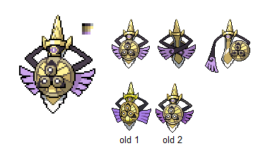
I decided to take a stab (pun intended) at Aegislash, since there were a few things from the existing sprite that could use improvement. Aegislash's design has so many minute details that are really annoying to capture in such a small sprite. I'll sum up the changes since the new version is hardly even an edit of the old version anymore lol
-Made the hilt more lustrous/metallic with different shading
-Adjusted the palette to look more metallic and gold-ish (not sure about this one)
-Adjusted the light source to brighten certain areas more than others
-Changed the eye
-Made the arms straighter as opposed to giving them multiple "joints"
-Made the purple feather-like things less solid-looking
-Blended the hard outlines more (anti aliasing)
-Changed the hilt of the back sprite to better reflect Aegislash's angle
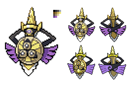
The old versions are on the bottom. New version also needs some fixing.
If you guys think I should keep up with the new version, I'll definitely make the blade form and give animating a shot. The in-game animation has very little movement besides hovering up and down. It's difficult to capture because the movements are so subtle, but I think less movement might be better for Aegislash.
EDIT: btw the new version does have some anatomical things that need to be fixed imo. I'm just too tired of staring at it and I need a break
EDIT2: fixed the shield to be angled more consistently with the rest of the sprite
Last edited: