Sticky X/Y Sprite Project

Typhlito

One Active Dawg
is a Social Media Contributor Alumnusis an Artist Alumnusis a Community Contributor Alumnus
ok fixed the dress. I have 2 versions here. The first one has the original animation with the fixed dress and the other is Layell's suggestion. Might have to slow the 2nd version down a bit but let me know which one you guys prefer and I'll start the back.

banette-front.gif
banette-front2.gif


And aXl your tyrantrum is nice enough for me to not murder you for now. Just disregard the vm :p However, I cant help but wonder if its a bit on the thin side though. Maybe adding a pixel or 2 of chest could make his head look more in place. (even though t-rex heads are proportional bigger but still) As for the back sprite, I think the big under jaw make him look like he has an under-bite. I know thats how it looks in the model but his head looks off when its a sprite. The crown also looks a little too pointed up. They aren't that long in the model. Maybe turning the head to show the jaw more can help. Maybe enough to show the eye? But otherwise nice work.
 

TrainerSplash

Alolan Form
Tyrantrum


Oh yes, the King is back. Newer sprites are in the middle.

Since I've already gone over most of Tyrantrum's Front Sprite edits, let's talk about what I did with the back. Primary edits include:
-rebuilding it from the ground up.

Yeah, I completely re-scratched the backsprite. Basically, the old sprite suffered from several main issues. Paper-thin neck fur with lack of shading, overly chubby body with non-existent shading, head turned at a 90 degree angle, broken tail, scale plating being only one pixel thick, and ankles that look like backwards sevens are the primary ones, among with several other proportions issues that I don't feel like listing. The front sprite fared better back in the day, and also had a nice open mouth that I could edit for coolness factor that would have been hard to redraw otherwise, so I decided it was more fit as a QC project. Since the base back sprite was off in several primary areas, I decided it would be just as difficult to scratch a new sprite completely, and I would likely end up with a better sprite as a result of similar work.

Accordingly, I fixed all of the issues I didn't like about the previous one and cursed my luck for agreeing to work on another Pokemon whose ingame Pokedex entry suffers from massive perspective issues due to possessing a mile long tail. All in all, I like the way it came out quite a bit. Hopefully I did a good enough job so that Typh doesn't murder me by next week at the very least. +)

As always, comments and criticisms are always welcome.
I really like your version of this, but something about the original head I like more it's probably just the angle and me thinking it looks cooler however. Mayber we can place the old head on the new body (white collar and down). But as for the new full back sprite and new body front sprite they look awesome.

ok fixed the dress. I have 2 versions here. The first one has the original animation with the fixed dress and the other is Layell's suggestion. Might have to slow the 2nd version down a bit but let me know which one you guys prefer and I'll start the back.

View attachment 13841 View attachment 13842
I like the one on the left a little better. The one on the right is very slow and makes it look creepy (well I guess it is a ghost type so I can't really say that) But the dress does look odd on the right one But Hands and fingers for it look good (not sure if there is a difference between the sprites for hands cause I haven't checked the thread in awhile).
 

Layell

Alas poor Yorick!
is a Social Media Contributor Alumnusis a Top Artist Alumnusis a Community Leader Alumnusis a Community Contributor Alumnusis a Researcher Alumnusis a Top Smogon Media Contributor Alumnusis a Battle Simulator Moderator Alumnus
>


Sometimes brighter is better. It's important to keep in mind that some xy models have really dull colours, lets keep with some colour shall we?

I'm not going to do the back since I'm expecting an update from someone else in the near future :d

also for spewpa, to make it shiny


Last edited:
I really like your version of this, but something about the original head I like more it's probably just the angle and me thinking it looks cooler however. Mayber we can place the old head on the new body (white collar and down). But as for the new full back sprite and new body front sprite they look awesome.
Thing is, the new head allows for much more other expressions because it's more neutral. Think of roaring, glaring... There's a whole lot more that can be done by using the current head on aXl's Tyrantrum.
 

Typhlito

One Active Dawg
is a Social Media Contributor Alumnusis an Artist Alumnusis a Community Contributor Alumnus
I would still give it a nice roar when I decide to re-animate tyrantrum. But tbh, I do like the old head better. If the head fixed up like your new head, I think it would be fine.

and Layell just curious. Does that mean that spewpa needs a new animation as well or are you just changing colors?
 

Layell

Alas poor Yorick!
is a Social Media Contributor Alumnusis a Top Artist Alumnusis a Community Leader Alumnusis a Community Contributor Alumnusis a Researcher Alumnusis a Top Smogon Media Contributor Alumnusis a Battle Simulator Moderator Alumnus
Yeah Typhlito it will since the color sharing made the shiny really messed up, wait for pom to give a quick blessing though. I did some flagrant colour modification.

We might be able to do something with pasting it over too, but you did say that Spewpa was a quickie to begin with right?
 
Perhaps as a way to compromise the two preferences regarding Tyrantrum, the animation could show it opening its mouth slightly, then uttering a massive roar in the rare ainmation. Just a suggestion.
 
About Tyrantrum's head:
Basically, the old one was broken and a primary reason why I rescratched the entire sprite. With the way Tyrantrum was designed, in order for the head to be pointing in that direction, it wouldn't match the front of the design. The old head was essentially turned 45 degrees to the right instead of pointing straight forward. In order to fix this, I tried to model the new head to be pointing towards the opponent instead of way to the right. The open mouth is going to be harder to see as a result unfortunately.

Granted, I'd be more than willing to pull a Mega Aggron/Mega Scizor on this beasty in order to give it a mouth that appeals to more people, since currently the mixed reviews aren't making me too happy with the current state of the revamp. Not sure if I'll go to quite the same lengths I did back in December, but I'll be willing to throw out a few more runs later in the week. In the mean time, I'll be taking a break to work on yet another QC job, so look forward to seeing some more of that later this week.
 

Legitimate Username

NO PLAN SURVIVES
is a Top Artist Alumnusis a Tiering Contributor Alumnusis a Contributor Alumnusis a Top Smogon Media Contributor Alumnusis a Battle Simulator Moderator Alumnus


I guess that this time I should include comments then?
  • For both shield/blade formes, I made minor changes to the static sprites so it would work better when animated. The new versions are on the chart as well.
  • They both go through a simple harmonic motion, and I think I used calculus to get the arm movement to look right.
  • As far as I know, these are complete, the jagged lines aren't an issue since most BW animated sprites have them.
  • On the frontsprite, the lower half of arm that holds the shield may look that it isn't moving, but I promise you that it actually is in the animation files, it's just only noticeable for a couple of frames since only a little stub isn't obscured by the shield.
  • Zygarde animation is next, but since an OU suspect test started, I probably won't get started on it until my rating has plummeted enough for me to give up on that, which will likely take somewhere between one and two weeks. At least I'll have tried.
  • The new head on Tyrantrum is actually way better than the old one. Also, I know that it's only colour changes, but that Diggersby sprite is an outdated version.
 

Layell

Alas poor Yorick!
is a Social Media Contributor Alumnusis a Top Artist Alumnusis a Community Leader Alumnusis a Community Contributor Alumnusis a Researcher Alumnusis a Top Smogon Media Contributor Alumnusis a Battle Simulator Moderator Alumnus
  • They both go through a simple harmonic motion, and I think I used calculus to get the arm movement to look right.
  • As far as I know, these are complete, the jagged lines aren't an issue since most BW animated sprites have them.
  • On the frontsprite, the lower half of arm that holds the shield may look that it isn't moving, but I promise you that it actually is in the animation files, it's just only noticeable for a couple of frames since only a little stub isn't obscured by the shield.
-what
-yeah
-ok

Though I will fix the two pixels to make it a good palette swap


I guess that this time I should include comments then?
  • For both shield/blade formes, I made minor changes to the static sprites so it would work better when animated. The new versions are on the chart as well.
  • They both go through a simple harmonic motion, and I think I used calculus to get the arm movement to look right.
  • As far as I know, these are complete, the jagged lines aren't an issue since most BW animated sprites have them.
  • On the frontsprite, the lower half of arm that holds the shield may look that it isn't moving, but I promise you that it actually is in the animation files, it's just only noticeable for a couple of frames since only a little stub isn't obscured by the shield.
  • Zygarde animation is next, but since an OU suspect test started, I probably won't get started on it until my rating has plummeted enough for me to give up on that, which will likely take somewhere between one and two weeks. At least I'll have tried.
  • The new head on Tyrantrum is actually way better than the old one. Also, I know that it's only colour changes, but that Diggersby sprite is an outdated version.
Looking fantastic, however I think the arm holding the shield needs to move a bit more. The upper arm I mean. It looks awkwardly stiff, and when you keep looking at it, it only gets weirder.
 

TrainerSplash

Alolan Form
Could we possibly add more movement to the Aegislash's reflection on top of it's "handel" perhaps add some to the actual sword part of itself?
Some Pokemon like Vanilite and Vaniluxe have it.
(oddly enough they are the only ones that seem to have that, not sure why) Most notable on Vanilluxe's "stem"
 
And so I return once more with my legion of Shiny Pokémon...

Decided to make these Shinies while I was at it. The grays stem from Rampardos, one tint custom-made on Bunnelby because there was this one shade of dark brown that was slightly different. The whites have been taken from Onix, while the brown's been reused from Diggersby itself. These were tricky to make and are as good as I could get 'em. Feel free to correct or give corrections.
 
Update time.
Furfrou
Old----------New-----------------------Old-----------

Furfrou's on a blue background because white-on-white seemed a little hard to make out.

So yeah, old Furfrou had some issues, mainly in the back sprite. General edits include:
-F/B: Generally shifting the leg posture to resemble the model more closely, as the model possesses more character than the Sugomori stance imo.
-F/B: Changed the application of the four white shades. Previously, Furfrou only had two base shades and two outline shades. The outline shades have been consolidated into one color and a third gray has been added to the main body.
-F/B: Fur has been sharpened and stylized in a few places where it was previously dull. On the back, this includes removing its floppy hair.
-F/B: Face color edited to use a brown base for the black instead of blue, and eyeshadow added to the corrected eyes where it should be visible.
-F/B: Leg fur is now less jagged near the ground and more noticeable where it flips upward.
-B: Tail no longer looks like a ducktail/cowlick.
-B: Removed silly-looking chest fur poking out from behind the ear.

With that said, I should be just about done with this doggy. That means its time for me to move onto the next project, although I have yet to determine what that'll be. Regardless, comments or QC on Furfrou are appreciated as always. +)

Edit WPS : Honestly I have no idea if this project will ever get around to doing the other Furfrou forms, and if so, they are on a fairly low priority atm. There are a lot of them and they don't have any noticeable effect on the pokemon's stats or abilities, so if I remember correctly, the general concensus is that they're going to probably be one of the last things we do if and when we get to them. I have yet to make a shiny for this one, but it shouldn't be too hard to edit the face/skin if it ends up looking weird.

Will look into the height thing as well, although I think that might possibly be just based on the foot orientation on the backsprite. Glad to hear someone was impressed with the shading on the back of the head, as I worked for an hour on that. +)
 
Last edited:
My immediate thoughts are whether the skin tone needs an additional shade, as while it works now, I think it would look odd in it's shiny form as just a single shade (and some of its formes show more skin, so one shade might not be sufficient there, either).

Second thought is whether it has enough free spaces in its palette to make creating the various formes easy enough. It has 5 by my count, which I guess is probably enough.

Btw, the furry shading on the back of its head is amazing, though I do notice its a pixel taller from behind, making the face look lower down.
 

Legitimate Username

NO PLAN SURVIVES
is a Top Artist Alumnusis a Tiering Contributor Alumnusis a Contributor Alumnusis a Top Smogon Media Contributor Alumnusis a Battle Simulator Moderator Alumnus

I fixed up Diggersby to have a less ridiculous perspective. If anyone loved the old super massive left ear (which admittedly looks cool), I made an alternate version that keeps it.

I think this one isn't as good, as the left ear had to be made much smaller in order to accomodate the implied large distance it has from the head.
I feel like this may have been forgotten, so I decided to bring it up again just in case.
 

TrainerSplash

Alolan Form
New Furfrou sprites look pretty good and I really like the new back sprite compared to the old one, good work aXl.
As for Darkhuaza's shiny Diggersby, the whiskers look a little odd on them. Is the border supposed to be like that? I think it might look better if one of the darker shades were used.
 

Layell

Alas poor Yorick!
is a Social Media Contributor Alumnusis a Top Artist Alumnusis a Community Leader Alumnusis a Community Contributor Alumnusis a Researcher Alumnusis a Top Smogon Media Contributor Alumnusis a Battle Simulator Moderator Alumnus


Apparently princessofmusic gave me this back on april 7th, I said I'd take a look later. Well here is later.

We are thinking mostly about the back, as it is rather plain. Looking for someone to add to the back sprite.

edit for great justice:

[2:46:47 PM] Layell: I'm going to hold off on having them open for spriting
[2:47:06 PM] Layell: well it does seem we have height and weight but
[2:47:08 PM] Layell: hmm
[2:47:12 PM] Layell: if anything only fronts?
[2:47:26 PM] Layell: I'll wait until after e3 at least for more footage
[2:47:40 PM] Princess of Music: no don't open it up yet
[2:47:42 PM] Princess of Music: but if you do
[2:47:57 PM] Princess of Music: i'm considering reserving mega diancie
[2:48:07 PM] Princess of Music: though it would likely be an edit of whatever comes out of our regular diancie
[2:48:19 PM] Layell: yeah we should finish that one first
 
Last edited:
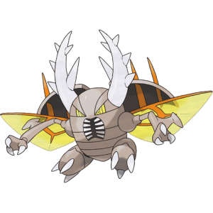
Heya. I've looked over the spriting progress, and I'm very impressed. One of them that was a bit striking to me was Mega Pinsir (maybe the outline was too dark... I dunno). I use Paint.net myself, so I decided to give Mega Pinsir a go. So far, the primary colors are looking good:

Current:

Personal:


Maybe it's too small? I dunno; from the perspective of 96x96, it would look small at first. Then again, the wings do take up some width... May reconsider, considering I based this WIP off of the Sugimori art:


So far, I'm kinda nervous as to whether or not I should continue trying to complete the front sprite and work on the back sprite, but it depends what you think. Took me about a hour or so.
 
Last edited:
The sprites only show up if you disable animations anyway, and I think our current one doesn't really need to be changed. If it did, that would would be up to the people in charge of sprites.
 
Last edited:

Layell

Alas poor Yorick!
is a Social Media Contributor Alumnusis a Top Artist Alumnusis a Community Leader Alumnusis a Community Contributor Alumnusis a Researcher Alumnusis a Top Smogon Media Contributor Alumnusis a Battle Simulator Moderator Alumnus
I don't really work in that process Tyrell but you seem to have a good idea of where you are headed, and I have been looking to improve Pisnir. If you get back with outlines and all the rest then I'll take a good time on it.
 

TrainerSplash

Alolan Form
Ok since we have seen the new scans, are we going to do make the sprites for Primal Kyogre, Primal Groudon, Mega Diancie, Mega Swampert and Mega Sceptile. Yes the Kyogre and Groudon have been confirmed to be in battles, either they are just mega or legit new forms are unconfirmed. Also Mega Swampert is said to learn the move hammer arm. I am not sure if this is supported on normal swampert through level up. If are gonna at least start on the mega evolutions, may I start on Mega Sceptile?

Edit: Just saw what Layell said a few post back. However when we do start spriting these guys I really would like to reserve Mega Sceptile.

As for the mega Pinsir, we should really change the wing shape. it's too round IMO.
 
Last edited:

Users Who Are Viewing This Thread (Users: 1, Guests: 4)

Top