Thanks for the critique and helpful advice! I know I'm not the best spriter, but I just did what I could to make the sprite better. I know I still have a long way to go compared to aXl, Layell, X-Speed or you, but I'm definitely picking things up by analyzing your sprites. Keep in mind,
I'm no spriting genius and I really can't compare myself to the previously listed spriters.
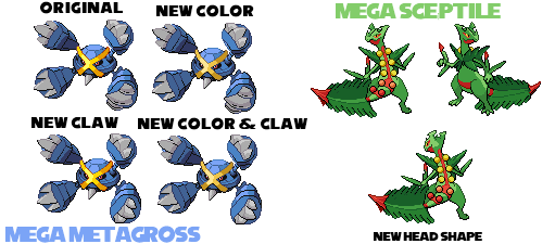
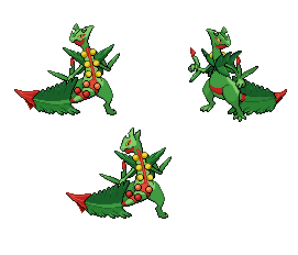
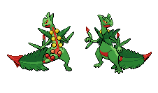
I've struggled for hours spriting the leaf cross and I know it's still not good enough, but I've had to use several references and none of them were at the exact angle. That's the big problem; I need a clear reference that completely views Mega Sceptile as we intend to make the sprite, either that or I need to wait until November to look at Mega Sceptile's model.
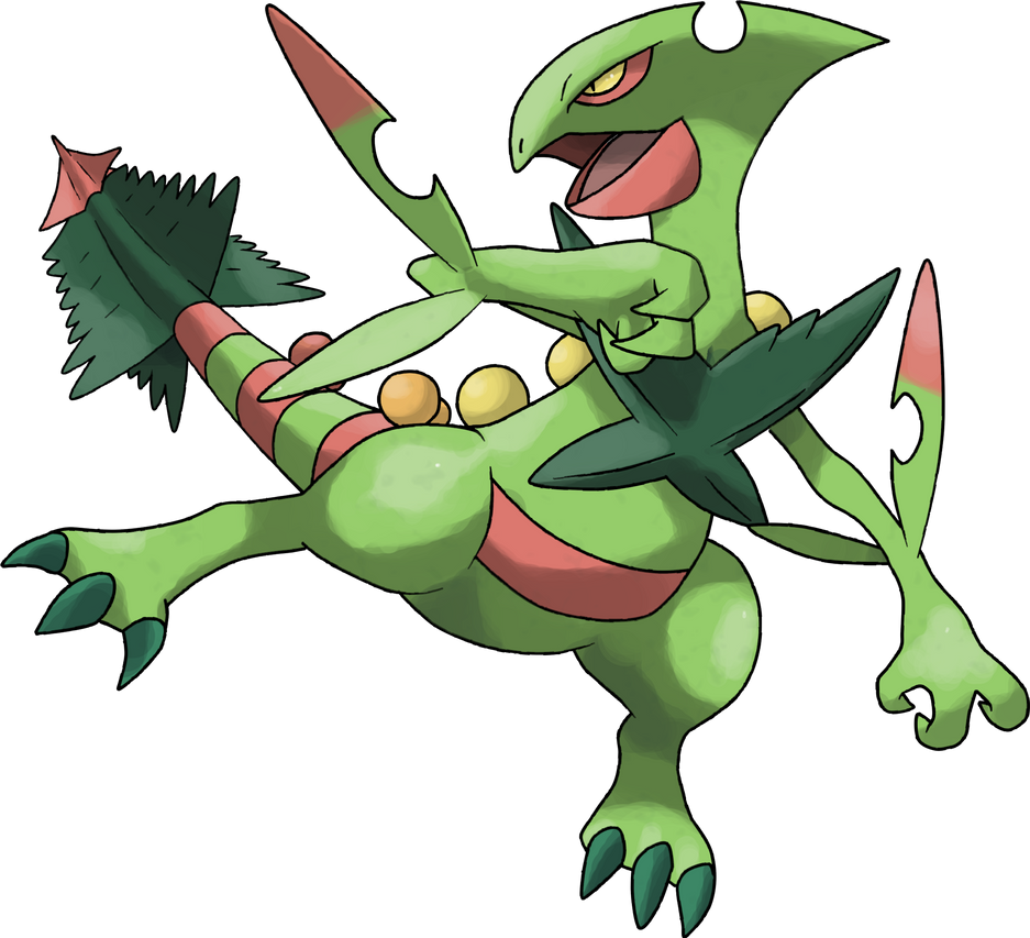
The arms may look like they connect low to the body, but really, that's just how they're positioned. I just followed the official artwork and in-game screenshots as references; Mega Sceptile just has a really long neck, as I've emphasized in previous posts.
If we had to redo the sprite, I'd have bittersweet feelings about it; on one hand, the current sprite has been a great experience that got me back into spriting, but on the other hand, I feel like all those hours of hard, meticulous work will be in vain.
Once again, thanks for the feedback and the helpful tutorial! It's given me more insight on how lighting and shading work on artworks of all sorts, especially the last paragraph is a useful spriting reference.
Enjoy your vacation!
EDIT:
Once again, I've tried my hand at QCing the sprite; I've changed the shading on the leaf cross (hope it now looks more natural, still kind of a WIP) and I've brought some fixes to the head. Still needs some work, but hey, it's at least
something. The red leaf tips have been elongated as well. The lower left leg on the backsprite (our perspective, Mega Sceptile's lower right leg) has been lengthened by one diagonal pixel as well.
I hope I've improved the sprite, since I swear, that blasted head took me long enough.