TrainerSplash
Alolan Form
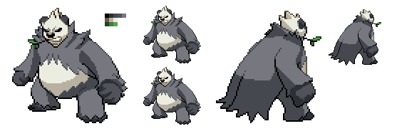
Thank you, Typhlito. And yeah I agree, the tail tip looks broken. I'll try to fix that.

I'll attempt to fix the seeds, but can you elaborate a bit more on the tail? I don't really get it, sorry.About the back of the neck, I think you should adjust the perspective of the top yellow seeds. It probably should be curving slightly to the right since that is the direction the back is going. If you do this, the red strip would fall right into place. Also, for the back sprite, the tail outline should match up with the tail outline on the red tip. It shouldnt look broken like that.
TrainerSplash QC means quality check. The more you know :]
Yeah, I see now. Thanks! I'll be updating the sprites in this post later.You see the tail lines that go through the middle of his bushy tail right? Well towards the tip where it connects to the red tip that outline breaks. If you fix that to not be broken, it would look better. Just look at the front sprite. The tail lines does not break there. Does it make sense now?
There is no need to remove it at all - Pangoro is and has been 'done' as a single sprite for most of the duration of the project.Sure, Jacup101. I don't understand why you want to remove this when Pangoro is pretty much done though.

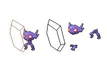
Good job. Making the hands more noodle like as it solves the problem of how stiff his arms were before. I say we are almost done with this guy and is ready to animate, but I'm no expert at all so don't take my word. However one thing I could say is that the two binicles on it's shoulders look odd on the back sprite, but that could very well just the angle.New________Old________
Barbaracle, now with 50% more noodle arm.
-Front and back now have darker claw outlines. Thanks for the tip, Speed-X +)
-Rocks cleaned up and highlights added.
-Completely rescratched the left arms, right arms cleaned up in general.
-Everything else was basically just applying the stuff I mentioned on the Frontsprite's post to the backsprite.
The left arm was a bit of a hassle, as perspective would make it look a tad weird no matter how I posed it. So I decided to break the pose continuity a bit for the backsprite and put it in a more neutral position. It's the only thing at this point that I'm really concerned about, so if anyone has any advice for that arm, that'd be great. If you like it as is, feel free to say as much. +)
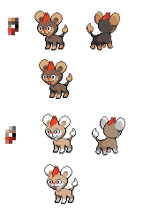
I have to agree with this, the body should be larger. Somewith the eyes look odd. However I don't understand what Layell is saying with the colors, as they look fine to me. Unless you mean the shiny one.Anyways I won't accept this Litleo because I have a problem with its proportion, colours, and eyes. Head is way too big for the rest of that poor body.
I tried updating Litleo according to Layell's critique, primarily with Litleo's proportions.Anyways I won't accept this Litleo because I have a problem with its proportion, colours, and eyes. Head is way too big for the rest of that poor body.
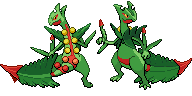
Mega Sceptile's back was originally done by TrainerSplash, and the head, arms, legs, and tail were contributed and continuously edited by Kyuzeth and me. Arhops also helped to edit the back stripe some.Also PSA I have major colour edits to make with Mega Sceptile, don't touch it until I say so. If someone could also tell me everyone who helped with that one so far I'd appreciate it.
I meant Sceptile's literal back, not his back sprite. I knew perspective would get confusing. xDNo, I did the original front sprite. While The Cynical Poet did the back sprite.

Nope.Going back to an earlier topic about the Litleo sprite (before it becomes forgotten), is the Litleo sprite more suitable to your liking, Layell? Or should it be edited further?