I'm home safely. Frankly, I was homesick the entire time and thought about the project every night before I fell asleep. Factor in stuff like boredom and seriously bad bug bites and we get a 4/10 vacation overall. )': Anyway, now I can put my foot down on some things.
Mega Sceptile
It still isn't where I'd like it to be, but regardless, it's a decent placeholder for now.
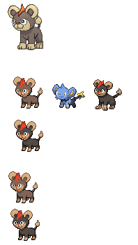
Litleo
The Cynical Poet I like your new Litleo a lot more than the old one with the maniacal stalker face ngl. Apparently Layell disagrees with me but that's nothing new. Parts of your sprite seem a bit large and/or flat-looking, but hopefully, we can reach some form of compromise.
Yveltal
Layell, I de-approved it before leaving for a good reason. Like I said before, worst shiny ever.
Mega Altaria
EDIT: Also before anyone even thinks about it I am reserving Mega Altaria for princessofmusic, because I know she will take us all down if she doesn't do that.
princessofmusic should definitely sprite Mega Altaria.
No complaints on princess doing Mega Altaria either.
Whoa... I'm not as good as aXl.
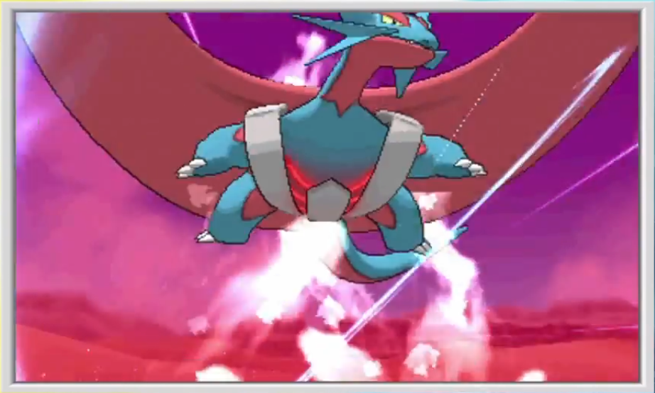
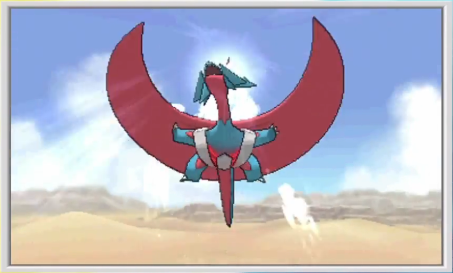
Kyuzeth Salamence is my second-favourite Dragon after the fluffy soprano bird of doom. This Mega could've been better-looking though. ):
Barbaracle
It looks great. Thanks, aXl. The only thing I have to point out is the left foot on the back sprite. Are you sure that the toes/claws shouldn't be visible? Other than that, I'd be ready to approve it, but we can wait for a finished Binacle first, since there are still loads of other things to animate
(where have you animators been).
Pangoro
I want Pangoro redone eventually. It's low priority since it's already done, but I'm discontent with the current shading and proportions. I sort of figure that if Branflakes ever returns in time, he can redo his own sprite. Until then or until we finish most everything else, we can just leave this one alone for now.
New Releases
I get that we're excited about new stuff and need OK-looking static sprites by November, but don't forget that we have a whole bunch of old sprites that are still incomplete. I'm glad to see Cynical on Litleo, for instance. My goal up until this point has been finalizing as many XY sprites as possible before we get overwhelmed by ORAS stuff.
Lastly, the bloke whose ign name was "Jeremy" on the connecting flight to Chicago this morning and whose face I never saw... if perchance you actually saw the memo that said "Smogon sprites" and find yourself reading this, well, thanks for the cute Magcargo. I'll take good care of him.