

He wanted to fly.... a little too much

And at the cost of needing what looks to be like one of those scoliosis braces to boot.
Mega Altaria is totally my new waifu. D Dance and Return or Hyper Voice with Pixilate sounds like fun.

He wanted to fly.... a little too much
I really don't like this look.... still, probably fun to use.
He wanted to fly.... a little too much
This quote doesn't imply that Pikachu only get the moves in contests. In fact it implies that Pikachu gets the moves while wearing the costumes which we've seen it do out side of contests in Amie. Not to mention it's a quote and not a direct translation of the actual Japanese text. But I called it! Didn't I? I totally said Pikachu Libre was gonna be able to use Flying Press!! haha. But yeah, if you can wear these costumes into battle then it means cool new moves for Pikachu!Guys afaik: the pikachu contest moves are just for the contests. Serebii quotes: "It also confirms that when you change your Pikachu's clothes for contests, it gets special moves. Pikachu Rock Star gets the move Meteor Mash, Pikachu Ph. D. knows Electric Terrain, Pikachu Pop Star knows Draining Kiss, Pikachu Belle knows Icicle Crash and Pikachu Libre knows Flying Press".
I still hope I'm wrong though :-(
There are also screenshots of Pikachu using the moves.This quote doesn't imply that Pikachu only get the moves in contests. In fact it implies that Pikachu gets the moves while wearing the costumes which we've seen it do out side of contests in Amie. Not to mention it's a quote and not a direct translation of the actual Japanese text. But I called it! Didn't I? I totally said Pikachu Libre was gonna be able to use Flying Press!! haha. But yeah, if you can wear these costumes into battle then it means cool new moves for Pikachu!
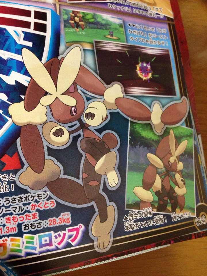
Also this kind of makes sense once you notice how skinny her neck is..... o.OI just thought to point out that mega lopunny is actually lighter than normal lopunny
It does raise a question: Will the otufit count as a held item? If not, Pikachu being able to use Light Ball with something like Icicle Crash might give me a nice electric type to consider when playing ORAS. Well, would if the damn thing wasn't so rare.This quote doesn't imply that Pikachu only get the moves in contests. In fact it implies that Pikachu gets the moves while wearing the costumes which we've seen it do out side of contests in Amie. Not to mention it's a quote and not a direct translation of the actual Japanese text. But I called it! Didn't I? I totally said Pikachu Libre was gonna be able to use Flying Press!! haha. But yeah, if you can wear these costumes into battle then it means cool new moves for Pikachu!
It does raise a question: Will the otufit count as a held item? If not, Pikachu being able to use Light Ball with something like Icicle Crash might give me a nice electric type to consider when playing ORAS. Well, would if the damn thing wasn't so rare.
Seriously, am I the only one who things Lopunny's mega supports the playboy image since it looks like it is wearing a pair of leather chaps?

Very agreed with this. PLus add High Jump Kick to that move lists :DI was checking out Lopunny's movepool on Serebii and it's pretty sweet. It gets the Elemental Punches, Drain Punch, Low Kick, Circle Throw (Lopunny-based stall?), Magic Coat (wtf), Healing Wish if you don't want to Mega for some reason, and even Heal Bell.
I don't know how they're going to make 65/76/84/54/96/105 into something passable without subtracting from something else (plz be SpA, it doesn't need it) and/or putting half of the Mega BST into attack.
"Mega Lopunny is Normal / Fighting and has Scrappy. Its Attack and Special Attack are improved. It’s slightly taller and much lighter than before (Mega: 1.3m / 28.3 kg, Normal: 1.2m / 33.3 kg)." -pokebeachI don't know how they're going to make 65/76/84/54/96/105 into something passable without subtracting from something else (plz be SpA, it doesn't need it)
Gaining an incredibly powerful STAB in Double Edge is just about the biggest buff Salamence could hope for. It doesn't need priority as it can boost its speed with Dragon Dance.Yeah, and compare his learnset to Salamences. That quick attack is not to be messed with. I'm not saying that Salamence won't benefit at all but he could have received something much better.
Fucky fucking fuckers that fuck. The best I can see for it without subtracting anything is 50 in each stat (126/104). That's pretty "meh" for a Mega."Mega Lopunny is Normal / Fighting and has Scrappy. Its Attack and Special Attack are improved. It’s slightly taller and much lighter than before (Mega: 1.3m / 28.3 kg, Normal: 1.2m / 33.3 kg)." -pokebeach
uhh...


