Sticky X/Y Sprite Project

Can you perhaps make it's head a little bit rounded? The left cheek kinda looks like a slide of pixels and the forehead looks really wide, not the normal Litleo that I see. I have a spare Litleo sprite that I recycled with the old hind and front legs design. The left cheek remained the same with a few more pixels to renew it, as you'll notice it's head is a bit of rounded, I also plunged in the forehead a bit and drawn it a bit closer to the eyes. I also changed the soulless eyes into something more expressing.
The darker color -->
The lighter color -->


Sorry for tinkering around without permission. I'll work more of it if I get a nice permission though. Tell me what you guys think.
I really love what you've done with the ears and eyes, Farriella! You may feel free to work further on Litleo if you wish, but I've expanded on what you've done:

-Updated back to new legs.
-Face is more rounded out.
-Reduced any unneeded extra colors.
-Updated several outlines so the shiny can be a simple recolor (I think).

The shiny and back sprites have been added as well for reference, as well as the palette.
*EDIT*

Fixed up the hind leg shading.
 
Last edited:
I really love what you've done with the ears and eyes, Farriella! You may feel free to work further on Litleo if you wish, but I've expanded on what you've done:

-Updated back to new legs.
-Face is more rounded out.
-Reduced any unneeded extra colors.
-Updated several outlines so the shiny can be a simple recolor (I think).

The shiny and back sprites have been added as well for reference, as well as the palette.
*EDIT*

Fixed up the hind leg shading.
Thanks! ^_^
I'll just get back on editing it more if others see some mistakes or improvement.
 
Ok. Since I -finally- have some free time, I decided to use this weekend to try to catch up on the things I've been missing out on, so I'll do a quick update:
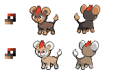
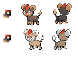
Mega Pinsir Update:


This is coming off of aXL's checklist that he made for me so far. The main parts I'm fighting are the horns, the talons, and the wings. Everything else seems to be easier for me, but those parts in general make up the war I'm fighting... to get Mega Pinsir back home to his brother, Mega Heracross.

-----

College is simmering down a bit on the paperwork and such, so I'm able to come on at least three-to-four days a week to update my progress, I'll be ready, willing and able to keep fixing up my Mega Pinsir sprites. Sorry for the month-long delay...

Anyhoo, I decided to look over the progress on the sprites. ...Pretty impressive work done by the three musketeers on Mega Sceptile. I know I'm only a rookie in this, but I just wanted to let you know that I believe you're doing a good job.

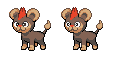
aXL Props again on the Mega Heracross and Goodra sprites. I'm liking the Binacle and Barbaracle improvements as well. It's too bad Heracross' brother isn't ready yet, but it'll come soon! Keep waiting, Heracross; your brother's almost here!

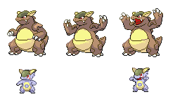
Typhlito Loving how Heliolisk came out in that animation. I'll say this: the one thing I found about Zebstrika's animation was waiting for that rare animation, albeit short, so I can truthfully say that, from my perspective, it fits Heliolisk well. I could envision it being a bit smoother and having a less -clunky- tail.

princessofmusic I read up on the article you posted about lighting and shading; I've seen this somewhere in the past when I was in a game-making class at Ventura College in the Summer of 2012, so it brought back memories... Anyhow, sorry about how your vacay turned out. Bug bites are nasty, and boredom is practically the worst factor to come across in a quest for R&R. Honestly, I could see you working on Mega Altaria from the jump; and [not really] knowing you, you could make it the best-looking one out there (then again, different people have different perspectives, so some might not agree with me nor you). Again, welcome back.

Wobblebuns LOOOVE the Mega Tabunne sprite you posted. Seriously, the first time I laid eyes on it, I nearly screamed; since Tabunne was first intro'd in Black and White, I adored its appearance, but -slightly- loathed its typing in XY (but I guess since it -becomes- a Normal-Fairy in Gen VI, I guess I can be okay with that). On a side note, I like to refer to it as Tabunne, because Audino sounds so punny.

-----

Also, in regards to the light and form princessofmusic posted... I probably know this already, but the light is coming from the top-left corner, correct? Or is it coming from the--wait. It's the front; both sides seem to be staring at a light in the middle of the battlefield.

EDIT: Uploaded the new sprites. You can find me in the almost-always-empty #XYSprites on the synIRC network. I loves me some live feedback.
 
Last edited:
Got another update on Litleo!

Updates include:
-Improved shading on the front sprite.
-Readjusted head on the back sprite.
-Smaller ears and slightly larger tuff of orange furr on the back head.
-Completely new legs on the back sprite, as well as updated shading.
 

TrainerSplash

Alolan Form
Well here is my update on Mega Loppuny! Added "kung foo" leg pose, replaced red with pink from the original loppuny since it seems to change, added "tights" to the "thunder thighs", and finally I made it one pixel taller from the chest to match her new height! Last edit: moves right leg upward a bit too look nicer. The reason why I made two different versions is cause of how the right (it's perspective) foot look. ones on the left are new and the ones on the right are new. I guess you can say a lot of mod
From left to right: New Foot Kung Foo, Old Foot Kung Foo, New Foot Reg, Old Foot Reg.
upload_2014-8-18_13-9-30.png
 
southern belle pikachu is my favourite cosplay pikachu!

View attachment 22175

Honestly, this is really just a traceover of the Sugimori art. Before that, I tried drawing the costume over standard Pikachu (hint: it didn't work). I'm not really happy with this, but at the very least, we know how to split up the palette without colour sharing. Feedback and edits are very much welcome.

After some thinking, I personally feel that the Pikachu forms should have different poses from one another. It's tough fitting clothes onto the official sprite, which was never intended to be clothed in the first place, without making it look "forced". Custom poses would also showcase their personalities better. The obvious drawback is there'd be more work to put into back sprites, but I'm convinced that the trade-off is worth it.


Comments:

TrainerSplash You did your best with the cosplay forms so far, but I think that it shows how the standard Pikachu sprites don't really have enough room for the costumes. For example, the marking on Libre's forehead isn't readable at all. I think that Lopunny should be taller still, and either way, I don't think that editing the base form to create the Mega form is the best way to go for this one. Btw, it's spelt "kung fu".

Tyrell D. Barnes I'm more concerned with the overall sprite rather than the details you mention. Some parts are actually too perfect in shape, which makes them look unnatural. Examples are the left side of the front sprite (Pinsir's right), where the arm and leg are at perfect diagonals, and the wings on the back sprite. I'm also certain that the orange ridges should be fully outlined. You could take away the darkest outline colour from the horns, which is shared with the inside of the wings and wouldn't be a shiny swap, and darken the other outline colour. Also, the shiny's horns are a different colour from the claws, meaning that you should take away the transitional body colour (the second-lightest) to have a spare slot for the claw shading.

The Cynical Poet Farriella I preferred the old Litleo eyes. Soulless as they were, they were more accurate, as aXl pointed out. The positioning of the ears on the front sprite is uneven on the Y-axis, and the legs and feet need work because they have a generic shape and remind me more of jellybeans than feline feet.


As for me, university starts again on September 2nd (two weeks holy smokes) and I probably won't be spriting very much. In the meantime, I'm still predominantly focusing on the Kalos critters.


EDIT: To TrainerSplash The official BW sprites seem to face whatever direction Game Freak felt like, as long as it showcases the design well. See Mandibuzz, for instance. Pikachu Belle's design is asymmetrical; the decoration on its bonnet is pinned to the right side of its head, so we might as well show that off.
 

TrainerSplash

Alolan Form
southern belle pikachu is my favourite cosplay pikachu!

View attachment 22175

Honestly, this is really just a traceover of the Sugimori art. Before that, I tried drawing the costume over standard Pikachu (hint: it didn't work). I'm not really happy with this, but at the very least, we know how to split up the palette without colour sharing. Feedback and edits are very much welcome.

After some thinking, I personally feel that the Pikachu forms should have different poses from one another. It's tough fitting clothes onto the official sprite, which was never intended to be clothed in the first place, without making it look "forced". Custom poses would also showcase their personalities better. The obvious drawback is there'd be more work to put into back sprites, but I'm convinced that the trade-off is worth it.


Comments:

TrainerSplash You did your best with the cosplay forms so far, but I think that it shows how the standard Pikachu sprites don't really have enough room for the costumes. For example, the marking on Libre's forehead isn't readable at all. I think that Lopunny should be taller still, and either way, I don't think that editing the base form to create the Mega form is the best way to go for this one. Btw, it's spelt "kung fu".
Thanks for the feedback! Yeah I realized that the Pikachu sprite was not dressable. I had the idea to make custome sprite of these guys but just too much work for me. However I don't think tracing over the Sugimori art is good for some of these Pikachu, it's a very good sprite. But don't the front sprites have to be facing towards the opponent more? But as you said this good for what we need to have for now, with the colors and an idea of what it could look like.

As for Mega Loppuny, I think most of it is from scratch, being the "x" (what even is that), the legs and of course the ears and arms will be when I get to them. Body was slightly altered, however I can try creating an entirely new body only leaving a head as the base for the face. I can also try making it taller, but it already seems so much taller than the normal sprite. Should I try finishing this before I go onto a more custom made one so we know hit is looks? I new I didn't spell Kung fu right, I couldn't tell what >.< thank you!
 
Tyrell D. Barnes I'm more concerned with the overall sprite rather than the details you mention. Some parts are actually too perfect in shape, which makes them look unnatural. Examples are the left side of the front sprite (Pinsir's right), where the arm and leg are at perfect diagonals, and the wings on the back sprite. I'm also certain that the orange ridges should be fully outlined. You could take away the darkest outline colour from the horns, which is shared with the inside of the wings and wouldn't be a shiny swap, and darken the other outline colour. Also, the shiny's horns are a different colour from the claws, meaning that you should take away the transitional body colour (the second-lightest) to have a spare slot for the claw shading.
...I don't know how the hell I managed to neglect the shiny swap when I posted my update to aXL last night before heading off to bed. I ran a quick test and made the necessary changes to make the palettes swappable. I had the inner shell color changed, I know that much, to begin with; the outlines of the claws were taken from the skin colors, so I apologize, and that has been changed. Layell instructed me to use the palette from the original Pinsir when I began this project anew, so there's my color basis. In any case, here are the two in comparison (no backs, since I'm still working on those):


It seems you and I have -partially- conflicting ways of thinking. I've been taught that "it's the little things that make a big difference". That's why I take a big picture and edit every small detail to make it look as fluid as possible, using the knowledge attained on its respective topic or set of topics, and I know art itself is based on one's perspective (because it's hard to mimic another's work when you don't have that person's "vision"). It's the same reason people draw differently, write differently, however you want to put it. I'm not saying your way of thinking is wrong, and excuse me if I implied that; it's been rather difficult for me to grasp another's style of art represented by Game Freak themselves; and as a rookie, I'm still learning, so of course my art isn't going to be perfect. I'd trace to learn their style, frankly.

In any case, I hadn't intended for the arm to be perfectly diagonal, which is why I angled it slightly, but I can see what you mean in the leg. I've been building the parts using three factors: the Sugimori art, the in-game 3D model, and the Pinsir base. Now, I do have one question: I've practically reached my color limit, and the spikes on the shells use only two colors; so what can I do to... outline them, per say?
 

TrainerSplash

Alolan Form
EDIT: To TrainerSplash The official BW sprites seem to face whatever direction Game Freak felt like, as long as it showcases the design well. See Mandibuzz, for instance. Pikachu Belle's design is asymmetrical; the decoration on its bonnet is pinned to the right side of its head, so we might as well show that off.
Oh I see what you mean, but still think how it was put is odd. The only ones with "odd placement" would be: Meloetta (orange), Mandibuzz, and a keldeo.
(the animated keldo looks different)
Your belle Piakchu is good and I love it. But I can't help to think that something is off about it. But yeah I do get what you are saying and the way Mandibuzz explains why Piakchu is placed like that, even Keldeo seems like that.

Edit: I'm starting to think it's more the Pikachu itself and not the sprite. As I'm doing a similar way you did, with Libre Pikachu and has same similar effects.
 
Sup guys,
I'm new here but I'd like to help as much as possible. I'm not very good at making sprites from scratch, but I often fix problems with other people's sprites.
Anyway, first I made a few changes to Litleo (Hopefully The Cynical Poet and Farriella don't mind)
Got another update on Litleo!

Updates include:
-Improved shading on the front sprite.
-Readjusted head on the back sprite.
-Smaller ears and slightly larger tuff of orange furr on the back head.
-Completely new legs on the back sprite, as well as updated shading.
The body and backsprite look perfect to me, but the head shape and face are a little off.
Here you are. Hopefully it's an improvement.
I changed the head shape (particularly the lower left), the eyes, left ear, and mouth thingy of cuteness.
I can't quite get the left eye or ear down (the ear is angled wrong) though.
 

TrainerSplash

Alolan Form
Sup guys,
I'm new here but I'd like to help as much as possible. I'm not very good at making sprites from scratch, but I often fix problems with other people's sprites.
Anyway, first I made a few changes to Litleo (Hopefully The Cynical Poet and Farriella don't mind)


The body and backsprite look perfect to me, but the head shape and face are a little off.
Here you are. Hopefully it's an improvement.
I changed the head shape (particularly the lower left), the eyes, left ear, and mouth thingy of cuteness.
I can't quite get the left eye or ear down (the ear is angled wrong) though.
I don't like the new eyes, new head shape looks better, BTW that kind of mouth is called a muzzle.
 
Hi! I'm new around here and I recently noticed this project. I recently started spriting and I decided to show off some of my sprites! They are mostly just trace overs off of official art, but I only started around 2 weeks ago and it's the best I can do so far.
Also, this one is just a simple outline with some color. Anyone is welcome to edit any of my sprites to give them a more Pokémon Black and White-ish look! (:
Slowbro sprite.png
 
I don't like the new eyes, new head shape looks better, BTW that kind of mouth is called a muzzle.
That's the word I was looking for. Anyway, I don't like the new eyes either, but the old ones seem to be facing the wrong direction. As I said before, I can't get them down and hopefully someone else can much improve on that.
 
That's the word I was looking for. Anyway, I don't like the new eyes either, but the old ones seem to be facing the wrong direction. As I said before, I can't get them down and hopefully someone else can much improve on that.
Litleo's eyes do kinda point inward to create the derpy look it's known for and the old eyes pretty much perfectly capture that derpy stare.
 
Mega-Kangaskhan


New back! I made it so that Kanga-baby's back sprite is in perspective relative to Momma-Kangaskhan. Its color palette was also likened to Trainer Splash's first recolor option, just made my take a bit more purple.

Mega-Audino


Miniscule edits for Mega-Audino; darkening the outlines on the chest tuft and removing extra black colors on the ends of the curled extensions under the ears. I also used the darker shade of pink on the eyes as suggested.
 
Sup guys,
I'm new here but I'd like to help as much as possible. I'm not very good at making sprites from scratch, but I often fix problems with other people's sprites.
Anyway, first I made a few changes to Litleo (Hopefully The Cynical Poet and Farriella don't mind)


The body and backsprite look perfect to me, but the head shape and face are a little off.
Here you are. Hopefully it's an improvement.
I changed the head shape (particularly the lower left), the eyes, left ear, and mouth thingy of cuteness.
I can't quite get the left eye or ear down (the ear is angled wrong) though.
I'm not sure how I really feel about the eyes facing that direction, though I completely agree that the muzzle needed to be fixed up. I feel as if the changes you made to the muzzle were a bit too much (it almost looks as if Litleo has a swollen jaw, but that's my opinion), so I took the liberty of seeing if I could get the best of both worlds with everyone's contributions:
Both pairs of eyes have been included, since I'm not sure which set is going to be decided on. I'll leave that up to Layell and PoM.
Changes include:
-Repositioning the (our) right ear
-Fixing up the Muzzle and mouth
-Trying to Un-Jellybeanify Litleo's feet.

I tried to give Litleo's paws more of an arch that'd be akin to that of an actual feline, as well as tried messing with the outline/shading.
 
I really like coy-ish smile that you made Poke-Max, but eh, doesn't fit Litly that much..


It's been like a week of school, so I didn't get that much updated, but eh.. oh well.

I made a quick change on Litly's right front foot. I don't really like the pixels colliding that much, so I kinda changed the direction a bit, I'll fix the shadowing later if you guys wanna use this. I don't know what you're really using right now, so I just changed both in these two sprites. In my view, I really want that foot to face directly in front.

Even if this wouldn't help, I'd still post it.
 

Attachments

Layell

Alas poor Yorick!
is a Social Media Contributor Alumnusis a Top Artist Alumnusis a Community Leader Alumnusis a Community Contributor Alumnusis a Researcher Alumnusis a Top Smogon Media Contributor Alumnusis a Battle Simulator Moderator Alumnus
FYI on Litleo axl will be approving it for animation in my place, since I don't really want to do that one. Although if something is still horribly stylistically wrong I will reactivate my veto. He and pom will be the ones with a good grasp on the cub.

(I have in the past not approved something because another spriter I truested had issue with it, but I am making this much more direct).
 
Could we fix Kanga's mouth? It's really bothering me, and haven't been able to say anything. Considering we're basing it off the HGSS sprite, perhaps reference the 2nd frame sprite from HGSS:

It's skin looks weird like that next to the red of its mouth.
 

Typhlito

One Active Dawg
is a Social Media Contributor Alumnusis an Artist Alumnusis a Community Contributor Alumnus
Tbh, the thing that bothers me the most about mega kanga is that the baby is not copying the mother's pose when its known to do so. Its shown in the art and its even shown in that sprite snivy posted. Might be something to consider for it.
 
Could we fix Kanga's mouth? It's really bothering me, and haven't been able to say anything. Considering we're basing it off the HGSS sprite, perhaps reference the 2nd frame sprite from HGSS:

It's skin looks weird like that next to the red of its mouth.
Tbh, the thing that bothers me the most about mega kanga is that the baby is not copying the mother's pose when its known to do so. Its shown in the art and its even shown in that sprite snivy posted. Might be something to consider for it.
I feel that the best solution here would be to resort to a rare animation.

I made up a nice looking idle base for the Mom Kangaskhan, and for her rare animation she can raise her arms and open her mouth like she does in her HGSS sprite. The baby Kangaskhan can do this as well, though forgive me for the very hastily made sprite I made of the baby; I just wanted to whip out something quick so I could better demonstrate.
 

TrainerSplash

Alolan Form
Mega Kangaskhan
Tbh, the thing that bothers me the most about mega kanga is that the baby is not copying the mother's pose when its known to do so. Its shown in the art and its even shown in that sprite snivy posted. Might be something to consider for it.
I think I have said this earlier and has been annoying me forever.
I feel that the best solution here would be to resort to a rare animation.

I made up a nice looking idle base for the Mom Kangaskhan, and for her rare animation she can raise her arms and open her mouth like she does in her HGSS sprite. The baby Kangaskhan can do this as well, though forgive me for the very hastily made sprite I made of the baby; I just wanted to whip out something quick so I could better demonstrate.
Good job on it, I really love that new idle sprite. Baby Kanga's mouth looks a little odd in the rare animation, but limited space so idk if it can be changed. Mama's tongue outline is also too bright, outlines should not be brighter than the legit coloring.

Mega Gengar
Made my own Mega Gengar, however the one on the left has colors taken from the sugi art, while the one on the right was from the other Mega Gengar
upload_2014-8-20_20-14-7.png

yes I under stand the left (his right) ear looks odd along with the teeth I plan to fix it.
In general this is a trace over the sugiart.
 

Layell

Alas poor Yorick!
is a Social Media Contributor Alumnusis a Top Artist Alumnusis a Community Leader Alumnusis a Community Contributor Alumnusis a Researcher Alumnusis a Top Smogon Media Contributor Alumnusis a Battle Simulator Moderator Alumnus
Could we fix Kanga's mouth? It's really bothering me, and haven't been able to say anything. Considering we're basing it off the HGSS sprite, perhaps reference the 2nd frame sprite from HGSS:

It's skin looks weird like that next to the red of its mouth.
Hey sure, but I mean it's not like there was anything stopping you from showing us what it would look like!

Although I took a slightly different route. Along with fixing some colour issues that were occurring.


EDIT: WOBBLES HAS SO MANY STRAYS I THINK I NEED TO OPEN UP AN ANIMAL SHELTER


pom and I have the sneaking suspicion that the shiny will have different coloured eyes from the body but we will cross that road when we get there so I added it. Full 15 colours. Also made the outline slightly lighter.
 
Last edited:

Users Who Are Viewing This Thread (Users: 1, Guests: 6)

Top