CAP 19 CAP 19 - Sprite Submissions

Status
Not open for further replies.

Quanyails

On sabbatical!
is a Top Artist Alumnusis a Community Leader Alumnusis a Community Contributor Alumnus
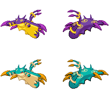
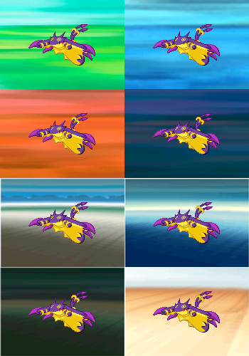
I've had some time to take other people's comments and try reposing the tail. How does this look compared to the first one? I tried making the rings closer in position to Magistrum's intent, but I can't seem to make them look like they're perfectly distanced from each other, so I think I'll have to claim artistic license to that and make them look more like three in the front, one in the back.


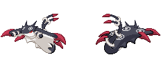
I sketched out a pose with a scorpion-like tail position, but the sprite didn't really mesh, especially since the 'hooks' the design has curve down, in contrast to the tail which would curve up.

Edit: Changed a few details on the front sprite and made a new back sprite.

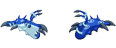
  • HeaLnDeaL: I made the wingspan of the design bigger and I pointed the tail outward to give it larger dimensions. ouob I think the design looks a tad bigger than Mantine, but not as big as Kyogre. Interestingly enough, I like your back sprite more than your front sprite. The rings are nicely done in composition on the back, and the main body has nice shape. On the front sprite, I think the way the hooks on the right fin look twisted, as if there was a joint near the tip of that fin that allowed the ray to twist its hooks like it were fingers on a wrist. The hooks themselves also look nonuniform, as the front one lacks the concavity the back one has. In general, the sprite has a jaggedness to it from a lack of anti-aliasing. I hope that you smooth some of the details out as you keep working on it. :)
  • DougJustDoug: Despite my personal preferences, I really do like the second of your posted poses. The pose looks relatively natural (despite it having fins instead of wings), the hooks look perfect, and it makes great use of the restricted canvas. Of course, it'll be harder to animate, but at least it looks all right while static.
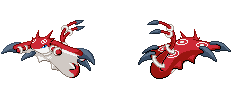
  • Jaret: The sprite is technically nice; I notice especially the sharp lines on the fins. There are a few details that could be aesthetically improved. The main concern I have is the use of shading on your sprite. It's a bit detailed for what Gen. V sprites use. I think you could increase the contrast between shades or make some colors used buffer colors rather than primary shades. I'm also not fond of the back sprite portraying the fins as bat-like wings, intentionally or otherwise. The design's fins are rather thick, and adding those stretch wrinkles make them look insubstantial. I think that maybe even removing those stretch wrinkles might make the fins look thicker, if that might help.
  • SomeDude01: I'd try to keep the pose more neutral unless you'd like animators to add extra frames in for a flapping animation. Currently, the sketch looks like it's falling out of the sky, since both the fins and tail are curved upwards. I would say to change either the position of the fins or tail to make the direction of movement less downward.
  • noobiess: Ooh, I like that perspective used on those fins. The WIP view is cool, too. I think that the right 'hook' could be angled more toward the the camera rather than angled right, since the hooks aren't angled quite that far apart. The rings on the fins look fantastic! You've done a great job using those two hues. The sprite is a bit on the small side, but if you think of the design as a small ray, go for it. ouob
 
Last edited:
Quanyails That is the pose I tried pulling out and failed! I have to say, your sprite truly is my favorite out of the bunch so far, looks like you use the 96x96 box to its fullest and try to maximize the size of the sprite. Can't wait to see how the backside's gonna look like.

Will probably just drop spriting CAP19 as i feel like i am in over my head here (My spriting is very lots-of-shades-ey, and I can't just get the pokemon style to work out with the way i approach spriting). Oh well, wouldn't pick my sprite over half of these here anyways!
 

HeaLnDeaL

Let's Keep Fighting
is an Artistis a Forum Moderator Alumnusis a CAP Contributor Alumnus
Quanyails, I love your new sprite. My main criticism is that the points tail creates more of a tilted triangle shape for your overall design. It might be more balanced if the tail curved oh so slightly to the left once it splits, somewhat like with noobiess's sprite.

Jaret your sprite is not out of the running for sure! Your outline is great, and the main thing you have to work on is just coloring/shading. Don't be afraid to use solid colors to fill some of your spaces.
 

Eragon2

Banned deucer.
Rlly rough WIP:


I think I need to slim down the head a little bit.
Let me hear your thoughts.
 
wip.png


Re-shaded him/her/it/whatever. Again, i think I am not yet happy with the colors. Took a bright yellow and a bit of fading to make the circles look like they're electrical, in the animation I imagine them becoming brighter and darker as he gently "flaps" his "wings".
 
Last edited by a moderator:
View attachment 27398

Re-shaded him/her/it/whatever. Again, i think I am not yet happy with the colors. Took a bright yellow and a bit of fading to make the circles look like they're electrical, in the animation I imagine them becoming brighter and darker as he gently "flaps" his "wings".
I really like your design. The way the tail was drawn is dynamic and fits the Pokemon quite well. In terms of coloring, maybe if the back was just a little bit darker it would make the yellow pop more. The circles themselves are fine, and I also envision them "pulsing" in the animation.
 
An update of the sprite:

And the WIPvideo:


There is still some work to it, but I just wanted to get some feedback on what I got so far.
Also some comments on the others:
Quanyails Much better! The pose looks really natural! I kind of disagree with what HealnDeal says, the placing of the tail doesn't bother me at all.
Eragon2 I think the head should be tilted a bit. Pokemon sprites never look straight forward.
Jaret Great shading. Who said you couldn't rock the B/W spriting style :p I would make the color of the claws a bit darker to make it match the design more. Also about the the backsprite: where the tail starts, it goes to straight. Try to add more curve to it.
 

HeaLnDeaL

Let's Keep Fighting
is an Artistis a Forum Moderator Alumnusis a CAP Contributor Alumnus


On the top are some new sprites I've made. With these, I tried to go back and rework my original pose into something a bit more refined. On the bottom I have my previous pose for the sake of comparison, and it's more dynamic and probably more bird-like as well. I'm definitely taking suggestions for either pose at this point :)

EDIT: Made the wings on the top a bit shorter.

EDIT2: Added on the bottom a third pose. To me, it looks like a cross between a Mantine Pose and an Azelf pose. If I go with this pose, should I make the sprite bigger?
 
Last edited:

paintseagull

pink wingull
is a Top Artistis a Forum Moderator Alumnus
** Mod post! **
Movepool poll is up so we now have 48 hours for that to finish then about 24h of grace time for spriters! I'll try to give an exact deadline in a day or so.
****​
 
Last edited:

paintseagull

pink wingull
is a Top Artistis a Forum Moderator Alumnus
And a comment post! (I like to keep the mod posts separate)

noobiess : Very cool sprite! I like the pose and colours. The perspective seems perhaps a bit extreme though, as in, the near wing seems a lot close to the viewer than the far wing.

Jaret : Very cool pose. I would remove the glow effect on the back sprite and save that version to use in a possible animation though. The submitted sprite should be the basic sprite rather than a "rare" part of the animation.

Eragon2 : I like the pose but yeah it needs some refining. Slimmer on the head, the transition to the body is not sharp enough. The tail seems pretty wobbly too. The colours are a bit dim as well.

Quanyails: Love the sprite and colours a lot! That back sprite is excellently done :)

@HeaLnDeaL I gave comments in #cap but yeah, if you have dimmed the colours it will be a nice sprite! I'm excited to see which pose you choose.
 

Quanyails

On sabbatical!
is a Top Artist Alumnusis a Community Leader Alumnusis a Community Contributor Alumnus
Final Submission


I wanted to go with Tron lines for the yellow parts of the shiny, but I also wanted to differentiate the colors enough from Volkraken's and Umbreon's shinies, hence that purple-red body.

Edit: Updated!

Background test:


Comparison test:


  • HeaLnDeaL: Hmm, I was rather fond of the rings and fin on the old back sprite, since they gave the back sprite much more shape. However, I like the first new pose you have. The other one you suggest feels like it's in the middle of an animation. The first one's pose is interesting but not too dynamic, which fits for an idle animation. I'm not sure what you mean that my sprite is imbalanced. It does intend to draw attention toward the front of the sprite.
  • Eragon2: Some more shading and a smidge of anti-aliasing would help. The tail currently makes me think of two chewed straws rather than barbed stingers. Overall, there is room for improvement anatomy-wise, so take that into consideration when continuing to work on the sprite!
  • Jaret: The cels are very much improved! The contrast between the yellow parts seem a bit too much without a buffer color, so I'd think that adding one in will help the colors flow more elegantly. paintseagull gives a good point that making the rings glow would be something to add during the animation phase rather than the static sprite phase.
  • noobiess: I'm all right with the perspective of your sprite. ouob The size of the sprite also gives it magnitude as some people intend for a manta ray to be. I don't have qualms about your front--you've represented Plasmanta excellently in your style.
 
Last edited:
wip.png


The final submission for now. Not completely happy yet, but whatever. Was busy the last week or so, and had a severe headache (still have, actually). The edits are really minimal in this one: moved the tail on the back sprite a bit to the right, added more curve to it, added a shiny form, removed the "pulse" of the circle light thingys, added a buffering color for the yellows, and that's it i guess.

EDIT: oopsies, not transparent. I'm just stupid like that...
 
Last edited:

HeaLnDeaL

Let's Keep Fighting
is an Artistis a Forum Moderator Alumnusis a CAP Contributor Alumnus
Jaret, in order for you final submission to be legal, you have to have it on a transparent background and I think it is standard to host your sprites on an external image site such as imgur or tiny pic.

Also, great shiny but I think the green might be a bit too intense.
 
Thanks for the comments. I might not finish it though.
Recently I don't have much time and ,to be honest, I like another entry (cough Quanyails cough) more then mine.
But If I find some extra time, I'll work on the backsprite.

Comments:
HealNDeal I like the last pose a lot! I would take that one. I would reposition the spikes on the head though.
Quanyails It looks very clean, with every detail in order. I only have one remark and that is that the black outline of the eye on the backsprite is a bit too dark for my taste. Other then that, another great entry!
Jaret I like the process of your sprite. You have improved so much in such a short period of time! I have some small remarks, but I'll leave it for what it is since I don't want your head to explode ^^ (but make sure your entry in legal). Hope you get better soon.
 
Final Submission


Now it's transparent. Added buffer colors to smooth the purple shades as well, made the greenish claws a bit darker and desaturated since they popped too much. Pretty happy with it.

@noobies: any criticism is welcome dude!

EDIT: Again, oops, have to use external image source. brb.

EDIT 2: Done.
 
Rough W.I.P

ok guys this is my first time making a sprite for cap, and this is still a really rough draft, but hopefully I can clean it up and finish it up before the dead line...oh and make a backsprite... and shiny. I got lots of work to do XD

P.S the tail tips are way to thick ik. I'm fixing that in the next update
 

HeaLnDeaL

Let's Keep Fighting
is an Artistis a Forum Moderator Alumnusis a CAP Contributor Alumnus
I like your pose hendrix96, and your dorsal fin in particular turned out well. I might try to tilt the back down a bit more to help your back sprite not quite so angled however. Your shading looks cool, though not quite in the same style as GameFreak... I realize you have some tweaks left, and good luck with getting them all done! So far, my favorite thing about your sprite is that the angle of the wings and the tail help to fill out the space really well.
 

DougJustDoug

Knows the great enthusiasms
is a Site Content Manageris a Top Artistis a Programmeris a Forum Moderatoris a Top CAP Contributoris a Battle Simulator Admin Alumnusis a Smogon Discord Contributor Alumnusis a Top Tiering Contributor Alumnusis an Administrator Alumnus
Moderator
Final Submission


After tearing my hair out for quite some time, I ended up having a lot of fun making this sprite. Getting the right pose was the hardest part for me. Details about the pose, background tests and other stuff are in hide tags below, including more than you probably ever want to see on shiny colorings - Enjoy!


The Pose
I wanted a pose that would somehow show off the design from the top and bottom between the two sprites (front and back). The easiest way to show the top and the bottom is to use a vertical pose. BUT I really wanted to stick with a relatively "flat" pose. Regardless of the name, Plasmanta is a STINGRAY, and stingrays are generally in a horizontally flat position. Nothing against the spriters that went with a more vertical pose (I started to go in that direction myself too), I think the vertical look is very cool. But ultimately, I decided to figure out some way to get this thing into a pose that appeared more "flat", like a real stingray.

I settled on the pose above, because it allowed me to really showcase a different cool feature of Plasmanta in the front and back sprites. In the front sprite, I was able to show off the nifty head design, with the ears, spiky head, and electro-ear-flap-antennnae-things. On the back sprite, I was able to prominently showcase that awesome tail. Since this is a stingray, I really wanted to make the tail prominent somehow, and this pose allowed me to do that. The are downsides to the pose too, but hey, you can't have everything! I'm happy with how this pose turned out.

Shiny Colors
On almost every CAP sprite, I love noodling around with shiny colorings. This Plasmanta sprite was no exception. I had numerous shiny color schemes that I thought looked great, but alas, I can only use one. Rather than let all these nifty colorings go to waste, I figured I'd share them with those of you that are into obsessing over shiny colors, like I am!


Obviously this is the shiny I went with for my final submission. I like the other ones below quite a bit, but this one really hit all the marks for me. I wanted to use some kind of green for the shiny, because green is a great alternative poison coloring. The teal shade makes it a green with a bit of a "water" feel, which supports the hidden water typing (due to Storm Drain) nicely. Also, teal is a great impact color that makes the shiny really pop. The sandy bottom color is there because stingrays often nestle into the sand underwater, and a sand shade seemed to support the whole stingray theme. The golden accents are just good for a shiny in general and have a metallic look that I think makes it look like it can conduct electricity.


Here's all the other shiny colorings I seriously considered, in roughly my order of preference, and a brief explanation of each:

I call this the "Black Shiny". I love black shinies ingame (Rayquaza and Charizard are my faves), and I almost always play around with some form of black shiny for CAP sprites. But oddly enough, I have never done a black shiny for any of my past CAP sprite submissions. I REALLY wanted to do a black shiny this time around, and I think the coloring looks amazing. But it just doesn't "feel right" for a Poison/Electric pokemon, nor does it really look like it should be swimming around underwater. So, as much as I liked it, I guess a black shiny from me will have to come in a later CAP!

The "Pink Shiny". We have often joked about doing a "pink CAP" and I was thinking perhaps a pink shiny Plasmanta would be cool. This shiny coloring has more pop than any other and I love how the pink and purple (great poison color, of course) work together. But when I looked at this shiny side-by-side with the normal coloring, it was just too many purple-ish colors for me.

The "Red Shiny". Since we made this pokemon to support Gyarados, I thought it would be cool to give it a red-and-white shiny, just like the famous Red Gyarados. Extra bonus was the black claws (see my comments on black shinies above). But as cool as this shiny looks, to my eye, every time I see it, I think "Swiss Flag" or "The Red Cross" -- and for that reason, I had to scrap it.

The "Superman Shiny". I'm a lifelong comic book fan, and when playing with shades, I stumbled across a blue body with red hooks. Instantly I thought "Superman!", considering the yellow belly was already there from the normal coloring. While it was neat for me as a comic book geek, I figured most people wouldn't get the reference, nor did it really have anything to do with Plasmanta or the concept.

The "Ice Blue Shiny". Since this is a water creature, I forced myself to make at least one blue shiny coloring. This was the best of the blue schemes. Not a standout coloring in any particular way, which is why it is at the bottom of the list.

I hope you enjoyed all these coloring experiments. I had fun making them, and I hope you agree with my final shiny selection. Even if you don't agree it is better than the ones presented above, I hope you think it looks pretty cool nonetheless!

Size Comparison


Background Test
 
Last edited:
Jaret I think the yellow circle behind the head is too close to the head. In the backsprite, you see that the circle is behind the curve of the back.
DJD The frontsprite looks amazing.The tail on the backsprite looks big and awkward to me. I had the same problem when I tried to make a backsprite for my sprite (which was a bi fail ^^).
 

paintseagull

pink wingull
is a Top Artistis a Forum Moderator Alumnus
The Movepool poll finished last night at 11pm, so the deadline for sprite submissions will be tonight, October 11th at 11pm EDT . Please let me know ASAP if you think you need an extension, I can possibly accommodate a small one.

Leaving this open overnight, I'll make the poll asap tomorrow morning!
 
Last edited:
Status
Not open for further replies.

Users Who Are Viewing This Thread (Users: 1, Guests: 0)

Top