
TrainerSplash , as an outsider interested in sprites, I can understand where Kyuzeth is coming from. If you look at many BW sprites, they're bold and not incredibly detailed, normally quite sturdy in appearance. That greninja sprite is very detailed, flimsy, and I would expect it to be a pain in the ass to animate.

-
Welcome to Smeargle's Studio! Please be sure to review the studio rules. Feel also free to check out our hub to learn more about this place!Welcome to Smogon! Take a moment to read the Introduction to Smogon for a run-down on everything Smogon, and make sure you take some time to read the global rules.Congrats to the winners of the 2023 Smog Awards!
Sticky X/Y Sprite Project
- Thread starter Layell
- Start date

TrainerSplash
Alolan Form
I think you mean Princess? Kyuzeth hasn't comment on Greninja I don't think. I do understand what she is saying about the outlines being broken and shoddy. I just don't understand what "tiny" means.TrainerSplash , as an outsider interested in sprites, I can understand where Kyuzeth is coming from. If you look at many BW sprites, they're bold and not incredibly detailed, normally quite sturdy in appearance. That greninja sprite is very detailed, flimsy, and I would expect it to be a pain in the ass to animate.
I really need to learn how to tag users in posts...Update time on Mega Salamence!


Changes include:
- I've fixed the head crest by thickening the side horns a bit and working on the top spikes somewhat. I've used some outline changes to make the transition to the tip better.
- The red has been made a lot more vibrant to go along with the official artwork and the anime appearance. I like the colors as they are now, so personally I don't want to change them. They really individualize Mega Salamence.
- Speaking of outline changes, I've added some more slightly lighter dark outline to the sprite and fixed the outline where the right front leg extends from the body.
- I've added the right back leg and extended the tail view.
~ I'll have to see how I can make the top of the crest look better, but I'll do my best to make it look as good as possible, as always. If there's anything you need to add in terms of critique or advice, just state away!
~ Added a regular Salamence sprite just for a size comparison. The body height is comparable, but you'll notice just how large the wings are on Mega Salamence. I've already had some trouble with detail, so I'd rather not change its size any further.
Just wanting to share this music link since it played during pretty much the entirety of spriting Mega Salamence. Go give it a listen, it's fantastic.
Thank you for reading and looking! Kyuzeth out!
Sorry my mistake, but I literally said what tiny means in my comment. Please try to be more open minded as it helps everyone in the project. I said it was flimsy, and I would add thin-limbed and miniscule in general.I think you mean Princess? Kyuzeth hasn't comment on Greninja I don't think. I do understand what she is saying about the outlines being broken and shoddy. I just don't understand what "tiny" means.
I really need to learn how to tag users in posts...I just wanted to say, all the sprites you have done so far are amazing! good job guys!
On the Mega Salamence Kyuzeth I think the metal shoulder things should be slimmer as in that they bend at almost a right angle, when on the actual model, they are thinner, and like i think you need to slim the body to something like the image below, also I think it might work with the wings if you have them really horizontal so they don't take up that much space? If this is totally useless, you can delete my post but I was just trying to help out as an onlooker on what I think could be improved, although it is pretty good as it is

bottom is new, top is current
Thanks for the feedback! Well, the problem is that Mega Salamence does have a larger body than regular Salamence and if I were to make it look smaller, the head would look really oversized.I just wanted to say, all the sprites you have done so far are amazing! good job guys!
On the Mega Salamence Kyuzeth I think the metal shoulder things should be slimmer as in that they bend at almost a right angle, when on the actual model, they are thinner, and like i think you need to slim the body to something like the image below, also I think it might work with the wings if you have them really horizontal so they don't take up that much space? If this is totally useless, you can delete my post but I was just trying to help out as an onlooker on what I think could be improved, although it is pretty good as it is
bottom is new, top is current

This image is the one I've referenced it from, which Ridaz kindly provided some time ago. This should also give you a clearer image of how I've modeled the braces. If you need another image of how the braces work, then I have the video from which the image has been taken in the spoiler tag below. Basically, when standing, Mega Salamence's braces are folded open; when it takes flight, it closes the braces and tucks in its legs, kind of similarly to what Latios and Latias do.
Again, thanks for the reply! It's at least given me an image of how I should model a potential flying sprite, should we go for that. Remember, animations can surpass the 96x96 canvas, as they're not the static sprite, so the wings will be less of an issue in a flying issue.Last edited:Mega Altaria Update!
While this isn't a huge update, I would like to say I took the time and made an actual final-wing frame that wasn't just an upside-down version of the first one. Aside from that, I've included the shiny pallet. My next task is transferring these updates to the back sprite.
TrainerSplash
Alolan Form
Oooh, that makes much more sense, I apologize for not understanding quickly as I am a slow learner. I'll try to be more open minded next time.Sorry my mistake, but I literally said what tiny means in my comment. Please try to be more open minded as it helps everyone in the project. I said it was flimsy, and I would add thin-limbed and miniscule in general.
Yeah the "pants" look extremely thick even in the official smash artwork.
So I think I fixed that, if not then idk. made many parts thinner and shorter like his tongue arm and legs. Also fixed some outlines.
Again idk if this is good enough for you guys but hopefully you guys will like it. Still gotta fix his webby hands.
Edit: it totally just crossed my mind how the outlines still look odd and thick along with some proportional issues still need to be fixed. Pokemon like this is what I have trouble with >~<Last edited:
While I do agree that the current Greninja sprite isn't the greatest, I feel as if your sprite is way too heavily based off of the Smash Bros. official model. That, as well as your Greninja's line art and shading is a bit choppy.Oooh, that makes much more sense, I apologize for not understanding quickly as I am a slow learner. I'll try to be more open minded next time.
Yeah the "pants" look extremely thick even in the official smash artwork.
So I think I fixed that, if not then idk. made many parts thinner and shorter like his tongue arm and legs. Also fixed some outlines.
View attachment 29468Again idk if this is good enough for you guys but hopefully you guys will like it. Still gotta fix his webby hands.
A list of issues I can point out are:
-The tongue scarf is way too blocky, especially where it overlaps itself.
-The limbs are way too skinny, and the sprite seems way more condensed than it needs to be. Meaning, the head and body should be more inflated to give the sprite a more full look.
-The shading just looks off in a lot of places; namely the legs is where it suffers most.
-The white caps on Greninja's knees seem too defined, as well as suffer from choppy outlining and shading.
-Greninja's eye doesn't look all that right to me.
-Greninja's tan ear isn't as pointy as it should be.
Overall, it's a decent sprite that has some stuff going for it, but it just doesn't seem to fit the B&W style, in my opinion. I said it was flimsy, and I would add thin-limbed and miniscule in general.
TrainerSplash Regime and Cynical are both spot-on in their critique. Proportions are the hardest aspect to do QC for, and most of the time, I won't do it if I don't have to. I like Quany's sprite, as I personally think that Greninja looks awkward no matter what pose it's in (as a crouching ninja frog).-The limbs are way too skinny, and the sprite seems way more condensed than it needs to be. Meaning, the head and body should be more inflated to give the sprite a more full look.
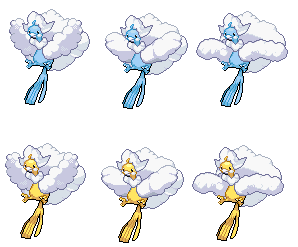
The Cynical Poet For Altaria, the extra wing poses aren't needed, as it isn't close to animation. Stick with the far left set. The new sprites are an improvement, but I have concerns about the hat and tail. The hat was better in the old version; notice how the new outline isn't "cloudy" enough. The tail points straight down and looks too stiff, as opposed to the gentle curve in the Sugimori art (which would also help conserve space). Notice the lack of smoothness in the lineart as well.
http://www.smogon.com/forums/threads/cap-3-sprite-submissions.3467075/page-2#post-4244703
As a general announcement to less experienced spriters, I recommend having a look at Wyverii's impromptu spriting guide from CAP 14 (above), which has already been linked multiple times itt but it's well worth finding it again. There are many other guides on this topic available on the web if you search.
Let's see if this is any better:The Cynical Poet For Altaria, the extra wing poses aren't needed, as it isn't close to animation. Stick with the far left set. The new sprites are an improvement, but I have concerns about the hat and tail. The hat was better in the old version; notice how the new outline isn't "cloudy" enough. The tail points straight down and looks too stiff, as opposed to the gentle curve in the Sugimori art (which would also help conserve space). Notice the lack of smoothness in the lineart as well.
I've given Altaria back her original bonnet, though instead of trying to curve the tail underneath Altaria, I've instead gotten it flowing behind her. In doing such, the line art has gotten a lot more clean from the previous version, and has the ability to flow if/when the sprite is animated.
TrainerSplash
Alolan Form
While I do agree that the current Greninja sprite isn't the greatest, I feel as if your sprite is way too heavily based off of the Smash Bros. official model. That, as well as your Greninja's line art and shading is a bit choppy.
Overall, it's a decent sprite that has some stuff going for it, but it just doesn't seem to fit the B&W style, in my opinion.
Thanks for the critiques again guys, I really approciate this. As well as I do know what all 3 of you are saying it feels like it's bumping off eachother. First of all, it is based off the Super Smash Brothers artwork, other than the diancie movie and X/Y Smash is the only way to see him a calm pose for idling. I agree with Princess saying that no matter what pose it is in, it will look odd. But what I don't understand is that you guys seem like to be saying make certain areas smaller yet some larger which I assume is what you guys mean. It's hard for Greninja to be put in a pose that isn't dynamic in such a small canvas. The big white bubbles did cross my mind, I'll see if I can take from the sugi-art. Again, agreeing with Princess, Quany's is better but I thought I could do better than it specifically when I had it mind.TrainerSplash Regime and Cynical are both spot-on in their critique. Proportions are the hardest aspect to do QC for, and most of the time, I won't do it if I don't have to. I like Quany's sprite, as I personally think that Greninja looks awkward no matter what pose it's in (as a crouching ninja frog).
I'd like to thank for all of you on this criticism it actually means a lot for a sprite like this.
I like the edits done to altairia BTW, Cynical.
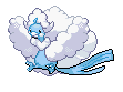
Mega Altaria looks really nice so far! I think the tail should potentially curve under the big fluff cloud, since now it looks like it's right beside it. You could perhaps add some colored outline to it as well, since Mega Altaria generally doesn't use much black outline. Also, something regarding the cloud colors:Let's see if this is any better:
I've given Altaria back her original bonnet, though instead of trying to curve the tail underneath Altaria, I've instead gotten it flowing behind her. In doing such, the line art has gotten a lot more clean from the previous version, and has the ability to flow if/when the sprite is animated.

You see how the clouds are sorta pinkish/purplish/orangish? If you could incorporate that into the sprite along with the change to the tail feathers, I think it'd be spot-on. Again, though, you've done a great job with the sprite so far!COLLEGE QUICK REVIEW x2 PART 1: THE MEGA-NING
-Aside from the tail needing some outline shades as Kyuzeth mentioned above, the outline jumps around a bit in terms of angle and width. Try to smooth out the curves a bit by alternating the widths of the pixel segments.Let's see if this is any better:
I've given Altaria back her original bonnet, though instead of trying to curve the tail underneath Altaria, I've instead gotten it flowing behind her. In doing such, the line art has gotten a lot more clean from the previous version, and has the ability to flow if/when the sprite is animated.
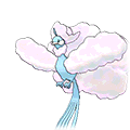
-Maybe its just me, but I also am really not much of a fan of the tail's current positioning, if only because it looks like its jutting out straight to the right rather than drifting behind or under Altaria's body. Maybe you could try shortening the tail's length and adding some foreshortening to try to give it some more depth, and putting it visibly behind the cloud to better depict its depth.
-I feel that the giant cloud isn't big enough, at least on our right. Referencing the ingame model and the official art, the left (our right) sidepoof (not to be confused with the wing) should extend a little lower to match the left in terms of general floofiness.
-Last nitpick. Altaria's chest seems to be slumping a bit. Again referencing the ingame and Sugimori art linked by Kyuzeth, Altaria's chest seems to swell around the base of the wings rather than slumping down to the base of the legs. Consider editing the chest area and seeing if the edits make it look more proud, because a pirate captain should always appear dignified in order to best intimidate the opposition.With any luck, I'll be back tomorrow with more insightful comments for Kyuzeth and TrainerSplash.
-the fact that it has taken me nearly a week to get back to you on this is kinda my fault so I'm extremely sorry about that. College is rough.Update time on Mega Salamence!
Changes include:
- I've fixed the head crest by thickening the side horns a bit and working on the top spikes somewhat. I've used some outline changes to make the transition to the tip better.
- The red has been made a lot more vibrant to go along with the official artwork and the anime appearance. I like the colors as they are now, so personally I don't want to change them. They really individualize Mega Salamence.
- Speaking of outline changes, I've added some more slightly lighter dark outline to the sprite and fixed the outline where the right front leg extends from the body.
- I've added the right back leg and extended the tail view.
~ I'll have to see how I can make the top of the crest look better, but I'll do my best to make it look as good as possible, as always. If there's anything you need to add in terms of critique or advice, just state away!
~ Added a regular Salamence sprite just for a size comparison. The body height is comparable, but you'll notice just how large the wings are on Mega Salamence. I've already had some trouble with detail, so I'd rather not change its size any further.
Just wanting to share this music link since it played during pretty much the entirety of spriting Mega Salamence. Go give it a listen, it's fantastic.
Thank you for reading and looking! Kyuzeth out!
-Although it's not a big issue, the red shades are very similar and should probably have increased contrast. I'm mentioning this mainly because the mouth is almost imperceptible against the neck shade, but the wings would benefit from this edit as well. Honestly, watching the trailer, I'm not sure if Salamence's colors change upon Mega Evolving, so it might just work better to reuse the original pallet.
-Tail's ventral side should have red visible, similar to Base Salsamence. Even though the base art doesn't feature it, it should still be there, unless the texture artists didn't get the memo. *coughfemalepyroarcough*
-You have a lot of 1-pixel thick points. Looking at base Salsamence, you should aim to have slightly more rounded points, as Salsamence lacks such points. While the wings are pointier in this form, it is rarely a good idea to leave only the outline to show the presence of a point or other thin piece. This can also be seen by comparing M-salamence's middle left face spike to Salsamence's, as Salsamence's maintains a 3-pixel width until the very last pixel.
-speaking of face spikes, the above-mentioned face spike should poke out over M-Salamence's open mouth like a faceguard. Check out the official art and you'll see what I mean.
-The chest plates have a few issues. For starters, they seem too round and thick at current. The edges of these things should be more angular, as Salamence wants to be aerodynamic like a jet as he flies. In regards to being too thick, the shading on the right (our left) chest plate makes it seem to be almost as thick as the plate is wide. Trim the shadows a bit to correct this easily.
-In regards to the middle chest plate, if you want to have the chest plates in their released position, you should make sure that the middle chest plate is discernible from the one behind it, as currently they share the same outline and are hard to differentiate.
-I have more to say, but not enough time so expect me back tomorrow.
Sláinte. +)
Splash, the issue is that the sprite is too skinny-looking, even if Greninja itself is that way by design. I'm afraid you don't "get" it.
Here's an exercise in linework I quickly put together.
- Left: last version you posted
- Middle: <1 hour of minor QC
- Right: with colour adjustments
Have a close look and try to determine what I changed and why I did so. This is also a challenge for Kyuzeth and Cynical. I'd make my own notes, but it's late and I have a lecture at 10 am tomorrow. Have fun analyzing you guys (':Last edited:
I've actually tried previously to incorporate a sort of meshing of orange, pink, and purple. The end result wasn't pretty for me. Once I've gotten a for sure final product with the sprite, I might try to attempt it again. Thank you, though! :)Mega Altaria looks really nice so far! I think the tail should potentially curve under the big fluff cloud, since now it looks like it's right beside it. You could perhaps add some colored outline to it as well, since Mega Altaria generally doesn't use much black outline. Also, something regarding the cloud colors: You see how the clouds are sorta pinkish/purplish/orangish? If you could incorporate that into the sprite along with the change to the tail feathers, I think it'd be spot-on. Again, though, you've done a great job with the sprite so far!
Taking your critique into account, this is what I've gotten:-Aside from the tail needing some outline shades as Kyuzeth mentioned above, the outline jumps around a bit in terms of angle and width. Try to smooth out the curves a bit by alternating the widths of the pixel segments.
-Maybe its just me, but I also am really not much of a fan of the tail's current positioning, if only because it looks like its jutting out straight to the right rather than drifting behind or under Altaria's body. Maybe you could try shortening the tail's length and adding some foreshortening to try to give it some more depth, and putting it visibly behind the cloud to better depict its depth.
-I feel that the giant cloud isn't big enough, at least on our right. Referencing the ingame model and the official art, the left (our right) sidepoof (not to be confused with the wing) should extend a little lower to match the left in terms of general floofiness.
-Last nitpick. Altaria's chest seems to be slumping a bit. Again referencing the ingame and Sugimori art linked by Kyuzeth, Altaria's chest seems to swell around the base of the wings rather than slumping down to the base of the legs. Consider editing the chest area and seeing if the edits make it look more proud, because a pirate captain should always appear dignified in order to best intimidate the opposition.
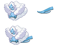
I feel as if I've got Mega Altaria's chest going in the right direction now. If not, I can't figure out any other way to go about it without more extreme modifications to the structure of the sprite. I've also expanded greatly about the lower part of Altaria's tail fluff.
Now, the tail I'm still pretty unsure about. I'm definitely sloppy at making structures that are suppose to flow, so the current tail is the best I've got right now. I've definitely straightened a lot of the tail out compared to the previous version. In regards to placing the tail behind the cloud, I'm assuming this is what you guys meant. It doesn't align perfectly as of right now, but I wanted to see if I had the right idea going before I head off to bed for the night.I made some Carbink Forms Sprite!!!!Attachments
-
 4.1 KB Views: 1,254
TrainerSplash
Alolan Form
Ah I see what is done and makes much more sense now that I see what has to be done. And you're right I don't get these past critiques considering how much I got. I'm a slow learner ( I toon ably should have said this before) and visual, so after this, and Cynical's critique it made more sense what to edit and how to fix. I'm so sorry if this is being an annoyance but yeah, I think I understand most if not completely.Splash, the issue is that the sprite is too skinny-looking, even if Greninja itself is that way by design. I'm afraid you don't "get" it.
Here's an exercise in linework I quickly put together.
View attachment 29526
- Left: last version you posted
- Middle: <1 hour of minor QC
- Right: with colour adjustments
View attachment 29528
Have a close look and try to determine what I changed and why I did so. This is also a challenge for Kyuzeth and Cynical. I'd make my own notes, but it's late and I have a lecture at 10 am tomorrow. Have fun analyzing you guys (':
i still need to fix his left (our right) hand it looks odd.
It doesn't go through the clouds, it should be under it then over lapped by the clouds. I'll see what I can do later today or tonight. Meshing in Orange purple and pink won't blend well unless we try making the shading of the fluffy stuff a similar color.I've actually tried previously to incorporate a sort of meshing of orange, pink, and purple. The end result wasn't pretty for me. Once I've gotten a for sure final product with the sprite, I might try to attempt it again. Thank you, though! :)
Taking your critique into account, this is what I've gotten:
I feel as if I've got Mega Altaria's chest going in the right direction now. If not, I can't figure out any other way to go about it without more extreme modifications to the structure of the sprite. I've also expanded greatly about the lower part of Altaria's tail fluff.
Now, the tail I'm still pretty unsure about. I'm definitely sloppy at making structures that are suppose to flow, so the current tail is the best I've got right now. I've definitely straightened a lot of the tail out compared to the previous version. In regards to placing the tail behind the cloud, I'm assuming this is what you guys meant. It doesn't align perfectly as of right now, but I wanted to see if I had the right idea going before I head off to bed for the night.
Expect a stream tonight if anyone is interested.
Edit:
So I was helping to edit Mega Altaira and it's too big...not sure if the original was but this edit is. This was pretty much an example of what the tail intersecting the cloud should look like, not really a legit edit anyways.
Two edits done to Greninja. On the Left, new pose created from the same sprite swapped legs, added a more body made to resemble more of Sugi-art, added tail, still crouched to reserve space. On the Right is the one made from Smash artwork. this builds onto what Princess did, but I added a little bit more shading around certain outlines fixed some skinniness, added a tail, fixed a section of his right (our left) leg to make it actually look like it's behind and not look like a fat hanging. Lastly I fixed that hand... I think not really but I think it looks more organic compared to what the old one had. I can see why raising it up in the air wasn't a good idea. If this greninja still doesn't do well compared to Quany's sprite I don't see the reason to keep updating it and I'll have it for personal use or as an extra just in case something happens.
Also, I spoted these things from your edits, Princess: Smother tounge, ear reshaped, shading fixes, eye change, color swapped, "bubbles" on limbs reshaped and outline fixes.Attachments
-
 1.6 KB Views: 616
Last edited:Alright, time for more updates on the most badass non-Legendary Dragon-type!


- - CUSTOM - - - - REGULAR - -
I've provided both the custom Megamence palette, as well as the one from regular Salamence. If that's the one to go with, I'll have to do some outline fixing on the head, but I'd really like to keep the custom palette, as it appears in just about any other medium from the games. I've also previously brought up how it differentiates Mega Salamence from its regular form and this individualization is something I'd love to keep. I've tried to make the reds more distinguishable, on a last color-related note.
Changelog on further updates:
- One-pixel lines on wings and horns fixed; made central spikes look like mouthguards
- Braces thinned and made more angular; center plate fixed to stand out more on its own
- Shading on right (viewer's left) plate altered to make it correspond better perspective-wise; I may still fix it up a bit for a next update
- Added red shading to tail's ventral side
In addition, I've given Mega Altaria a shot, complete with an attempt to incorporate pink into the clouds.

If you look closely at the outline by the tail, you can see I've made the tail partially get covered by the massive fluff on its back. I've tried to make it look like the tail really goes underneath the cloud.
As always, just tell me what you think! If you have any remark on the Mega Salamence sprite, just any tiny little thing you want to point out, feel free to inform me about it and I'll fix it! Kyuzeth out!Last edited:
TrainerSplash
Alolan Form
I love those pink clouds but why are they two different shades?
I think we can some purple to it as well... Maybe?Kyuzeth imo the custom palette looks WAY better than using normal mence's palette. However, I would recommend going to the link Princess posted (I believe it was post #2938), and scroll up from the linework post. You should see an image of the CAP on 6 different backgrounds, as to make sure the palette looks good on said different backgrounds, which the sprite would encounter if it went to Showdown. Also, the middle fin on the right side of Mence's head (The side that isn't exposed) looks a bit clunky to me. Maybe take a minute to trim that down and see if it looks any better.
One more thing. The pink on M-Altaria looks better as an accent rather than what you have currently. Try changing the colors to something more akin to this:

(Image was large so I put it in a hide)
As you can see, the bottoms of the cloud-wing things are pink, while the majority of the clouds are white.
Hope this helped!Time for another update!
MEGA SALAMENCE

Updates:
- Slightly fixed the left wing to make it rounder (still somewhat tricky, but it now looks better)
- Altered shading on left brace to make it look more angular
- Fixed middle brace
~ I've placed the sprite onto several backgrounds used on PS and there's absolutely no issue. Mega Salamence fits excellently on the BGs.
MEGA ALTARIA

Update:
- Clouds now have brighter pink shades
~ As an extra thing, I'd like you to take a look at the in-game model of Mega Altaria, which clearly depicts its wings as having a pinkish hue. It's a very nice touch to really show the Fairy-type side of Mega Altaria.
As always, just tell me what you think! I may start on Megamence's backsprite later today, too, so stay tuned for that. Kyuzeth out!Last edited:I kno I haven't bseen on for awhile because of school, visitation, projects and mah grades are sliping too, but I have started on Mega Steelix backsprite and shiny mega Rayquaza tooUsers Who Are Viewing This Thread (Users: 1, Guests: 6)
- ... and 1 more.


