-
Welcome to Smeargle's Studio! Please be sure to review the studio rules. Feel also free to check out our hub to learn more about this place!Welcome to Smogon! Take a moment to read the Introduction to Smogon for a run-down on everything Smogon, and make sure you take some time to read the global rules.Congrats to the winners of the 2023 Smog Awards!
Artstuffs by Kadew
- Thread starter Kadew
- Start date
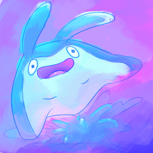
 That looks really pretty! I love the composition and the way you drew his face, heheh. He looks happier than usual. C:
Haha yeah you are right. It's pretty obvious that after I finished the crobat was the point where I kind of lost interest, the clouds could've used a lot more care.A happy Crobat is a nice sight for weary eyes. Really like how the blues and yellow meld together in this pic, my only nitpick is that those clouds were probably better off painted with colors alone as they don't really need that black lineart imo
In other news, two drawings posted in one day is a whole new kind of madness!

Favorite Ghost type: Honeslash
sord
Why isn't it made of dough?!?Haha yeah you are right. It's pretty obvious that after I finished the crobat was the point where I kind of lost interest, the clouds could've used a lot more care.
In other news, two drawings posted in one day is a whole new kind of madness!
Favorite Ghost type: Honeslash
sord

Favorite Ground-Type: Larvitar
"Larvitar is born deep under the ground. To come up to the surface, this Pokémon must eat its way through the soil above. Until it does so, Larvitar cannot see its parent's face."
Larvitar always seemed to me as some kind of sad, chubby emo kid/peanut. All alone in a mountain until it can break out and reach the surface, its dex entries are so sad.
Tropius: Certainly cute, but I'm bothered by how there seems to be some white space between the colours and the lines, unless this was intentional. Some of your other drawings have this as well, including Stunfisk for the MAC.
Larvitar: I never thought of it this way! Poor thing. Those are some snazzy-looking stalagmites and stalactites, great background and the picture looks sufficiently gloomy.
Lapras: This thing is my favourite from Gen I. Red looks like he's 1 foot tall, or that is a really gigantic Lapras rofl. I love the perspective of the music notes.
Lovely stuff overall, I don't figure you know me but it's great seeing you back and filling out this favourite Pokemon challenge! Your old stuff was so humourous (e.g., close wombat).Last edited:
Thank you for your feedback, I love it when people comment! Yes this white-near-the-lines thing is a problem that keeps happening. It's a result of resizing after coloring in a stupid way and I need to stop accidentally making that same mistake, it makes the piece look just bad.Tropius: Certainly cute, but I'm bothered by how there seems to be some white space between the colours and the lines, unless this was intentional. Some of your other drawings have this as well, including Stunfisk for the MAC.
Larvitar: I never thought of it this way! Poor thing. Those are some snazzy-looking stalagmites and stalactites, great background and the picture looks sufficiently gloomy.
Lapras: This thing is my favourite from Gen I. Red looks like he's 1 foot tall, or that is a really gigantic Lapras rofl. I love the perspective of the music notes.
Lovely stuff overall, I don't figure you know me but it's great seeing you back and filling out this favourite Pokemon challenge! Your old stuff was so humourous (e.g., close wombat).
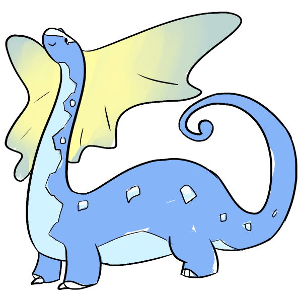
Regarding the lapras, it is just one of those pokemon I imagine to be much bigger than the 'dex entry claims. I want a giant turtlesaur to ride across the ocean on in style~

Favorite Normal-type
Bidoof loves you, even if you do not love them back.
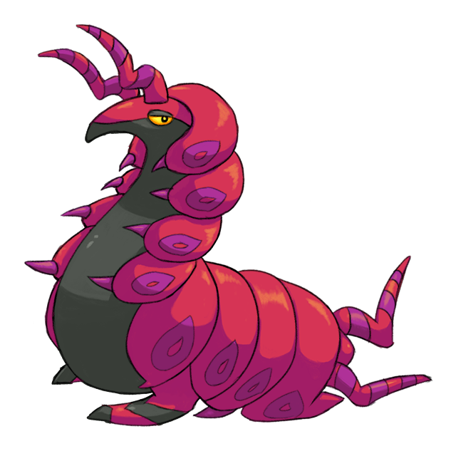
I'm tired and probably still a little sick and a bit headache-y and scolipede is a jerk to draw so blarg have a sketch. maybe finish tomorrow. bleh
The coincidence of feeling unwell while trying to draw "Favorite Poison-type" is not lost on me.
I finished it, yaaay. This gave me SO much trouble. I love scolpede's fat horsebug design, but it is harder to draw than I expected. The horns in the front and back are approximately 90% bullcrap and 10% giving up.
Drawing this gave me RSV.Last edited: Kadew just posting to let you know that I'm a huge fan of your art. I love your cutesy style and it was always fun to watch you draw during the OI meetings. Even just the two pieces above are really good examples. c:
I really hope you keep it up because you're one of my favorite users and I hope you can continue to spread joy through your art. c:
Stealth bump. c;

Favorite Psychic-type: Gardevoir/Gallade
I couldn't pick one of the two, I really like both ends of the evolutionary line.
They each lost their other arm in a horrible accident. That accident was me not sketching them out very well, and becoming frustrated when trying to figure out how the other arm should be posed. Hurray for giving up! I keep forgetting to check in this thread ...
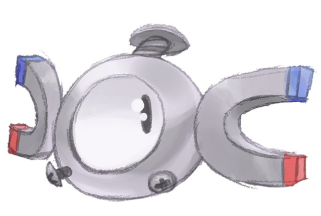
Love the cute take on the Tropius, and for increased potassium awareness. The perspective used for the Lapras pic was excellent, makes the whole scenery very harmonic (because of the music hue hue hue). And then there's the Magnemite, which despite the elss clean lineart actually works really well, makes it seem more rusty and crude, much like its design.
Not entirely sure how far you've gotten with that PokeMeme, but the progress itself is great and I like how you've also experimented with various styles along the way. Neat stuff.Users Who Are Viewing This Thread (Users: 1, Guests: 0)
- ... and 1 more.