Worst Pokemon Sprites?

Am I the only one who can easily see the different color schemes of Shiny and regular (non-mega) Gengar? Now Shiny Garchomp I still have a hard time identifying from the regular.

But anyway, on the subject of bad shiny sprites, Shiny Crobat. Nuff said

This is why I never evolved my shiny Golbat in SoulSilver.

It's the 3D models that throw me off.

It used to be way clearer with the sprites.
Agreed, though I've always felt that Shiny Gengar in Gens III and IV looked closer to being the right color than regular Gengar (Gen V fixed that).
It's a shame that Gengar is so hard to hell apart when Haunter is one of the more interesting shinies:

(Gold)

(Generation VI)
It's subtle, yet obvious. A rare combination, to be sure. (Though better in Gen II)
 
Last edited:
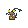
On the subjects of bad shinies, I just saw Dedenne:

It...it looks like it got burnt really bad. Which makes me sad cause I really like Dedenne.
Actually, looking through some of the shinies of Gen VI, most of them are rather ugly.
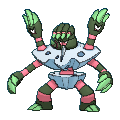
I mean, they made Barbaracle UGLIER:

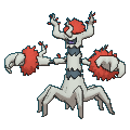
Though I will give credit where credit is due: shiny Trevenant is perfect.

That is a spooky tree.
I do love that they gave Trevenant the appearance of a burnt tree with fire around it. It just works so perfectly.
 
I'm surprised no one has mentioned the horrible R/S/E sprites from FR/LG/Colosseum/XD exclusives! Here's the one that bothers me the most:
latest.png

The quality on this is just horrible. The way that left arm stands out is just awkward. Oh, and don't get me started on its face! The whole design comes off as a bit uncanny to me.
 
The "face" position and orientation in the sprites is reversed in the second game, the direct opposite of the first game's position and orientation.
...yes, that was Vader_the_white's point.

We were asked to find a sprite that Green actually got right, and Koffing as Vader_the_white pointed out was one of them. Another was Kakuna:
in comparison to scissor-arm Kakuna in Red/Blue:
although they didn't get the eyes right until Yellow:
. All the others look disturbingly dead inside...

Speaking of Koffing, it appears that it took developers forever to decide how Weezing is oriented (especially that little third tumor-thing):

In order: Red, Gold, Ruby, Diamond, Heart-gold (got it right), and Black/White (got it wrong again). Firered got it right and Silver almost did (the second face is too high).
Oddly, this was another thing that Green actually did right:
 
Last edited:
...yes, that was Vader_the_white's point.

We were asked to find a sprite that Green actually got right, and Koffing as Vader_the_white pointed out was one of them. Another was Kakuna:
in comparison to scissor-arm Kakuna in Red/Blue:
although they didn't get the eyes right until Yellow:
. All the others look disturbingly dead inside...
Actually, some early Sugimori artwork shows those odd arms:

It was likely part of the original design that got abandoned early on with leftovers in the first generation games. And now I'm imagining RBY Mewtwo with Leftovers. It is a thing of nightmares.
 
Speaking of Koffing, it appears that it took developers forever to decide how Weezing is oriented (especially that little third tumor-thing):

In order: Red, Gold, Ruby, Diamond, Heart-gold (got it right), and Black/White (got it wrong again). Firered got it right and Silver almost did (the second face is too high).
Oddly, this was another thing that Green actually did right:

In BW, they got the sprite right, you are just seeing it from a different angle.
 
I'm going to ignore all Gen I sprites because we all know they're bad. Might as well ignore all Gen II sprites too while I'm at it. Makes it more interesting to take a look at more recent sprites/models that have no reason to be bad.

D/P Gliscor:


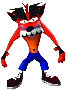
This is fucking awful. I don't know what the guys at Game Freak were thinking when they made this, but it doesn't even look like Gliscor's official artwork. It looks more like Fake Crash with that retarded facial expression and deformed row of teeth:


Moving on...

Gen V Ferrothorn:

I know it's supposed to be hanging from the ceiling or something like that, but it only makes sense in caves, and even then it's just silly because it looks like it's just wobbling its tentacles in the air like an idiot. Gen VI was a huge improvement for Ferrothorn.

Speaking of Gen VI, many Pokemon got butchered by their 3D models. Here are the worst offenders:


You get my point. It looks stupid when a Pokemon is just floating in the air motionlessly. The absolute worst case is Xatu, who is supposed to be just standing still looking like a totem pole. That's the whole point. It's not supposed to be flying.
 

Users Who Are Viewing This Thread (Users: 1, Guests: 0)

Top