Sticky X/Y Sprite Project

Mega Lopunny
Old------Recolored----Finished
View attachment 31634
You guys, this obviously wasn't finished, how can you not notice it.
The recolored one was just as it applies, it was a colored version with mroe colores added to it, meaning more shades and changed eye color. the finished one was a legit edit, face makeover fully redone texture added to feet.
Ok, so I finally caught a Lopunny, although I can't post picture evidence atm since Im typing on a phone and phone copy pasta sucks. Anywho, I have a few recommended edits:
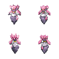
-The inner ear should not be visible behind the forehead's X-Fluff. Erase all of the exposed ear to the right of the X-Fluff, since it shouldn't be visible from a front angle.
-While we're on the topic of the X-Fluff hiding details, due to the angling of the front sprite, the base of the right (our left) ear should be more visible than the left ear, as the X-Fluff is more directly in front of the left ear.
-X-Fluff should be a few pixels taller than the tops of the ears. The bottom two parts of the X are about the right size, but the top segments need to be lengthened.
-The body is too long by several pixels, and is not teardrop-shaped like it should be. Basically, it remains a thin stick for too long before beginning to widen out.
-Arm fluff could be larger in both instances. Depending on the angle, the arm fluff is nearly as big as the uncovered area of the face, so you can use that for a general size estimate.
-Aim to try to round out the curves of the ear-pigtail-links. The brown areas should be more or less perfect ovals connecting the fluff balls, kind of like a bone-joint-bone connection. The bending of the ears shouldn't be visible in the non-fluffed segments.
-Eyes are too close together, and head could be shaped better. Even though this thing is a menace in the tiers, rabbits are non-predatory animals, and as such, they do not have binocular vision. Lopunny's face doesn't change much upon Mega Evolution, so consider using Lopunny's base form as a reference for how the face should look, head shape, and eye reference.
-Legs are weirdly bent. When I get back to a computer, I can try to get a better image reference for what you're trying for, but currently, the legs look somewhat awkward/broken in some places.
-I don't know about sizing atm, but I know PoM mentioned it earlier. Keep in mind that MLopunny should be only 4 inches taller than its base form, and the sprites should take up a similar amount of space. Again, not sure how much of an issue this is atm, but just thought Id bring it up jic.

W/e the case, I look forward to seeing what you do with the sprite. Even though it has it's fair share of issues right now, the current sprite is a good base to work from and shows promise. Best of luck with the editing man. +)

Also, do we have a backsprite for this yet? I honestly have no idea. If not, might be good to prioritize that, and just iron out any issues that come up simultaneously.
 
Last edited:
As 2014 reaches its end and 2015 arrives where the sprite leaders reside, here's a reflective post from me. EDIT: also 400th post, apparently

I've been co-leader of the project for just over a year, which feels sort of crazy. Lots has changed over the past 14 months, taking join date into account. While I've never bothered to open up about this, before I knew it, I was underweight from eating 1-2 meals a day and sleeping way less than I should, and generally always feeling that I have too much to do. At any given point, I'm either fast asleep in a bed or probably would like to be.

Despite what went wrong, I've had a great year. I owe most of this to someone whom we know as Layell. In January, being around him made me realize what I felt leadership should be about, which helped me shed my angsty teen self and become a "bonafide" princess.

Obviously, that isn't all that happened; of all the highlights from this year, I developed an awkward crush on my sprite boss, who happened to be a cute blond with great arms. Reasons such as these made attempting to act normal in front of everyone else interesting and difficult, in addition to him being charming, cuddly, witty and replete with puns, a master Marth abuser in Smash, etc. Seriously, what is with the real-life, B-list romantic comedy plot: boy meets girl, boy and girl hate each other, they hang out, Showdown switches to 3D, shit blows up, and boy and girl eventually go steady after a multitude of sprite critique, badge nominations, cards, and more dates, all of which bring them together. ??? I'm mostly kidding around, as I have zero complaints about the ending.

As sappy as it sounds, upon becoming co-leader, what I wished most was for the sprite project to be fun and to bring people closer together. Thinking of movie night and all the in-jokes we've accrued, I believe the dream is a reality, even though some members of the "family" have inevitably left, and some are more distant now than before. Without a doubt, the people here are the best part. You're my friends, and thank you for being funny, talented, intelligent, and all-around amazing.

Watching this thread's viewcount since the end of the summer has shown that this receives around 1,000 views per day on average, sometimes as many as 2,000 views, making this ostensibly one of the most viewed threads on Smogon. The current total is just over 0.72 million: these are big numbers, considering all we are is a bunch of volunteer artists placing dots on a screen whilst arguing at each other. Is it right that I'm surprised? Who watches this thread, and why? Is our work really that good, that bad, or is the drama really that priceless? I'll probably never know. Whatever the case, thanks for sharing in our idiosyncrasies, vices, fears, our joys, and our triumphs, all "anons" who end up reading this. Every view is another reason not to quit, because it means that at least somebody out there hasn't quit on us. That probably sounds laughably corny, but it's the truth. So, please keep sticking by us!

Midnight has already passed, and I can't think of much more to say, except Happy New Year to all, spriter or not! ♥ Here's to more productivity, fun, laughter, not arguing, and, of course, good ol' pixel art.
 

TrainerSplash

Alolan Form
All those views are probably from me as I look at this page 10 times a day I don't have a life so shut up ;_; I'm gonna say I find a lot of you guys as my friends too although I only been here for like 5 months. I started off as a shitty spriter (still kinda shitty though) and I have improved a lot over this project. Was I smart to start off wit a crappy ability of spriting? Obviously it wasn't, but I learned a lot from you guys specifically how to do team work with that Sceptile sprite (Shout out to Kyzueth and Cynical)
I love all of you guys. Have a wonderful new year everybody.

Princess if you think writing this at midnight at bad, I'm writing this at 2:30 AM after New Years passed. Two cups of coke and a whole lotta cookies are still in my system. :U
 
No worries, Splash - I always am viewing this project too, and I'm up at 4 a.m. without shame. This year has definitely been very productive for the XY Project, yet we still have a lot of work that needs to be done.

Speaking of work that needs to be done, I was searching around the internet at fanmade Pokemon sprites, and discovered (what I consider to be) an absolutely beautifully crafted Mega Steelix sprite over at the Serebii X/Y Project. I had personally messaged the creator of the sprite, noobiess, asking if it was alright to do my own edits to the sprite:
Noobiess~~~~~~~~~~~~~~~My edits~~~~~~~~~~~~~~~~~~~~~~~~~~~~~

Edits include:
A slightly altered palette, using colors from the B&W Steelix sprite.
Changed the eye color to blue.
Made M. Steelix much taller, so as to more accurately reflect its proper size.
Gave more emphasis to the blue rings on the sides of Steelix.
Gave Steelix's diamonds a red, blue, and yellow hue.


After showing him what I had done, mentioning the Smogon project in the process, he had this to say:
I don't mind you using this for the Smogon X/Y project, as long as you mention it came from the Serebii X/Y project.
I would also love to contribute to the Smogon X/Y project in the future, but my main target will be to submit it here. So it would rather be some sort of collab, where I submit my sprite in the smogon X/Y project and the Serebii X/Y project could use the edits you guys make (if that is ok with the artists there too).
To make a long story short; noobiess has given us permission to utilize his sprites as well as making our own edits with proper credit.
 
happy new year everyone! to celebrate 26 hours late, have the first fully-evolved Pokemon from the Kalos region, stopping by today to avenge his fallen prevo! which we don't talk about here for good reason
Also, have some music which fits QC work perfectly.

CHESNAUGHT
New______Old________

I'm almost 100% certain that Ice-cold Claws didn't QC the backsprite in his last QC run, because there was a noticeable quality difference. But no matter, here's the changelog!
~Face editted because Chesnaught doesn't look at people like that.
~Various color edits to make the green look healthier and the tan tastier.
~Shell has been seriously smoothed out in both sprites, and made to be rounder as is in-game.
~Shell patterns have the outline dropped, as there was too much going on in too small of a space for outlines to do anything but add confusion.
~Various other body parts have been changed to curve more naturally.
~Tail makes sense now/is proper width and curved.
~Hair re-styled
~Spikes have been editted to look pointier/anatomically correct/not pointing directly at the viewer.
~Added left hand on the backsprite because seriously why isn't that showing


Comments and critiques are appreciated as always. +)

The Cynical Poet Looks good, I might hit it up with some edits of my own pretty soon. noobies is a pretty cool guy, and he does great work. Glad to hear he's OK with contributing to the Smogon XY project. Maybe I should go drop off some of my more recent scratch works over there again sometime soon as a thank you.

Anyways, keep up the good work everyone, and we'll see if we can't make 2015 the best year for the Sprite Project yet!
 

frenzyplant

Inertia is a property of matter.
is a Top Contributor Alumnusis a Smogon Media Contributor Alumnus
I didn't really like the old Mega Lopunny's pose, so I made a new one and backsprite that hopefully fixes some of the problems the old one has.

aXl , great job on Chesnaught! I feel the backsprite's right arm-spikes should be shaded to show their roundness, and there's something about the new left leg that makes it look unbalanced, as the toes seem to be curling around something.
 

TrainerSplash

Alolan Form
I didn't really like the old Mega Lopunny's pose, so I made a new one and backsprite that hopefully fixes some of the problems the old one has.

aXl , great job on Chesnaught! I feel the backsprite's right arm-spikes should be shaded to show their roundness, and there's something about the new left leg that makes it look unbalanced, as the toes seem to be curling around something.
Ears look too thick, X looks a little too thick on my end as well. Those legs could do some work though. on the backsprite it looks really nice aside from the top of the ear. I'm not sure which sprite to use at this point, as you are the 3rd person to make a lopunny sprite >_<
 
Happy New Year, guys! It's been a while since my last update, but I have been working undercover the past few weeks and this butch panda here is the latest among my works. Of course, comments and suggestions are always welcomed. c:

Pangoro

(New)
(Old)

  • Perspective made less "pronounced"
  • Color palette changed
  • Head and face reworked (to the likeness of the Sugimori art)
  • Fur restyled
  • Claws added to the feet
  • "Cape" now has a visible split
  • Left leg on the back sprite now shown
Looks great, Wobble! I was a little leery when I first saw it, but I've since grown to like the new edits. I'll look into posting something more detailed about it in the near future if I spot any potential fixes, but I'm liking what I'm seeing.

Anywho, have some music, because we have another QC coming at ya'. Also, the song is fitting because it's 3:30 am.

Hawlucha
New_____Old______


Mainly edits to the backsprite, but I did add more feathers to the front sprite's left wing due to the perspective. Also, both sprites' wings were lengthened, and there are some other edits I made that I'm too tired to recall atm. So yeah, I'll respond to comments in the morning. Good night. +)

Sláinte!
 

Soul Fly

IMMA TEACH YOU WHAT SPLASHIN' MEANS
is a Contributor Alumnus
I'm just here to post that I've been lurking this thread since day 1, and I really sometimes wish we had these sprites in the sim. Overtime right before my eyes, they have transformed from the first barely palatable hobby sprites from early XY, and when I seriously doubted the viability of such a project, to this. Hard to imagine how the rag tag group grew into a bunch of enthusiastic (and very talented) amateur spriters. Damn I wish had the aesthetic sense to sprite.

They've become gorgeous handiwork of art.

I wish you all the best.


EDIT: (@below) thanks bruv. :)
 
Last edited:

TrainerSplash

Alolan Form
upload_2015-1-6_20-3-21.png
upload_2015-1-6_20-14-31.png
<colors
I'll leave this here for now. It's not done. As of right now, it's just some of the edits aXl suggested. Right ear (our left) is still trying to be rounded out, moved left leg (our right) closer to the other look nicer. Right leg (our left) still being edited cause it still needs to be smaller. It's left ear is more rounded, I couldn't remove the inner ear cause it would look odd. Body is loser and more tear shaped, still very tall, but as of right now I'm just gonna say it's standing on it's tipy-toes. But yeah, still shrinking it down to size, unless this is fine. Tail is removed, it got it the way and I don't think it will be seen at this angle, I can re-add it if needed. Tops of ears lower to be smaller that the X.
 
I told PoM I'd call this post "Falgeyea has trouble with faces," and I'm not one to make a liar out of myself. Also, to commemorate the occasion of us now being a stickied thread in a new forum, this post will be Double-Stufed and contain one of my favorite boss themes from any video game, period. Click the title for music.

"Falgeyea has trouble with faces"

Quilladin
New Old


Ah, Quilladin. How I hate your dumb face missed you. For anyone who doesn't know my long and troubled history with Quilladin, don't look it up.
~Colors editted to be brighter.
~General shape rounded and proportions fixed.
~Realized that its eyes should be actually black and that was my problem all along (shoutout to princessofmusic )
~Evened out the ear spike heights and shaded them better.
~Got rid of useless colors like the old outline shade for the red
~Removed face shading since it was unecessary and implied that the face bent inward before getting back to the armor.
~Realized that Quilladin is literally one step away from being Pedobear. No changes related to this one, just thought it was worth pointing out for all of you participating in NFE events. If Quilladin is spotted near Little Cup activities, please contact the authorities.
QC'ing my own sprites always feels weird to me. Anyways, here's our special guest who decided to stop by to promote their new movie!

Diancie
New Old

Ok, so I've always liked Diancie's basic form a lot more than the Mega, and I have always wanted to do QC on this 'mon, so when PoM brought up me QC'ing it earlier last week, I was actually kind of excited. Anyways, onto the Changelog! This one will be a bit longer, so yay for that.
~Proportions have been editted to more accurately represent the in-game model. (ty Gamestop, you corporate bastards)
~Made all of the diamonds less soft edges and more hard edges, since all of Diancie's diamonds have four sides leading to a square-based prism on the end rather than simply being a round blobby cylinder. Regice was used for inspiration as well as the way light hit the diamonds on the in-game model.
~Face extended and completely redrawn.
~Head gem shaded to have a cut more similar to it's in-game model, with several circular faces surrounding a flat, circular top.
~Arms larger and less stiff
~Coal chunk redrawn using the ingame model as a base. Shading also references the ingame model, as I aimed to place shadows and highlights where they could realistically appear based on the geometry of the coal slab. Also, useless outline color on the Coal was so close to being black it wasn't even funny, so I ditched it.
~Speaking of ditching colors, counting the white as two separate colors for the Shiny recolor, old Diancie had 18 colors. Now it has 15. (One shade of red for the eyes, gold highlight and Coal outline shade removed.)
~Dress-thing now drawn with more apparent bumps in the edges, and reshaded so as to not look as pillow-shaded.
~Diancie has hands.
So yeah, these were fun/painful to do in fair share, so tell me how to improve so I can make them even better should you see any glaring issues with the sprites that I should be correcting. In the mean time, enjoy the new QC's and the forum, all. +)

Sláinte!
 
Last edited:

Sunfished

fisch
is a Top Artistis a Community Contributoris a Forum Moderator Alumnus
Sorry if this isn't how this works, but I was working on a back sprite for mega lopunny, as it was one that was missing

The ears and head area do need more work, but this post is to generally see if what I was doing was allowable, as the front sprite was not mine.
If it is, feedback would be greatly appreciated :)
 

TrainerSplash

Alolan Form

The ears and head area do need more work, but this post is to generally see if what I was doing was allowable, as the front sprite was not mine.
If it is, feedback would be greatly appreciated :)
You could have asked for my finished edits ya know, instead of taking what I showed you at the time lol. As I have explained on Showdown and what you just said, the head and ears need to be fixed. I see you added part of X-fluffy though. Still confused whither or not we should shrink that tail or not. The showing could be thinner at the thigh and thicker towards the shin area. Arms look off as I have stated, I could possibly fix those when I go back to editing tomorrow.
I also remember I did some more Groudon edits... I forgot to save them and post them here, they will also be done tomorrow.

Now, time to chill and sprite tomorrow as I sit and drink hot chocolate playing my brand new Wii U for the rest of the night and tomorrow. Snow days are the best.
 
The Cynical Poet Looks good, I might hit it up with some edits of my own pretty soon. noobies is a pretty cool guy, and he does great work. Glad to hear he's OK with contributing to the Smogon XY project. Maybe I should go drop off some of my more recent scratch works over there again sometime soon as a thank you.
Thanks ^^

Since you liked the pixel over, here as some new ones I made recently:
Mega Camerupt and Mega Metagross

I noticed you already had made those, so I don't know if you can use them. But I'll just put them out here, just in case.
Ps: I'll probably will make a pixel-over of the backsprites too so if you all are interested in them I'll post them here too.
 

Legitimate Username

NO PLAN SURVIVES
is a Top Artist Alumnusis a Tiering Contributor Alumnusis a Contributor Alumnusis a Top Smogon Media Contributor Alumnusis a Battle Simulator Moderator Alumnus
Forgive me for thinking that I could improve upon perfection created by aXl, but I had one little nitpick with Diancie that wouldn't stop bugging me.

While both sprites were great on their own, I felt like the front and back had too much difference in the positioning of the head crystals. I shifted them around a few pixels here and there in order to accommodate for that.

Also, while I made this a while ago, it's about time that I actually started working on it more now that decent back references for those oversized armlegs exist. For now, though, here's what I've made so far.

The perspective difference from the front is pretty extreme, but it seemed necessary. Hopefully it'll look good when the whole thing is done.
 

TrainerSplash

Alolan Form
upload_2015-1-7_21-4-25.png
Here, have some updates by Sunfished and I. Not much is done cause I'm lazy. We combined our edits on the backsprite, a lot still needs to be done (seriously this thing is giving me such a headache, too much edits that are tough to do. Good thing I'm home tomorrow and possibly Friday.) Groudon is coming I promise.

Loving your Dianice and Quilladen sprites, aXl, they look cute and huggable. The colors look really nice on both and really like the reflection on Diancie. Belly marks on Sanik Quilladen could have better ourlines. The last thing I could say is that the rock is too purple IMO, but it's hard to critique your work. The edits done by Legit are perfect too, I like what he did to the "crystal hair' (It's all made to look like hair and you all know it.)

Metagross looks nice for an early start, Legit.
 
[6:41:42 PM] Princess of Music: this should be your 900th post imo
[6:41:42 PM] Princess of Music: perfect occasion
[6:41:57 PM] Falgaia: well it could have been post 1000
[6:42:07 PM] Falgaia: then it would have really been perfect lol
[6:42:33 PM] Falgaia: "so here's me doing the first pokemon I made for this project over again because whoo big 1k"
[6:42:58 PM] Princess of Music: yea but this'll have to do
[6:44:57 PM] Falgaia: true enough

have some music (for some reason all I could listen to was rock while I sprited this lobster)

CLAWITZER
New Old


Yeah, 900 postcount! Let's celebrate with a redrawing of one of my earliest submissions to this project!
~Completely new Clawitzer front sprite scratched using two angles of Clawitzer's 3D model as reference. (one for the cannon, one for the main body and shield)
~Colors made more vibrant
~Perspective has been changed so as to allow for Clawitzer's main body to be larger while still accurate.
~Wiskers made to be thicker as they are in the ingame model.
~Cannon looks ready to bite into something instead of just limply hanging open
Dark blue made to be shinier and better show the curves of the surface without heavy usage of draker outlines.
~Backsprite posed to better fit in frame and has thinner claw spikes. Otherwise, mostly same general ideas behind changes as the Frontsprite.
While normally I'd wait to post something like this until I finished the backsprite, the chances of me finishing the backsprite before Sunday are slim, and I didn't see much use in waiting that long.

Scratch that, Front and Back are now done. Either way, feel free to leave comments or critiques you may have below and I'll be sure to get on them before moving forward.

Have a great weekend everyone! +)

Sláinte!
 
Last edited:

TrainerSplash

Alolan Form
Simple edits to Primal Groudon.
upload_2015-1-12_15-43-17.png
upload_2015-1-12_15-51-21.png
upload_2015-1-12_15-43-41.png
upload_2015-1-12_15-51-33.png

Here have some edits. Nothing was changed on the front, it's just there for reference. Some color fixes near the tail and leg. As Regime has shown an odd spot in coloring making it look uncontrolled. In all honesty I have no idea how you put that together, as the original has something similar. I have tried to edit it and it looked on in every way I tried. I just did the shading similar to normal Groudon with some dark spots on the edge of the yellow to make it look nicer. Shading and color edits transferred to the shinies. Although not made matellic like it's normal counterpart I thought this would do for now. Another thing that bothers me is that the eye should still be red (as shown in the game), the sprite itself already has a butt load of colors (should I counted which was my mistake). I'll make the shiny more metallic and figure out eye color problems later unless someone gets to it before I do myself.

Next up: More Mega Lopunny edits, cause the sprite still doesn't look right to me still.

I swear guys I'll get fully finished and more major edits done soon.
 
Well, it's been a little while since I've contributed anything of merit, so I'm going to try to rekindle an older project of mine:

I didn't really know what was going on with the Litleo sprite, so I've decided to clean it up a bit. I've got two versions here, the only difference between the two being the head size. Other than that, here are the other changes:
-Reworked Hind Leg
-Reworked Back Paw
-Cleaned up the mouth to look less jagged.
-Cleaned up the shading around the neck

Feel free to critique it as you will - and not based upon your feelings towards the Pokemon itself *cough*Layell*cough*
 
Thanks ^^

Since you liked the pixel over, here as some new ones I made recently:
Mega Camerupt and Mega Metagross

I noticed you already had made those, so I don't know if you can use them. But I'll just put them out here, just in case.
Ps: I'll probably will make a pixel-over of the backsprites too so if you all are interested in them I'll post them here too.
Layell's mentioned a few times in the past that he won't accept new sprites unless they have an accompanying back, so I imagine that rule probably stands in regard to your new sprites, but from a personal perspective, I think that your Mega Camerupt looks better than the one we have currently, just because it looks less messy in regards to the lava floes on the back. With a little QC work, I think it would work pretty well as a B/W style sprite. Granted, I don't speak on behalf of the entire sprite project, so I can't really say for sure whether the others would accept it. As for Mega Metagross, I feel yours and LU's share similar quality, so I can't really say much there.

Whatever the case, thanks for stopping by, and I'm sorry it took me this long to get back to you.

Forgive me for thinking that I could improve upon perfection created by aXl, but I had one little nitpick with Diancie that wouldn't stop bugging me.

While both sprites were great on their own, I felt like the front and back had too much difference in the positioning of the head crystals. I shifted them around a few pixels here and there in order to accommodate for that.

Also, while I made this a while ago, it's about time that I actually started working on it more now that decent back references for those oversized armlegs exist. For now, though, here's what I've made so far.

The perspective difference from the front is pretty extreme, but it seemed necessary. Hopefully it'll look good when the whole thing is done.
Diancie looks good to me. I had to look hard to notice the differences, but I agree that they do look pretty swell, so good job on that one. +)

As for Megagross's backsprite, the lower left arm has this weird area on it where it seems to hit two outline colors in quick succession, or otherwise it gets dithered. I'd try to clear that up, as it looks a bit strange in terms of color transitions. Other than that, the current progress looks pretty nice. I'll say that with Megagross, keep in mind it's probably not going to fit the frame well, so feel free to over/underexaggerate the size of some parts if it makes the sprite look better on the whole.

EDIT:
Well, it's been a little while since I've contributed anything of merit, so I'm going to try to rekindle an older project of mine:

I didn't really know what was going on with the Litleo sprite, so I've decided to clean it up a bit. I've got two versions here, the only difference between the two being the head size. Other than that, here are the other changes:
-Reworked Hind Leg
-Reworked Back Paw
-Cleaned up the mouth to look less jagged.
-Cleaned up the shading around the neck

Feel free to critique it as you will - and not based upon your feelings towards the Pokemon itself *cough*Layell*cough*
god its face is ugly
Don't have my 3DS on hand atm, so I can't say anything proportions wise, but the right one's face looks less creepy than the left one's. The mohawk could probably do with a third color other than outline shade>red, as currently it's a bit flat. I'd recommend playing with adding a highlight to it. Also, the part of the body that falls between where the two forelegs meet could do without the extra shading, as it gives it a sort of pillow-shaded look with the neck shading above it. Just keep a bit out darker color to outline where the leg meets the torso in front, get rid of the rest of the shade imo.

Also, could just be my monitor that needs cleaning, but the head's right ear (our left) seems to have the inner ear highlight at the top while the left ear has it at the bottom. Assuming Litleo's ears aren't weird (again, lacking my 3DS to check) this should probably be made consistent. I personally prefer the way the left ear is shaded, with the highlight covering the lower inner ear, so I'd recommend that, but do whichever looks best.
 
Last edited:
EDIT:


god its face is ugly
Don't have my 3DS on hand atm, so I can't say anything proportions wise, but the right one's face looks less creepy than the left one's. The mohawk could probably do with a third color other than outline shade>red, as currently it's a bit flat. I'd recommend playing with adding a highlight to it. Also, the part of the body that falls between where the two forelegs meet could do without the extra shading, as it gives it a sort of pillow-shaded look with the neck shading above it. Just keep a bit out darker color to outline where the leg meets the torso in front, get rid of the rest of the shade imo.

Also, could just be my monitor that needs cleaning, but the head's right ear (our left) seems to have the inner ear highlight at the top while the left ear has it at the bottom. Assuming Litleo's ears aren't weird (again, lacking my 3DS to check) this should probably be made consistent. I personally prefer the way the left ear is shaded, with the highlight covering the lower inner ear, so I'd recommend that, but do whichever looks best.
So, I've decided to truly try and rework how Litleo looks. This is my result:

Updates include:
Completely reworked front legs, spread slightly more apart.
A new color pallet.
Added brighter red mohawk shade.
Reworked the inner part of the ears to a more natural color (it looks like you can actually see into the ear now).
Spruced up the shading around the ear, chest and neck area.
Added a darker and lighter shade for the dark brown fur.

The back sprite is going to need further revision; especially its paws, but as it stands I think I'm becoming much more pleased with how Litleo is turning out.
 
View attachment 33881

Both of these guys needed a shrink. Sliggoo was outsizing others in its height group while Goomy simply must be small and squishy. >u< I've done some other QC as well over the past while, such as Pangoro, although I don't feel particularly like posting them.

Could you make a short list of changes I need to make on the lineart? In regard to the backsprite: outside of altering the shading below the wing, I guess I should work on the wing's highlights and remove the dark shade on the left wing. I had my doubts on the wing shading anyway, since shading is my weakest point in spriting.
I'll be glad to make any adjustments to perfect the sprites, I just need to know what to do. I can't work that well without clear directions, sorry. :s
What I meant was I think that you've gone as far as you can with these sprites. I'm not inclined to give instructions pixel by pixel because it's better if you have or develop the capacity to make those kinds of calls on your own. View the linework guide by Wyverii I linked a while ago for an overview.

aXl's massive burst of productivity the previous week was quite the development. The Megas, grass starters, and Clawitzer look good as they are. Diancie could use some subjective edits to make her cuter, but that isn't high priority. Hawlucha looks better than ever, but I might always dislike it innately.

Wobblebuns I have a copy of Pangoro on my hard drive with some of the linework cleaned up, but I made a note when saving the edits that there were NO stray colours and it was a shiny swap, hahah. Way to go (':

TrainerSplash Lopunny still looks extremely squished, especially the face. Groudon's colours are too bright/saturated and cause the dino to look fluorescent. I suggest switching to a darker crimson.

The Cynical Poet Those Steelix sprites look too much like blatant pixel overs of the 3D models. On a different note, I could've sworn that Layell organized a two-way usage agreement with the Serebii project a long time ago... either way, it's sort of amusing if you read this post then this one.

As for Litleo... I edited the front some time ago but never got around to posting because I never did the back. Wobblebuns recently made some more adjustments but never posted it either, even though I implied that he should've. So... >_> In other words, an improved Litleo exists out there in the aether.
 

TrainerSplash

Alolan Form
Can't give an actual reply 'cause I'm on my phone, in the middle of school...

Anyways, I actually agree that the groudon has a too bright of a color scheme, but I took it from the actual model as that is the only thing that shows it's metallic look. I can probably take from the official art work, current colors and darken them, or use normal colors and Britten them. I'll try a bunch of options and see what I can do, but making something look between the artwork and model is going to be tough for me.

As said before, Lopunny is not finished cause there is a lot of fixes I need to do. Yes it is squished, the face is better than last time IMO, but yeah still problems with it V_V I'll try messing with the ears and face some more and will probably fix that leg along with backsprites edits.

Yay more several hours on the same two pokemon like I did from the last few weeks :c at least it's Thursday.
 

Users Who Are Viewing This Thread (Users: 1, Guests: 1)

Top