Should designs be based off animals only?

antemortem

is a Forum Moderatoris a Community Contributoris a Site Content Manager Alumnusis a Battle Simulator Admin Alumnusis a Top Social Media Contributor Alumnusis a Smogon Discord Contributor Alumnusis a Contributor Alumnusis a Top Smogon Media Contributor Alumnusis an Administrator Alumnus
Socialization Head
I had a thread previously where I asked if Pokemon should be considered "human" but a different thought occurred to me. The majority of Pokemon are based conceptualized from real animals such as the Growlithe line being based off dogs or the Spinarak line being based off spiders. However, it's become more common in recent generations for Pokemon to be based off of non-living things - we have the Drifloon line based loosely on hot air balloons, the Pawniard line based on a "Japanese bandit", and the popular Unova-spawned ice cream and garbage evolutionary lines. That isn't to say that earlier generations didn't have their mutations of inanimate objects, as the Grimer and Voltorb lines are popular early examples, but I'm providing these examples for the sake of grounds for brainstorming and discussion.

My questions are:
  • Do you think Pokemon has had success with non-animal designs and concepts and if so, should it continue introducing more Pokemon not based on animals?
  • For the sake of discussion, would it be more "creative" and "fresh" to introduce, say, something based off a blanket rather than based on another species of fish or land mammal?
  • What if, from the very beginning, Pokemon had always been based off animals? Would we have lost anything prominent? Just consider if the likes of Magmar, Magneton, and the Regi Trio didn't exist.
 
This is an interesting topic and here are my two cents:
1) I think that when you break it down there are several categories of non-animal designs.
There are completely non-animal designs which I quite like - Magneton and Porygon for example. By completely non-animal I mean designs based on inorganic or even intangible concepts - Magneton is magnets; Porygon is digital data; Grimer is pollution and so on.
And then there are beast-like pokemon which are not based on any one particular animal species - Groundon and Dialga come to mind - and they manage to be cool and bad-ass.
A third category which is more middle-line is a combination of animal AND a concept. For example Xatu is a mix of bird and totem, and Camerupt is a mix of camel and volcano. This is the group I like the most design-wise.
So yeah I definitely think there has been successful non-animal designs in the Pokemon franchise. While I was mainly answering your first question I guess this also largely answers the third question.

More thoughts to come later!
 

Codraroll

Cod Mod
is a Forum Moderatoris a Community Contributoris a Top Smogon Media Contributor
Moderator
Are you sure that title is entirely correct?

Anyway, I have little against concepts that aren't based on animals, but I feel that overly humanoid designs aren't that inspired (see: most Fighting Pokémon - Throh and Sawk are the worst offenders). If the design basically boils down to "human wearing fancy costume", I won't be overly impressed. There has to be some element of inhumanity for a humanoid concept to work. See for instance Weavile or Azelf.

That being said, I think Pokémon should be animal in their ultimate concept. It doesn't matter what it is based on; unless the Pokémon is clearly entirely supernatural (ghosts, certain legendaries) or artificial (Magnemite, Klink), I think the end result should strive towards some sort of coherent biology. I much prefer Garbodor to be a toxic troll than a living garbage heap, for instance. Sticking a face on an ice cream cone does not make a very good Pokémon either. If the Pokémon is an animal, it should try to look as such, and if it isn't, well, don't make it look like one. Grimer and Muk works well as piles of toxic sludge, because that's all they're trying to be. No arms, no legs, just goo forming shapes and making faces. Garbodor has a clearly defined body, limbs and a set face, but is somehow meant to be sentient garbage that just happens to look like an animal. That just creates dissonance for me.

JXDK's "third category" - Hybrid designs - are rather interesting, and I too think they are very clever. Basically, they combine an animal and an inanimate object to yield really interesting results. The designs share aspects of the object, which give them interesting propeties and abilities, but I can buy the designs because of the animal side of it too. See Klefki, for instance, for a really good execution of this design category. The Vanillite line is an example of this done wrong, because they combine two objects (ice cream/icicle) without the animal component. And then they tack a face on it, and things go baaaaaad. Sunflora is also a bad execution of the concept, as it's basically a flower with a face. Not a combination of anything, just a flower with a face.

Another key aspect is mobility. The design should be able to at least explain how the Pokémon is getting around, gathering food, or fighting (if applicable). Some, like Shedinja or Nosepass, are completely immobile, but their design works that way as they're based on things that don't move, and their behaviour reflects the fact. Not as much with, say, Vanillish, which can only hover and make silly faces, yet is made as agile and clear-minded as most animalistic Pokémon. Contrast for instance Geodude, which also hovers, but has arms to give it some dexterity, expressivity and fighting capability, or Koffing/Weezing, which are simply hovering but also clearly as slow and dumb as a pair of potatoes. Basically, if the designers want to make the Pokémon "intelligent, individual and expressive", they should give it an appearance to express that. Just because Vanillish and Vanilluxe can form faces don't mean I'll ever buy their concept as full-fledged animal beings on par with the likes of, say, Pikachu or Oshawott. Likewise, an immobile and silly design can work if the Pokémon is given an immobile and silly behaviour to match it. Cryogonal works as a design, whereas Vanilluxe doesn't, because Cryogonal doesn't pretend to be animalistic in its behaviour.


So yeah, I don't know if this all makes sense, but that's my take on the matter. Basically it boils down to: "Let animals be animals and objects be objects". Animals that aren't animals (Garbodor) or objects that aren't objects (Vanillite line) make for poor designs.
 
That's what I've always liked about Pokemon, their designs aren't just restricted to humanoid and animal designs like in so many other games, inanimate Pokemon add a bit of an alien feel to the franchise, which as a fan of Sci fi I love. Just imagine that in real life our first ever meeting with intelligent alien life turns out to be a species that all look like Magneton? How cool would that be? It would be much more cooler than meeting something like the Turians, which just look like humanoid birds, they are nowhere near alien enough.

If Pokemon designs from the beginning had always been inspired by animals and humanoids than I wouldn't love the franchise as much as I do now. Pokemon like the Regi trio make the series for me and they're what set's it apart from other game series.
 
Last edited:

Pikachu315111

Ranting & Raving!
is a Community Contributoris a Top Smogon Media Contributor
1. Yes, I would say they've had plenty of success with Pokemon not based on animals (or are animal hybrid) and agree they should keep making them. There's still plenty of objects, concepts, and mythical/fictional creatures that can be made into Pokemon and as long as they put effort into it. One of my favorite things about Pokemon is that what a Pokemon can be based upon isn't limited to animals and that allows for more potential and let's them to get more creative.
That said, as Codraroll pointed out, they do need to be careful how they implement such Pokemon. Designs when its just that object with a face slapped on do seem a bit lazy compared to ones which look to have more thought put into it design to make it into an actual creature. There are exceptions of course, but these exceptions are usually very simple in design.

2.
I wouldn't say it's more "fresh" or "creative", mainly because it has to do with the circumstance of that Pokemon's creation. I think a Pokemon's creation should be an independent thing and not done simply because it would be different from the norm. Using your example, if they created another fish Pokemon its probably because its filling a certain niche like they needed more Water-types to fill the water routes or they found the fish the Pokemon is based on interesting. However if they decide they've done too many fish so scrapped it and instead replace it with a Pokemon based on a blanket, it's most likely they'll need to design the blanket Pokemon to replace that fish Pokemon which might create a bit of a design dissonance. If anything I would say a Pokemon based on a object/concept would need to be created almost strictly on an independent basis so that they can properly place its own reason to exist.

3. I would say Pokemon would be a bit less interesting. While there are many species with their own looks, you can generally describe them in broad terms. I would say we'd be seeing more animals we could classify as cats/feline, dogs/canine, monkeys/apes, birds, fish, lizards, beetles, spiders, etc.. As I said, having Pokemon based on objects, concepts, and mythical/fictional creatures allows for more potential and creativity.
 

Pikachu315111

Ranting & Raving!
is a Community Contributoris a Top Smogon Media Contributor
Codraroll maybe I'm missing something... I don't see the "animal" characteristics of Klefki or Garbodor beyond them having faces.
I think what he was saying is that Klefki isn't just a key chain and with Garbodor isn't just a bag of garbage with a face slapped on. You can tell there is some additional design going on. That's compared to Pokemon like Sunflora, Vanillite, and Klink which are just the objects with a face slapped on.
 

Codraroll

Cod Mod
is a Forum Moderatoris a Community Contributoris a Top Smogon Media Contributor
Moderator
Codraroll maybe I'm missing something... I don't see the "animal" characteristics of Klefki or Garbodor beyond them having faces.
Well, for Klefki I might be inclined to agree with you upon closer inspection, but Garbodor can clearly be seen as an animal rather than just a heap:


A particularly ugly one, true, but I see a good resemblance to a troll in there...
 
I think by a design standpoint it's a little silly to create virtual living creatures that are based off of things that are considered non-living or inanimate in our world. Because of the striking similarities of the Pokemon world and our own this it seems rather silly to base Pokemon off of candles or washing machines. Since some of these things are creations made by humans themselves.
 
Personally, I have never had any qualms about the concepts behind various Pokémon species. People complain about Garbodor being literal garbage or Rotom-Wash being a washing machine (it isn't, it is just a Rotom possessing a washing machine, calm down), but I don't hate those concepts. Now, the final design can be ugly, such as the aforementioned Garbodor (but Trubbish is cute and you will never convince me otherwise), but the concept isn't bad. This is due to the series establishing this early on with Pokémon such as Muk, Porygon, Magneton, etc. I also have similar feelings on Pokémon like Lickitung and Nosepass.
Long story short, I don't mind non-animal designs as long as they are well done. I think Codraroll is right on what is a well done non-animal design.
 

Pikachu315111

Ranting & Raving!
is a Community Contributoris a Top Smogon Media Contributor
Well let's look through the object Pokemon (or at least the most obvious ones) and discuss them and see what works and doesn't work:

Geodude/Graveler/Golem:

Now at first you would consider Geodude just a rock with a face, but the thing that I think elevates Geodude is the addition of the arms. The human-like arms made of rock helps Geodude stand out amongst rocks and you can see how it can fight aside from ramming into its opponent.
Graveler can be seen as an evolution of that concept. The rock has grown bigger and so it has also grew a pair of legs and another set of arms. Also the rock has molded eyebrows on it, accentuating Graveler's face while still being part of the rock body.
If anything I'd argue Golem was the boring looking one (and now thinking about it doesn't really fit with Geodude and Graveler, not in concept or color but that's another issue). Golem is pretty much a lizard head, arms, and legs attached to a cobbled together boulder. Now by itself it looks fine, its unique looking as you wonder whats inside that boulder body which I would say visually looks more interesting being cobbled together instead of just another giant rock.

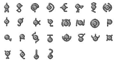
Magnemite/Magneton/Magnezone:

While people say Magnemite is the magnet Pokemon, as you can see there's more to it then being a magnet with an eyeball. If anything its a magnet, metal ball, and screw Pokemon, it actually has more screws then magnets (though the magnets of course are the most visible). It actually looks like a robot based around a theme of magnets than a plain magnet.
Magneton... is just three Magnemites, so I guess take what I said about Magnemite and read it three more times or something. Actually, Magneton has less magnets then 3 Magnemites, for some reason the bottom two Magnemites lost one of their feet screws (the bottom two Magnemite are actually upside down).
As for Magnezone, its actually a magnet combined with a UFO, changing up the design (though keeping the multi-body design as well, except now the "lesser" Magnemites have simply become shoulder pieces, but at least they keep their head screw while the main Magnemite gets it replaced by an antenna). It not only looks more like a robot, it looks like a robot from another planet. They even manage to change up the main Magnemite's eye by giving it a giant red pupil, the better to search out for puny humans to abduct.

Grimer/Muk:

How can a pile of sludge not be a lazy design, let alone two? Well Grimer is an example of simplicity at work. Yes, its a pile of sludge with a face. The pile of sludge has been formed into a vague face and two hands, but its still a pile of sludge. And guess what, that's what Grimer only ever tries to be. It's a toxic sludge monster with over-lapping layers of various shades of purple sludge. It gives it a simplistic personality, thus when it shows off any kind of personality which it can do with it having not only a face but hands it makes the design work even better.
Okay, but isn't Muk the same thing? Yes, but in a different way. While Grimer is able to "stand upright", Muk has completely collapsed under its own weight. It looks like the only thing that's protruding out is the top of its head or gives it a hunchback appearance. Its arms and hands are also less define then when it was a Grimer, it having to spread them out to even look like individual fingers. Finally its face has also gotten so huge that it can't completely open its mouth without their being a streak of slime connecting the bottom and top. It's pretty much what you would expect to happen to Grimer upon becoming a bigger pile of sludge, and that's why the design works.

Onix/Steelix:

The first of the hybrid object Pokemon, Onix is a giant snake made of segmented rocks. That said, its still a bit of a dull design but one major factor of Onix's design is also its size. Those aren't pebbles its made from, those are giant boulders with even the rocks making up its tail being the size of your head. Also they added that spike on the top of its head to I guess give its face some additional features, removing does sort of make Onix look like its bald. Actually you can say the horn helps it look like an animal as many animals have head adornments even if they serve no purpose.
Steelix you would think is the same design but it has some differences to make it different but they make it work. The major change is with the head as they decided to put more emphasis on its lower jaw and replacing the head spike with stubby protrusions making its head look more squished, sort of giving it a brutish appearance. Its body is even enhanced with spikes coming out of certain boulders, which gives it an even large appearance. So with Steelix you can say they further emphasized what made Onix's design work on an otherwise simple concept, rock snake.
We're not going to cover Mega Evolutions since they're a whole different beast.

Voltorb/Electrode:

Another simplistic design. Voltorb is just a ball with eyes, nothing more nothing less. You'd think that would qualify for a lazy design, except that the ball its based upon is a Poke Ball, an important device in the Pokemon world. Suddenly Voltorb's design goes from being lazy as one wonders how a creature like this came into existence looking just like one of the world's most important devices... before it blows up in your face. Because that's another part of Voltorb's design that makes it work, its not only a ball (which gives it a high speed stat) but since it has no arms or legs to attack it has also become a bomb.
Electrode both works and doesn't work as an evolution to Voltorb, and that's to the benefit of its design. It turns upside down and grows a mouth, yet its eyes completely change and the mouth is a toothy grin. It goes from being constantly angry to some sort of a wise guy. Where did the teeth come from? Those eyebrows aren't even attached to its face! You know what Electrode is? It's a JOKE to the concept of slapping a face onto an object and calling it a new creature. That's right, its meant to look ridiculous so much so that they played around with its design to give it things that wouldn't make sense for it to have. And that's why its design works, as its pretty much a parody of the concept. Also all it does it still explode so that helps too.

Koffing/Weezing:

Koffing is a combination of a toxic cloud and a mine, giving us this odd floating purple spike ball filled with gas... that has a derpy face on it. Koffing is already an odd design that just adding a face to it wasn't going to make it any less odd, and so they gave it a face that you wouldn't think would be on an otherwise otherworldly looking object. Koffing has a face of someone you think you can have fun with... until you suffocate on the noxious gas it leaks out. And just to further offset the innocent face, lets put a skull and crossbone just below its mouth. Thus we get a floating purple spike ball of poison has who happily shows that he's highly dangerous. Its the offset that helps with the design.
Weezing is what happens when it realizes its an abomination. It mutates into a molecule-looking toxic cloud mine, with one of its new orbs also gaining a equally frowny face. The last orb is just there to stick them together those some Pokedex descriptions says it also becomes a face, probably also sad looking. I think what makes Weezing work is that it looks so depressed, a complete 180 of how its pre-evolution was portrayed being. Koffing was just happy to be alive, but Weezing just wants the suffering to stop. They make a hilariously depressing comedic tragic duo. Coming this fall to a TV near you!

Porygon/Porgyon2/Porygon-Z:

Based on a 3D object, what makes the Porygon family's design work is that it's actually meant to be a progression of advancing technology. Porygon is suppose to look like a blocky bird-like creature, simple in design since early 3D technology was only able to handle making simple objects like that.
Porygon2 shows the advancement of technology, as now the software that could only handle the low-poly Porygon can now handle an object having more polygons, so Porygon's edges are smoothed out making it look rounder giving us Porygon2. Not only that, they're also able to show more physical details such as the beak being a separate part of the face and the tail having different widths, something Porygon couldn't do as it needed to keep things simple such as having the beak be just the tip of the face but colored differently and the tail having to be a be made of straight lines.
Porygon-Z is both an advancement but also an aversion to the idea. It's a poorly modded Porygon-Z which has caused it to glitch out. The neat thing about Porygon-Z is that you can actually take it apart and pretty much put it back together so that it looks like a Porygon 2 (except the eyes would still be bugged out and the bottom blue part wouldn't exactly match). Comparing it to Porygon2, Porygon-Z's head has been flipped upside down making its neck into a horn while the legs and tail have been moves and flipped so that they're going in the direction of the stomach. They pretty much did all they could to make it look like a glitched out Porygon2 which is what I think one of the neatest thing about its design.
 
I question this whole thread on the basis that Growlithe is a Shisa not a dog :< question it I say!

Ok seriously though, personally I like pokemon designs regardless of origins as long as they fall into 3 general categories:

1) Biologically Neat Things: basically if the pokemon is based on some interesting animal (or plant or other organism really) or if it's typing or abilities are a reference to some aspect of that animal that is not generally mentioned in fiction it is fine in my book, for example Stunfisk is an ugly design but because it's a flatfish I can't get myself to hate the guy cause flatfish are neat, by the same token I really like Anorith but hate Armaldo cause anomalocaris is supercool and Armaldo looks nothing like one.
Now, I usually prefer animals rarely seen in fiction but anything that makes a clever (or semi-clever) allusion to a real animal's biology makes me like a pokemon more.

2) Mythological Neat Things: same as above with with one key difference (besides replacing animal with myth :P) made up things are fine as long as they are clever, for example Klefki, it is not based on anything but key-rings really but it's supposed to both steal and protect keys, to both help and distress people; now that doesn't seem like much but Klefki is also a fairy type and the way it acts is so totally how faeries act in folklore even the fact that what it does it is a relatively minor thing fits with faeries in spite of there being no actual myths about key stealing faeries. References to things that aren't technically myths but are archaeologically interesting and somewhat mysterious (oOoOooooo) are also alright in my book, the fact that there a pokemon based on moai and kachina dolls is something I really like and I hope to see more of.

3) It Doesn't Have Random Stuff Attached to It: Ok I'm kinda cheating in this one but this is how it goes as long a any part of a pokemon doesn't conflict with the rest of the design or is complementary to it that pokemon is kinda ok i guess, take for example Suicune, it is as far as I'm concerned the worst design Gamefreak ever made and not because it's "overdesigned" Hoopa is overdesigned and I like it alright, no is 'cause that mane/coat/water/thing on it's back makes it look clunky an confuses the overall design (the stripes or ribbons or whatever make it worse) or to put it another way Reshiram is overdesigned but it's a good design until it gets to the tail, see how it conflicts with the rest of the pokemon? that is what I mean.


Also I disagree with the whole "inanimate objects are becoming more common" thing, they aren't, pokemon tend to reference organisms or myths a lot even if that references seem obscure (in most of the world anyway, cliones are super well know in japan) to give an example; people complained how Honedge was "just a sword" but it isn't, it is a reference to several mythical living swords like Frey's for example http://www.pantheon.org/articles/f/freyr.html
 
Last edited:
Question!

Does animals only mean no legends, cyptids, mythological creatures, or yokai? Because if so we're cutting off at least three entire types (fairy, dragon, and ghost, for sure; steel being a maybe) in addition to inanimate objects or human-shaped.

While the majority of pokemon are based on animals, I think we forget sometimes that pokemon stands for pocket monsters with an emphasis on monsters, they can be whatever they want to be. Plus I want my dullahan fairy-type.
 

Codraroll

Cod Mod
is a Forum Moderatoris a Community Contributoris a Top Smogon Media Contributor
Moderator
The thing with the examples we've had of washing machines (Rotom) and lamps (Lampent, Chandelure), is that they're clearly portrayed as ghosts. That is, spirits having possessed various objects. I feel you're allowed to do a little more with that. The designers can be more explicit in the inspiration, because the Pokémon aren't meant to be animals. There is no digestive system, sensory system or limbs to worry about. It's a spirit - in and itself a comprehensible identity - which has taken possession of an item and made it its body. Steel and to some degree Rock Pokémon can do something similar, being "dumb objects" without spiritual powers.

The gap between object and animal can managed in two ways. The first is by closing the gap as much as possible. Either, making the object-based Pokémon decidedly un-animal (such as Magnemite, Cryogonal or Klink), or decidedly un-object (such as Chimecho or Darumaka). Alternately, the gap can be bridged by adding a supernatural element as explained above. This element is usually a secondary typing, such as Ghost, Psychic or, recently, Fairy. By saying "this one works because magic!" the designers create some suspension of disbelief. A legendary status can also work well as a supernatural element, explaining why Pokémon such as Regice can work. A somewhat rare category of supernaturality is mutations. Objects coming to life when certain chemicals mix. Examples would be Ditto or Grimer, arguably also Voltorb.

Problems arise, though, when the gap is left wide open. When Pokémon based entirely on man-made objects are given animal properties without explanation. This is the uncanny line the Vanillite line crosses. Their design is like ice cream cones, but their nature is supposedly animalistic. They live in herds like penguins (or mammoths?), yet their entire biology seems to demand a supernatural component to a much greater degree than other animal-like Pokémon. They're also given a remarkably flexible face for being based on objects. The Vanillite line lacks the component of supernaturality that bridges the gap between lore and design for most other object-based non-animal Pokémon.

Garbodor is to me an example of a semi-bridged gap. I can buy it as a creature, but as an object come to life, there is something lacking. Its body too solid, too many animal traits are present (such as limbs - two arms, two legs) for it to be a convincing mutation of trash. The result of that would be goop like Grimer, or a heap of loose material like... uhh... Golem(?), not a troll-like creature. But if pretended to be an animal having evolved from the mutated trash Trubbish arguably does a decent impression of, that's fine by me. I can buy the idea of a Trubbish spawning in nature. Not so much Garbodor.
 
Also I disagree with the whole "inanimate objects are becoming more common" thing, they aren't, pokemon tend to reference organisms or myths a lot even if that references seem obscure (in most of the world anyway, cliones are super well know in japan) to give an example; people complained how Honedge was "just a sword" but it isn't, it is a reference to several mythical living swords like Frey's for example http://www.pantheon.org/articles/f/freyr.html
Yeah, many of the Pokemon are references to Japanese and other Eastern legends and myths, the likes of Growlithe/Arcanine(There's a reason why Arcanine is called "The Legendary Pokemon" even though he himself actually isn't actually a legendary in the Poke-verse), Arceus and Honedge like you mentioned. I think it would do many of the hardcore Pokemon fans good to go and read up on some of these legends, it would give them a much greater appreciation of the games and give them some insight into the inspirations of the designs of many of the Pokemon.

Also, many of the Pokedex entries start to make much more sense when you know what Eastern legend they are referencing.

Question!

Does animals only mean no legends, cyptids, mythological creatures, or yokai? Because if so we're cutting off at least three entire types (fairy, dragon, and ghost, for sure; steel being a maybe) in addition to inanimate objects or human-shaped.

While the majority of pokemon are based on animals, I think we forget sometimes that pokemon stands for pocket monsters with an emphasis on monsters, they can be whatever they want to be. Plus I want my dullahan fairy-type.
Yeah, we have to remember that whilst many of the Pokemon designs are inspired by real life animals, they aren't actually animals, just like the design of the Turians in Mass Effect is inspired by birds, but the Turians themselves aren't actually birds. Pokemon are their own separate entities, with no relation to the beings which inspired their design, so they can be whatever they want to be.
 
You know Codraroll I think your problem with the Vanilluxe line is because you're thinking of it like an animal when Gamefreak envisioned it more like a mineral (that's my guess anyway) like imagine the same concept but as a stalactite with dirt on top.

I imagine they work like this; you're in a frozen cave and there are icicles on the ceiling,nothing out of the ordinary when suddenly one of of them dislodges and ohman it's actually a pokemon, and I imagine that if you don't catch it, it'll float back to the top of the cave and bury its head back on the ceiling leaving only its lower half exposed, like icicles are actually Vanillish and only move in the wild when they have to due to falling down or cause their cave got to hot.

Of course this is just my interpretation of the line, but it makes the whole line more palatable I think.

Otherwise it's intentionally silly and illogical and the equivalent of Gamefreak making a stupid face at it's audience so they'll laugh ("look at me! O3O aren't I ridiculous?" the SpongeBob effect I call it)

Or maybe Vanilluxe is supposed to be both.
 

Codraroll

Cod Mod
is a Forum Moderatoris a Community Contributoris a Top Smogon Media Contributor
Moderator
It was envisioned like a mineral, maybe, but its appearance is, well, rather the opposite. All three members of the family have got a (very derpy) face. Their design is too symmetrical and "polished" to even resemble icicles, they lean far too heavily on the ice cream side of things. Vanillite is even flat on the bottom and has a twirl on the top. That's clearly not an icicle vaguely resembling an ice cream, that's an ice cream not even remotely resembling an icicle. The two evolutions look more "natural", but still way too little mineral because of the huge, expressive face. Add to that the smoothness and symmetry of the ice, as well as the frickin' straw sticking out of Vanilluxe's back, and the entire evolution line looks man-made from the ground up, rather than like anything that could have evolved in the wild even within the rules of the Pokémon universe, which just cuts off the suspension cord of disbelief.

Smeargle's Studio ran a contest a while back on redesigns of various Pokémon. One of the rounds featured the Vanillite family. I feel like shamelessly plugging my (second-to-losing) entry here, just to give my two cents on how the design could have been so much better with just a few simple touches:


Female and Male, respectively, drawn into the same model for simplicity. I made the faces way less expressive, and designed the bottom part to look like the entire thing was dislodged into the ceiling of an ice cave. That means ditching some of the symmetry, and the two small spikes. The difference between male and female is basically the composition of the "eyebrows" as well as the placement of the mouth - what looks like a frozen moustache on the male looks like muffs on the female. The ice is meant to look frozen and twisted - like the aftermath of a blizzard - rather than soft and smooth like a scoop of ice cream. The top of the heads is given a "crown" of ice crystals rather than a swirl like a soft ice cream. All semblance of arms are removed, they served no purpose anyway. I barely touched the basic shape of the Pokémon, nor did I invalidate any piece of its lore or design concept. The semblance to an ice cream is still very much there, albeit less in-your-face. If I may say so myself (though I'm not entirely unbiased here), this looks a lot more like a creature you'd find in an icy cave than GameFreak's take on the concept.


Female and Male, respectively, drawn into the same model for simplicity. I made the faces way less expressive, and designed the bottom part to look like the entire thing was dislodged into the ceiling of an ice cave. That means ditching some of the symmetry, and the two small spikes. The difference between male and female is basically the composition of the "eyebrows" as well as the placement of the mouth - what looks like a frozen moustache on the male looks like muffs on the female. The ice is meant to look frozen and twisted - like the aftermath of a blizzard - rather than soft and smooth like a scoop of ice cream. The top of the heads is given a "crown" of ice crystals rather than a swirl like a soft ice cream. All semblance of arms are removed, they served no purpose anyway. I barely touched the basic shape of the Pokémon, nor did I invalidate any piece of its lore or design concept. The semblance to an ice cream is still very much there, albeit less in-your-face. If I may say so myself (though I'm not entirely unbiased here), this looks a lot more like a creature you'd find in an icy cave than GameFreak's take on the concept.
That is so cool the pun the pun the horror

I admit it is a superior design, I particularly like the crystals on top they look like sprinkles.
 

Celever

i am town
is a Community Contributor
The Vanillite line was designed when the design team visited a zoo for possible inspiration and a designer had a mind blank, thinking that the ice cream he had bought earlier was actually an ice cream. Dumb and farfetched? Sure, but this story has been confirmed by Game Freak. This explains why Vanillite is so animalistic; when the designer of it (I believe it was Vanillish who was originally designed) created the concept, Vanillish was an animal.

Please don't take this the wrong way Codrarool, but I actually think that Vanilluxe's original design is heads and shoulders above yours. Vanilluxe isn't this strong, rugged Pokémon. Think about it for a moment: How good are its stats? Godawful. Its movepool is lacklustre too. Vanilluxe is supposed to be cute and derpy. Someone mentioned the spongebob effect earlier, and this is like that. Kids love ice cream, and the Vanillite line is the complete embodiment of an ice cream Pokémon. The progression of the concept through evolution is also very clever IMO.

I want to say more but I'm on my phone and in a foreign country...
 

Pikachu315111

Ranting & Raving!
is a Community Contributoris a Top Smogon Media Contributor
A few quick comments:

1. While I'm doing objects at the moment, I'll go into things like plants, mythical creatures, and concepts later on. Thought I'd just pace myself.
2. Codraroll pretty much hit the nail on the head with the problem with the Vanillite family: their lore says they're icicles that just so happen to look like ice cream, but they look TOO MUCH like ice cream. The picture that Codraroll drew more represents the concept of the Vanillite family. I can still see a resemblance of an ice cream cone but at the same time I can also see its still an snow covered icicle. Its progression is pretty clever as Celever said... if it was treated like ice cream. But its not, its a living icicle who has molded the powder snow on its head to look just like ice cream (and Vanilluxe having a random tube of ice that just so happens look like a wafer straw). But we'll get to the Vanillite soon enough.

Natu & Xatu:

First up is another hybrid Pokemon, though its not really prevalent to Natu. Natu is just a bird with some may say Native American markings and design features (like the feather sticking out on the stop of its head) and is more meant to help with Xatu's design.
Where the object comes in is Xatu where it becomes a totem pole bird (its much more obvious when it has its wings out thus why I included its DP sprite. Oh, and when it's also standing on the ground, Sky Battles...). Now they could have overly designed Xatu easily but they decided to keep things simple and I feel that works. Being bright green Xatu already catches your eye. Also it would probably look odd to have a "full" face or even more than one pair of eye markings, limiting it to just a single pair of eyes not only helps show that yes its a totem pole but also works when it has its wings open or close. Now looking at it I also want to say Xatu may also have a bit of a wigwam (a Native American tent) design to it as well, like the wings are the door flaps and it opening it reveals the face looking at you from inside (it probably plays a mean game of peek-a-boo). Also its face looking like a de-winged Natu helps further build the totem idea as many totems use animals standing on top of each other and a popular animal is often a bird of some sort. So Xatu looks like a Natu standing on top of a veiled face... almost makes me want Mega Xatu to have wings and a top head feather on it.

Unown:

Unown I would say is the first object Pokemon who's design I would say not totally have worked, though mainly because its not meant to be used as a Pokemon. Unown, the former king of the form gimmicks before Spinda and its 3 million variants came out, though at least for Unown they actually physical change shape. Anyway, Unown are meant to be used as letters, something Game Freak likes to remind us about all the time. And while I do sort of like the way they shaped them for each letter (you can tell they had to skip a few early on and get creative with later (even having to use the lowercase) like with C, g, q, and V; I find that a bit funny), the question of their existence does come up. Yes, this question is asked in the game too but if you think about it it still doesn't make much sense. Ancient people must have worked real hard to form an alphabet using Unown instead of just easily making up their own symbols (well, at least for regions which had Unown, and all of them somehow ended up with the same way to spell words). Also, did modern people create the modern alphabet off the ancient Unown language, and if so why did they just no keep the Unown symbols? How have we lost the connection between the english alphabet and Unown after all these years then? It's a design that's just meant to be used as a gimmick and raises a bit too many questions for me to take it seriously, which also describes Unown's battling capabilities.

Wynaut & Wobbuffet:

One of the com mons that are able to take on Legendaries because they'll gladly take a hit, both are actually based on two different objects which sort of do the same thing.
Wynaut is based on an object called the okiagari-koboshi, a Daruma-like object and is used to represent perseverance and resilience as it has a rounded weighed down bottom so when you knock it over it lifts itself upright again. However Wynaut doesn't look like your typical okiagari-koboshi which I think works to its benefit as it allows them to shape it into a mini-Wobbuffet which its trying to be. Actually it's sort of like a deflated Wobbuffet, the bulb on its forehead is seen on the back of Wobbuffet, its ears resemble Wobbuffet's arms, and it still has a similar face and that mysterious black tail. It works as it takes precedence of being a natural creature, looking like a mini-Wobbuffet, then trying to resemble a traditional okiagari-koboshi.
While I know Wobbuffett (and in relation Wynaut) are partly based on a comedian act, that's more on how they act. We're focusing on design and Wobbuffet is akin to a punching bag with the gimmick that what you can give it gives back on the back swing. Because its based on a punching bag it has a simple design, and it was a good idea to make it blue as to have some uniqueness (many punching bags are either tan, brown, or red). Also the added lore about its tail helps make it feel like a more natural creature, even possibly explaining why a creature has evolved in a way that it fights by first needing to be hit. Are you hitting the real Wobbuffet, or are you hitting a flesh puppet while the REAL Wobbuffet is a rather pathetic black creature lurking behind the puppet in the shadows, safe from harm...

Pineco & Forretress:

Another hybrid, one a bit less obvious.
Pineco is a pine comb combined with a grenade, which explains why they like to explode. Now Pineco is a rather plain design, NOT SIMPLE, plain. It's a pine comb that's blue and has eyes. That's it. Is it a bad design? No, they actually do try to somewhat make a face out of it by having the top middle seed look like a sort of nose and the two beside it like cheeks (and the two above the eyes look like eyebrows), however at the end of the day its still a blue pine comb... that has some grenade similarities.
Forrestress... doesn't really fall into this category. It takes much more after the bagworm aspect that Pineco's Pokedex description tried telling you it was. It does has those hollow spikes on its side which you can say resembles defensive cannons when it closes its shell, however it still looks more like a clam shell then a fortress.

Qwilfish:

Qwilfish is a brilliant combination of a puffer fish and a mine (which you'll recall what Koffing somewhat resembled as well, but for Qwilfish its more appropriate as its in the water). Qwilfish has a simple design, its a spike ball with a tail fin. I would be saying its more heavily leaning to its mine inspiration because of that, but I do think it keeps enough of its puffer fish aspects (the tail fin and ability to puff up) that I'd call it 50/50. Actually its when its puffed up does it start really looking like a mine, because most of the time it actually looks like a spiked mace, though it would be pretty unwieldy due to its tail not making for the best handle. Also another nice animal trait, its blue on top and white on the bottom, similar to how some real aquatic animals are camouflaged (looking at them above they'll blend in with water while looking at them from above they'll blend in with the light shining down).

Remoraid & Octillery:

A mistake often made about the Remoraid family is that its a fish evolving into an octopus. This is wrong. Its a pistol evolving into a cannon. Makes sense now? ;)
Based off an enemy from another Game Freak game (the pistol fish from Pulseman), Remoraid is a fish that's been shaped to resemble a pistol. Its back fins look like a handle and flintlock, it has a bottom fin that's the firing trigger, and a horn that's the sights some pistols have to aim better (not to mention an always open mouth which squirts high-pressure water). The fish they chose is a Remora which has the "trigger" fin on the bottom and a slender appearance so its not a bad choice (though sadly they aren't a species of fish that spit out water, however they are a species of fish which do hand around manta rays thus fitting into the Mantine/Remoraid relation better). It's a bit ugly, though maybe it can be passed off as cute ugly?
Octillery is an octopus that's a cannon. A bit less obvious then Remoraid being a pistol, but it's mouth is shaped like a cannon (similar to Forretress's spikes) and you can say its orb-like suckers are either wheel-like or cannonballs laying around the cannon. While Remoraid had a bit of a complicated design to get it to work, Octillery goes for a simple design which I sadly don't think helps it. While I'd say it would look fine on its own, when paired with Remoraid its design failed to convey "pistol into cannon" which may have resulted in people thinking "fish into octopus".
 
Vanilluxe actually has a pretty high BST for an ice type so don't think he's a total joke.

Before continuing I want to look at what I think is Gamefreak's general design intent when making a pokemon, I found 3 general trends:

Cool: Pokemon whose intent is to get it's audience to think "man that guy looks awesome, I want to battle with it" pokemon like Garchomp, Scizor, etc. it also encompasses Scary pokemon too because they convey the same message: this guy is good in a battle. Note that that's the intent not the competitive reality.

Cute: Pokemon that try to make the audience go "awww that' so cute I wanna raise one" Pokemon like Cinccino, Wigglytuf, etc. it also includes Beautiful pokemon like Milotic or Aurorous.

And finally Goofy: Pokemon whose intent is to make the audience laugh "ahahaha, look at that guy, look at that stupid guy, it'd be hilarious to own one" guys like Slowpoke or Spinda.

So why do I bring that up? Because regardless of it's inspiration, is pokemon that are Goofy the ones that generate controversy among fans.

People didn't complain about Golem because he's Cool even though it is literally a rock, also Chandelure is generally agreed to be one of the best gen V designs among fans in spite of being a chandelier (I re-emphasize generally) and I'm pretty sure it's because Chandelure is also a Cool/Scary design.

Now let's look at some of the designs that people complain most about; Garbaodour, Vanilluxe, Bibarel, Stunfisk, Kelfki, two of those are animals but all of them have the same design philosophy behind them, they're all Goofy (arguably Klefki could be Cute but it certainly looks to me like the intend behind it is to be Goofy)

This is why I think that, even for its audience, there's no problem with a pokemon based on an animal or not.
 
Last edited:

Codraroll

Cod Mod
is a Forum Moderatoris a Community Contributoris a Top Smogon Media Contributor
Moderator
Please don't take this the wrong way...
No offense taken...

Codrarool
...But misspelling my name is unforgivable! Unforgivable, I say! :D


The Vanillite line was designed when the design team visited a zoo for possible inspiration and a designer had a mind blank, thinking that the ice cream he had bought earlier was actually an ice cream.
Umm... there might be something wrong with this sentence. Why would the ice cream not be an ice cream? Was the zoo that heavy on the bootlegged ingredients that the FDA wouldn't allow them to call it that? Did he buy a popsicle, which has no cream in it? I feel that you're trying to make a point here, but can't really figure out what...
 
Edit: There was an image here, but then I remembered Smogon's policy on memes. Sorry!

On topic now: I think the animal/item/monster the pokemon draws from has been proven less important than the overall asthetics of the design. Although most of my favorites come from when Gamefreak pulls from rare and less known animals (Goomy-line for dragonslugs, Relicanth the coelacanth, whatever the heck Executor is supposed to be...).

Like how (overall) honedge and doublade were found boring and uninspired but then Aegislash came along and "ALL IS FORGIVEN!"
 
Last edited:

Users Who Are Viewing This Thread (Users: 1, Guests: 0)

Top