CAP 20 CAP 20 - Art Submissions

Status
Not open for further replies.

Quanyails

On sabbatical!
is a Top Artist Alumnusis a Community Leader Alumnusis a Community Contributor Alumnus
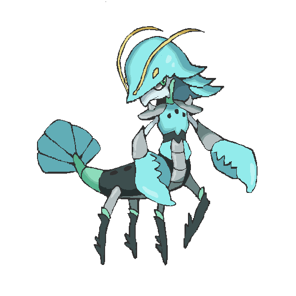
A sketch of the Loch Ness Shower, inspired by Sgt.Moose's critter and this ladle. :P Might add more details if it's a bit too bland for others, since it's just a sketch for now.


A general comment: I personally tire of marine, more fish-based designs since we've had Volkraken and Plasmanta as the past two CAPs. I'll take a lot to get me interested in them, but if you think you have a successful-enough idea, give it a shot. :)
  • PixelMoniac_: Fits Water- and Steel-typing nicely. I can see it using Dragon Dance and Calm Mind. The two design elements work together quite well! :)
  • Knirp: Cute and creative is what I have to say. :) Lovely use of contrast to show the types well. I would say, if you can, to make the bluish body more than a tube with fins at the end, though. Some texture or lateral asymmetry would give the creature more interest instead of just the scuba gear.
  • hendrix96: Hmm, Cawmodore already has an anchor incorporated in its design, so there might be redundancy there. :/ Does it have to be an anchor?
  • Integer Mova: Great choice of inspiration! I wish the design was a little more obvious that it was a turtle, though--maybe just change the perspective so the shell is a bit more clear. Otherwise, I'm not seeing turtle at first glance.
  • aXl: Cool inspiration and solid drawing. Overall great sketch. It doesn't 'wow' me in particular, though, but still, it's solid.
  • Golurkyourself: Your design hits all of the marks I'm looking for--Water/Steel, plausibly using Dragon Dance/Calm Mind, and a creative creature of origin! The only thing I'm not as fond of is the design itself. XD It reminds me of inflatable balloons, since it's smooth, shiny, and has 'painted' patterns on the skin. Still, with what you have right now, I definitely love the drawing.
  • Sgt.Moose: Aww, it's cute. C: It fits what the CAP is looking for, no? I like that 90-degree bend and how artificial it is, conveying Steel-type well. Also, that pipe vs. its bulging body is a great contrast! I'd personally use brighter or alternative colors rather than Water blue and Steel gray. It's quite mundane that way.
  • Sunfished: Neat-o. Creative choice of colors for the typing. :) I think the head is interesting enough--no need to add superfluous detail.
  • Magistrum: Clever integration of physical/special attacking. Great design. A little bit more complex than what I'd prefer, but that probably can't be helped with the Steel-type plating. Excellent. ouob
  • Igloo the Almighty: Hmm, submarine fish fits under my umbrella of uninspired. How much are you willing to change the drawing? Currently, the wobbly lines and misaligned pose don't do it technically for me. :/ The design itself also feels... well, a bit lacking, compared to some other art in this thread, to be honest.
  • justinjiaxinghu: Fits the CAP. Not bad. ouob We do have a land narwhal CAP, though, so just be aware of repetition among designs.
  • Doran Dragon: Cool! Neat design, and I like your choice of colors both before and after. Mercury is a nice idea for Water/Steel, for sure, but it's harder to understand that in your drawing with your new choice of colors. On the other hand, the old palette may be considered bland. I kinda prefer the old palette since overall, the design loosely reminds me of Plasmanta. >__>
  • Slapperfish: I'd use some more shading to get across that the fish is Water/Steel rather than Water/Rock. It reminds me of a rocky coelacanth otherwise. For a staple remover, I'd hook the teeth backwards some more.
  • HeaLnDeaL: Ah, now here's an interesting concept. I wouldn't associate llamas with water and steel. How'd you come up with the design in the first place? I'm curious. If possible, I'd make the design less overtly a llama dressed in ninja garb. I'm thinking of how Cobalion is wearing armor, but it's well-integrated into its body structure. Do you think you can do something like that here?
  • KAIZA: Really nice drawing! :) I love the use of line thickness to give that sense of 'it's huge and looming above you from the ocean surface'. The inspirations integrate together well in your design. I think that the anchor on the side of the head is a little artificial of a marking. We have Koffing/Weezing, yep, but Gen. VI Pokemon don't have that sort of thing--feel free to respond if I'm missing something there. I wholly like your drawing. :) We have a squid CAP in the form of Arghonaut already, though, and we have Volkraken as an octopus, just to warn you. That might dampen interest in another design of a similar nature.
  • Bramblestein: Cute idea, but is a manatee with a propeller on its back that organic of a design? It's a bit artificial for me. If that fan can be incorporated more, I'd like it more.
  • Otter Power: I'd go for the otter if only because I'm tired of marine animals. XD Well, not just that; it also looks more like the type to use Dragon Dance and Calm Mind.
  • aim: I'd have to say that PixelMoniac_'s battlewhale eclipses yours, at least with the current image. Sharpening lines would bring it closer to par, but design-wise, I prefer PixelMoniac_'s.
  • Key: It's an unusual fish that does little to interest me as a design. o3o
  • RiCH HOMiE CHRiS: I actually think this design could become worthwhile if more effort was invested into making its lines clearer and sharper. Of course, the design would preferable be less piecewise. What is exactly happening in the gray area? I'm not seeing what it's meant to be.
  • Emvee: All of the attention in your design seems concentrated at that snail shell helmet. If the body were more clear in the art rather than being obscured by the cape, I might say otherwise.
 
A WIP of a my CAP entry, supposed to be a cross between a dart and a narwhal.

Yes, I know there's already been a narwhal CAP but this narwhal is different in a lot of ways, okay. I know it doesn't look organic, but i really do need your feedback and comments onto how to make this CAP worthy, so please, feel free to give feedback. EDIT: I made a slightly better looking one, and it's smaller so size isn't an issue anymore.
 
Last edited:
Oh look its me with my CAP entry which i have to majorly redesign about three times before anyone likes it as usual

Basically its like a greek siren/mermaid. and it sits by the sea and sings and combs its hair and stuff. then it takes the comb out of its hair and wears it as a mask and takes its claws out its hair like one of them psycho killers if you get me and its tail can split into legs and shit. It has shiny gold scales and a gold mask and metal claws idk. plez tell me what to improve idek what this is
edit : nooo she looks like an 80s disco dancer lool. guess thats okay for dragon dance tho XD
http://i.imgur.com/5F0fqHd.png the mask supporting art

DJD EDIT: Please observe the rules in the OP regarding the file size of images. Changed the image to a link.
I think I fixed it but let me know if I didn't >o> sorry
 
Last edited:
More feedback!

Quanyails That Loch Ness Shower is so adorable! I squee'd right away! I took your advice on the turtle, and I made his shell slightly bulkier, and added that white circular piece that Blastoise has. Does it help at all? If it doesn't resemble a turtle enough, should I call it "Netaro-CAP" instead of "Turtle-CAP" because of his mythos?

Hollymon Your siren is adorable as well. While I see a vague resemblance to Meloetta when the siren doesn't have the mask, that can always be worked around. It's probably just the eyes.
 
Last edited:
WIP

Here is my humble effort, based on olms and lindworms.


The two half-shields either side of its head are in place of gills and can be put together in front of the head to defend it. For some reason, it also has some random magic gem stuff going on for some dragon-y psychic-y mystique.

Edit: Must've forgotten to say - comments would be appreciated. Thanks.
 
Last edited:

Unsee

so smart me, enjoy book so much
is an Artist
Welp, this is probably the roughest sketch ever to grace the Internet.
http://i.imgur.com/vmsv5gL.png (also below)

Wow... that's actually pretty big... Anyway, this is NOTHING compared to what the final design might become, as there is an obvious lack of detail and hair-splitting concisement. Also color.

I tried to stray away from the fish/typical marine creature infused with steel objects, so I made an alligator-esque design infused with steel objects instead. I don't know, guys - continue or naw?

DJD EDIT: See the OP rules regarding image size and use of HIDE tags.
 
Last edited by a moderator:
So, I looked at the criticism for my design, and decided to completely redo it. So, here's my new one:


I was wondering what to do with my design, when I realized;

There aren't any barracuda Pokemon.

And so, this weird thing came into existence. It's still somewhat combined with a sub, but it's much more subtle (the tail is probably the least subtle thing, besides the cannon) To make up for the lack of any special attacking stuff, I added a cannon into the mouth to replace the torpedo tube from the original design. I must say I like this design better. c:

Once again, C&C would be appeciated!~

EDIT: I modified the design a bit based on TUP's comments; it's pretty much a robotic barracuda-thing now. Spooky.
 
Last edited:

Unsee

so smart me, enjoy book so much
is an Artist
Igloo the Almighty I love your design - the colors are awesome. One aspect of it you could change, though, to make it look nicer, would be to make the tube/pipe in its mouth originate from the throat (unless your intention was for it to be connected to a blowhole or come thing like that).

My one other problem with it is that its Steel typing is only represented by the cannon in its mouth. If it closes its mouth, it has no visual reason to be a Steel-type. Maybe you could make that already metallic-looking dorsal fin a bit more metallic - maybe even sharpen it a bit! :D
 

Sunfished

fisch
is a Top Artistis a Community Contributoris a Forum Moderator Alumnus
More progress!

I gave him a better pose as to see his anatomy better, and made him a walking fork. Taking in Quanyails feedback, I ended up just adding another prong/tube on his head, which actually makes him more water-typed, somehow. I also made the legs more like stumps, and made the body and arms much shorter.
I guess this is as good as I can get him to be, but of course, I'll be happy to hear more feedback!


Crustaceans are somewhat an obvious choice for a Water/Steel Pokemon as the shells can lend itself to be made as armories which adds necessary tones in showing the latter typing. Going with this, I came up with... kind of like a, lobster+centaur(?) samurai. I'm not fully satisfied with it, but it's the best design I have made so far. I'm starting to see some hints of Clauncher in the design, with the look of the helmet and the palette, so definitely I would be working on that if I am going to continue with this concept.

DJD EDIT: Please observe the rules in the OP regarding image sizing. Changed the image to a link.

(Sorry about that :x)
 
Last edited:
Ok After looking up water/steel fakemons for inspiration, I came upon one that looked so much like mine that I have decided to abandon my anchor shark design. Now Im kinda branching out to some different designs. My first design is an armored salamander, I have one other idea except for this one so I will post again after I finish it, but for now here's the armored salamander

Again this is another rough draft and with two possibilities I would love comments & constructive criticism on these two as I really feel like it needs more development.

Anyways thanks to everyone who commented on the last one :)
 
Last edited:
WIP maybe


Yay! Now its body is made of water. Doran Dragon suggested this and it kinda was my idea to start with so there you have it. I also fixed the feet as I thought they looked bit dumb.

OH WOW LOOK IT IS SUPPORTING ART!
CLICK HERE CLICK HERE!
 
Last edited:

This is my first draft. Please give me suggestions to improve! I just thought of a gorebyss and a bisharp.
EDIT: Sorry, is this pixel size okay?
 
Last edited:
Based in part on Doran Dragon's criticism, my lindworm has undergone quite a transformation:


I have delved a little into the folklore of my native England and inserted some inspiration from the Lambton Worm - a creature that was caught by a young man out fishing, then trapped in a well until it grew into a fearsome dragon, which the young man then slew.

Edit: I won't be able to scan anything in in a couple of days, so the image now complies to final submission standards if I need to post it as such.

Edit 2: Have some kinda random supporting art (all drawn in pencil, so a bit faded). Enjoy!
 
Last edited:
WIP

http://i.imgur.com/BbjyjES.png

Currently only line art, and is actually my first CAP art (And my first piece of decent art in a while). I based it off of a swordfish, while going into a bit more depth with the sword part. Kinda going off something similar to Shrips from kid icarus, with the scimitar like blade prouding from it's nose, with the rest of it resembling a normal sword fish. I feel like I need a bit more armor on it, and add a helmet (I'm looking towards a centurion-esque one) and maybe stylize it a bit. Anyway, critique away
 

Magistrum

DOITSU NO KAGAKU WA SEKAI ICHI
is a Top Artist Alumnus
Thanks for the feedback! ^_^

Integer Mova don't worry I'll make sure not to resemble the krill :P
Doran Dragon I think you're talking about the peacock mantis shrimp, which definitely has a multitude of colors. While I know that I could not incorporate all its colors due to sprite color limits, having fewer colors doesn't automatically mean injustice since there are many other species of the mantis shrimp, like the zebra mantis shrimp and the purple-spotted mantis shrimp, which only have 2-3 major colors throughout its body. :) And yes my sketches do tend to be messy and has lines all over so it might have looked overdesigned on some parts haha
paintseagull yeah I agree it looks robotic, but I guess as a water/steel crustacean with cannons on its limbs, it's inevitable haha. This current design isn't final yet tho, and I might get an idea to make it more organic depending on the ability we get :3
Quanyails thanks! :) I hope the current one I got is less cluttered than my sketch haha
~~~~~~~~~~~~~~~
A progress update :)

Boo.

Yes I agree that the earlier sketch looked overdetailed on the head part and seemed robotic, so I merged the horn segments into one instead to offset it. So far the color scheme I got is teal and red-orange/whatever-the-hell-you-call-this-shade-of-red. I added silver and yellow as an accent and a nod to the steel typing.

Also feedback to some designs (sorry I can't comment on everyone, it's probably because that someone had already commented what I wanna say)
Knirp nice art so far! Although the lack of pectoral fins makes me think it swims kinda awkwardly haha. There's a lot of potential on the scuba fish concept tho, so that's a plus :)
Golurkyourself oh i remember this little guy :3 I have no critique for this apart from maybe making the steel-typing more apparent somewhere since in the spriting stage the sheen of its body might not be interpreted much.
Doran Dragon awesome mercurymon concept. The subtle reference to Mercury's staff is pretty nice too. I guess I like the red&blue color scheme, tho you could add a bit of gray to that as well. I agree the design looks specially biased, tho you could incorporate something else to the design to offset that.
Slapperfish Pretty awesome design as well! Like others have commented tho i think the craggy scale parts reflect rock-type more, so you can either turn them into smoother metallic scales, or keep them while adding some more of the stapleremover concept onto other parts of its body.
KAIZA I really like your design, and the idea in itself is quite witty. Although tbh I don't see any warships that are bight red (correct me if I'm wrong). IMO you could lessen the red and/or incorporate a different color, but that's just me :)
Quanyails d'aww :3 it's adorbs. I think a few gold accents might give it additional oomph and class, but it's your call :)
Wobblebuns yay for crustaceans ^_^ I really like what you've got so far. A minor nitpick is that as a samurai/knight themed mon it's pretty hard to imply special attacking, but that's just me :P
 

Yilx

Sad
is a Top Artist Alumnusis a Smogon Discord Contributor Alumnus
Thinking of something that could probably use both Calm mind and Dragon dance properly,


(1) is a Liquid Metal Otohime, (2) Is a metallic Coelacanth thing.

EDIT: Thanks for the feedback guys, narrowed down to 2 designs

Commenting on my more favourite designs:

Golurkyourself Looks as good as it is, maybe play around iwth the silhoeutte to fit the stat spreads and abilities when the time comes.

Magistrum Stop being so OP

Sunfished This one is really cute, I'd like to see this one finished.

Doran Dragon Very nice silhouette and simple design.

Key Beautiful

Hollymon Nothing much that I can actually say except I really like the concept. Would like to see you work on her more too!
 
Last edited:

Deck Knight

Blast Off At The Speed Of Light! That's Right!
is a Forum Moderator Alumnusis a Top CAP Contributor Alumnusis a Top Smogon Media Contributor Alumnus
Once again, another art thread with some *GREAT* Submissions already.

Knirp I think the design would look a lot better without the pipe and snorkel. They just seem to make it complex, clunky, and asymmetrical and not in a good way. - ALTERNATIVELY you could double up on the pipe/snorkel (presumably forming an X pattern in the back) and making the snorkels more like horns. The tubes also could (in my imagination anyway) actually be fists that form the appearance of tubes when held close to the head. Dunno. Either way it just seems to be stylistically incomplete.

Sgt.Moose This thing is adorable. One of the best simple designs I've ever seen.

Magistrum My only suggestion is not to overdo it on the segmenting and small details. Most of those will end up buffed out in sprites due to size restrictions, but my experience is that designs that go on the higher level of Sugimori Art (Think Aggron, Rhyperior) detail perform better. Crawdaunt is incidentally not a bad reference point on both counts, actually.

justinjiaxinghu Looks like a good start. Keep working on this design, don't let the fact Colossoil is out there dissuade you, your design has a much sleeker and more aquatic feel, as it should.

Doran Dragon solid submission as usual. No other comments, you seem to have this one nailed down.

Slapperfish A lot of people are saying the scales look a little too rock-like. Here's just a suggestion, but change the scales so they look like staples instead of rocks. It will add to the theme of your design, look "more Steel" and address some of those concerns.

HeaLnDeaL I am Lluzumaki Naruto! Keep working on the fur, looks a little too bumpy right now.

KAIZA My only worry here is the proportions seem out of whack. I don't know if it's just the pose, but I can't quite tell which parts of the design are supposed to be large and which are supposed to be small.

Bramblestein Also adorable. Finally a manatee that can teach those boats a lesson!

Otter Power I like the otter more. The Decorator Crab seems less fleshed out as a design and will likely face stiffer competition. Someone noted the idea is was more like a capybara. I know it will be less otter-like, but I think more prominent teeth would help distinguish it, give the "Steel element" a little more bite, and differentiate it more from Dewott.

Quanyails Also adorable. My chief worry is that the back looks too concave. I know it's supposed to be a tub, but maybe if it were filled to the top with sudsy water like a bubblebath to gel with the rest of the design?

Hollymon Stylize the mask a little bit more, which I think is your intent anyway. Maybe with some dark, slanted eyes kind of like Arbok's design, but with black pupils to give it an even more menacing appearance.

Charniodiscus This design came pretty far from the original, and in very good ways. I think the arms need a little more as far as placement and the lines leading to them, but stupendous effort so far.

Sunfished Looking very good. My only recommendation would be that the helmet kind of stretches over the stomache, and I think the design would look more put together if they seemed like they flowed together as part of the suit rather than one overhanging the other.

Wobblebuns Awesome. I think you've nailed about the right level of detail. The design looks complete without being overdone. I'd recommend some supporting art in other poses, but otherwise, fantastic job.

Yilx Go with the Otohime.
 

Pent

dumb broad
WIP

http://i.imgur.com/2Xfq1NP.jpg?1

This is pretty obviously a WIP.

Now, I was aiming for something a bit different since people are just making things based off of something out of the ocean. All I was thinking was that, "Hey, this is Pokemon! It doesn't 'need' to be based off of an animal." So I remembered some paintings to where the mist was made up of swirls of light colored paint, and it reminded me of mist. I loosely based this off of a Cat and I guess genie. It will look better when digitalized, but I like my concept so far.

mod edit: image size too big
 
Last edited by a moderator:

Blue Frog

It's lucidity. So clear!
is a Top Artist Alumnus


Here's a tentative first draft, based on the basilisk lizard. Feedback is greatly appreciated.
 
WIP
Alright, I took some feedback into account for this. Thanks everyone! ^w^
Magistrum: I admit I was still playing a bit with the colors to see what would stick. Since most battleship photos I found tended to be only gray/grayish-blue, I wanted to try different variations. In the end, I guess I went with this one, since it's closer to actual battleship colors, without looking too dull.
Deck Knight: I guess it's the pose, in this case. For ease of reference, I've also made another small sketch showing it standing upright in a better-proportioned pose, both front and back. I hope that helps with the proportion issue. ^^;


Based on feedback, I think I'll finally settle on this color palette. Also took the time to add in the shading and lighting, to get a better idea for the colors. Also changed the angle of the pose, make it look more like it's standing up. Maybe that'll help a bit with its proportions too. ^^;

EDIT: Yilx: True, now I see it too. ^^;
As such, after asking for some more feedback, I decided to change up the color palette a bit again. This time with different colored tentacles (thanks to Hollymon for the feedback on that)!
 
Last edited:

Yilx

Sad
is a Top Artist Alumnusis a Smogon Discord Contributor Alumnus
Blue Frog: He feels quite sleek and agile, but yet heavy at the same time. Maybe you could try giving it "stronger" legs and arms?

KAIZA: The distinct yellow+black is giving it more of an electric-type vibe now. My suggestion is that you don't stick to the 'rules' of a battleship design and try a few more variations to see what works better. Maybe even give it some markings/patterns on it's head?

EDIT: Finished the Quicksilver Otohime, nyttyn convinced me to go for this one.

 
Last edited:
I was searching for a bit of inspiration, so I simply searched "dragon sea creature," and the cutest little bugger popped up! The glaucus atlanticus is an animal that is a sea slug, that looks like a dragon. Its color scheme is often a mix of black, blue, and grey, which is exactly what I had imagined this CAP to be. At first, I was going to do a banana slug because it is the slowest mollusk out there, and a mollusk fits right in with the "water" theme. However, I changed my mind when I realized how not-super-cool the slug is, and we have Mollux already, so I decided to continue my search. That's when I stumbled upon the glaucus atlanticus! Going back to this little creature, its nicknames include "dragon slug," "blue dragon," and "blue angel". This is why I chose it. Firstly, it has the dragon theme going on, which fits Dragon Dance, and the "angel" part makes me think of serenity. What I think is super cool about this animal in particular is that, when in water, it stretches out and floats across the surface; however, if it is taken out of water, it collapses until a ball. This makes me think armor, like Steel-type Pokemon are commonly represented as. Enough of my thought process and jibber jabber, and let's take a look at my art submission!

Work In Progress

Link


these are just me getting my thoughts on the paper, lol, and my final submission will only include the part labelled "front".

Also, I need to fix the face :<
 
Last edited:

TrainerSplash

Alolan Form
First excuse the shitty lightening and shading, my tablet wonked out and I had to resort to my mouse (specifically on the top of the red hair).
Considering I didn't like CAP, I thought I'd give it a try and see if I like it. Without further ado, I present:

http://i.imgur.com/x941tOq.jpg

A Mermaid knight! Or female Escaviliar due to color scheme and knight theme known by others. I gave it a knight and mermaid theme making it unique compared to other underwater Pokemon. basing the red hair off knightly helmets and red hair by popular mermaid specifically Ariel from Disney's The Little Mermaid. I wouldn't mind changing the colors or altering the appearance to make this fit more.

Edit: forgot to clearly state that this is a WIP, not final.

DJD EDIT: Please observe the rules in the OP regarding image size. Changed image to a link.
 
Last edited by a moderator:
Status
Not open for further replies.

Users Who Are Viewing This Thread (Users: 1, Guests: 0)

Top