CAP 20 CAP 20 - Art Submissions

Status
Not open for further replies.
Here's where mine's at right now (Hopefully the right size for posting). I tried my hand at changing his face, and adding teeth. as others have suggested.


Probably still a few more edits to go, but it's coming along well so far. (ninja edit: changed fur colour to bluish. If that's not blue please inform me and I'm colourblind.)
 
Last edited:
Here's my very rough WIP...


It's like a horse-fish thing (a la hippocampus). The top version i included some "armor" to make it look more intimidating
What do you guys think, should I go with the top version (two "legs") or the bottom one (fish tail)? I was thinking maybe a male/female thing, but I'm not sure.

Any feedback is greatly appreciated.
 
Another potential idea

Based on ninja throwing stars and fish. As seen in top left it can move the blade on the outside very fast, allowing it to cut through anything. For special moves the blade rotates as seen here and the mouth shoots out a move. Thanks for the special move idea Doran Dragon


Comments: (if your on ps you can ask me anytime)

Blue Frog - tbh the steel typing is not very evident so I would try and incorporate it better. maybe ask questions like : why does it need the steel typing to survive? I always think that question is good for making pokemon/fakemon. Keep going, looks good so far.

Yilx Really cool design, but is the liquid water or metal? i couldn't tell

Doran Dragon The current colour scheme is the best, nice design

Wobblebuns Cool idea, definately change colour scheme tho. it looks like a clauncher evo with the blue and yellow

KAIZA the new colour scheme is amazing!

Thank you Mos-Quitoxe and Toebag and Doran Dragon for the support, i appreciate it
 
Last edited:

I think there's a few too many arthropod CAPs so I wanted to introduce a mammal in there. Original concept was a cross between a walrus / elephant seal and a harpoon gun but then I wanted it to be able to move around easier so it's more like a straight up elephant now. Its body is a water tank, it can shoot water from its trunk and fire harpoons from the pipes on its side. I see it as being a final stage Water starter, perhaps? Not too sure how it learns dragon dance, tbh... it still needs some work, so feedback is greatly appreciated!
 
WIP


here's my WIP for now i'll try to update.

Origins of the Work:

Based on an Iguana while also having some egyptian traits.
I tried incorporating the three gems of this generation, Ruby, sapphire and Emerald which is what also represents the markings on the tail. The purple one is what i believe the next gen will be XD. amethyst
 
Last edited:
Final Submission

Okay so seeing as cap is probably going to be speedy i entirely abandoned whaleboat in favour of this bugger. In case you're wondering its a fusion of a frog and british cryptid 'Spring-Heeled Jack' go look it up if you're curious. This was a bit difficult to work with and to be honest wouldve been way better as dark/steel or whatever but to be honest this works i think, i'd appreciate any criticisms you all have! ^_^

Edit: I was going to work on this some more but i injured my arm and i don't think i'll be able to make any edits before the deadline, guess i'll save this for if we have a dark steel CAP XD
 
Last edited:

Yilx

Sad
is a Top Artist Alumnusis a Smogon Discord Contributor Alumnus
Otter Power This one looks nice and simple, good job. Maybe you could try for a few pieces of equally solid supporting art and/or more poses?

Shelmet Try to flesh out the base a bit more first, it still looks a little rough but the silhouette is there.

Hollymon Maybe I'll try to modify the shading to make it seem more liquid metal, thanks. As for the shuriken fish, it's a KICKASS idea, but I'm afraid it might be a little too simple for the CAP haha.

Involuntary Twitch I can see where you were going with the harpoons coming out of it's mouth and frankly it's a really cool idea, but right now sadly it looks like it's just eating harpoons. Maybe turn them back into regular tusks with harpoon edges?

Mystery ZOroark I love it.

@PixelMoniac Thanks, I'll probably try another pose when I get the opportunity to. I like the concept you've came up with and that's really cool pose, but like you've mentioned it gives the vibe of a Dark/Steel too much right now; I'd say try to play around with the colours and silhouette.
 
EDIT: I added the other spike on the back Zoro(ark) pointed that out. Thanks Zoro ^w^


Here's my cap submition :D
I kinda based it on rusty metal Tortoise half Turtle. I made it Dragon-like for Dragon Dance, and a Pearl on its forehead for Calm Mind.
The color scheme is based on copper's rust color, but the green parts are just skin not metal x3.

Here's a little doodle for the back. Its not detailed much but most of the back is a rusty metal shell.
 
Last edited:

Sunfished

fisch
is a Top Artistis a Community Contributoris a Forum Moderator Alumnus
WIP

Still WIP :(
I tried Deck Knight 's suggestion of making the helmet fit over his body, but it looked sorta "stiff". I guess the main point of the way he looks is that his helmet was supposed to drape over his body, focusing the main appeal of the design to his helmet.
Unless there's anything more for people to suggest, I guess this is finished for now.

Comments for everyone!
aim - I like this design! Maybe try fleshing out the whale parts a bit while making him the same size, so it doesn't look too large to Dragon Dance :D

Blue Frog - He looks pretty much complete to me. I think the area where his arms are at feel sorta empty, maybe because of how heavy the bottom half looks compared to the top.

Bramblestein - I like the idea of a manatee representing a DD/CM user! My only concern is that the mechanical parts seem a little too forced into his design, such as the bolts.

Charniodiscus - His neck frills fit so well with his design. I like it :D

Derexon - This one really fits the mold for a DD user, but I can't really see it utilizing CM, due to how "mechanical" it looks.

Doran Dragon - This one is adorable! I love the mercury aspect of it the most :D

Emvee - The design looks very creative, with the crustacean parts fitting DD and the shell brain fitting CM. I'd like to see how this one turns out.

Golurkyourself - I really love the presentation of this guy. My only concern is that the steel-type aspect is hard to see, unless I'm assuming his body has some mercury theme.

hendrix96 - While it looks a little too simple in my eyes, I like the design nonetheless. It using CM is kinda hard to see as well.

Key - The blush makes it so adorable >w<. I can see the water type well enough, but the steel typing seems almost nonexistent, mostly because it only seems like it's put on those 2 spikes. I'd say try to play around with the face to make it more iron-like.

Igloo the Almighty - While this one is fits the water/steel type well, I'm finding it hard to understand how it would still look steel typed if it closed its mouth. Maybe if you made some of his fins mechanical, it'll make the cannon feel more in place than it is now.

Integer Mova - This one is cute! Really simple and straightforward.

Involuntary Twitch - The concept is very great, but I feel like the pipes feel "plastered" on, especially the ones in the back. Maybe try incorporating the pipes in a more natural way, because right now they seem like a completely different entity.

justinjiaxinghu - The narwhal fits very well with this theme. Very straightforward :D

Knirp - As what Paintseagull said earlier, It peering out of the helmet make it seem strange to me. I do like the diving helmet + fish theme though!

macle - The steel type is very obvious, but the water typing only seems to be loosely connected to it being a flamingo.

P3DS - While simple in design, I think you can do a bit more with the body, as it's somewhat plain at the moment. I like the sword part though!

Quanyails - This one is super adorable @w@. The typing is very noticable, but I can't seem to see it using DD well, due to the very stumpy legs. Like what other people had said before, I think a claw-footed tub would help it fit that move better :D

RiCH HOMiE CHRiS - I think the sudden shift from dragon head and human torso is a tad weird. I'd say to make the shift more gradual in its design, instead of making it pop up from the body. Also, I don't know if it's complete or not, but I don't see it being steel typed, unless the silver thing is some sort of cloth/armor.

Sgt.Moose - This one is also on my list of adorable CAPS :D. I think it's a bit too simplistic, but that's just my opinion.

Shelmet - I like the idea of using a hypocampus as a theme to revolve the CAP around, since they're very knowledgable and can pack quite a punch in their mythology. Out of the two, I'd say the bottom one looks like it has more potential.

Slapperfish - Like what Pixelmoniac_ said in his comment, I think the grey bits make it more like rock. If you're planning to shade it, I'd say to make it somewhat shiny so it would look like bits of steel. I really like the staple remover part too XD

The Unseen Potato - This one is also very straightforward in its design. I like it! ^^b

unfixable - As what I said about Golurkyourself's entry, it does an amazing job looking very water-like, but the steel aspect is very hard to see.

Wobblebuns - This one is really neat. I'm assuming the helmet is supposed to look like it was taken from Clauncher?

Yilx - Otohime was a fabulous choice to use :D. The design appeals to me for the use of mercury/liquid metal, and how adorable it is. I don't think there's anything for me to suggest to change about it, since it looks quite detailed already.


If I didn't comment you, I probably already talked to you on PS :D
 

TrainerSplash

Alolan Form
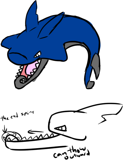
Well here I go again I have another concept as I did not like how I created the last one, but I will still update it if needed to. This time I have a Pokemon that I am surprised no one is deciding to make: The Heliocorpion/Hammerhead Shark! I have based the heliocorpion parts off the bottom lip, with both versions of a heliocorpion. The Pokemon itself is based off many power tools, and like I said sharks. Power tools such as a saw blade, tape ruler off the tail and partially on the tongue, and the body itself is shaped like a hammer and hammer head shark.
 

Unsee

so smart me, enjoy book so much
is an Artist

I attempted some simple coloring shenanigans... the back leg(s) are still rough - how's the color scheme?

To go into a bit more detail about my design, it is based loosely on the urban myth of a sewer alligator in that there are pipes fused with its body. It can launch pressurized bursts of water from its now-weaponized pipes and easily utilize its metal-enforced beak-like snout as a sharp weapon (as well as its claws), hence being able to function as both a physical and special attacker. Its most powerful weapon at its disposal is its tail cannon, which can both be slammed into other Pokémon (or anything, really, in general) and fire its main special attacks from.
These sewergators have become a species of themselves and moved into the cleaner oceans to live more easily (the sewer stuff has not added a Poison type to them. Rather, the addition of the pipes has caused it to develop a Steel type and therefore a Poison immunity. It does not associate itself with toxic materials).


EDIT: Added some explanation
 
Last edited:

boxofkangaroos

this is the day of the expanding man
I attempted some simple coloring shenanigans... the back leg(s) are still rough - how's the color scheme?
I love the design, but I get an immediate Water/Electric vibe from it. Maybe you could desaturate the yellow a bit, or change it to a grey color?
 
Last edited by a moderator:

Texas Cloverleaf

This user has a custom title
is a Social Media Contributor Alumnusis a Forum Moderator Alumnusis a Community Contributor Alumnusis a Tiering Contributor Alumnusis a Contributor Alumnusis a Smogon Media Contributor Alumnusis a Battle Simulator Moderator Alumnus
Magistrum Wobblebuns Blue Frog

Your three designs are by far the most well executed I'm seeing as far as relating to the typing and representing a pokemon designed to be both a physical and special threat. All of these babbymons and cute mins are completely missing the point. Wobblebuns as you yourself notes my major complaint is that the headpiece is a dead ringer for a clauncher. Either make it super obvious as part of the flavour or alter it slightly. Blue Frog as people mentioned the limbs are a bit skimpy for a DDer, sceptile is a good reference point I think. Magistrum is god. Idk what it is but every cap I'm unimpressed and then your design blows me away. Only possible improvements is to make it a little more obvious it could CM but otherwise definitely the best.

If voting were today your three would be the only ones I would vote for.
 

nyttyn

From Now On, We'll...
is a Forum Moderator Alumnusis a CAP Contributor Alumnus
Yilx like I said over IRC, I like your design. Definitely my favorite of the lot, it looks both highly flexible in role (between dragon dance and calm min) as well as visually appealing.

Sgt.Moose hella cute~ A bit simple, but I think it's extremely cute. Maybe make the pipe a little shinier, for the sake of Flash Cannon?

@quanyalis cuuuuuuuute! Perhaps a bit simple as well, but hella cute. The limbs are a bit short and stubby though, so you may run into problems if the base speed winds up being on the faster side of things.

@wobblebums I'd try to differentiate your design a bit more from clauncher, atm it kind of looks like a clauncher evo.

To all artists, great work so far, keep it up~
 

Quanyails

On sabbatical!
is a Top Artist Alumnusis a Community Leader Alumnusis a Community Contributor Alumnus


I took the advice from feedback and gave my shower monster slightly more detail. I added a golden color as a metallic contrast, and it now has lengthier legs. The legs are reminiscent of claw-foot tubs (which, ironically, lack showerheads), but the actual feet are... well, I think they're still up to change. Here are some very rough sketches of two ideas of what the feet could be. I'm less fond of leonine feet since they're less elegant compared to the feet in my main image, but if a lot of other people prefer them, I'll make the change. Otherwise, I'll start anti-aliasing the drawing.

General comments:
Don't be too concerned with fitting the CAP's attributes to a tee. The CAP will likely keep pace with moderately speedy OU Pokemon, but that doesn't require the design to be lithe. We have Tentacruel and Miltank sitting at base 100 speed, for reference. In addition, just because the CAP is an offensive threat doesn't mean it requires a beastly design. Azumarill and Dragonite are examples of offensive yet 'cute' Pokemon.

I'd also be less concerned with whether a creature mixed with a machine looks 'natural' or 'organic' for this CAP. Steel is one of its types, and refined metal is by nature unnatural. :P

  • Nightmare Serum: I'd say you've pulled off the narwhal-dart fusion well. I don't mind if it doesn't look organic. ouob You'll need a full-color image with a white canvas background, so I hope you have photo-editing software or digital drawing software to clean up the image!
  • Hollymon: The first design does have Meloetta's face, but otherwise, I'm entertained by the mermaid. :) The second design is, quite plainly, cool. You've pulled off the typing creatively and excellently. Sadly, it's harder to rationalize Dragon Dance and Calm Mind with the second design, but I still love it.
  • Integer Mova: I think I responded to your concern about your design. ouob I'd still exaggerate the shell to really show it off--the contrasting blue does make it prominent, but it's still not obvious that it's a thick shell without any changes in contours.
  • Charniodiscus: Dragon-y and psychic-y are good allusions for Dragon Dance and Calm Mind. ouob Cool design, but it looks a bit too focused around that set of fins. Do you think you can redesign, recolor, or repose the drawing so the attention isn't all toward those fins?
  • The Unseen Potato: Hmm, I don't really 'get' the design. o.O What are the tubes exactly for? The yellow color makes me think of brass instruments, but the purplish body makes me think of exhaust. I guess I'm seeing more Electric/Poison currently instead of Water/Steel. For a crocodile, I would think to exaggerate the mouth, as it currently reminds me of a bird's beak.
  • Igloo the Almighty: Hmm, barracuda vs. other fish. Honestly, I'm just seeing 'robotic fish' with your design, which doesn't interest me. :/ Starting with a cannon/torpedo/other machine and incorporating barracuda elements--rather than the other way around--would make the design less ordinary.
  • Sunfished: I don't see any problems with your design. :) Nicely done!
  • Wobblebuns: I'll echo what other people have said--the color scheme is very reminiscent of the Clauncher line. Changing either the teal or yellow would help remove that similarity. Besides that, though, the design all works together excellently.
  • hendrix96: The drawing feels a bit mundane, especially with the imprecise linework. The idea works, but it's not technically spectacular. Might I suggest cleaning up your lineart for your submissions?
  • Sgt.Moose: I love it! :D The watery body really brings out the design well. I hope others don't overlook the drawing because of its simplicity, considering how detailed CAP designs tend to be.
  • Derexon: Cropping the image's edges and increasing contrast will help with determining what the design exactly is. It's a bit hard to see otherwise.
  • P3DS: I'd like to see more creativity with swordfish designs. It's a fish with a sword nose currently, which feels.. uninspired.
  • Magistrum: I took your suggestion and added gold as a color. The colored version of your design doesn't look too detailed for sprites, so I have no issues with it! :D
  • Yilx: Great concept and great execution. Everything about the design fits together! I'm wondering how it moves considering its lack of visible leg-like limbs.
  • Deck Knight: What's the issue with having a concave back? I'm just curious.
  • Sparkl3y: Cool design. :) Looks a bit 'windy' to me, but that doesn't have to be indicative of Flying-type. It looks mystical enough for Dragon Dance and Calm Mind, so that's great!
  • Blue Frog: I'd peg your design as the standard for other designs to go by. It's very suitable for the CAP's attributes so far, is clever in concept, and is designed well! I really like your style of shading that makes it shine but not in a way that's not glossy. :) For constructive feedback, let's see... a secondary color to offset blue and silver might give the design some pop, but the current choice of colors do that fairly well already. The fins/ridges on its back and its fingers/toes could be more sharply defined. I don't have 'big' suggestions, though; I like the design as it is.
  • KAIZA: I didn't mind your yellower color palette. If anything, it contrasted nicely with the 'typical' blue and gray/silver of Water/Steel designs. This is a minor nitpick, but I noticed that the the 'hand' on the left has a lip on the rim, but the hand on the right doesn't. Other than that, nice job! :)
  • macle: A steel flamingo would come out ahead if the CAP gets Flying-type coverage. More details and sharper anatomy for the wings and feet would be preferred, though. :P
  • unfixable: Hmm, your drawing is currently competing with Golurkyourself's in concept, but he was thinking about an alternate design. Regardless, the Glaucus atlanticus is probably my favorite concept for this CAP--it's only the execution that'll persuade me otherwise. Keep at it! :)
  • TrainerSplash: I like the shark for its originality, and I think you can add a detail or two to make it pop. The mermaid is neat, but it's currently executed in a rather boring manner. The knight's helm, plume, and lance look unoriginal for a mermaid knight. I'd change them up some if you continue with that design.
  • Otter Power: The one thing that bugs me with the design's composition are the color of the shells/fans vs. the color of the fur. If you look at Dewott, the shell-fans are a pale yellow, which contrasts nicely with its blue fur. A lack of contrast makes the design slightly more confusing. If you'd like to keep the shell-fans blue, maybe making a gradient from the hinge to the edges would bring them out more.
  • Shelmet: Is that a trident mask? o3o On a Water/Steel type? I'd change that to something else. I like the top drawing with the four legs, but I think I'd need to see it colored to really see the Steel typing.
  • Involuntary Twitch: Quite an interesting mix of metal and mammal. :) The drawing, while stylistically cool, looks overall kinda derpy due to the flat eye and tusks sticking out from the top of the mouth. Do you think they could look more naturally incorporated? If we're talking elephants, maybe designing it around the ceremonial ones from India could provide a basis for Dragon Dance.
  • Mystery ZOroark: Creative design. ouob Fits what we have for the CAP thus far. It looks like you have some details for details' sake, though. Is there an origin to the markings on the claw or the colors on the ponytail tip? Just a description may suffice.
  • PixelMoniac_: I love the pose and idea behind your newer design. :D It's really creative and suitable for this CAP! Do you think incorporating some more pirate-like elements would make it look more aquatic, or would that just overlap into Cawmodore's territory?
  • Modeling Clay: Cool art style. :) Neat design as well, but I'm still skeptical how well it fits the CAP. Your turtle/tortoise looks very physically bulky and slow, and stats likely won't lean toward a physical tank. I'd ease up on the design's proportions just a smidge.
 

Unsee

so smart me, enjoy book so much
is an Artist
I took the advice from feedback and gave my shower monster slightly more detail. I added a golden color as a metallic contrast, and it now has lengthier legs. The legs are reminiscent of claw-foot tubs (which, ironically, lack showerheads), but the actual feet are... well, I think they're still up to change. Here are some very rough sketches of two ideas of what the feet could be. I'm less fond of leonine feet since they're less elegant compared to the feet in my main image, but if a lot of other people prefer them, I'll make the change. Otherwise, I'll start anti-aliasing the drawing.
Quanyails, I love the new additions to the Loch Ness Shower, but something still seems a bit off. The style of the head now just doesn't click with the new lower area - maybe you could add some gold lining or some sort of gold influence to the head, as it will match it up with the body more clearly. :D
 
Last edited by a moderator:
Quanyails Loving the Loch Ness Shower much more now, as the feet on the "bathtub" make him (or her) actually look reptilian. I see some vague mammalian traits in the feet as well, but that's another story for later.
In regards to the shell on my design, I don't think I can do much with it anymore unless I redraw it from scratch. The spikes look out of proportion on Netaro's front anyway, so I'll have to redraw him regardless.
 
http://imgur.com/6F5erBi

First attempt, just a draft on a sketchbook. Going for a clown fish crossed with a monk. Tried to think of something that could be good as a physical attacker and special attacker and a monk jumped to the top of the list. Then refined the monk theme to the Seven Lucky Gods of Japanese mythology, specifically the fisherman. Chose a clownfish because having owned one they could be nice and calm or aggressive like a dragon depending on circumstances (eh eh?), plus the mucus goes well with the water veil plan that seems to be winning the ability poll (wasn't a consideration, but its working out nicely. Later on planning on making the parts of the body that would be typically orange on a clownfish gold to fit the lucky god motif as well as match the steel typing.

Like I said, just a really rough draft. May add an item like a lucky sack or fishing pole (fish fish fish. what?) but who knows. Feel free to critique.
 
Last edited by a moderator:
[http://imgur.com/6F5erBi

First attempt, just a draft on a sketchbook. Going for a clown fish crossed with a monk. Tried to think of something that could be good as a physical attacker and special attacker and a monk jumped to the top of the list. Then refined the monk theme to the Seven Lucky Gods of Japanese mythology, specifically the fisherman. Chose a clownfish because having owned one they could be nice and calm or aggressive like a dragon depending on circumstances (eh eh?), plus the mucus goes well with the water veil plan that seems to be winning the ability poll (wasn't a consideration, but its working out nicely. Later on planning on making the parts of the body that would be typically orange on a clownfish gold to fit the lucky god motif as well as match the steel typing.

Like I said, just a really rough draft. May add an item like a lucky sack or fishing pole (fish fish fish. what?) but who knows. Feel free to critique.

For an initial sketch it's good. To improve it I would probably make it look less like it is wearing clothes as most Pokemon don't. Obviously there are the few exceptions like Hitmonchan, Gardevoir etc, but those are definitely what you should look at to improve the look of this fakemon. I do like the head though and I don't think I would change that too much.
Yer, so what I would do with it is make the clothes look more attached to the body. You can then easily have parts that flow/hang off the body to give it the look of clothes, or even turn them into fins if going for a water type.
First time doing this, so sorry if this isn't the right sort of feedback I'm supposed to be offering. Where I create fakemon we give this sort of feedback to get it looking as close to an official Pokemon as we can in terms of design.
 
Last edited by a moderator:

Unsee

so smart me, enjoy book so much
is an Artist
http://imgur.com/6F5erBi

First attempt, just a draft on a sketchbook. Going for a clown fish crossed with a monk. Tried to think of something that could be good as a physical attacker and special attacker and a monk jumped to the top of the list. Then refined the monk theme to the Seven Lucky Gods of Japanese mythology, specifically the fisherman. Chose a clownfish because having owned one they could be nice and calm or aggressive like a dragon depending on circumstances (eh eh?), plus the mucus goes well with the water veil plan that seems to be winning the ability poll (wasn't a consideration, but its working out nicely. Later on planning on making the parts of the body that would be typically orange on a clownfish gold to fit the lucky god motif as well as match the steel typing.

Like I said, just a really rough draft. May add an item like a lucky sack or fishing pole (fish fish fish. what?) but who knows. Feel free to critique.
I love the fact that your design is a new, original idea (as opposed to metal-infused fish), but there are several aspects of your drawing that don't add up with the boundaries we've already established for this CAP. I definitely see how it can use Calm Mind, but it doesn't look like a D-Dancer to me. Then again, Corphish and Barboach can learn it.... Also, I'm not sure I see the Steel-type influence in your design - I'm getting more of a Psychic vibe from it. Great work, though - it just needs a bit of tweaking.
 
Last edited by a moderator:

Yilx

Sad
is a Top Artist Alumnusis a Smogon Discord Contributor Alumnus
Quanyails: Much, much better. perhaps add some kind of design around the upper half/head so that it glues in with the rest of the design, like maybe a yellow/gold underbelly/, a crest or ornament; right now it kind of sticks out weirdly. Don't worry about the lack of legs, she can dance just fine. :)

Gun6: fatwafl with the fatcat again. It's fine IMO, don't worry about changing stuff. Try making the cat parts blue maybe?

metal-ankh: I'm getting a strong Water/Psychic vibe from this. I like the idea, but you need to bring out the Steel type better.
 

Bughouse

Like ships in the night, you're passing me by
is a Site Content Manageris a Forum Moderator Alumnusis a CAP Contributor Alumnusis a Tiering Contributor Alumnusis a Contributor Alumnus
Magistrum Hiya. Lovely design, as always. However, I am bothered by the use of the trident-type shape on both the head and tail. Just looks repetitive imo. I would experiment with tweaks to one or the other. I'm not totally sold on the color scheme yet either, but I think it could grow on me. It's just a lot to take in at once. It's not /actually/ a mantis shrimp or anything, so I don't think you need 4 bright colors + shadow + shine to stand out. It's a strong design without needing to draw more attention to itself.

Yilx I'm sorry but I just have a very hard time seeing Dragon Dance on a humanoid mon. Were this CM + NP or something, I think your design would be perfect. But I have a feeling that the flavor disconnect is going to be tough for many voters (like myself) to overcome. If you have any other design ideas brewing, I would recommend you pursue them. This is very pretty art, and I hate to be bearer of bad news, but I think this is tough love and will help in the end. The coelecanth thing will probably fit better with the overall movepool.

KAIZA Before I start my critique that might sound harsh, super awesome design concept. Never in a million years something I'd expect to see. That said, the angle/perspective of the ship stuff jutting out on the top left of the image seems off to me. I also think including the actual control tower stuff pointing out in the back is super unnecessary as the ship reference is obvious already and it will only make doing backsprites that much harder. Lastly, consider changing what you've done with the long tentacle things. Right now I'm getting a plug/socket-vibe from them, which reads electric even now that you've changed your color scheme.

Wobblebuns I like where you're headed. I don't know your skill with schmancy lineart etc, but if you can produce a very polished version of what you already have, I think you will do very well. I know most of your work on smogon has been as a spriter, and so this may be a bit of a reach for you. That's ok. There are exceptions where the CAP voters look to concept over polish and I hope you are one of those exceptions :) Wish I had useful criticism on the design itself, but I think it's about as solid as it can get.

Quanyails I like both versions of the feet you hid in the linked image more than what you showed here. I also agree that the ornateness of the feet feels off with the plain old shower head. But I like where you're headed and think it's a super cute concept that by virtue of being dinosaury automatically fits with Dragon Dance. Calm Mind is feeling like a bit of a stretch with that derpy face. Yilx's suggestion of more ornamention fits in with making CM look more plausible so I'm all for that. Play around with some sketches imo and ask for opinions so you don't waste forever on a few details.
 
aXl: Captures the CAPmon's qualities both design-wise and concept-wise really well. The contrast between the hard exoskeleton and the fur is really nice. It's kind of weird that it has four legs but then again, I haven't seen the full view of it so it's hard to judge. For now I think it'd be better left off with two legs. On the topic of legs, maybe you can make it look bulkier or heavier as it looks a bit unstable to me. Also, I think you can manipulate either the armor or the fur to better resemble a monk outfit. Overall, good job and I'm excited to see some digital and supporting art!

Quanyails: Simple, clever, and just adorable; nice job! Gonna echo what others have already said in that you can add a form of those metallic elements to the head. Right now, it just looks a bit uneven; some big "party" going on in the bottom half, but it kinda fizzles out from the neck up. Should you add those ornaments, I think the second feet design on your sketches will suit well giving the design a slightly more vicious vibe.

Sunfished: CUTE. I actually like the sea slug helmet more and I thought it would be really cute if it had a shell serving as an oxygen tank. However, the current design is strong as it is. The three prongs indeed added more to the Water-typing of the design; kind of resembles a trident.

- - -

Supporting art! It still features the Clauncher-like helmet but I did drew alternative armors. Also, included in this sheet are head close-ups and an action pose. I'll be focusing on more possible designs for the next sheet.

http://i1291.photobucket.com/albums/b554/Omega_Supernova/Supporting Art 2_zps7b8xy9zg.jpg

Thanks for the suggestions and the nice comments, guys! ;~; Gave me more confidence in my design and I'll most probably continue on with this one. The main thing I wasn't happy about was actually the Clauncher similarities. Again, I'm gonna play around this problem soon.
 
Status
Not open for further replies.

Users Who Are Viewing This Thread (Users: 1, Guests: 0)

Top