CAP 20 CAP 20 - Art Submissions

Status
Not open for further replies.
Here's my WIP! I'll keep working on it, and I may or may not take design suggestions. It's a robotic Nessie-type creature. :3 (I'm open to feedback, just realize that I'm a stubborn person and I may not take suggestions even if they're great. I do appreciate it~ ^_^; )
 
Last edited:
WIP (but getting there)
Ok thank you guys for the comments :). I had to change the program I was using, as the line art was always messy. Now im using gimp and it looks alot better, anyways this is the next update to the armored salamander, now it is the armored lotus salamander. As sunfished said it didn't really show itself to be a calm mind user. So I looked up some symbols that have to do with calm minds, serenity, or mental pureness and found the lotus from Buddhist culture, after looking up the different kinds of lotus I chose the white lotus as it showed complete mental purity and so as feathers/ ornamental head gear the salamander now dons the white lotus symbolizing it calm and pure mind, plus it has white eyes now that always makes things look like they have a calm mind right?. so here is my update of the armored lotus salamander

I was thinking of giving him bubbles on his skin to make him look like a glass salamander full of water, but alot of people are doing that atm, so I decided not to. Do guys think that he would look better with the bubbles?
Also I'm working on one other idea so hopefully i'll have that up in a few days.
anyways guys hope you like mr.lotus the salamander here and can give me some comments on how to improve him :)


After a stint of inactivity and silence, I have returned with Yeticrabmon 2.0!

Decided to keep the standard six crustacean legs (see:Kingler, Crawdaunt) and removed the back-facing legs in favor of two feeder-arms around the head. Added more fur to the arms to make them a bit more robe-like and also changed the proportions to make the main claws larger than previously. Current lineart doesn't show this very well, but I'm currently toying around with the idea of flavoring its back as a gong in order to keep it visually interesting and add more Eastern flavor.

Also, I'm still unsure what to do with color schemes on this thing, so I threw together a set of quick color options over here. The file is a little large, so be warned. If anyone has a favorite/recommended set of colors, that'd be much appreciated.

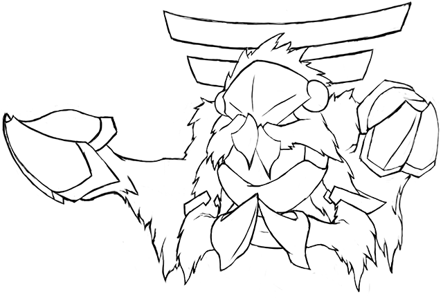
Otter Power Currently the fur is more of a dark purplish color. I think there may be a better color pallet out there, but this one works well enough. I would recommend maybe making the shell-hands a different color or shade from the fur though, as currently they're a little hard to make out.

Involuntary Twitch I dig the Elephant idea. As a couple others have said, the harpoons look a little out of place. I think you could probably remove the harpoon tusks and focus more of your attention on the water cannons and create a stronger overall theme for the pokemon.

Mystery ZOroark Your design seems a bit complex to me. The gems don't really add enough to the concept to seem worth inclusion, and just create noise in the design. Maybe if I knew more about the Egyptian traits you mentioned I'd be able to justify more of the design choices, but currently there's just a lot happening and I don't really understand why. You could probably improve your concept by focusing on two/three important elements and using those to re-focus the design.

PixelMoniac_ Nice idea with SHJ, although currently I feel the main body is lacking in flavor. Maybe try seeing if you can incorporate more elements of Steel into the body? Maybe try to draw more attention to a particular frog species even? There's lots of potential here.

Sunfished I like this design a lot. I'd like to see supporting material for it. Only thing I could really suggest is potentially finding a way to make the arms and legs a little more interesting, but otherwise it seems pretty watertight.

Wobblebuns Its funny because I had been going in the directions you advised even before I read your comments. Great minds think alike, eh? As for your design, the supporting material looks great. Of course I'm unnaturally biased towards liking anything that even remotely resembles Virizion so there's that. I look forward to seeing your alt-designs when you post them.

I'll do more of these when I have more time.
 
This design was inspired by snapping turtles (specifically the alligator snapping turtle).


Possible pokédex entry idea:

These Pokémon can live up to 500 years and have special jets in the sides of their shells that propel them at incredible speeds; giving them a formidable combination of both power and wisdom.

(Quick example of it swimming)
https://lh3.googleusercontent.com/EY_DPcrrv6UkFuVcTAhXiiashhj5zkbvEplqk_dygw=w333-h259-p-no


Integer Mova
Hmm...I dunno how comparable the designs are given how mine is meant to be more aggressive/strong while yours seems much more cute and weird to me (in a cool way...reminds me of an earlier gen pokemon). As for it not looking like a steel type; I found that the colors chosen makes the most difference in helping it feel right. It took me forever to get it right, but greys and blues are definitely a safe way to evoke water/steel (and i chose the additional purple-ish tone to fit the dragon and psychic moves). You might experiment with greys, but your rust motif was really original so you might also try to make it feel more rusty with some strong red/brown colors and maybe abit more organic-ness to the edges.

Quanyails
I love this thing! Gives me a very Mollux-esc vibe in a way.

Sunfished
This is awsome and it fits the water/steel theme very elegantly. But in its current state it reminds me of an electric type and could be simplified just slightly. What if you tried removing the middle prong on its head and changed the brown color on its body to grey?
 
Last edited:
CommanderZorvox Gotta say, your turtle looks a lot better than mine (it's on the first page). I love the way you portray yours swimming.
Now that I think about it, my Netaro looks like a pure Water-type than a part Steel-type.
 

Unsee

so smart me, enjoy book so much
is an Artist
Integer Mova I actually see yours as a pure Rock-type, believe it or not. I just see a sand-caked turtle that seems to not have been in the water for a long time. I think there need to be more of both Water- AND Steel-type influences in your design.


Here's a new color scheme for Netaro CAP. Hopefully, it doesn't look as sand-caked as it used to, and it won't be a technicolor mess. I might change the orange as well, but this is what I have for now.

EDIT: Completely new picture, alongside a slightly in-between skin color from the previous two. Will replace with a colored outline eventually.

Quanyails Thanks for the critique, once again! I tried to re-draw it, and came up with a new picture. Also, I suggest to forgo the faucet head-crest... thing.
 
Last edited:

oh god it's 1 am OK I went with this design after all! I made the main wing appendages into claws/flippers with webbing. And 9000% more glitter everywhere.
This better make it 'look Steel-type' now. :P

EDIT: I changed its eyes and made the markings more prominent. I hope it dialed back the murderface into more of a manslaughterface
im too tired to do any more stuff but I'll have some supporting art of its back or something later (it's still all silver)
Here is the earlier design for reference.
 
Last edited:

ethan06

⋖(☼┆☼)⋗
is a Community Contributor Alumnus


Decided to try my hand at this. After looking at the concept and the Water / Steel typing, for some reason I thought instantly of crossing a flying fish with a space shuttle, and this happened - enter Shuttlefish. (Working name ofc but the pun could not be left unsaid ;_;) The image was originally hand-sketched before I ran it through MS Paint to make the background transparent and clean up the lines and colours.

Original sketch (with bubble thrusters!)
 

Magistrum

DOITSU NO KAGAKU WA SEKAI ICHI
is a Top Artist Alumnus
Some supporting art for my entry: (Click thumbnails for full view)
<< Proposed Relative Size
<< Scary Face and Taunt
<< Bullet Punch, Dragon Dance and Calm Mind

Replies to personal comments:
Yilx no u >:P
Deck Knight I'm kinda confused about your comment actually. One one hand you advise to simplify some details, while saying that detailed designs generally do well on the other. I dunno what to make of that lol. I think I could remove a segment or two on the red parts, altho for me the current design isn't that cluttered o3o
Texas Cloverleaf thanks, and about the Calm Mind thing i hope the support art above makes some sense haha. Mantis Shrimps have among the most advanced eyes in the world, and are marine hunters so I guess that warrants Calm Mind to a degree (the robotic-looking eyes in the design were a nod to this, but i guess it wasn't enough :P)
srk1214 about the colors, so far i've done 4 major colors for every cap design that i've done so idk, it sort of always worked for me. I guess the extra shine for this one kinda made it different tho. :P About the trident head, I have tried many things in the sketching stage (dorsal fins, a horn, nothing, a crown like kingler's, etc.) and that was the only one that seemed right to me ;~;

Thanks for the comments, I really appreciate it ^_^
 
WIP


This design is inspired by anglerfish and fishing lures. The metal plating is also inspired somewhat by dunkleosteus.

Is it a metal anglerfish with a fake fish for a lure? Or is it a cute little blue fish with a big scary fake metal fish coming out of its tail? What if they're both real? If you find that you're second guessing yourself, that's the point! I feel that this helps to embody the unpredictable nature of CAP 20. Comments, criticisms, and suggestions are welcome, but be aware that it might be a while before I find time to incorporate them.

I might edit in some comments here later, but right now I can't think of anything substantial to say.
 

Unsee

so smart me, enjoy book so much
is an Artist
After some feedback, I did a simple recolor to make Waterheatercat more in-line with the Steel/Water typing as opposed to Fire/Water.
I think the change is for the best... Maybe the old version can be when it's angry or all heated up. I like it! :3
 
After some feedback, I did a simple recolor to make Waterheatercat more in-line with the Steel/Water typing as opposed to Fire/Water.
I think it looks better with the new art. It looks a bit more industrial this way. One thing you might try is to make the steam come more out of the holes instead of out of the top, but other than that, it's pretty slick.
 

Quanyails

On sabbatical!
is a Top Artist Alumnusis a Community Leader Alumnusis a Community Contributor Alumnus


I started wondering what to add to the head so it matched the body more. I was at a loss for a while until dA led me to these fakemon. Spigots--of course! It adds to flavor well enough, and it could be turned for Calm Mind and provide more torque for Iron Head. :P

I thus sketched out a two-handle vs. four-handle spigot here (along with a bubble shower cap, which I dropped) and liked them enough to paint them into the final-design-in-progress. I'm not sure which to use (if either), hence why I'm posting the three variations in this thread. I'll probably revisit the entire head/neck area anyway to make sure the added adornment doesn't disconnect the head and body further, but feedback would be appreciated to help determine what head variation works.

I've also decided against the lion's feet for the Loch Ness Shower. The design isn't meant to evoke viciousness, so lion's feet feels out of place on it.

Edit: Here are the heads attached to the body, if it's of any help.
Re: Yilx: I'm not sure what else I could add to the head that contributes to the overall design. Plesiosaur and shower heads are typically bare.

Edit 2: I went on IRC and, with feedback, decided on the bubble shower cap. The spigots, for reference, are here.

  • The Unseen Potato, Yilx, srk1214, Wobblebuns: Does a spigot headpiece work, or should I go back to the drawing board?
  • Integer Mova: Do try another drawing! I've found that the second time I put pencil to paper (or mouse to computer) is an improvement over the first in multiple areas. :)
  • Gun6: I agree that the red is less useful as a design element with a Water/Steel typing. In the same vein, the steam whiskers could also be modified, now that the lack of red removes the implication of hot water. I imagine your design doing The Robot for Dragon Dance, as a complete aside.
  • metal-ankh: Your design looks quite humanlike. That's not bad in of itself, but I'd be wary of what details you use in the design. It looks like your design has a hat and clothes, and they don't immediately look stylized enough to be part of its body in the way that Gardevoir's 'hair' and 'dress' are. Perhaps a colored version would make me think otherwise, or perhaps a second draft would buff out some conceptions. I look forward to a next post!
  • User of Shadows: I love those little bubbles in the aquatic body! That's the first thing I noticed about your drawing. :) Currently, Steel-typing seems less obvious than Dark. The fins look a little like bat wings, in particular. Just lightening up the dark color would probably make it less Dark-like.
  • hendrix96: Ah, your drawing is cleaner. :D Very nice. It hits all of the CAP's criteria thus far, and the concept is pretty original. I'm not sure whether bubbles would help--the skill already has that ripple-like texture to it, which I think is pretty clear. Could you explain the concept behind the Axew-like tusks? They seem a bit heavy for a calm salamander.
  • aXl: Hrm, I'm not really fond of your light-blue color palettes. Yeti + light blue makes me think of Ice. I'd probably go with the palette with gray/silver fur to tie in Steel- as a typing, unless you make it clear with shading that some parts are explicitly metal. Even then, I might see it as Ice/Steel.... v_v Be aware of typing interpretation.
  • CommanderZorvox: Your design hits all Water/Steel and Dragon Dance, and I guess I could make the stretch to Calm Mind. I love how cleanly the details fit together without openly pandering to the CAP's criteria. Overall, I really like it. :)
  • Golurkyourself: I really want to like the design. I think the blue sea slug is one of the best concepts for this CAP, but your execution is off-putting. :/ It looks uncanny, and I would think a sea slug dubbed a dragon would be more elegant. Would it be possible for you to instill more personality or life into the design? Perhaps dotting the eyes or doing something so they're not blank and red would suffice to start.
  • ethan06: Not bad of a concept. It would be better if the Flying-type were involved in this CAP, however. Currently, the CAP lacks such connections bar Levitate as a secondary ability or Flying-type coverage, so it wouldn't be my first choice flavor-wise. If that happens, though, that'd be great for the design. :)
  • Cattail Prophet: Clever way of conceptualizing a metal fish. ouob I'd think to make both fishes less 'ordinary' in appearance, however. I say this because I'm noticing the metal plating on the fish on the right, which doesn't seem to contribute to the design besides making the Steel typing connect. If the metal plates ran contour to the fins or scales, however, it would appeal both to typing and toward design. Your left fish also looks quite generically 'fish' to me. Would it be possible to make it less so?
 
Last edited:

Bughouse

Like ships in the night, you're passing me by
is a Site Content Manageris a Forum Moderator Alumnusis a CAP Contributor Alumnusis a Tiering Contributor Alumnusis a Contributor Alumnus
The spigot is cute and could even double as a propellor if you wanted to ditch legs altogether :o

I'd have to see the final design probably though to form a conclusive opinion, and even if I did, it's ultimately your design. Go with your gut.
 

Yilx

Sad
is a Top Artist Alumnusis a Smogon Discord Contributor Alumnus
Quanyails I was thinking more of an adorned crest, or some kind of ornament/decoration or perhaps even markings. This one might work, but we'd have to see it on the overall design to properly judge. The third one reads the best, but it might give off a little too much flying vibes.

aXl: Neat design, although it reads too much as a Psychic-type at the moment in my opinion. Might want to work off the colour schemes for the Middle Top and Middle Bottom.

CommanderZorvox That looks great! It reads very well and has a good impression, although it might rely on a bulkier stat spread a little too much.
 
Quanyails there are two reasons why the lotus salamander has those tusks, and neither are very good of a reasons. One, I felt like it added to the physical side of the design and added more stream like quality to him. The second and main reason why I added them is that without them it looked like a depressed blue Toothless, the dragon from how to train your dragon XD.

so yeah ... Thanks for the feedback everyone :)

btw Quanyails I love the quad spigot design
 
Last edited:

paintseagull

pink wingull
is a Top Artistis a Forum Moderator Alumnus
Here's my first idea that I've developed enough to show. It's based on the idea of tiny striped fish that like to live among coral, but abstracted up to a dragon silhouette. A hardened coral-like shell forms armour and wings around a long fish-like body. These sketches are just to show the idea and general impression I'm going for, I still need to work on details, so lots of feedback is definitely appreciated and can still be incorporated.


Another two preliminary sketches showing different silhouettes I was working on. The above is a combination of these original two.

Comments for others:
Yilx Just beautiful!
Hollymon This is really cool and an amazing idea, I bet you could come up with an evolution for it that would work really well for the CAP. As it is, though, it won't hold up to the stats that CAP20 needs.
Involuntary Twitch I think the starting idea is good but I think you need to incorporate the steel elements into the design more organically. Great start!
User of Shadows Good start but could you try playing around with proportions and poses? The design isn't very clear at the moment. How could you make it stand out?
CommanderZorvox Incredible design and art.. wow. Very cool!
Cattail Prophet This is a nice start, but I think the lure takes away from it… it looks strange and awkward. Maybe you could just do a rickety submarine fish idea and work up from the metal fish part, which is well done.
Gun6 Something about the all-blue takes away from the steam whiskers.. they don't stand out as much anymore. Not sure what to do about it, hmm. I think it works nicely with red.
 
Thank you to anyone who gave feedback. Without further ado, the third iteration of my lindworm:


The neck frill / external gill / well grate thing has been shrunk and recoloured black to give the impression of cast iron. The arms are now positioned higher up than before an sprout out of some pointy shoulder blade things. The rays for the tail fin are now also spiky, cast iron thingummies. Any comments or criticism would be greatly appreciated!

Edit: Now with whiter than white background. As always, any comments would be greatly appreciated.
 
Last edited:
So many cute designs, it's too much to take! ;;

Currently, my circumstances for a good design are 2 things:

1. Looks somewhat aquatic while maintaining a Steel type vibe
2. Looks like it can both Dragon Dance and Calm Mind

This is why I'm having trouble picturing sharks, otters, etc. for this CAP: They're either not 'calm' enough to Calm Mind, or too 'peaceful' to Dragon Dance. Then again, things like Whiscash can Dragon Dance, but at least it's considered 'majestic' in Pokemon.

Right now, my favorites are Knirp's scuba eel and paintseagull's coral fish. They, to me at least, fit my two self-imposed guidelines to a tee, and of course they're so gosh-darn adorable. I do have some other designs I like, such as CommanderZorvox's snapping turtle, but these are my most preferred so far.


Sooooo. Here is new pipesaurus. I realised that original design idea was bit too simple to really compete against some of the great contenders. So I had to add something to it. And there it is.
 
i need sleep


so my attempt to combine steel, water and dragon dance into a single creature might seem too obvious, but here it is anyway, a viking longship. The "oars" are extensions to its wing support bones, which it keeps furled most of the time. I really wanted to make the wings sails, but that idea's been done ' 3'


Alternatively, for those who love scald and recycling, I offer the spinosaurus radiator I initally created for CAP 18. It was turned down there for being _too_ steel-type, but that is no longer a problem :P

please give feedback here or in PM on what I should proceed with!
 
Last edited:
I tried something new to fit with the physical bias the stats spreads seem to have

Its a serpent-like marine iguana with some fish influences. I wanted it to be a bit more serpent-like to get that dragon dance in there, and the salt armor of the marine iguana is great for translating to steel type
colors not final


Crusader seahorse. No time for explanations right now, may add later. Comments are welcome.

Also I really don't practice computer graphics enough.

Great submissions so far, everyone.

EDIT: There's also an option with fin.
 
Last edited:
Status
Not open for further replies.

Users Who Are Viewing This Thread (Users: 1, Guests: 0)

Top