aaaaaaaa

Oh wow, page 2!

Had some time between classes these past few weeks so I decided to make something of it.
And have some kickass music that's not by me because it's cool and makes everything better.


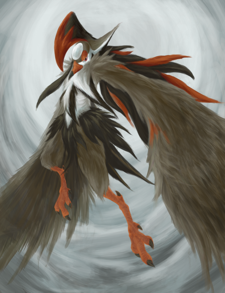
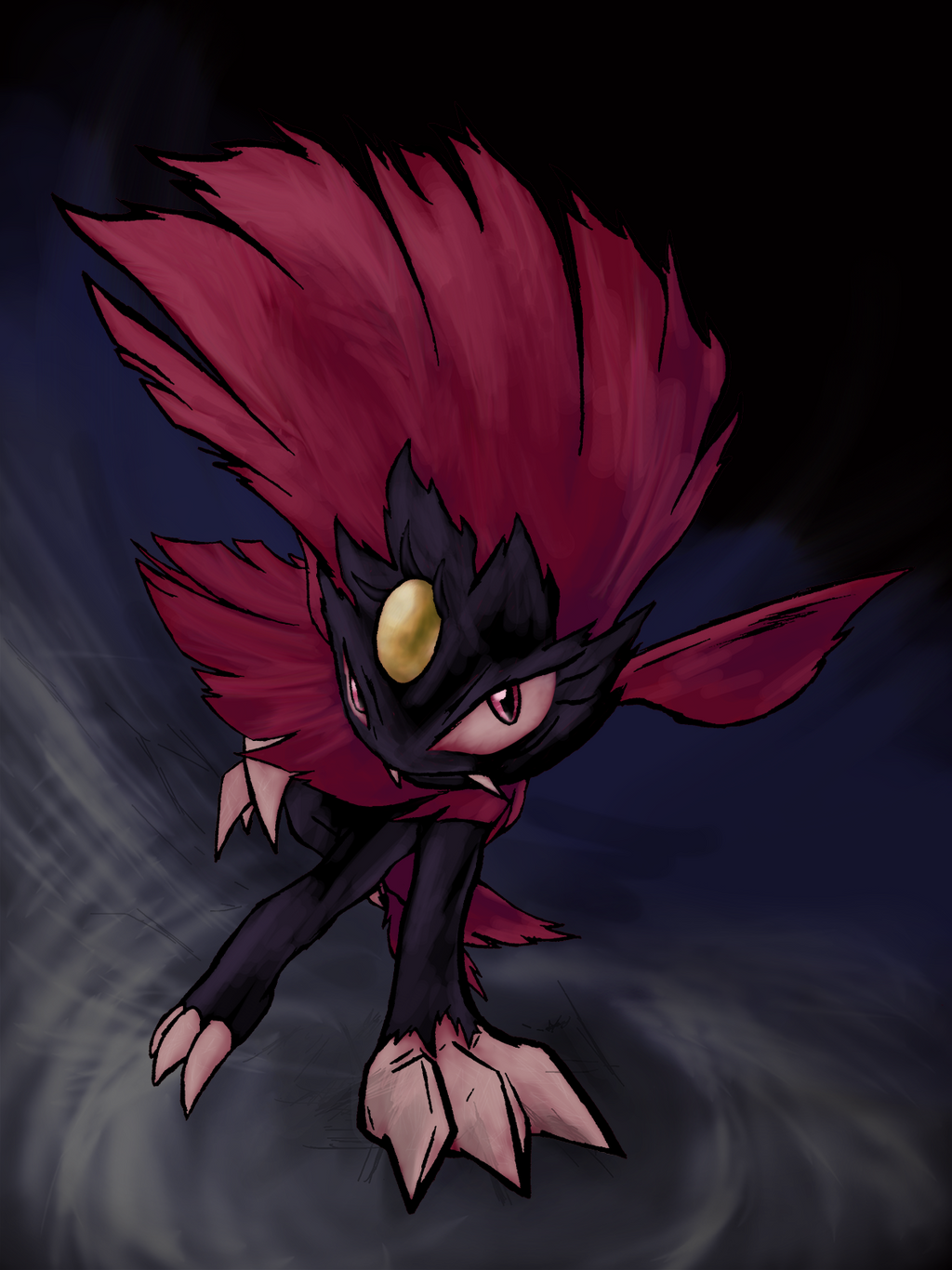
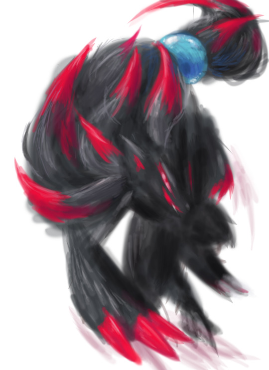
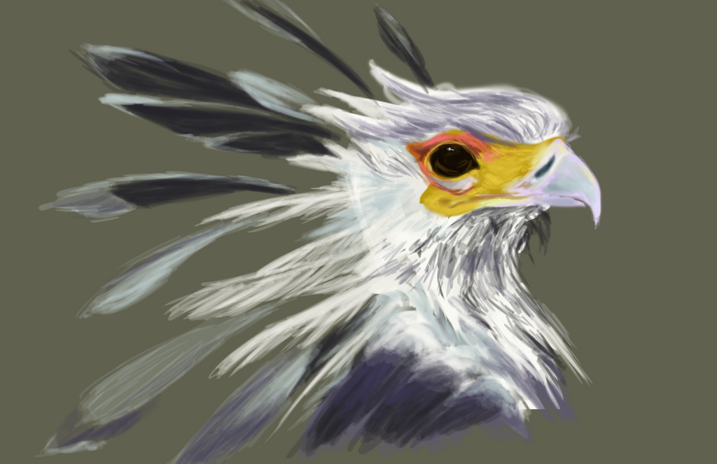
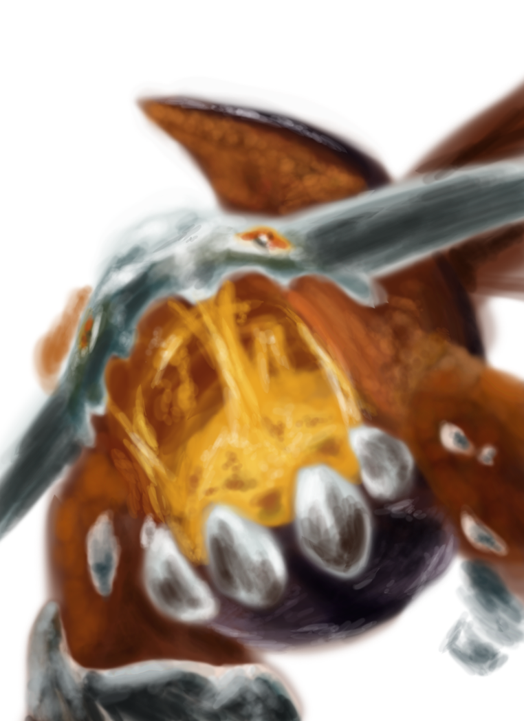
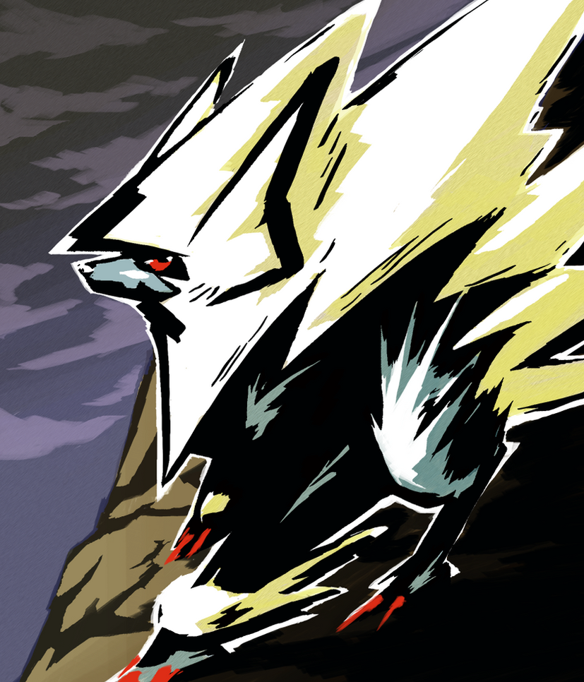
Basically a Staraptor anthro-harpy thing that I doodled in ARCH History awhile back and wanted to develop more, so I made this. Was really fun to make, and I finally found a good use of the Smudge tool in Photoshop. (Who'd have thought it was there for feathers of all things?) Also proves that you can still make time for non-ARCH art even with an ARCH-filled schedule. Also this piece was good feather practice for when I eventually decide to make art for my half-dozen Pathfinder Tengu characters.

Hope you guys enjoy it!
 
Been a while since I commented here, but two things I definitely really liked were contest Diancie's "coy" pose and the colouring of the gems, as well as the lighting and angle on Facebook Altaria. As Bummer said in the contest thread, Mega Diancie can be a tricky 'mon to draw, but you portrayed it really well.

pls work on sprites again sometime )':
Diancie was actually a ton of fun to make, even if it was a little strenuous/repetitive to shade due to the gems having to appear similar. Apparently a lot of people liked it, because it still gets notes on the Tumblr posting of it, which is insane to me considering it was made two months ago. Altaria was also fun to make, but for different reasons, as the cloud style I went with was pretty much found by blind guesswork and ended up being fun to create in layers. Glad to hear you liked them both!

also I just posted Mega Altaria's backsprite on Thursday so yeah

In other news, I also made another piece for Facebook's PotW to account for a certain dropped slot *coughRODANcough* and I think it came out pretty well for a rushed job that was made in ~4 hours. Also one of the first times I've successfully drawn a Weavile that I liked, so there's that too. Turns out it makes a great iPhone Background too, but that's beside the point.


Made another PotW art this week, this time for (Mega) Ampharos! It's another watercolor piece because I still can't rely on my computer to do anything right atm, but I experimented with a couple of different techniques/stylistic choices that I think change the mood enough to make it unique. I tried to see about deconstructing what it'd look like for Mega Ampharos to evolve, and this composition came about as a result. It was a joy to make, especially considering Mega Ampharos is one of my favorite Pokemon, and the best from Johto imo.

Hope you all like it!
 

MiniArchitect

Detail Disoriented
is a Top Artist Alumnusis a Community Contributor Alumnus
Indisputably the most dramatic rendition of the dopey electric sheep I've ever seen. I love the texture that the watercolors give to the background; it forms a mix of blobby and sharp shapes that add some turbulent motion. There's good contrast between the black shadow covering his front against the white of his mane, as well as between the jagged edges of the bolts coming from his eyes and the smoother, wavy contours emerging from his arms, hair, and the orbs floating around him.

I'm similarly enamored with the Azumarill in the previous post for its sense of speed and fluidity. The way the water effects are rendered makes Azu look like he's melting into the water.

All in all, excellent work! You've got real talent working with watercolors.
 
I honestly didn't recognize Azumarill at all when I first saw that image. I agree with the way that MiniArchitect described it, and I love the creativity of the concept and how there are bits of purple mixing in with the blues. Both of the PotW watercolour images look spectacular.


So I normally suck at monthly challenges but I decided to pick up the PokeDeXY thing that circulates Tumblr this time of year and give it a shot. I'll be updating this every few days or so, but here's days 1 (Ledian) and 2 (Zoroark) along with bonus Mega Banette in accidental grayscale in order to get my juices flowing.

My restrictions for these are as follows:
-No references
-Digital only
-No Eraser
-One Layer
-Keep it Under One Hour

mostly just so that I can get better at digital sketching, since I always feel like i freeze up when I pick up my pen for a blank composition.
 

MiniArchitect

Detail Disoriented
is a Top Artist Alumnusis a Community Contributor Alumnus
I'm loving the Goodra quite a bit. The style of these sketches works especially well with its design; it gives those little purple flecks flying off its left side a cool jelly-like texture.
 
I'm loving the Goodra quite a bit. The style of these sketches works especially well with its design; it gives those little purple flecks flying off its left side a cool jelly-like texture.
Yeah, I really love the way Goodra came out as well, it really turned out much better that I could have ever hoped for. Glad to hear you like him!

In other news, update post. I recently had a piece that's been in storage go up for this week's PU Pokemon of the Week over on Smogon's Facebook, so now I'm comfortable with sharing it here. Have a free rose during this finals week!


Also, for the PokeddeXY, I drew second favorite fighting type, favorite fire and favorite flying, so those are posted below. Warning: One's a dragon, bringing my dragon count up to 4.


More coming.
 
Oh wow, I love that Heatran! The one-layer sketchy feel really makes it pop out to me, making it seem like a blurry photo someone would take before being killed by a monster in some cheesy horror movie. I love it!


1: final type I forgot to post from the DD challenge that hit off the rails not long after so w/e with the others
2: secret santa entry for 2015, request was to draw a Cubone experiencing the joy of christmas for the first time.
3: an unused PotW for Smogon's Facebook featuring Mega Manectric
4: school assignment where I drew a bird a lot
5: school assignment where I drew a bird a lot (but this time I used clay)


art dumping

Top two are for Facebook PotW's from the first three months, bottom two are from the recent Arterview I did with Bummer about a month ago, made using a 3DS. Another piece I made involving pokemon should be getting off NDA within a week or so, and I'll see if I can't remember to update relatively quickly when that happens. If anyone missed my arterview, you can find it hosted here: http://www.smogon.com/articles/arterview-axl

Good news is, I beat Fire Emblem Conquest, so now I can get back to art a bit more seriously over this next month. +)
 

The article attached to this one just went up today, so I figured I'd share the art here. Next piece I'm working on for Smogon will be focused on a related topic.

also just realized that this entire second page of the thread is literally just Architecture Year 2: Artistic Side Projects.
 

MiniArchitect

Detail Disoriented
is a Top Artist Alumnusis a Community Contributor Alumnus
I believe I said as much on tumblr, but it bears repeating here: your Heatran is fantastic. I like that those three long crystals jutting out from the edge of the image form a triangular frame that helps accentuate the perspective. The texture of it is great, too; there's a distinct difference between the surface of its skin and that of the metal chunks sticking out of it, where the former feels fluid and translucent, and the latter is smooth and shiny. The level of detail in that eye is great, too; the white lines visually draw you into the iris. I can tell you put in a lot of effort to step up the production value, and it definitely paid off.

Other nice general observations include those beady eyes on Quag and Ampharos, the perspective of Mienshao and Virizion, and the sweeping pink leaves on the tree behind Virizion.

If there's anything I had to complain about, I'd say there are some areas in your artwork where the painting gets a little too smudged and loses definition, such as in the very front of Heatran's mouth and the ends of Mienshao's whiskers, but in general the way you handle texture and composition is greatly improving. Keep it up! +)
 
I don't know when the thread title changed, but I like it.

Something I especially like about your recent works is your experimentation with colour when shading, namely the purple on Ampharos's yellow and blue on Virizion's green. On Virizion and a few others, I also like that you can still see the brush texture clearly and the strokes aren't overly blended.

Also enjoyed your Arterview very much.
 

Users Who Are Viewing This Thread (Users: 1, Guests: 0)

Top