


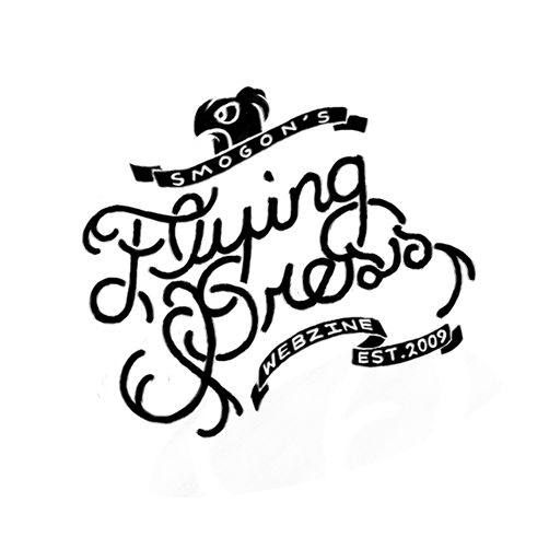
Welcome to the voting stage of Smogon's Flying Press Logo Contest! We asked the artists of our community to create logos that they would most accurately represent our project, and now we need you to decide which one is the best. We accepted one submission from each artist (and decided amongst ourselves which one to include if multiple were submitted) and are now allowing voters to vote for all of their favorite logos! 
Logo #1
designer's notes (interchangeable parts)
Logo #2

Logo #3

Logo #4

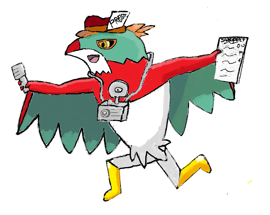
Logo #5

Logo #6
designer's notes (concept explanation)

Logo #7

Logo #1
designer's notes (interchangeable parts)

Logo #2
Logo #3

Logo #4

Logo #5

Logo #6
designer's notes (concept explanation)

Logo #7

vzxt said:I really wish the "Smogon Purple" version of #1 was here instead of the black&white one...
As you can see in both OPs, if there were multiple submissions for one user we chose our favorites to feature in the poll.Seaco said:Also, seriously check out the submissions thread because for example #7 has a bunch of support artwork that doesn't show here and it sucks that only one logo is shown in the vote.
Last edited:


