
-
The moderators of this forum can be found in the CAP forum staff directory.
-
Welcome to Smogon! Take a moment to read the Introduction to Smogon for a run-down on everything Smogon, and make sure you take some time to read the global rules.
-
Congrats to the winners of the 2023 Smog Awards!
CAP 22 CAP 22 - Art Submissions
- Thread starter HeaLnDeaL
- Start date
- Status
- Not open for further replies.


WIP
Egyptian design for my cat, I ignored the criticism of AbsolClaw and change the color green ome details and changed to yellow, giving a pint of gold
Absolclaw: your design looks great but still remain unconvinced too, especially that l-sustaining head with a stick, I think it would be a little better if he had it in his hand, like a scene from Hamlet
Macle: your desing is très magnifique (sarcastically :p)
fellfromthesky: I like the concept of Red Riding Hood into a wolf, but I do not see the fairy type, rather it is a dark / fight type
DarkLatias92: your concept is great, even with little fairy, even I do not feel convinced by the ball in the tip of the tail or pants (better would be a bag)


EDIT3:
As per the advice of Sunfished, I played around with the colours and made this version brighter/lighter in attempt to give the impression of a fairy type instead of a dark one.
EDIT: Colour scheme changed once again. The three old ones are here.
I'll give feedback soon as well!

As per the advice of Sunfished, I played around with the colours and made this version brighter/lighter in attempt to give the impression of a fairy type instead of a dark one.
In response to feedback, I made the bow larger and altered the colour scheme in an attempt to make it more fairy-esque.
It could probably use some more work conveying the fairy typing... I was hoping the red riding hood fairy-tale element would be enough. The boxing glove claws and muscular build add the fighting typing and the dark-ish elements were added to give it a parting shot flair. I clearly went a little overboard with dark. Ironically, probably part of what made it seem dark was the wolf base, which I had intended to make it more fairy-ish because wolf equals moon, which equals fairy, for some reason (clefairy, moonblast?).
It could probably use some more work conveying the fairy typing... I was hoping the red riding hood fairy-tale element would be enough. The boxing glove claws and muscular build add the fighting typing and the dark-ish elements were added to give it a parting shot flair. I clearly went a little overboard with dark. Ironically, probably part of what made it seem dark was the wolf base, which I had intended to make it more fairy-ish because wolf equals moon, which equals fairy, for some reason (clefairy, moonblast?).
EDIT: Colour scheme changed once again. The three old ones are here.
I'll give feedback soon as well!
Last edited:

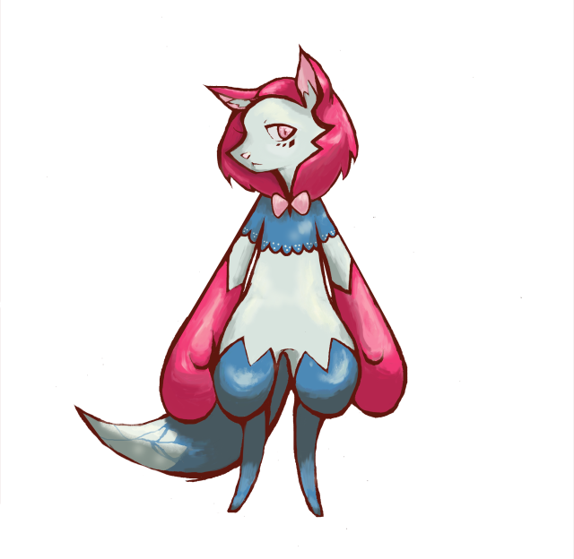
Big thanks to all your comments. I smoothed down the cloak and gave it a new colour scheme to enhance the Fairy-type, and I also "fluffed up" the paws. Additionally, I changed the proportions on its legs to better resemble a cat.
I did, however, end up making another design due to a second idea I had. A chesire cat basis, but with a different influence from a rope-based martial arts called Hojojutsu, the design can be seen here. I'm a bit undecided about which to keep, so comments and criticism would be appreciated!


Made some edits to the Jack-In-The-Box clown. Before, it was pretty clear it was a Fairy-type by the clown nature alone, but it still kinda left the Fighting-type hanging, so I redesigned it to have bigger or at least more noticeable boxing gloves, clown paint made to resemble a luchador mask, and even a heavyweight champion belt! It's also now normally already has its spring "unslinked", to make it a touch less human.
WIP 2 2.5
Thanks for the feedback guys ^^
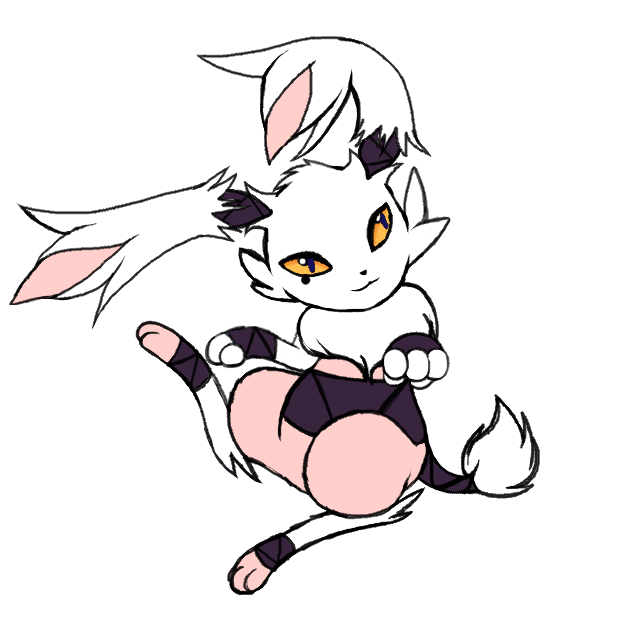
I picked the obvious pink and white for fairy type (and since the hare it was based off of was also white) and purple for the wrappings.
I tried to make the fur less pointy (and avoided curls altogether because it'd make it look more like a poodle), but since the fur's supposed to appear to be ripped...
Eyes yellow to go with the purple and the pupils are a kinda royal blue (hard to see, but it's there)
Not sure if this much fur missing is enough or I should remove some more (or change the patterns entirely)
Still open for more feedback (I know the lines are messy, but since it's a WIP it's gonna be that way)
EDIT: Minor edits; made a few adjustments to the face, made the pupil color more apparent, and moved the black eye mark a little. Also made the pink a little more peachy ^.^ if it doesn't work, I'll change it back.
Old version 2

Thanks for the feedback guys ^^
I picked the obvious pink and white for fairy type (and since the hare it was based off of was also white) and purple for the wrappings.
I tried to make the fur less pointy (and avoided curls altogether because it'd make it look more like a poodle), but since the fur's supposed to appear to be ripped...
Eyes yellow to go with the purple and the pupils are a kinda royal blue (hard to see, but it's there)
Not sure if this much fur missing is enough or I should remove some more (or change the patterns entirely)
Still open for more feedback (I know the lines are messy, but since it's a WIP it's gonna be that way)
EDIT: Minor edits; made a few adjustments to the face, made the pupil color more apparent, and moved the black eye mark a little. Also made the pink a little more peachy ^.^ if it doesn't work, I'll change it back.
Old version 2
Last edited:
I updated the cat.

Canis Majoris: Your second design is far superior.

Canis Majoris: Your second design is far superior.
Last edited:

Feedback time!
If I didn't comment on yours, that means I know you personally and have already given my feedback on it through some other means!
Absolclaw
This one is an interesting design, and utilizing the concept would yield a fairly interesting look that tries something different. At the same time, I feel like the lack of any distinct features on the body makes it somewhat lacking, and the whole design seems to rely on its detatched head in order to have a form of appeal. In my opinion, I think if you were to make the body have an interesting quirk, either by exaggeration of patterns, it would help flesh out the overall balance of it. As some warnings, I think trying to add to much patterns, or having too many shapes, will bring the quality down a bit. Rather, striking a good balance between what you want and what it "needs" is good to aim for :D
adagi0
As someone else pointed out, this design seems to do very little at being asymmetrical, despite what you said about it relying on such an idea. The very large amount of shapes and patterns you used in the design seem to make it feel really cluttery, while the parts which I assume were "asymmetrical" end up adding more to the clutter in design elements. However, I think the flapper concept is fairly neat to use for this typing and concept, so I hope you could try lowering the amount of unneeded detail, and pursuing a better visual of being asymmetric if you want, in order to make a design that looks less messy and more organic.
Calad
The pillow-fighter theme is evident in this design, and can really pass as a fairy/fighting if given the right colors. However, as someone else mentioned, the cap has decided to do a fast parting shot user, which means that you may have to end up making the design more lithe in order to match the speed that it envisions. Making the legs longer while lowering down the bulk could possibly suffice, which allows you to keep the concept.
Composteel
This is by far one of the most bizarre combinations of design elements I've seen in this thread, which makes it really unique to me. However, the parts that constitute clothing seems to make it wear clothes, which doesn't seem to help its design in the sense that the fairy typing seems plastered in. Overlooking the fact that rhinos can be percieved as slow, (since tauros and miltank exists), I think what you could do with this design is to make the clothes feel more like a part of its body, which would help it add more parts on its body to make it less like a real world rhino.
Darklatias92
I'm loving the theme, and the execution makes it super adorable. There's not really much I can say about the design in terms of criticism, since it seems really perfect to me, but in regards to the colors, I'd pick all of them besides the top left one. The top left one, having the colors of a natural kangaroo, makes it feel more like its wearing clothes on top of its skin. The rest, in contrast, have a different skin color, which makes me feel like the "clothes" are actually natural part of its body, making it feel very organic.
Durengardnit
There's not really much to say about the design, which can be seen as a good and bad thing. On the plus side, it looks like it can pass all of the things this cap requires, utilizing it in a very smooth fashion. However, there's not really much "oomph" to it, making it somewhat lacking. If you could possibly add one unique feature to it, which makes the viewer go "I remember that Pokemon because of _______", it would help add a familiarity to it that makes it memorable.
ethan06
I want to say that this one is pretty cool, and reminds me a lot of that one boss in kirby. While it is a pretty cool design, the elements used to make it feel sort of stitched together, rather than being a natural combination of separate ideas. I don't really know what to suggest to help its design while keeping the concept, but I believe if you research ways to incorporate some more features to use as a way to connect the wings and main body, both literally and metaphorically, it could come out as more of a single concept rather than two ideas stuck together.
Felis Licht
This is the cutest design I've seen in the thread, which says a lot about how the fairy typing was well integrated into the design. The fighting type could also be seen in it, which makes it a great mixture of both typings in a natural fashion. There's not much to say about it otherwise, so I hope you'll find ways to make it even better :D
FellFromtheSky
The use of both red riding hood and the wolf makes this concept very interesting to look at, and it's very obvious that it has the fighting type due to the "bulk" it has. However, while it may be a personal opinion of mine, I think the really dark colors used as the main body color make it feel more Dark type than Fairy type. I think if you played around with the dark colors on its body, such as altering the brightness, or the color used, I think it would detach it from the Dark type a considerable bit, allowing the abstractness of the Fairy typing to be used in place of it.
Golurkyourself
Your design is one of a few in this thread that sells me the typing due to the concept used, which makes it pretty much perfect in that regard. However, unless there's more to it than meets the eye, your design doesn't seem to be something that would be fast, which cap22 has decided to run with. There are a few exceptions to this, like Dendenne being oddly fast, which I hope you use in your explanation as to why it fits the speed!
hendrix96
The fighting type can be easily seen in your design, and the fairy type can be somewhat implied, which makes it fit very well with the execution. What irks, me, however, is that while the neck and below have a substantial amount of detail, the head is somewhat lacking in it. I think if you could add some sort of shape to the head, or change the head's shape as well, it would help round-out the difference in detail, helping balance it out greatly.
Integer Mova
While I commend you on using a more darker concept for your design, (which makes it super rad!), I think the concept ended up overtaking the typing, making it look more of a set of different types than Fairy/Fighting. A way to circumvent this while keeping the concept is to probably play around with the colors a bit, and maybe adding a fair few more things on it to help make out it's a fighting and fairy type. I really love this idea, so I hope you can figure out how to sell to viewers that it's fairy/fighting, rather than some other type!
macle
As much as I love the design, which the pink helps to distinguish it as a fairy type, it doesn't seem so much as to fit the fighting type and ends up giving a flying type look. Completely out of the blue, which I hope you understand, I think if you went with a frog it would more easily represent the fairy/fighting typing.
Mr Spyda
I'm loving the concept, but the main problem with it to me is that it seems to be wearing clothing, which can be seen as plastering on types. I think if you changed the parts where the clothes sort of "end" in a skirt-look into something of it being a smooth transition to the next piece of clothing or skin, it would make the clothing feel like it's more part of the body rather than something that can be removed.
P3DS
The design in yours seems to lack an apparent fighting type element, which, compared to the fairy typing, is a bit less abstract, so should be somewhat visibly apparent on the design. I don't know of a way to add a fighting type thing to it without resorting to "add gloves", so I hope you find a way to make it more apparent that it's meant to be a fighting type!
QxC4eva
The moon rabbit motif is a really fun concept to see executed, which helps lend favor to the fairy typing. The fighting typing in it can also be assumed due to the physique of it, so kudos there as well. However, I think there isn't much else to it other than the hammer that makes it memorable, which can be due to how there doesn't seem to be any kind of "wow factor" in the body from the neck and below. I think if you could flesh out the bottom half of it without adding too much, it could help serve as eyecandy for viewers and make the design more special.
Ssensenh
I'm super loving the design, and it completely fits everything that I can vision for a fairy/fighting type. There's not much I can suggest for the design, but for colors, I think the first set of colors you displayed in an earlier post fits it the most. The rest of the colors feel too monotone in color, which makes it somewhat drab compared to the one with many different colors.
Sgt.Moose
I like the new version you posted the lastest, and makes it very apparent it has a fairy typing, while using some of the design's basis as the link to the fighting typing. However, I think it would be better if you also added some sort of visual element onto its design to make it feel like a fighting type from the get-go, which the first version's design did well, having had had the arms. So, I think if you re-added the arms onto the newest design, it would at least give a way for it to look like a fighting type without needing to explain it through the concept.
Slapperfish
This one is a clever use of mushrooms and gnomes in order to make it look like a fairy/fighting type, so there's not really much to add onto it. If there's anything I'd want to change, I think that the bandages on the arms and legs should be more like patterns on its skin rather than something removable, adding more to it being a wild animal,(I'm basically referring to that lone bandage that seems to have been whipped off of his arm!)
ThePsychoBear
For the cat you just posted, I think the patterns on its skin end up making the design more cluttered in terms of unneeded design elements on its body. Otherwise, I can see it perfectly as a fighting type, with a tiny bit of explaining to tell me its a fairy type.
willow616
The design on this one can easily tell me it fits the typing, which is good. However, the patterns on its body end up making it feel very cluttered, making it feel a little messy, and makes it rely more on the patterns used rather than the shapes. In theory, shapes tend to help deviate a design from its basis, so by relying more on the patterns, it ends up making it look like it's "just the animal". If you could possibly add some more shapes to its body, make the patterns less busy, and avoid making it too cluttered, I think the design would stand out well.
If I didn't comment on yours, that means I know you personally and have already given my feedback on it through some other means!
Feedback!
I hope I was helpful!
Felis Licht: Your design is super adorable! You've definitely effectively conveyed the typing. I particularly like the triangular pattern in the wrappings/bandages. That and the eye shape add a certain texture to the design that really sets it apart from other designs. The only complaint I have is that the beauty mark/mole thing seems a bit out of place, especially since it sits asymmetrically on its face.
Canis Majoris: Your linked design is superior.
Golurkyourself: Up their in terms of cuteness with Felis Licht's. It's also beautiful in its simplicity. One of my favorite designs thus far.
Yilx: While all of your designs are ridiculously fantastic, I'd definitely rank them Hobgoblin/star>'Badass Brawling Fairy'>Strength/Lion Suit. The Hobgoblin seems the most elegant in its execution.
Calad: Another ridiculously cute design. I have little to say other than to echo others in that it's great but looks rather too bouncy and slow for a fast parting shot user.
Lucy Hearfillia: I really love the idea of a l peacock Pokemon! So The only thing I find a bit off-putting, however, is that the tail, as well as the fans seem a bit too angular and geometric. Making them more "feather-y" might be an improvement. Other than that I really love the design. I especially love the laurel crown of feathers atop its head.
Sgt. Moose: The newer version is far superior, both in the general aesthetic of it and how well it conveys the typing.
Magistrum: Probably my favorite design as of yet. I love the incorporation of Classical Greco-Roman elements, especially the laurels. The deer spots are also lend quite a bit to the design. I can't wait to see it in colour!
Sunfished: Another super cute design! This pillow fighter isn't as sweet and friendly looking as Calad's, but it conveys the typing better, the inclusion of parting shot in its movepool, and appears as though it can move quickly as well. I have no complaints for this one!
I hope I was helpful!

WIP

Changelog:
-In general more shading/coloring
-Anatomy changes: changed the look on the snout, changed the hands/fists (went from two fingers to three), moved the leg/foot on the left
-"Shirt bands" near the "sleeves" removed to make the fur vs clothes battle go more in favor of fur (keeping the design a bit more natural)
-Pink tail tufts added... I'm not 100% sold on them yet, but so far they've had mostly positive feedback. They are meant to compliment the mask and to make the tail almost wand-like for firing off special attacks (support art for this will happen eventually... couldn't find any poses I liked with the tail-wand yet, but once I start sketching on paper later it should work out better for me).
Here's some various scribble drawings of Raccoonmon using some moves. Please note that the moves portrayed, other than parting shot, might not even be learned by CAP22 at all. The moves chosen here so far were purely for comedy. Whether or not these specific moves are learned or not, I hope they give a sense of personality to the design as I try to mold some sort of weird slightly mischievous wannabe superhero raccoon thingy... These are just some scribbles right now, but I'll probably polish them up a bit, and add some tail-wand action too. I also made some different mouth versions (warning to low bandwidth users: this links to an imgur album with 4 images. Each image is under 200kb, but collectively they are about 600kb) which I hope add to the range of personality.
Regarding Tanuki vs Raccoon: Honestly I'm quite fine if my design looks like a Tanuki. I'm probably going to refer to it as a raccoon still, but Pokemon aren't always based on a single species, so I'm comfortable if my design looks like both.
I... I also just want to say that CAP22's concept of being a Parting Shot user has definitely made an impact on my design. Some comments seem to imply that my design needlessly looks like a Dark-type. Well, Parting Shot is a Dark move, so I want my design to have a bit of a Dark vibe @_@ Pandas (Pancham/Pangoro) and Raccoons/Tanuki are masked mammals, so I hope I'm adding onto Pokemon's flavor as well with their choice of Parting Shot users. If people can see all of Fairy, Fighting, and Dark types in my design, I'm comfortable with that, and there are a fair amount of Pokemon that seem to have a flavor tertiary type, and even some CAPmons as well (Plasmanta has a mild flavor Water-type, Naviathan has a fairly strong flavor Dragon-type).
Round 3 of Feedback from me :)
I really fell like having a hard time in this CAPs Art polls...
Modeling Clay Great Idea! I love how simple, yet fitting the design is. I'd love to see a picture of it where it is drawn a bit bigger tho.
Ssensenh still one of my favourites, but the head seems a bit bug-like to me.
Jackii wow, now I have nothing left to say. I love the concept!
Yilx I absolutely love the 3rd Design! It's fitting out typing best by far! pls color it :3
Golurkyourself Amazing and original idea! I see no flaws in proportions and color choice, but I feel its eyes and mouth look a bit weird/undetailed.
FellFromtheSky I like the new colors you chose, but I still get a bit of a Dark-type feeling from it. How about making the grey parts almost white with a tad blue and the blue parts also brighter?
Felis Licht Great color choice! The only thing I fell kince uncomfortable with is the eyes, the yellow looks a bit out of place.
HeaLnDeaL Since the dark-type vibes are intended, I'll not suggest changing them. Apart from that I feel like the Artwork looks a bit chubby, also it's left foot looks twisted because the knee points to the front while the foot is pointing left
WIP

Based on Raccoons and superheroes. Not really much more to say apart from the fact it looks like a camp sly cooper. Not sure about the colour palette but i've got a few extra possible colours i've tried and would appreciate comments before i make the piece actually look good
Furrymon/10
WARNING big link https://imgur.com/xAyUum2,DJjJlO5,AZM3e8M,5yJqQRR,rvWNovF,mLDptiS,eAKmJtL,8lNeEDs,PtTln4G
*Edit* More colour palettes http://imgur.com/CUGCLx5,9l6TxMR,ns...gNVdN,KClMTiQ,oCDh1LS,NuyZ15k,qjRqrPs,x1Ay5VR once again big link
Suggestions on the colours are more than welcome!
Calad I absolutely adore your design, its such a cool concept and the pokemon looks so damn cuddly! my only problem is it doesn't look all that speedy which CAP22 appears to be doing
Golurkyourself Such a cool mon design i'm totally in love although I think the head could be a tad smaller and also it looks more fairy/ground than anything else
FellFromtheSky Lovely looking pokemon but i think it looks more fairy/dark than anything and has a bit too much semblance to zoroark. But nontheless it looks really nice
Felis Licht Wonderful little design there i'm a big fan. I do think it could look a little more 'fighty' but honestly I find it hard to find much wrong with it!
Sunfished Waifu AF
Jackii Really nice design but looks too much like it's wearing clothes and also it just sorta looks like you've gone for a humanoid 'looks cool' rather than going for a particular concept, nontheless really nice entry

Based on Raccoons and superheroes. Not really much more to say apart from the fact it looks like a camp sly cooper. Not sure about the colour palette but i've got a few extra possible colours i've tried and would appreciate comments before i make the piece actually look good
WARNING big link https://imgur.com/xAyUum2,DJjJlO5,AZM3e8M,5yJqQRR,rvWNovF,mLDptiS,eAKmJtL,8lNeEDs,PtTln4G
*Edit* More colour palettes http://imgur.com/CUGCLx5,9l6TxMR,ns...gNVdN,KClMTiQ,oCDh1LS,NuyZ15k,qjRqrPs,x1Ay5VR once again big link
Suggestions on the colours are more than welcome!
Calad I absolutely adore your design, its such a cool concept and the pokemon looks so damn cuddly! my only problem is it doesn't look all that speedy which CAP22 appears to be doing
Golurkyourself Such a cool mon design i'm totally in love although I think the head could be a tad smaller and also it looks more fairy/ground than anything else
FellFromtheSky Lovely looking pokemon but i think it looks more fairy/dark than anything and has a bit too much semblance to zoroark. But nontheless it looks really nice
Felis Licht Wonderful little design there i'm a big fan. I do think it could look a little more 'fighty' but honestly I find it hard to find much wrong with it!
Sunfished Waifu AF
Jackii Really nice design but looks too much like it's wearing clothes and also it just sorta looks like you've gone for a humanoid 'looks cool' rather than going for a particular concept, nontheless really nice entry
Last edited:
Feedback stuff
PixelMoniac_ I like the light palette, it speaks fairy well. I've already commented on this, hope you get to finish it well.
ethan06 This concept is really unique, but it feels a bit more of a ghost type as opposed to fighting, sadly. I'm interested in seeing how you develop this one further!
HeaLnDeaL I think the dark-type vibes are fine, the design holds itself together really well. that's just how Parting Shot is as a move. Perhaps you could try slightly modifying the pose to bring out a better fighting-type vibe?
Felis Licht Very nice, not much I can suggest here. Maybe include a bit more of your accent colour (yellow) on a few tiny spots? Looking forward to it being finished.
FellFromtheSky I really like the concept. It's probably a bit late for this, but I'd play around with the proportions a bit more; it feels like it'd be a better fit if it were more 'chibi' but that's just me.
willow616 If you could simplify the face a bit more, it'd look great.
Golurkyourself Great as usual, I don't have much to say, expect maybe try to bring out the fighting-type a bit more.
Ssensenh I'd suggest making the body and legs a bit shorter, but it's up to you. Looking forward to the final either way.
Darklatias92 I'd go with the bottom left White/Pink one.
Modeling Clay Feels vaguely like the Hi-Jump enemy from Kirby indeed, but that's not a bad thing. Would like to see you develop it further, perhaps break the silhouette around it's head a bit more?
QxC4eva: I think it got alot better after you added colours. I like the simplicity!
Calad I really can't decide between the two pillow fighting mons, they're both super solid. Hope to see you finish yours.
Sunfished Can't really find anything to criticize about this as well as Calad's, great work.
Jackii Waifu/10
Sgt.Moose Props for going the difficult pathc doing a fighting type without limbs. I preferred it with the limbs, but it's up to you. I don't have much to say except it looks solid.
kekecleon This has alot of potential. The vaguely Mienshao-esque stature really helps to bring home the Pokemon feel.
macle It's not steel but it's pink so fairy
Koumashiki Perhaps you could combine the two concepts? I personally felt the 'whole' feeling of the first one was more appealing.
Magistrum I really don't have much to say lol, it's great as usual. Not a fan of the robe myself, but if others say it looks good, then I leave it to you to decide

Okay, let's try to do some feedbacking as well. Going just by through those concepts that caught my eye (any from current 2nd post - the summary one):
Composteel - I appreciate the Rhox-like style (MtG players know), but daamn, it needs much wider legs. Such thin thingies wouldn't support rhino-like weight at all.
DarkLatias92 - With the punching ball on the tail, this looks highly adorable. Not my favorite, but a nice eye-catcher nonetheless.
Durengardnit - This really gives the "trickster fairy" feel we're probably looking for. The one: "I'm gonna play and have fun. Too bad it's gonna hurt you."
HeaLnDeaL - One of the more awesome here. And as a bonus, there's the Taunt art to get hearts of people here. I'd probably go for the smiley-with-fang-closed-mouth face.
Jackii - Bayonetta much. Which, by the way, is a good thing. The purple stands out between all the browns (animalish) and pinks (fairyish)
Kekecleon - Meloetta's training partner in all of singing/music, dancing and fighting. Might get nice lore from that.
Krazyguy75 - I like the idea of drunken master, as for me, Parting Shot might as well be the last drink (shot) before you go home. It makes sense that you dring it with your foe, foe gets drunk (therefore, the negative attack stats) and you go home (pivot out). The concept, however, feel too flat and falls short to many others directly due to art.
Lucy Heartfilia - Battle fans? Now that's both original and fitting. Also, the crane-like style fits those fans.
Pixelmoniac_ - Good, but outclassed by HeaL in most regards.
Sunfished - my personal favorite with the pillow fighting. Reminds me of Bulánci (a truly old Czech computer game where pillows shoot at aech other). The white main part of the body feels unfinished tho', I'd go for light blue.
willow616 - Cats are welcome most of the time. Egyptian motiffs are nearly always a good thing. Cats and Egyptian motiffs fit well together. Hard to find bad parts.
I'd enter if I could digital art but I can't so lol
Anyways I'm gonna give feedback on some of my favorites here.
Yilx I love the goblin, I dunno if you intended but it's got a fantastic "jester" vibe that fits the fairy typing and Parting Shot theme well.
Calad The design is simple and accomplishes the typing excellently, but I don't see Parting Shot working with this design as it is. Some supporting art for it would be great.
QxC4eva I love bunnies and naturally I'll like this.Wood Hammer or bust. Of course, this design is WIP so I expect this, but it's very simple right now and could use some touches to include details to give off Parting Shot feels to it.
Golurkyourself The inspiration for your piece is fantastic and I love this design so much. It needs a slight bit of work for the Fighting typing, but otherwise, fantastic job.
PixelMoniac_ This is my favorite piece by far. It fits the typing and heck, it being a raccoon makes Parting Shot seem natural. Absolutely wonderful.
Felis Licht At first, with your other WIP's, I was uneasy on how beat up and violent it looked, but now it's a really, really nice mixture of the typing and concept. Only thing I can think to fix is that it's a bit too monochrome and the pink helps with this, but doesn't entirely fix the issue. Otherwise, fantastic pokemon.
HeaLnDeaL I think the ears need to be looked at. They look a bit off. Otherwise, I love the design.
Anyways I'm gonna give feedback on some of my favorites here.
Yilx I love the goblin, I dunno if you intended but it's got a fantastic "jester" vibe that fits the fairy typing and Parting Shot theme well.
Calad The design is simple and accomplishes the typing excellently, but I don't see Parting Shot working with this design as it is. Some supporting art for it would be great.
QxC4eva I love bunnies and naturally I'll like this.
Golurkyourself The inspiration for your piece is fantastic and I love this design so much. It needs a slight bit of work for the Fighting typing, but otherwise, fantastic job.
PixelMoniac_ This is my favorite piece by far. It fits the typing and heck, it being a raccoon makes Parting Shot seem natural. Absolutely wonderful.
Felis Licht At first, with your other WIP's, I was uneasy on how beat up and violent it looked, but now it's a really, really nice mixture of the typing and concept. Only thing I can think to fix is that it's a bit too monochrome and the pink helps with this, but doesn't entirely fix the issue. Otherwise, fantastic pokemon.
HeaLnDeaL I think the ears need to be looked at. They look a bit off. Otherwise, I love the design.
WIP

*sticks my head in for the first time in months* Well, it's that time again. Might as well get started on my entry because why not. Concrit of the other entries to come over the weekend, imma tired.
Anyway, I always thought my idea of a Fairy/Fighting 'mon would come in either of two flavors: mythical giant humanoid or dancing humanoid. So I mixed them together and ended up with a cyclops/ogre in a pink frilly tutu.
You're welcome, humanity.
Falchion I don't care what anyone else says; this design is amazing. I'm damn serious.
HeaLnDeaLHey, listen! The shading on the tanuki is much nicer than before, giving it a sparkly appearance, so to speak.
FellFromtheSky That pink looks great on that woof. Much better than the crimson color it was before.
Golurkyourself Your armadillo looks plain adorable, and I want to give it a hug.
HeaLnDeaL
FellFromtheSky That pink looks great on that woof. Much better than the crimson color it was before.
Golurkyourself Your armadillo looks plain adorable, and I want to give it a hug.
Last edited:

WIP
It's more boxer-like now so it isn't just some armadillo like before. Also with fluff this time! I couldn't bear to make it not-stocky so making it a bit taller is a small compromise regarding the speed. I hope it's okay.

Just Wow! I love the armadillo wrestler!
WIP
It's more boxer-like now so it isn't just some armadillo like before. Also with fluff this time! I couldn't bear to make it not-stocky so making it a bit taller is a small compromise regarding the speed. I hope it's okay.
My favorite by far.
I have problem to understand the "Parting Shot" move. In my native language this means "Ultima palabra", which it's... like a person who talk in last place just before a battle... it's the same in english??.
Well, according to the dictionary...Just Wow! I love the armadillo wrestler!
My favorite by far.
I have problem to understand the "Parting Shot" move. In my native language this means "Ultima palabra", which it's... like a person who talk in last place just before a battle... it's the same in english??.
Parting Shot: a threat, insult, condemnation, sarcastic retort, or the like, uttered upon leaving.
In fact, Parting Shot is a sound-based attack, which essentially consists in yelling out at the target before leaving the scene.
Hopefully that helps clear eventual doubts.
Final Submission
All of the supporting material and art, as well as the a more comprehensive justification and explanation of my design, can be found here (as a WARNING, the linked post is in a thread containing some over 500 KB images).
Alternatively, you can view supporting art through one of these links (to imgur):
Alternatively, shorter, less comprehensive justifications and explanations appear here:
It's been a lot of fun participating so far!
Yilx, extra huge thank you to you for this comment:
EDIT: Huge thanks to Magistrum, who provided an amazing template for many people, myself included, with which to base a final sub on.
All of the supporting material and art, as well as the a more comprehensive justification and explanation of my design, can be found here (as a WARNING, the linked post is in a thread containing some over 500 KB images).
Alternatively, you can view supporting art through one of these links (to imgur):
JUSTIFICATION AND EXPLANATION
A comprehensive justification and explanation of my design, can be found here (as a WARNING, the linked post is in a thread containing some over 500 KB images).Alternatively, shorter, less comprehensive justifications and explanations appear here:
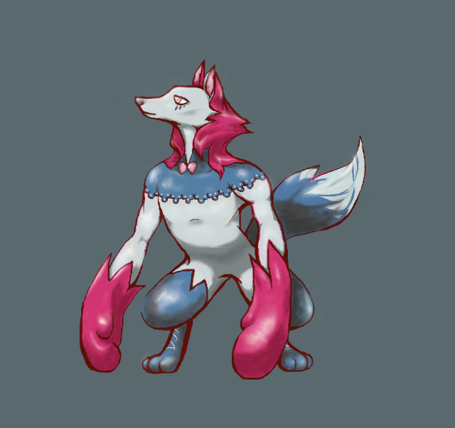
With regards to the design itself, I said lots about it in the linked post, but it's inspired by Charles Perrault's Little Red Riding Hood, both little red riding wood herself (justifying fairy typing), as well as the belligerent big, bad wolf (helping to justify the fighting typing). Body shape also helps convey fighting typing, its nimble and has a pair of boxing glove-like paws. The colour scheme on the other hand, which consists of soft pinks and deep blues, helps convey fairy typing. I envision this Pokemon as a light on it's feet special attacker that draws its power from the moon (adding a werewolf flair to the design), rather than relying on its more limited physical capabilities. It's also influenced design-wise by foxes, which are often devious and tricky in folklore, to help justify Parting Shot. Also of note, is that it's partially based on the maned wolf (but hooded instead, get it). This is particularly important for the section below on ability justification.
On Natural Cure:
I talk a lot about the primary ability, Natural Cure, in the linked post, so I'll keep this short. The ability is usually associated with cute, woodsy, nature-related Pokemon, pink blobs, or Pokemon actually known to regenerate limbs and such. This design falls in the first category, along with other cutesy nature-related Pokemon like Celebi, Shaymin, and Swablu. In addition, the diet of the maned wolf, which this design is influenced by, happens to consist of up to 50% of a fruit known as the wolf apple. This fruit was noted for its nutritional qualities and was used in traditional folk medicine. More importantly, however, its thought that the inclusion of this fruit in the wolf's diet wards off infection, specifically giant kidney worm infection, which is usually fatal for the animal. Perhaps Natural Cure as its ability is because of its diet.
On Aroma Veil and Parting Shot:
This section is intended to justify Aroma Veil as an ability for this design. The justification stems from the fact that wolves have scent glands all over their body's. Notably on their paws and tail, for the purpose of territory marking (its not just pee). The scent these glands exude helps mark territory for real wolves, but I could see this Pokemon using this scent to magically guard against taunt and infatuation and such, as magical fairy wolves are wont to do. This territorial instinct also also helps justify the belligerent move, parting shot. The inclusion of parting shot is also justified by its tsundere-ish expression and its basis on wolves and the maned wolf (also called stilted fox), which are often represented as devious or tricksters in literature.
On Stats:
A much more comprehensive justification for stats, including comparisons to other Pokemon with similar base stats, is provided in the linked post, so this'll be brief. Stat wise, middling 84/86/88 bulk and 119 speed make perfect sense for a petite, nimble creature such as this. While it's frail stature is indicative of its low 78 attack stat. Drawing energy from the moon (referencing werewolves and fairies simultaneously) makes a special attack stat of 115 perfectly reasonable for this design.
CLOSING REMARKS
It's been a lot of fun participating so far!
Yilx, extra huge thank you to you for this comment:
I was skeptical of the suggestion at first, as it seemed like more work than was worth it, but I tried it and actually loved it. I think it vastly improved the design, particularly with regard to effectively conveying the fairy-typing. Thanks also to all the others who commented on my design. The feedback was super helpful!Yilx said:FellFromtheSky I really like the concept. It's probably a bit late for this, but I'd play around with the proportions a bit more; it feels like it'd be a better fit if it were more 'chibi' but that's just me.
EDIT: Huge thanks to Magistrum, who provided an amazing template for many people, myself included, with which to base a final sub on.
Last edited:
One of my favourite designs so far Golurkyourself ! Really encapsulates fairy / fighting! Even still, for your design to properly fit the brief, I think you have too change the appearance to look far more agile than the sumo wrestling vibe that it currently has. Regardless, bravo!
Magistrum I love the satyr theme and I think your design perfectly fits the brief, fast, agile and fairy fighting type-esque appearance. I would perhaps slightly elongate the limbs, the arms moreso than the legs, and perhaps try relocating the cape to the back rather than the hips, just an idea! Also, I think you should try make it appear a bit more cunning and cheeky rather than innocent, as parting shot is, after all, a dark type move. Your design is perhaps my favourite just wanted to let you know how much I appreciate your design!
kekecleon really like the design. Perhaps reduce the amount of black used, as it looks more like a dark / fighting or dark / psychic than fairy and fighting type, and perhaps also beef up the legs to make them appear more muscly. [personally] I think a large issue with your design is the gem eyes, they give off a very psychic type vibe which damages the credibility of your concept as a fairy / fighting mon. Even still, I like how you have done something with eyes, possibly make the eyes smooth, like pearls perhaps? Idk. You have a great concept and design and could possibly win with some improvement.
Yilx great designs for both and great concepts. The thing holding me back for both is how human-esque both designs faces appear. I think both could be amazing but for the lion guy I would work on blending his face into its mane and making his face appear more like that of a Pokemon, and work on making the goblins face appear less human-like. I'm very excited for what your doing, grats on your amazing designs your very talented.
willow616 I honestly love your design. Straight off the bat tho, I would do something more with the ears, maybe make them larger and curlier, that would emanate a more fairy-esque vibe. I think you can also do something with the tail. I would go for a less purply and lighter pink for the body, my main problem is that it looks more like a psychic type than a fairy which poses an issue. I would also slightly shorten the arms and slightly lengthen the legs, it seems slightly off balance. Would be awesome if you could draw an image of it standing up so we can get a more realistic idea of its appearance. I would also change the color of its clothing, pure gold or silver would certainly work a lot better and suit the typing better
Imo. You could possibly also make its fists appear more like that of a fighting type. Lastly, the face is a bit cluttered, so I think you should probably try to simplify it a bit. Your design certainly needs work, but I see a lot of potential for it to be the winner of this years cap, really impressed.
Hope it all helps! :]
Edit: FellFromtheSky Holy damn! You improved your design so much and now I can definately see it as a possible contender, props dude / sister?
Last edited:

WIP

supporting art - curled fist, in flight
I gave it tassels! woo tassels. Decided to push the Hamsa/dreamcatcher aspect with the wing pattern and hanging parts while toning back the bright colours for something more earthen - somewhat more of a forest fairy than a magic fairy. More muted colours bring out the Fighting-type as well. Pretty pleased with this iteration, even though this design could imply a wide range of types, through Rock, Bug, Ghost, Flying, Ground, Psychic... I reckon a palette swap would place some distance between some of these, so I'll keep experimenting. I'd say the base design is finalised at this point though :)
((edit: deleted above post to cut back on potential thread hogging. comments and link to previous design in hide tags below. mods let me know if this isn't allowed))
WIP
like 150px too big both ways ;_;
Take 2 on ~navi backhand~ in the link above, front and back views. Overhauled the design of the wings to make them more fairy-like, and I'm pleased with the shape of the wings but feedback on the color would be welcome as I'm not convinced. Perhaps something that further sets it apart from a Bug-type/Volcarona likeness that I feel I'm flying a little too close to. Anyways, the eye is now on the palm and I made it look a little less human, as per some of the feedback from above. The shape and colour of the hand are more or less finalised - it captures the "terracotta warrior" look I was going for and looks suitably squared off and stout to convey a sense of strength. Next up I'll start work on what the hand looks like curled into a fist for fighting and rehaul the colour on the wings.
Shoutouts to the guy that likened my design to the Hamsa - I wasn't aware this was a thing and I'm pleased with the coincidence. I might add some tassels to the wings or something to make it look a little more like a dreamcatcher, but I'm aware of the similarity to Sigilyph so I'll play it carefully. Thanks all for the feedback, you motivated me to keep this design going ^_^
Last edited:

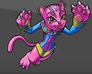
hello this is my star-bound space hero Fairy Fightin
-full art of bottom right palette-
-etc art-
edit:
foCUS B-Miss
Last edited:
- Status
- Not open for further replies.