Artpunch, Headpunch's Art

Welcome to my art thread. My specialty is scratch spriting, however I do occasionally upload black-and-white or colored pencil sketches. All of these are raw because I don't own a tablet.

I update this OP, so check it if there's something new.

_______________
Scratches
_______________
___________
D/P Style
_______________
CAPs:


_1._______2.

1. - Kitsunoh
2. - Cyclohm
_______________
Evolutions:

_1.

1. - Xanatu (Xatu evolution)
_______________
Trainers:

1.______2._______3.

1. - Pink
2. - Xia
3. - Tangerine
_______________
Other:
_

__1.________2.

1. - Wechant (Updated Weechant design)
2. - [Nameless]
_______________
_______________
Advance Style
_______________
CAPs:

__1.

1. - Stratagem*
* The canvas is 80x80 and it was intended to be D/P style. However, I was not entirely used to D/P style at the time.
_______________
Evolutions:

_1.________2.______3.______4.

1. - Serratyr (Marowak evolution)
2. - Cornuleon (Kecleon evolution)
3. - Montroyowl (Delibird evolution)
4. - Shangler* (Lanturn evolution)
* Again, the canvas is 80x80 and it was intended to be D/P style. However, I was not entirely used to D/P style at the time.
_______________
Pre-evolutions:

_1.

1. - Monzing (Zangoose pre-evolution)
_______________
Trainers:

__1.

1. - Leslie
_______________
Other:

_1.

1. - Weechant
_______________

_______________
Sketches
_______________

1.________________________2.___________________________________________3.____________________________________4.

5.____________________________________________________________6.

7.________________________________________________________8.

9.__________________________________________________________10.

1. - Hipmonlee!
2. - Shiftry
3. - CAP 5 Design
4. - Houndemon
5. - L. Lawliet, from the Deathnote manga by Ohba Tsugumi and Obata Takeshi
6. - Nicholas D. Wolfwood, from the Trigun Maximum manga by Yasuhiro Nightow
7. - Vash the Stampede, from the Trigun Maximum manga
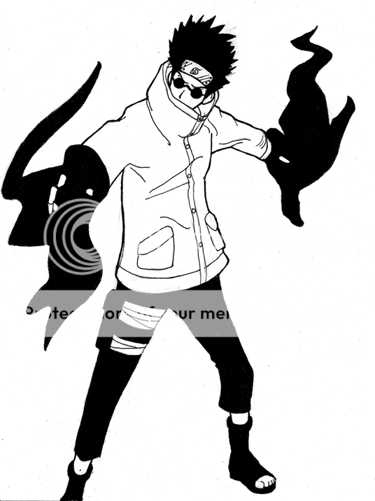
8. - Kimimaro, from the Naruto manga by Kishimoto Masashi
9. - Shino, from the Naruto manga
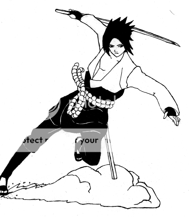
10. - Sasuke, from the Naruto manga
_______________

_______________
Read Before Requesting
_______________
If you would like to request either a scratch sprite or a sketch, please be aware that even if I agree, it may never be done because I have a very busy schedule with little free time. My new policy is to notify you via PM if you have made a request that I initially agreed to, but do not intend to complete. I will accept 1 sketch request and up to 3 scratch sprite requests at a time. Also, allot a significant amount of time for your request; I complete them at my leisure (sketch requests inherently take more time).
_______________

_______________
Pending Requests
_______________
1. (Sketch Request) - [Open]
By:
Made:
Status:

2. (Scratch Sprite Request) - Custom Trainer Sprite
By: Crunchatize Me
Made: July 23, 2009
Status: Not Started

3. (Scratch Sprite Request) - Custom Trainer Sprite
By: Ordile92
Made: August 14, 2009
Status: Not Started

4.
(Scratch Sprite Request) - [Open]

By:
Made:
Status:
_______________
 
That seems reasonable. I'll see what I can come up with. Cross your fingers, though. School starts the 25th for me, so I may be pretty busy.
 
I can't say much for your black and white work since I don't know the characters well and can't say whether any anatomical mistakes are in fact part of the general style. I do like Shino a lot though, he's cleaner than your other works. These would translate well into vector art but sadly you're having trouble with GIMP. The only possible thing I can see wrong with your Shiftry is your coloured pencils and you can't really help that. It's uniquely posed and has quite a bit of personality. ;p

Your pixel work is something I can critique though with certainty. Two outstanding things that need to be improved are general lineart and colour choice. I can understand that it's hard to pack everything in a small space but if you're unable to place hard black outlines for something such as hands in an area to suit the size of the sprite you should instead use a combination of shading and half outlined shapes to give the impression of the limb or object. Look at official sprites such as Squirtle to get an idea of what I mean. As for your colours they tend to be rather boring linear colour ramps with little change between hue or saturation and it's difficult to distinguish between most of the shades. Mess with the colours a bit and i'm sure you'll find something better.

Feel free to disregard this if you're not particularly interested in improving your work. If you want to go further or don't understand any of the points I made above I can edit one of your sprites with your permission to make it clearer.

~Your friendly neighborhood pixel artist.
 
On the manga styles, if you're actually implying that there are any anatomical mistakes, please point them out, because to my knowledge there are none. Please do not go off on lines inside ears or Sasuke lacking nips, that's being picky. They all (for the most part) look like they do in the mangas, and let me state how each was done:

Wolfwood--> Freehand from memory. No reference.
Vash--> Sketch completed in one sitting in a moving vehicle. One reference pic for the coat. Any bumps from the original sketch were fixed later in inking the lineart.
Kimimaro--> Freehand. Reference pics showing hair and feet.
Shino--> Freehand from memory. No reference.
Sasuke--> Freehand. Reference for clothing.


As for the sprites, I can see where you're coming from, however let me point out a few things. When you talk about the quality of the actual lineart itself, I can tell you right now, these look about as close as you can get to my design sketches. I think you may be referring to the lines on Weechant's hat and the fingers on Palledrigg's right hand, which are both somewhat shading issues. The lines on Weechant's hat may look wrong due to the different shades of brown I used, but are, in fact, correct. Trust me, they bug me even now, but I checked them for accuracy more than once. As far as Palledrigg's fingers go, I was limited to the use of two shades of dark blue and just black, so I couldn't use the techniques you're talking about to make it look completely correct. Now the colors. As far as saturation, using duller colors is actually the style I like (not to mention that advance uses duller colors anyway), and with these colors, there is technically substantial change in the luminosity, but it doesn't really look like it. There is actually the standard amount of change in the hue, too. Personally, I like specific examples with critique, so yes, please show me how you would improve these sprites. (Palledrigg's green color almost looks like a gradient, but I don't like his design enough to improve him.) As a side note, there are actually some of your sprites I'd like to critique, myself. Thanks for the concern.
 
Very nicely done for all your peices. I love the simple black and white manga peices alot. Wolfwood is perfect, Vash's gun arm looks a wee bit on the short side but is still very well done too. Shiftry has a great mysterious pose and perfect coloring :D and the scratch sprites are really nice too, liking Weechant best because of that hat :P

Thumbs up!

PS: If I could bother you with a request it would me a scratch sprite of a Kecleon evolution. Take your time and you have full artistic liberty on what the evolution would look like.
 
What a welcome addition to Smeargle's Studio! Glad you joined us <3

Really nice line work with the anime characters. I'd love to see more.


Also: I'm flabbergasted that you were able to do art in a moving car @.@
 
Very nicely done for all your peices. I love the simple black and white manga peices alot. Wolfwood is perfect, Vash's gun arm looks a wee bit on the short side but is still very well done too. Shiftry has a great mysterious pose and perfect coloring :D and the scratch sprites are really nice too, liking Weechant best because of that hat :P

Thumbs up!

PS: If I could bother you with a request it would me a scratch sprite of a Kecleon evolution. Take your time and you have full artistic liberty on what the evolution would look like.
You got it. I'll see what I can do with a Kecleon evo. I think that's about all of the requests I'll take right now. Also, about Vash's gun arm: I was waiting for someone to say that. Unfortunately, I had to shorten it to keep it on my sketchbook page.
 
Holy... from memory?! Right mister, you've officially earned my respect. Any issues I saw has either already been pointed out or exists in the manga style. Have you done any original characters of your own?

Well it's time to get on to the crit then:

I picked Serratyr for this exercise since you dislike Palledrig and it's easier to edit than Weechant (heh, very cute). First thing I did, altered the position of the head. The perfectly side on view of the head almost never happens in Pokemon sprites in general less so in leaf green/fire red so I moved it to a more dynamic position, then I altered the shades. Your original body shade went down in a scale of 20s on luminescence and altered saturation and hue little. I lightened it, added more contrast to lum and slightly altered the sat and hue. Respecting your intent I left it as close to the original colours as possible (ironically it's still darker than shiny Charizard). The large white style of eye never has a pure black outline and is usually shaded underneath with dark body shades if at all. Filled in the gap in the bone behind the head and left Marowak's colours alone.

Now for the rest of the body. highlight colours aren't used around the whole body, usually just the head, upper leg and arms depending on their position and shape. I also rounded off the shading to make the light source more obvious. I have no idea of how the arms are meant to be shaped so I left them alone for the most part. I bulked out the bone ribs on the right side since they look as if they're protruding objects and not patterns. The tail doesn't even look attached to his behind and even with my edit it looks awkward. I lightened the lower belly markings to match Marowak's.

Hopefully this shows you steps in which to help improve your work. I had no idea what to do with the arms though.
Thank you. The colors still fit it and the highlights look a bit better. Good job on the head repositioning. I might tweak it a tad bit, but that's just because you don't know exactly what the front is supposed to look like. Thanks for fleshing out the rib bones. That was one thing that kind of bugged me about it. Placing the tail further to the right is more accurate, and lastly, don't worry about the arms. I redid them several times while spriting it to make sure they looked right. Thanks for the trouble.
@ Wichu: As of right now, it is simply a patch that I'm putting together to include the above Pokémon and a few others over the glitches sitting between Celebi and Treecko. Now if you want to use them in the hack you're doing, I would be honored, because they don't have much of a future besides just as additions. I've done their base stats but didn't bother to post them in this thread. They're available by PM if the idea is down with you.
 
Winter.Mute, just look at this mess I created. His name is Cornuleon, and he's a dork.
Fix'd:

I really, really did not like this project. Personally, I consider Kecleon to be a stupid Pokémon. Oh well, I learned something about Kecleon at least: it's hard to make an evo that looks much different. I rushed on this, so any experienced scratcher will be able to identify some problems with it. For one thing, like Wyverii pointed out with Serratyr, its head is looking too far to the left instead of towards you. I also did a relatively sloppy job with the shadows and highlights (pillow shading, anyone?), but I suppose I'm being too critical. I should mention that its name is Latin, and literally translates "horn lion". Anyways, enjoy. I'll probably fix the shading and highlights later.
EDIT: I fixed everything that I didn't like about it. Ignore my above complaints.
 
That looks very HIIIIIIIIIGH TECHNICAAAAAAAAAAAAAAAAAAAAAAAL dood.

I <3 kecleon and this guy is just as awesome! In fact, possibly more since he might be more usable. Theoretically.
 
Lovely stuff. I'm curious as to how you would render... a Porygon, in your manga style.
Good question there. Before answering that, I'm going to have to study the Pokémon manga itself. Of course, it almost sounds like you're making a request, but I'm going to be "clever" and simply tell you instead of making an example.
could you make a zangoose pre-evo?

please?
That idea reeks of the same problem creating a design for Cornuleon had. It would be somewhat difficult to make a good design for a pre-evo or an evo, for that matter, but I'll give it a try. I'll get back to you on whether I like the idea or not.
Lovely ^_^ I like him alot, thanks a bunch!
Any time.

And finally, if you're wondering what happened to the Light Yagami request, I'll tell you: I'm saving it for this weekend, what with school happening and whatnot. :]
 

Users Who Are Viewing This Thread (Users: 1, Guests: 0)

Top