Hi I know I have a thread up here already asking for submissions, but this one is pretty different from the former so I figured it should have a separate thread. In case you haven't noticed, we've started regular programs for our twitch channel! Our current schedule is Mudkip Mondays (gimmicky/strange/fun teams), Route 1 (Pokemon for beginners), Victory Road (Pokemon for already competitive players), and our standard metagame discussion, Smogcasts. Darkie pointed out that our posts about these programs are pretty dull aesthetically, so we're looking for artwork to spice up those posts! So if the good users of Smeargle's Studio could assist us at the visual media outlets some more, we'd appreciate it!

-
Welcome to Smeargle's Studio! Please be sure to review the studio rules. Feel also free to check out our hub to learn more about this place!Welcome to Smogon! Take a moment to read the Introduction to Smogon for a run-down on everything Smogon, and make sure you take some time to read the global rules.Congrats to the winners of the 2023 Smog Awards!
Artwork for our Live Programs
- Thread starter Ace Emerald
- Start date

I'd be totally up for it! What kinds of art are you looking for for the various programs? Full pieces including backgrounds? Or would portraits featuring select Pokemon with simpler backgrounds be okay?Hi I know I have a thread up here already asking for submissions, but this one is pretty different from the former so I figured it should have a separate thread. In case you haven't noticed, we've started regular programs for our twitch channel! Our current schedule is Mudkip Mondays (gimmicky/strange/fun teams), Route 1 (Pokemon for beginners), Victory Road (Pokemon for already competitive players), and our standard metagame discussion, Smogcasts. Darkie pointed out that our posts about these programs are pretty dull aesthetically, so we're looking for artwork to spice up those posts! So if the good users of Smeargle's Studio could assist us at the visual media outlets some more, we'd appreciate it! What I had in mind were logos for each of the shows that we can use to draw attention to the posts on Facebook. I was also thinking we could have the logo on the splash screen while we're preparing for each of the shows.
Currently, the splash screen is the Smogon University logo on purple background while nothing is airing and also while the casters are preparing for the stream. Instead, maybe we could use the SU logo while nothing is airing and the show logo (or the SU logo alongside the show logo) while preparing for the cast.Last edited:
Sure thing; I'll post up some color/typography options as soon as I can crank them outGonna sticky this for visibility.
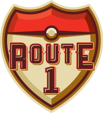
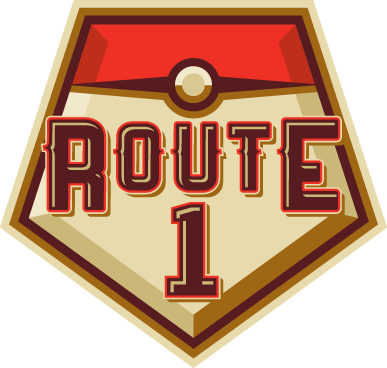
btw Zracknel do you think we could see a few alternate color schemes of that route 1 logo?I realize this is probably a silly question, but is there any compensation for getting your logo used?
I'm a 5th year design student and I'd love to help you guys out, but my time is precious and I can't just make things for free. But I would be more than willing to work with your art team to help develop a branding system for your youtube programs if there was some sort of payment or recognition of any sort involved.
this is just a small sample of my work, I'd love to get in contact with someone who can set some sort of deal up.
https://www.behance.net/tylerdreedLast edited:
Smogon is run by volunteers and hobbyists, so payment is not something that Smeargle's Studio artists tend to expect when contributing to the site. Zracknel and Yilx, two very talented artists whom I happen to know are working in the profession already, help out here in their spare time. That said, Smogon does indeed recognize artists who have contributed multiple works to the site with the Artist's Badge; the guidelines for that can be found here. Smogon itself has a pretty huge audience and the social media sites have been growing at a rapid pace recently, so if recognition is what you're looking for there's that incentive, I suppose. The people running the social media outlets are also very considerate about making sure their artists are recognized for their work.I realize this is probably a silly question, but is there any compensation for getting your logo used?
I'm a 5th year design student and I'd love to help you guys out, but my time is precious and I can't just make things for free. But I would be more than willing to work with your art team to help develop a branding system for your youtube programs if there was some sort of payment or recognition of any sort involved.
this is just a small sample of my work, I'd love to get in contact with someone who can set some sort of deal up.
https://www.behance.net/tylerdreed
Anyways, your designs look great. It would be awesome to see you designing for the streams :0
Keeeferz
Ace Emerald
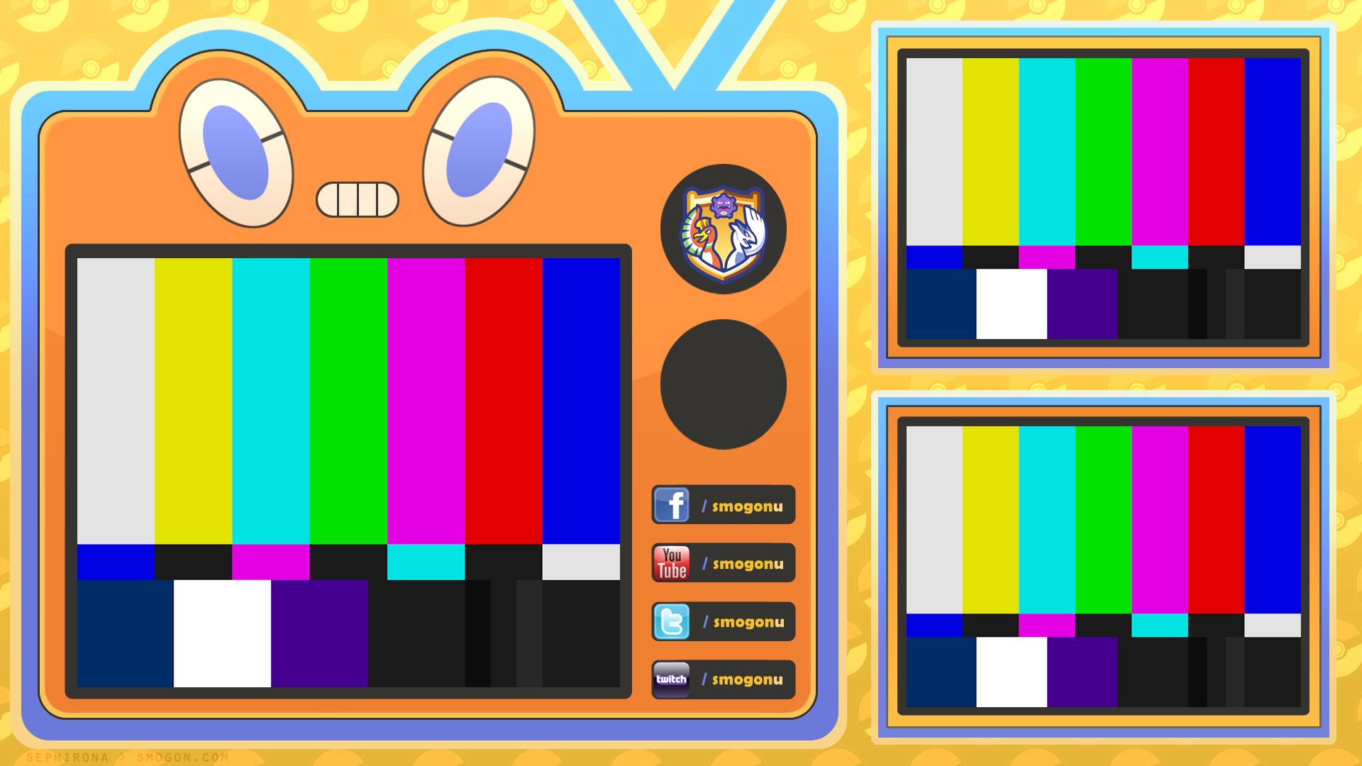
Figured I might as well post them all in one place - banners I designed incorporating Zracknel's logo for the SmogonU Twitch channel:
SmogonU Profile Categories:


Name Plates:


 Last edited:
Player-0
(*′☉.̫☉)
One thing I starting to notice, that could realistically be controlled with volunteer and hobbyist artist at varying degrees of skill level is font choice. I'm defiantly not saying that anyone has chosen bad or "wrong" font, but things are shaping up to look inconsistent.
Are there any practical steps the community can take to help an inevitable issue?
The practical (and typical real-world) solution would be to draft up a style guide, which would set a standard for all independently produced graphics. It would be challenging to do, though, because site-related identity stuff isn't yet finalized (and though I am sure they will be eventually, who knows when it'll happen...)Are there any practical steps the community can take to help an inevitable issue?
At some point in the eventual future, many things will likely stem from whatever is settled on with the logo/identity. However, I don't think we need to wait for that-- we can totally do something in the meanwhile. I know I am tired of things not moving forward, and I'm sure our audience is as well...
In general, I think we're at the phase of things where any volunteer graphics are better than no graphics-- while less consistent, it's a huge step over what we've had up to this point (which has been good-but-sparse, thoroughly basic, or mspaint)
And, for what it's worth, I like the typeface-- Impact-- that sephirona used for those banners, but I am sure that's not everyone's cup of tea
So, having said all of that-- if you would like to propose an aesthetic for our stuff, player-0 (or want to pitch some typefaces we should use, etc) I think it'd be fine to go ahead and post it here, so that we can discuss it.
(The same goes for anyone else who feels strongly about this! Please feel free to jump in)Last edited:
The way I see it, outside of the main forums we're actually just beginning to look into designs for Smogon's other sites so there hasn't been much to work with yet in terms of a style guide, as Zracknel said. I also think that different fonts and looks are needed depending on the circumstances. Using the banners I designed as an example, I went for a bold, slightly more three-dimensional design because, taking into account the limited amount of space available on the Twitch interface and the need to scroll through all the categories manually on the profile page, I wanted them stand out quickly in their panel spots and I didn't want to clutter them with too many extra details. I notice you did use a different font in your overlay design, which looks great on the overlay - but I didn't think a similar font would work for the banners, as I wanted a more solid font that would parallel the boldness of my banners. Likewise, Impact would of course not be as good on your streaming overlay because the overall softer style and subject is completely different - that style is great for the video, but might not translate as well to a banner.One thing I starting to notice, that could realistically be controlled with volunteer and hobbyist artist at varying degrees of skill level is font choice. I'm defiantly not saying that anyone has chosen bad or "wrong" font, but things are shaping up to look inconsistent.
Are there any practical steps the community can take to help an inevitable issue?
In short, fonts go hand in hand with the design of the elements around that font, so that's something we'll need to keep in mind if we're looking to write up a style guide.
If anything, I think it might be nice to have a color guide. Koffing is violet-purpleish, and the color also complements the warm orange yellows of Zracknel's logo, so I thought purple would be good for the bars. But the smogon site itself is predominantly navy and light blues, so there's that discrepancy. I guess something like this might work if we're trying to parallel the main site:

Edit: I ran this through Keeeferz and I'm gonna switch everything to this color scheme anyway, I like it better xDLast edited:
Player-0
(*′☉.̫☉)
Defiantly I agree with what you are saying 100%. Different fonts are used for different things that why we have so many organization methods for fonts. I was just stating that we need some type of lose guidelines. At the end of the day the people who design things for smogon have a huge impact on how users new/old view smogon.In short, fonts go hand in hand with the design of the elements around that font, so that's something we'll need to keep in mind if we're looking to write up a style guide.
If anything, I think it might be nice to have a color guide. Koffing is violet-purpleish, and the color also complements the warm orange yellows of Zracknel's logo, so I thought purple would be good for the bars. But the smogon site itself is predominantly navy and light blues, so there's that discrepancy. I guess something like this might work if we're trying to parallel the main site:
For instance rules for the logo could be defined. In your design you the color scheme of the logo is actually lighter than what the logo actually is. Sure everything is going to get approval, but I just thinking long-term.
Sure. I mean we have some hard standard of quality for other areas of the site. As with Sephirona, I don't disagree with anything you said.In general, I think we're at the phase of things where any volunteer graphics are better than no graphics-- while less consistent, it's a huge step over what we've had up to this point (which has been good-but-sparse, thoroughly basic, or mspaint)
I will see what I can do about the style guide. I'm defiantly more of a hobbyist, but I imagine it couldn't hurt to at least look into, especially with the field of work I want to get into.
In the case of the banners, I was trying to settle on a bar that didn't stand out too starkly against the light grey background of the Twitch channel, which is different from the dark navy blue/lavender Smogon has. Because the resulting bar is colored slightly lighter than the background we see here at Smogon, I wanted to make sure the logo looked integrated with the bar so it didn't also stand out and look out of place on the bar as well. I tried not to change the overall colors too drastically, but I can see where you're coming from, for sure.For instance rules for the logo could be defined. In your design you the color scheme of the logo is actually lighter than what the logo actually is. Sure everything is going to get approval, but I just thinking long-term.
I just still think that there should be some leeway when it comes to the design process. As an example, if you google DeviantART's logo you'll see a multitude of different variations of the same logo - some rendered more in 3D, others with a gradient, some simple with only two colors. Then, if you look at the mini icon on the top left of DeviantART's main page, you'll notice they've drastically darkened the outer rim of their own logo (especially when compared to something like, say, their favicon) so it stands out against their darker olive background. Colors shouldn't have to be set in stone as long as they're not too different from the original and the design is still true to the original - otherwise, the range of design possibilities across various differently colored websites becomes somewhat limited. As I said above, different mediums need different considerations - I think we should welcome new, sometimes experimental design ideas from new artists down the line rather than discourage them.
As our tools evolve and as we expand onto different social media, so will the various depictions of Zracknel's logo. I mean, how cool would it be if his logo was rendered in 3D and could revolve in place as a placeholder for streams in the future? The color palette would be different too when you factor in the lighting/shadows, but it would look amazing still.
But anyways, if you'd like to write up a set of guidelines you're totally welcome to post them and we'll all pitch in feedback afterwards c:Last edited:
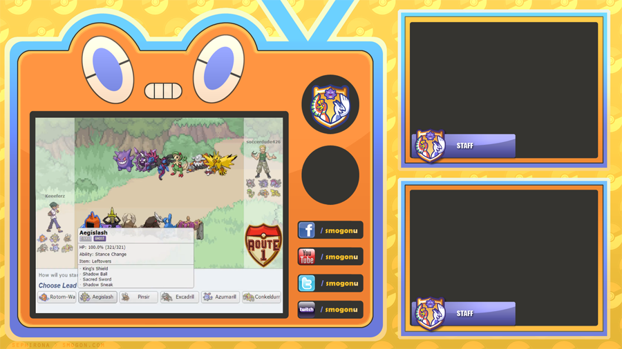
Designed a 2p layout and fixed up the nameplates for it~
Keeeferz I left a spot on the second knob for the program logo of the day, so you can place Zracknel's Route 1 logo there and such. I also tried matching the color scheme better to that of the nameplates. Lmk if the size of the Showdown! area is too limiting or if you need anything else added - I tried not to make it too small, but any bigger and I'd have had a harder time drawing Rotom, heh. >_>
Edit:
here's a sort of preview I guess


 Last edited:
Player-0
(*′☉.̫☉)
I am going to attempt a simple style guide before I finish anything else. Don't expect a 60 page document(initially at least), because no is going to read it in-detail, I purposely want to keep it loose, and I simply don't have the time. Ideally, the community itself would expand it in the future!
Before I actually start work on anything I feel like it would be appropriate to get the relevant leadership of Smogon idea's and thought's. (Toast++ Bummer ,Zracknel ,chaos ,macle ,darkie ) Anyone missing? Even though I want this to be a community effort it should defiantly be at the discretion of the community leaders.
vvv Thanks Ace Emerald. vvvLast edited: Type the @ symbol, and immediately after start the name (no space).
Player-0
(*′☉.̫☉)
(Toast++ Bummer ,Zracknel ,chaos ,macle ,darkie )I am going to attempt a simple style guide before I finish anything else. Don't expect a 60 page document(initially at least), because no is going to read it in-detail, I purposely want to keep it loose, and I simply don't have the time. Ideally, the community itself would expand it in the future!
Before I actually start work on anything I feel like it would be appropriate to get the relevant leadership of Smogon idea's and thought's. (Toast++ Bummer ,Zracknel ,chaos ,macle ,darkie ) Anyone missing? Even though I want this to be a community effort it should defiantly be at the discretion of the community leaders.
vvv Thanks Ace Emerald. vvv I am pretty good at designing logos if I do say so myself :) However I am a traditional artist and I understand that you guys need clean vector logos... would it be alright if I just uploaded some sketches of logo ideas, and others who are good with vectors and fonts could take a crack at them if they see one they like?
Some examples of logo work
Last edited:Users Who Are Viewing This Thread (Users: 1, Guests: 0)
- ... and 1 more.