a few comments for my favourite designs so far..
aragornbird: I like your panther concept, definitely works for physical/special/fighting/dark.. I liked the colour arrangement on the first cat better, with more white and less gold. Or, maybe a darker blue would work better with the more prominent gold. I like the simplicity, I feel like you acheived the look of a fully evolved pokemon without going heavy on the details.
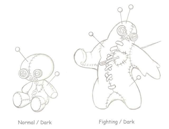
Buffalo Wings: I really love everything about yours, it's my favourite. It works so well, you really captured fighting/dark I think.
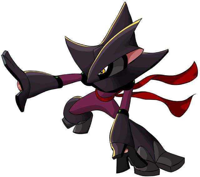
ckpmax: I like this concept a lot but I feel like the fighting type aspect could be brought out more, right now he has a very sly, vampiric look. I think even giving him a more fighty stance would solve this, since his physique could pull of the fighting type.
C~dog: I think your first lizard concept has lots of promise, but I'm not a very big fan of his armour, it's a little awkward. To make it more organic you could maybe have some exposed fused bone in some places, but that merges smoothly with the rest of his skin. I like your first sketch much better than the newer one; the first had more interesting, new ideas, where as the new one is plainer and feels more generic.
Wyverii: I think the raccoon inspiration is great for this. I really like your design too. I really like this concept.
hark: I think the black shadowy substance is better. I think also that if you made it less wispy, and more like a shadow (less fine traily bits, more rounded and stretched, maybe?) it would be more shadowy and less ghosty.