CAP 11 CAP 11 - Sprite Submissions

Status
Not open for further replies.


It's a Transparent PNG (yay, I figured out how to make them).
Those seem kinda...small compared to all the other entries.

@nobiess: I still think it should be pointing the other direction. With regards to the eyes, either the first or the second look good to me.
 
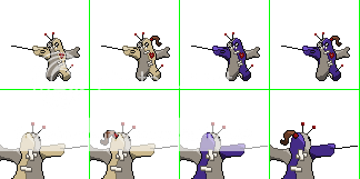
I decided to just keep the original direction,
I like it more.
And I actually putted it on the image on a battle scene and it looks to the opponent to me.​

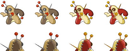
I also started to work on the shinies.
I personaly would want to see something cold, evil.
I thought something greyscalish where the most oppropriat for giving that feeling.​


But I'm not really shure what colors the eyes should be,
I want something that sticks out,but stillloks good.
The last one looks the best to me, but it looks a little messy though. And somehow I'm not a fan of making the 'eyes' darker the the button.​

Anyway I would like to make my final submission soon,
So if someone wants to comment my entry, (s)he has to do it quick​
I actually like it facing the other direction. It makes the black heart stick out more. Besides, it's the "correct" direction.
 
Final Submission

Final Submission

___M________F________M Shiny____F Shiny__Front


___M________F________M Shiny____F Shiny__Back

Gender differences are the alternate patches and the needle end shape.

I wont be around until next thursday, so I wont be able to do anything more now, so good luck everyone who's entering!
 
That's the point. Voodoom is a DOLL. Dolls are SMALL. I'm trying to win over the people that prefer anatomacally correct sprites.
I don't think it's impossible for there to be a large-ish doll, not in the world of pokemon. Therefore, your implicitly "anatomically correct" version is just one of many possible interpretations in a fantasy world. I would have to say that while it is a creative approach to the sprite, it doesn't allow for all the details to stand out of the art design. However, I would enjoy a Voodoom that was the exact same size as substitute dolls, so there's that.

sleet: I really love the different shaped needle, it's a unique approach to a gender difference.

DarthVader317: This sprite has a very good color and shade to it, along with a simple, yet effective pose that doesn't copy the original art. I can see this getting far in the polls.

All in all, there's a lot of really great sprites in this topic. It'll be difficult to pick which one(s) to vote for.
 
I get your point, HouseFantastic. I'm just trying to make my sprites stand out. Not everyone is going to like them.
 
I'm surprised nobody has made a needle change for a gender difference.

If I could sprite, my idea would incorporate heart shaped pins for the female.

Also, Sleet your sprites look damn nice!
Along with DarthVader317
 
I'm surprised nobody has made a needle change for a gender difference.

If I could sprite, my idea would incorporate heart shaped pins for the female.

Also, Sleet your sprites look damn nice!
Along with DarthVader317
Sleet did exactly that gender difference.

My favourites at the moment are aragornbird, DarthVader317 and Doug.
 
Final Submission

.....Male.........Shiny......Female......Shiny....


I'm pretty much finished with the sprites. If anyone has any more comments, feel free to contribute.
 

Skymin_Flower

It's Seed Flare time.
Final Submission

.....Male.........Shiny......Female......Shiny....


I'm pretty much finished with the sprites. If anyone has any more comments, feel free to contribute.
I love...your shiny Female....actually I love your female sprite in general. Really shows off the gender difference. Great job I'll say :)
 
Final Submission

.....Male.........Shiny......Female......Shiny....

<snip>
<snip>

I'm pretty much finished with the sprites. If anyone has any more comments, feel free to contribute.
Man, I love choascrippler's pose, but your shinys and female variants are awesome. I remember someone had hair for the female, whatever happened to that?
 

DougJustDoug

Knows the great enthusiasms
is a Site Content Manageris a Top Artistis a Programmeris a Forum Moderatoris a Top CAP Contributoris a Battle Simulator Admin Alumnusis a Smogon Discord Contributor Alumnusis a Top Tiering Contributor Alumnusis an Administrator Alumnus
Moderator
I have tweaked my sprites a little, and expanded them into a full sprite set:


I adjusted the pins on the front sprite to look less like antennae (thanks for the suggestion, Jebus!). I also tweaked the torso and legs, which lacked structure and didn't really convey the pose properly.

I generally don't like big gender differences, since most ingame sprites gender differences are almost imperceptible. So I made a very small change between the male and female sprites. Like I mentioned in the spriter notes in the OP, I thought this sprite might be a perfect opportunity to use color differences between genders, a la Hippowdon. I tried some different colors for gender on these sprites, and I thought it looked a bit... forced? But, I do like some of the gender coloration differences on some of the other sprites in this thread. I just didn't think it worked well on mine.

Because of how I "version" my sprites as I make them, I'm able to animate them all together, and show a "progression" of my sprite from the very first linework all the way to the current version. I've posted progress animations for the past few sprite projects I've done, so I figured I shouldn't break the trend. Here it is:


I think I'm close to complete with these sprites, and I don't envision any major changes from here on out. But, if you see something small that you think can improve them, I'm still open to suggestions.
 
Well, after alot of people saying that my pokémon should lie in the other direction,
I decided to drop my original pose and either keep the one in the other diection, or make a new pose.
I know it's really late in the process to change the pose but still...
So here is the alternative pose:

I know it isn't finished at all, some shadings still look wrong, and the outlining is just horrible;
But I thought it was stupid to work on it some more without asking some opinions about it.


I love how your sprite turned out sleet, but I really liked the one with the needle out of the body much more. The sprite looks way more violent then.

DougJustDoug,you really succeeded in making your gender diffrence unnoticable, because I can't find it :p Or maybe I'm just becomming blind.​
 
Hi, I found this thread by accident and thought it looked so much fun =)
I hope it's not too late!
Aragornbird's, gun6's and noobiess' sprites are my favorites so far.
Anyway, it was really difficult thinking of a pose that wasn't done yet, this is what I came up with.

Any suggestion? =S

And
@noobiess: I liked the one lying down better. If the way it is facing is an issue, maybe you could try just turning it's head a little bit?
 
Well, after alot of people saying that my pokémon should lie in the other direction,
I decided to drop my original pose and either keep the one in the other diection, or make a new pose.
I know it's really late in the process to change the pose but still...
So here is the alternative pose:

I know it isn't finished at all, some shadings still look wrong, and the outlining is just horrible;
But I thought it was stupid to work on it some more without asking some opinions about it.


I love how your sprite turned out sleet, but I really liked the one with the needle out of the body much more. The sprite looks way more violent then.

DougJustDoug,you really succeeded in making your gender diffrence unnoticable, because I can't find it :p Or maybe I'm just becomming blind.​
Wow, that's so much better. I really love that concept!
 

DougJustDoug

Knows the great enthusiasms
is a Site Content Manageris a Top Artistis a Programmeris a Forum Moderatoris a Top CAP Contributoris a Battle Simulator Admin Alumnusis a Smogon Discord Contributor Alumnusis a Top Tiering Contributor Alumnusis an Administrator Alumnus
Moderator
Yes, the gender differences in my sprites are very tiny. The head pins are a little shorter on the female, and the female has slightly different torso shading, that should make the waists look a little different. It's just a few pixels between the two sprites. Here's an animation that toggles between the male and female, if you look closely you can see the differences:

 
hi,
I made my backsprites in shiny form,
and worked on my front sprite too
I'm still choosing between the 2 poses, but I just can't decide.
And it's not like people around me helped because it's like the half likes the one pose more then the other and visa versa.​


I hope I can decide before the poll are up :p

edit:
changed the standing pose a bit
-->http://www.iaza.com/work/100814C/old5644637131-iaza.gif


X-Act

np: Biffy Clyro - Shock Shock
is a Site Content Manager Alumnusis a Programmer Alumnusis a Smogon Discord Contributor Alumnusis a Top Researcher Alumnusis a Top CAP Contributor Alumnusis a Top Tiering Contributor Alumnusis a Top Contributor Alumnusis a Smogon Media Contributor Alumnusis an Administrator Alumnus
noobiess, I kinda prefer the standing one more.

Also, the eyes of your sprite are not obviously buttons, unlike those of most of the other sprite submitters.
 
@noobiess ~ I think that you should use the crawling sprite. It looks so much more evil and it separates you from the rest of the spriters. It is much more creative. The standing sprite looks too skinny in my opinion.
 
@nobiess: Yeah, I like the crawling one better, but only because the standing one looks like the gingerbread man.

Great work DJD and arragonbird!
 
Status
Not open for further replies.

Users Who Are Viewing This Thread (Users: 1, Guests: 0)

Top