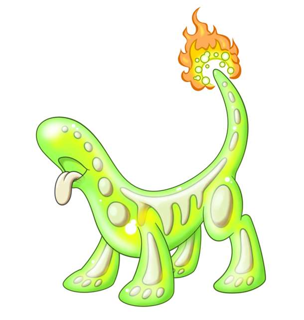
DougJustDoug: Re: Colors, for associating with radiation, have you attempted using blacks/dark-greys to represent silhouetted bones? It may end up not being very cute, but the advantage would be two-fold. 1) It may evoke thoughts of X-Ray images in the viewer. 2) It may help differentiate Hazmutt from the Reuniclus line.
The Batman Beyond villain, Blight, used a solid neon-lime body with a black skeleton to achieve a fairly radioactive visual effect. Up to you if you think it's worth investigating.
Re: Colors, for Shiny: If you go with silhouetted bones, Hazard-Sign Yellow would probably make a decent shiny body. As you said, the only colors other than neon-green associated with radiation are Black-Yellow hazard signs.