
Papainfernape, you're arguing against the point without realising that your counterpoint is the same as Tea's, just coming from the opposite direction. "dry skin" on humans is exactly how the ability is supposed to play out; the bearer has skin that is permeable to water to some degree, and allows diffusion across the membrane. What's happening with some of the entries here is that they are interpreting Dry Skin as involving an integument that is completely waterproof, largely in the form of reptilian scales, the waterproof-ness of which is pretty much the trait that defines them from the amphibians, visually. Other than that some people aren't giving a clear enough indication/explanation as to how sunlight damages their entry.

-
The moderators of this forum can be found in the CAP forum staff directory.
-
Welcome to Smogon! Take a moment to read the Introduction to Smogon for a run-down on everything Smogon, and make sure you take some time to read the global rules.
-
Congrats to the winners of the 2023 Smog Awards!
CAP 14 CAP 3 - Art Submissions
- Thread starter Wyverii
- Start date
- Status
- Not open for further replies.
@papainfernape95 Also, 'dry skinned' reptiles are watertight, meaning that they don't need to be in water to live, and are actually adapted for and thrive in dry conditions like deserts. Things like frogs and mushrooms need constant moistening or else they die, hence the application of the ability, and why reptiles don't quite fit the ability. Though I don't really mind too much if they look cool.
Also, I too would keep the three eyes. They add to the mutant aspect you said you were trying for, and taking it away would detract that. Plus it gives it that little quirky pokemonish touch.
And I would totally stick with the old color scheme, tea_and_blues. Your old design was pretty great as is.
Also, I too would keep the three eyes. They add to the mutant aspect you said you were trying for, and taking it away would detract that. Plus it gives it that little quirky pokemonish touch.
And I would totally stick with the old color scheme, tea_and_blues. Your old design was pretty great as is.

Goodness – I didn't mean to cause such a stir, sorry all. This will be my last concept, then I will return to the shadows and watch the masters continue on.
This was an idea I had before the decaying tree and is of the wet skin variety, which sounds like it goes better with the ability, after all. If it dries out, it shrivels up and becomes useless. I had thought this one would use its large "fins" to absorb water from the atmosphere to heal itself and to create the poisons that seep out of its 8 points.
Awesome work on here, very inspiring. Thanks for trying to point me in the right direction...
This was an idea I had before the decaying tree and is of the wet skin variety, which sounds like it goes better with the ability, after all. If it dries out, it shrivels up and becomes useless. I had thought this one would use its large "fins" to absorb water from the atmosphere to heal itself and to create the poisons that seep out of its 8 points.

Awesome work on here, very inspiring. Thanks for trying to point me in the right direction...

Yes, but their skin gets DRY in the SUN.You can work it that way, but it's a lot harder to make it sound plausible given the way the ability is applied to existing Pokemon. The Paras and Croagunk lines are both based on things with *damp* skin, not dry (Paras even gets Damp as its DW ability). The theme, in terms of flavour, seems to be the opposite of what you're suggesting.
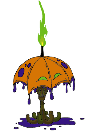
flexistentialist, that umbrella is quite a bit better than your previous attempts! Perhaps you should ditch the orange though, first thing I saw when looking at it was a pumpkin. You may also want to make the base/handles a less woody color.


Help appreciated.
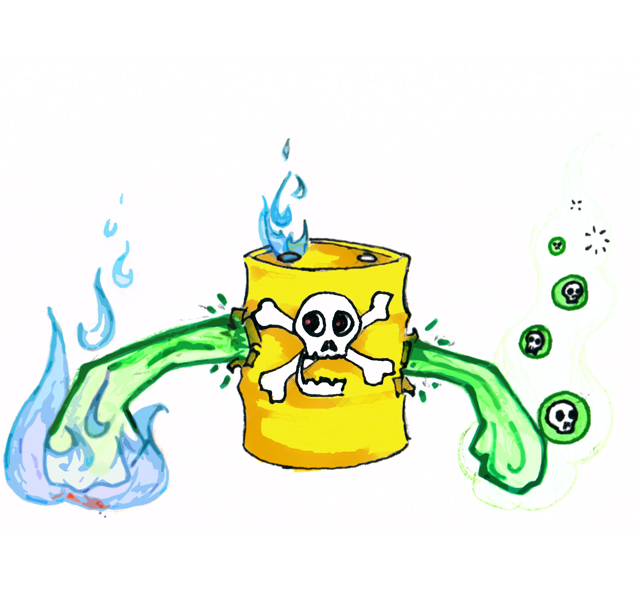
So I have worked on this update for a while, but I am thinking of adding a ripped-out mouth to the front of the can... tell me your thoughts. (I love doug's dog, btw. I also got the impression that it was like reuniclus at first, but I think that it is easy to move past it...)
Finally, I was wondering if the same ability as "dry skin," could run under a different name--similar to how cloud nine/airlock are, or moldbreaker/terravolt/turboblaze?
So I have worked on this update for a while, but I am thinking of adding a ripped-out mouth to the front of the can... tell me your thoughts. (I love doug's dog, btw. I also got the impression that it was like reuniclus at first, but I think that it is easy to move past it...)

Finally, I was wondering if the same ability as "dry skin," could run under a different name--similar to how cloud nine/airlock are, or moldbreaker/terravolt/turboblaze?

thornchild
Guest

Here's my (hopefully) final revision on Jellantern. I'm going to start working on supporting art of this little guy in action. Hope you enjoy. everything you guys are submitting are great so far.

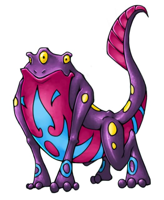
I feel I've done about all the fleshing out of mr slugfrog as I can, so I'm making it official.
Final Submission
This design is derived a bit from a few forms of aquatic life, such as frogs and slugs, and flipped in a way they usually aren't associated with. In this case, the Pokemon is a being that boils toxins in a large exterior stomach sac with its high body heat. The toxins when heated to different temperatures can have a myriad of different properties, even igniting with enough heat applied. The energy created from the chemical reactions that take place within this pokemon is used to maintain power for the pokemon as well as provide the core for its attacks. The liquid is highly toxic though so the pokemon's bright coloring is a deterrent to would-be predators. Ingestion of these toxins can be fatal in even the smallest doses.
These pokemon also live close to water as they must soak on occasion to cool down their immensely hot cores, lest they overheat. When one enters water, it creates a natural steamy hot spring. By mixing the oil in their stomachs, they can alter their buoancy at will, allowing for adept swimming. All in all though, they love nothing more than to rest idly in the water on their back!
Supporting art
Some attacking poses
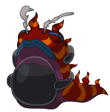
Back angle of the slugfrog
How Fire attacks are carried out
Using its nostrils, this pokemon can execute a variety of smoke-themed attacks
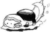
Group picture showing slugfrog with Doug's dog and Mos's snail and Yilx's sun
Thank you to the community for all the feedback and support thus far, I truly enjoyed working on slugfrog! I'm ready to call it a wrap though, until next time!
Final Submission

This design is derived a bit from a few forms of aquatic life, such as frogs and slugs, and flipped in a way they usually aren't associated with. In this case, the Pokemon is a being that boils toxins in a large exterior stomach sac with its high body heat. The toxins when heated to different temperatures can have a myriad of different properties, even igniting with enough heat applied. The energy created from the chemical reactions that take place within this pokemon is used to maintain power for the pokemon as well as provide the core for its attacks. The liquid is highly toxic though so the pokemon's bright coloring is a deterrent to would-be predators. Ingestion of these toxins can be fatal in even the smallest doses.
These pokemon also live close to water as they must soak on occasion to cool down their immensely hot cores, lest they overheat. When one enters water, it creates a natural steamy hot spring. By mixing the oil in their stomachs, they can alter their buoancy at will, allowing for adept swimming. All in all though, they love nothing more than to rest idly in the water on their back!

Supporting art

Some attacking poses
Back angle of the slugfrog
How Fire attacks are carried out
Using its nostrils, this pokemon can execute a variety of smoke-themed attacks
Group picture showing slugfrog with Doug's dog and Mos's snail and Yilx's sun
Thank you to the community for all the feedback and support thus far, I truly enjoyed working on slugfrog! I'm ready to call it a wrap though, until next time!
"Yes, but their skin gets DRY in the SUN."
That doesn't contradict anything I said, so I've no idea why you're being so emphatic. Damp-skinned animals that are at risk of drying out in the sun. Ayup.
Mos & Wyv - OMG so cute that little pic!
the flexistentialist - I'm liking this umbrella, didn't see a pumpkin, but can see how someone would, so I second the colour change. You signal fire well enough without oranges it seems.
McAwesome - I like the idea, but not how you've done the face. It's too "in between" a face and a logo.
thornchild - Somehow it's become too much like Chandelure. I preferred your original box design, it made me think "Oh, a box jellyfish taken literally, cool."


Thornchild, I like your design but the eyes and colour scheme make it too reminiscent of Chandelure for my liking. I think it'd be better to make the eyes more like actual eyes as opposed to cut outs, to help combat this, but I'm not sure whether that would go with the rest of the design.


http://www.fountainpennetwork.com/forum/uploads/imgs/fpn_1336686683__terrorsol.jpg
Also, thornchild- Brilliant.
Paintseagull You've easily got one of my favorite designs, cause lizards are just so awesome. I personally think that the middle set of legs is unnecessary and adds complexity that doesn't need to be there. Lizards are able to stand on their hind legs, which could be a great pose. I love where you've taken the design so far, and am very excited to see the final result.
Flexistentialist:
I like the design, I am just not a huge fan of the colour scheme. The base looks a bit too much like rotting wood and all I can think when I see the main body is "pumpkin"
I like the design, I am just not a huge fan of the colour scheme. The base looks a bit too much like rotting wood and all I can think when I see the main body is "pumpkin"
Woah - didn't expect such a nice response. Pumpkin orange - not a good idea. Can do. I'm quite flexible. If there are any other any suggestions, please don't hold back.


 I have a couple of minor supporting pieces if that's okay... but none of them are in color, because my previous color choices were – well – iffy.
Thanks again.
FireArrow – thanks very much to you! A little positive feedback can do wonders and your praise of my bird helped push me to do the others. (I still like the flamingo too.)


Thanks again.
FireArrow – thanks very much to you! A little positive feedback can do wonders and your praise of my bird helped push me to do the others. (I still like the flamingo too.)

flexi, it's a toss-up between the red and the purple. (don't use the cyan please) If you go with purple, I think you should make the flame orange.
solstice that's a good start you have there. There's a bit of an issue with perspective though, especially concerning the back legs. Might want to move/redraw those.
Also I think it was Tea_and_Blues who wanted this?

solstice that's a good start you have there. There's a bit of an issue with perspective though, especially concerning the back legs. Might want to move/redraw those.
Also I think it was Tea_and_Blues who wanted this?


No art update, since I've been rather busy the last week. Sticking with the non-ruffed snake. I'll get more art in sometime. D:
Comments:
Comments:
- KoA: The pose makes your slug look rather large, I repeat. Not that that's bad, of course, but it was misleading. Anywhoo, solid entry, and I'd be fine with that as our CAP. It certainly fits what we've got so far!
- GRs Cousin: If you'd like, I could have my oil snake sprout flames when it's angry or something, but it won't be the main design. That okay?
- Tin: Less metallic, more organic, or at least make the metal parts merge more than have it like armor. I would suggest a palish green or sunburnt orange for the primary color.
- YourFavoriteEgyptian: I don't think you recognize I have comments here. :P But still: I'm a bit confused over the back-plates, as they're volcanoes, and suddenly, they turn into cartoonish fires. The design is much better than the Grass-implying one you had first; I do wish the image's artistic qualities could be improved as well.
- ZcX: I do love the color scheme you've given the design. :) The fire and poison parts look rather separate, though. Fiery head, poisonous back, with some ambiguous lines and circulatory vessels. Conjoin these elements.
- bluemon: Remember, we're not naming CAPs or flavoring them yet. Though your design is cute, the anemone reminds me less of a lava lamp and more of a gas-filled latex glove. Having the shape be transparent and flexible does not convey lava well. Additionally, how will you put aside the comparison to Kingler in that they're both fiddler crabs?
- Tals: It almost works to me, and I'd love it if it completely did. The fire part's all right with that cooling magma, but I'd need to see the poison part a bit more. I'd think it's Fire/Rock without previous knowledge.
- the flexistentialist: Remember to make the image look its type; how well can an umbrella convey Fire and Poison without something like Ghost coming into play?
- SoIheardyoulikeSENTRET: Much more approval I have for this design. :D It does have that quirk pokemon has, and the three eyes perfect that. I just wonder if the flames on the frog are a bit too stuck-on. If it's necessary to convey the typing, I'm okay, but that's my only criticism.
- Lord of the Fireflies: The middle part of the pokemon remind me of Emboar, with the black body and swirls around it. I could see the rest of the pokemon being more integrated, with a bit more Poison-typing outside of those descriptions and maybe those swirls.
- paintseagull: The blisters are back. :D Thank you.
- McAwesome: Hello? I did have a comment I think you missed a few pages back. :P And we're not naming the CAP yet. And that'd have to be chosen once we choose the abilities. I don't think we're going to edit the ones already in place, but who knows?
- thornchild: No smoke at the top? Well, the current design works better than the arbitrary fire at the head. I'd still like to see the smoke to pull in the Poison-typing.
- noobiess: (Yay, less competition for my oil snake. ;D) I do think too much of the focus is on the turban and beard, whereas the rest of the design is a bit plain. The entire design will need to work well.
- Solstice: Cool. Instead of that skull on its side, though, could it be a little better integrated as a design or as the head. Maybe you could make the fuse the tail. :P Just an idea.
thornchild: And I though that you design couldn't get any better... Smoke coming out of the top is a good idea, but don't make it billow out, try to make it more of a "poison fog" if you know what I mean (well, if your going to even try smoke.)
the flexistentialist: I would try a Green, Black/Purple, and Red color scheme... I may be completely off, but I think it's worth a try.
McAwesome: It's hard to tell if it has a face or not. I would really makes the skull "stick out".
the flexistentialist: I would try a Green, Black/Purple, and Red color scheme... I may be completely off, but I think it's worth a try.
McAwesome: It's hard to tell if it has a face or not. I would really makes the skull "stick out".


Um, I've seen animated sprites on pokemon showdown for Tomahawk. Why not make one for Hazzmutt? Or are you referring to Pokemon Online?DougJustDoug: What if you said, for the sake of argument, (and supporting art) that the bones glow a firey color when it attacks or something like that. I know we don't do animated sprites but the idea of it might stick in people's heads if it was part of the concept, and would possibly be a less obtrusive incorporation of fire imagery.
---
DougJustDoug: Your design is impossibly flawless. Simplicity, conveyance of the concept, and style wrapped up into one beautiful package. It even has a name, and a damn good one. When it comes to a vote, you'll have mine. Thank you.


Ok! I think this is going to be the art of my final submission. I reworked the colors and I like it much more now. Any suggestions before I finalize it?
- Status
- Not open for further replies.