CAP 14 CAP 3 - Art Submissions

Status
Not open for further replies.

thornchild

Guest
I had to really think outside of the box for this one. Most of my initial ideas we're done by others too quickly.

http://img.photobucket.com/albums/v25/mirror/2012-04-29_14-39-37_198.jpg

This is just a rough sketch but the basic idea is of a jellyfish crossed with a floating lantern. It'll hover above the water getting it's prey, It protects it's flame within it's body. I know I ran a risk with levitate being brought up but I considered that if magnamite and it's evolutions can hover and be hit by ground attacks so can my pokemon.
 
Is anyone willing to convince Yilx that the golem one was awesome? The more I look at it, the more I think, "Well, that's just the bee's knees." It really is awesome, and the ancien, bulky, Sun Idol Statue look to it is awesome. Everyone else seems to like his other one, though...

Still love Aragornbird's Gila monster. Simple. Reminds me of past mons like Typhlosion or Poliwrath for it's appealing simplicity. Looks very pokemonish, is what I'm trying to say.

Phazon's could be a pretty sweet Torkoal evolution. I always thought Torkoal was the type that would get an evo in a later game.
 
Seems I missed the beginning of this project! gmail decided that my forum subscription reminders belonged in spam!

I'm guessing from the pictures that we're going to fire poison? =D

I'm seeing some really cool designs and I can't wait to try to work on some of my own!
 
I'm having trouble getting my volcanic-ash elephant drawing uploaded. Any help?
What uploading service are you using? what is the file format? what is your connection speed? details are the spice of life, and they make many questions easier to answer!

meanwhile I took the time to pump out some sketches. I'll periodically being adding whatever comes to mind, hopefully I don't step on anyone's toes in terms of designs, but I'm just sort of seeing what sticks!


Hey all! After running through a couple different ideas, some of which included a sloth, a smokestack, a bong, a cigarette, and a testube, this thing emerged.


Its like a nuclear waste pokemon that exploded out of its silo. Shattered chunks of its old housing still cling to its toxic mass. And yes, it has a gasmask.

PS. C&C greatly appreciated! I'm gonna leave mine in a later edit!
 

verbatim

[PLACEHOLDER]
is a Smogon Discord Contributoris a Battle Simulator Moderatoris a Battle Simulator Admin Alumnusis a Community Leader Alumnus
Hey Sentret, that looks interesting.

One suggestion I might add is to mess with the remaining metal from the silo, go for a rusted look. Apart from the visual appeal I see in it it will put you in great stead if dry skin becomes an ability. This one is more of a personal thing but I think you may want to consider removing the gas mask. It doesn't make sense for it to have at all.
 
I'm surprised that there aren't more volcano-based drawings. Volcanoes emit both extreme amounts of heat and very toxic fumes. Thematically, I can't think of anything more appropriate.

Of the ones I've seen, the ones I like the most are by Quanyails, paintseagull, and KoA. I feel that, as Poison and Fire are some of the most dangerous types, the submission we choose needs to be something fearsome.
 

canno

formerly The Reptile
I don't know why, but I think that a welder's mask would fit it better than the gas mask does.

However, I agree with verbatim, rusty metal would look better
 
I'd say that the gas mask works for it; since it comes from a hazardous material place. That being said, I do quite enjoy Sentret's design.
As far as distinguishing my own design from Eelektross... hmm...
 

Quanyails

On sabbatical!
is a Top Artist Alumnusis a Community Leader Alumnusis a Community Contributor Alumnus
Another batch of supplementary art for the oil snake:

http://img806.imageshack.us/img806/5403/unnamedsnakesupplementa.png

(Edit: The image somehow got resized to under half its original dimensions. I'll repost the full-sized sketches later.)

Left to right, top to bottom: Sludge Bombing or fireballing a Celebi while rolling, using something like Inferno on that Celebi, sleeping, biting on a Stunfisk, starting a line of oil, igniting that line of oil, and having that line of oil FWOOSH into flames.

Dah, I'm having fun with this art, even I'm making too many sketches. >>;

Comments:

  • Azul: Well, my suggestions didn't get implemented, eh? Well, all right. I'll point out the technical parts of the submission if you want it slated. The minimum image size is 320 x 320, so you'll have to enlarge that dimension of 286 pixels. As mentioned, make the puffs of smog solid, rather than having them open into the white background.
  • KenZomg: Hmm, I liked the worm more. But if you make it more humanoid rather than just a worm with arms, I think that'd be better. Like how you portrayed Flamethrower, definitely. Sludge Bomb looks like a psychic attack with that aura around it, but that just might be your style.
  • ikasu: I think those pipes on its head are rather unnecessary and detract from the design. The other issue I have is that there's already a cephalopod in CAP--Arghonaut. I do think others will appreciate variety in design.
  • KoA: I liked seeing the coloring alteration on the IRC. Although I think it could be brighter, it's a very solid entry.
  • elementalpenguin: Your entry's going to be changed, right? Well, I'll be expecting that.
  • Yilx: Your entry will fit quite well if Drought is chosen as an ability. I do wish the design was slightly simpler, for spriters' sakes.
  • LouisCyphre: Hmm. The barbs on the fins are the part that differentiate it from just another fish. Thicker stripes (as you may know) will simplify it for spriters' sakes; but they can stay; Zebstrika has a pretty complex stripe pattern and it works. If you'd like, put a few tear holes in the fins or something to make it less Water-type-like, and more like they're incinerated or dissolved or something.
  • Keiran: I do recommend shading, again, under the fins, so that they look like fins. D: Other than that, I can see this doing well, but, well, artistic quality kinda stops me from giving my approval. :/
  • chrysthehamster: Very strange. I don't think it works, though, as it seems monstrous and more of a mish-mash of stuff than a coherent design. Cohere the design would be my suggestion.
  • meddle: Now I like this! The happy medium has been reached between your first two designs. Typings are good, and design is satisfactory (makes me think of Dusknoir with the two 'faces').
  • SubwayJ: Weeell: How about a restart of sort on that design? I was thinking one of those rounded flasks with the opening as the tail and the bottom of the flask the frog's body. Another bulbous shape for the head, with bumps, if you'd like, can do for the body. And some sort of fire inside the flask on top of that liquid would do, as again.
  • Cretacerus: Dimension! That makes the design more appealing. I do think it's a nice little creature, though it's a bit too fire-type only for my tastes. What might you add that'll make it more poisonous?
  • RockPaperScizor: Hrm... personally, I don't like it. It's intentional in its design, I'd say, but it doesn't work. The typings seem stuck-on rather than mixed together well. Fiery ridge, purple spots, green and purple mouth... there's no coordination of the types.
  • MLaRF: I must say that it's very nicely stylized, and the coloring does well to bring the typings out. I'm concerned if others don't see the Poison-type typing, and see it as just some brimstone salamander. By the way, thanks for the compliment on the shading, albeit it's unimportant compared to design.
  • Calad: Agreeing with Mos here: The 'bean', or icebag, on the person needs to be more distinct. I like the thermometer tail, except it looks too much like something else. Creative and well-interpreted design for the given typing!
  • Jake Of Johto: I just think you should omit the tongue; after all, it's kinda unlikely it'll be sprited, and even then, the tongue'll be indistinct. The design looks much more focused without it.
  • andalite191: Interesting centaur-ant-thing. Hope you add the necessary detail for the typings. :)
  • paintseagull: You've heard from me how I like the incorporation of the typings while keeping the design natural and subtle. The color choice is unique and fitting. Definitely a favorite.
  • Phazon-764: Aw, that hole on the head could've been kept. Didn't want it to look too peculiar compared to the rest of the head. :/ Like a blowhole or something. I do think the fire-like color on the teapot is a bit too obvious, and that the steam is good enough for typing display. On the other hand, the Poison typing could be displayed when you color it in or add details.
  • Lord of the Fireflies: Well, your flavor is good, but your design doesn't show any of that. You might want to check that out. X3
  • elcheeso: One thing I must say is to cut down the number of dots, for the spriters' sakes. I'm not sure how I feel, from a design perspective, on the pipes on the reptile's head. But that's my curio and not yours.
  • Collol: I'm not sure about this. Maybe it's a bit too esoteric an idea in my tastes, but, well, I don't see it. The glass frog has been used and can work, but the vaporizer doesn't immediately show the Fire-type side.
  • thornchild: Nice of you to go beyond set standards with your design. :) Cute, I must say. The first thing I noticed is that the rectangular top turns into a roundish bottom, which looks odd for a jellyfish (even though some lanterns can be that shape). Could you try a cylindrical or elliptical body?
  • pkmn-taicho321: The first definitely reminds me of Venusaur or Vileplume, which are Grass-types more than Fire-types. The vines just further exacerbate that thought. The second design, though, works much better, although it's Torterra-like in the fact it's a normal-ish animal with stuff added on top to make its typing shown. Any way of making the typings more assimilated?
  • SoIheardyoulikeSENTRET: It's shiny. o3o But the typings are detached from one another, y'know, with the Fire head and Poison body. Mixing them together would be much stronger. Maybe melt the metal parts so that there's less indication of Steel as a type.
  • Doran Dragon: The ears still make it look canine-like. :P The spikes, though, do have that poison-like motif to it. And as for the Fire typing... well, it does seem lacking in that, unless the coloring shows that off.
 
Quanyails and MLaRF, I appreciate your commentary on my design. To address both of you (but mainly MLaRF, since you made the point more explicit), the series has recently moved in the direction of talking more about poop! Granted, it's been subtle but noticeable. It began with the introduction of Mulches in the 4th generation, then continued in 5th gen with Darumaka's Pokédex entry, which talks about travelers using its droppings to keep warm during the desert night. I did not know that "Digimon did it" and I'm honestly quite honored by their attempt to shamelessly mainstream the portrayal of poop. At the end of the day, there are plenty of existing Pokémon designs I could conceivably find more offensive to kids than a substance they know very well (hoodlums? actual toxic waste? all the ghosts who abduct lost or naughty children?).

But I'm not here to waste your time. I come bearing a sketch for a new and more serious design - an armadillo!


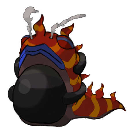
Yes, this is just a B+W pencil sketch because I don't have those advanced art skillz, but I do want to flesh it out further. Aside from being my favorite animal, I became hooked to the idea because I could alternate the bands between "fire" and "poison" themes/coloration. The hexagonal-patterned bands on his shell will end up red, while the bubble-patterned bands will become purple. Small fumes of burning poison emerge from the top bubbles from his shell, but the rest are just for show.

His tail has some poison seeping out of it, but I am thinking that I might just make that a sharp stinger instead. The dillo's claws and ears are fairly rigid, both of them designed to look like flames. The claws not only scratch the flesh of their enemies, but impart deep burns into their wounds at the same time. Some details of his head are included for your benefit - the one on the left turned out too narrow, but I really like the expression on the right-corner head.

The armadillo also gives a justification for a Water-absorbing ability based on the physiology of the actual creature: they are great swimmers and can fill their intestines with air to adjust their buoyancy. Pretty nifty planning, eh?

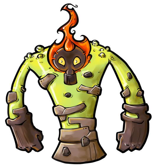
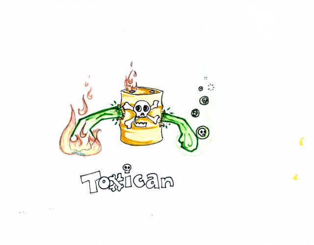
Also, I haven't given up on the poop monster. I included a small sketch of him about to eviscerate some 4× Fire weaks with his mighty flaming fist of ordure. The dillo also likes leaving some...presents, too.

Loving all of your designs so far, but Mos-Quixote's is by far my favorite. So cute!
 
Another batch of supplementary art for the oil snake:

http://img806.imageshack.us/img806/5403/unnamedsnakesupplementa.png

Left to right, top to bottom: Sludge Bombing or fireballing a Celebi while rolling, using something like Inferno on that Celebi, sleeping, biting on a Stunfisk, starting a line of oil, igniting that line of oil, and having that line of oil FWOOSH into flames.

Dah, I'm having fun with this art, even I'm making too many sketches. >>;
This is BY FAR my favorite, the supplementary art just sells it for me, especially the satisfied look on it's face when it ignites it's oil trail.
 
I dig it, catphantom, but I worry that having the three snakes spread apart like that back there will make the chimera's silhouette too large. When compressed down to a 96x96 sprite, you might lose a lot of detail.

As far as water absorption, maybe try flipping the script on the "chimera" concept a bit. instead of being mostly lion with a little bit of reptile, how about mostly reptile with a little bit of lion?
 
a few cents to all those going the chimera/manticore route, maybe have the lion mane be ablaze? and if you want to fit in with waterabsorb or other waterabsorbing nonconfirmed abilities then maybe have the body be in scaly skin? A reptilian hide like the snake tails (which I assume would spit poison)
 

KoA

Sorry, I thought anteaters were real
is an Artist
Still tinkering with color, but I think I may have a final draft coming soon with this general scheme. Now the stomach is at least clearly distinguished from the rest of the underbelly, aye?

 
My current favourites at the moment is Mos's cone snail and Cartoons!'s gila monster. Yilx's is quite possibly the most unique concept seen thus far and it works very well. It shows off both its fire and poison typings without overpowering the other and allows plenty of room for potentional anti-water. It's also freaking adorable.

Cartoons! concept goes in a different direction by being a rough and craggy bruiser. It covers the opposite bases that Mos's submission does. I just love how much a bully it looks. It could work like a thorny devil by funneling and drinking moisture that collects on its skin. Certain direct water absorbs don't work as much.

My suggestion to artists in general is to pay attention to a few things in particular about this 'mon. It's going to counter waters to some extent so really think about how well that works with open flames. Also, since nuclear is a popular theme for this, be careful not to use too much metal in your design, the same goes for rock with lava-like designs. Type confusion can be a constant battle, be careful with how you handle it, especially with our concept which is rather unusual design-wise. This doesn't mean you can't do any of these things, just be aware of it.


Well, here's a concept that I came up with for the contest. When I think fire/poison, I immediately think of a scorpion. It's a poisonous tyrant that lives in the scorching desert, and I'm pretty sure that it's sting would burn. The skull and skeleton armour is for protection from the sun. I might flesh out the idea more, but I need some opinions on it.
 
Toxican!

Sorry, I am new to posting... I thought that this seemed like a good idea, though... The idea is that the sides of the can were punctured, and are spraying out hazardous (and flammable) chemicals, which form the limbs. One arm is purposely smaller than the other, with the larger being the burning side. I would be willing to make both sides burning, but thought that the poison side added variety.
 

meddle

boomer user
is a Forum Moderator Alumnusis a Battle Simulator Moderator Alumnus
Female and male cauldron-mon variations:


I started drawing this before I saw support for the last design ;)

Next iteration will likely have the goo monster back. Hopefully I can draw it with some better clarity and quality (my tablet broke recently D: I should probably just pen tool over my sketch). Wyverii brought up a good point about avoiding open flames in the design (to support the competitive aspects), so I might be reworking the cauldron again.

EDIT:


Preview.
 

LouisCyphre

heralds disaster.
is a Forum Moderatoris a Community Contributor
Furosuto: I dig it! I'd beef it up—not a lot, mind, just enough to shake the "baby" proportions—and consider at least one more pair of legs. It can certainly stay simple, though! No need to render hair on the segments or anything. A scorpion is a great take on the typing, as long as you can keep the Fire- and Poison-typing stronger than any presumed Bug-type vibe.
 

Bughouse

Like ships in the night, you're passing me by
is a Site Content Manageris a Forum Moderator Alumnusis a CAP Contributor Alumnusis a Tiering Contributor Alumnusis a Contributor Alumnus
I'm gonna post part of what was in my earlier post that used a certain forbidden phrase.

This is because I think it is incredibly important for two rising artists in the CAP world, Yilx and Sentret. Be careful with your art being self-derivative. Having aspects that are found in currently existing Pokemon is generally ok and can help give your design a good feel. But I can't escape the fact that both of your designs as they currently stand are derivative (to my view) from your designs for CAP2. And I think as CREATE a Pokemon would suggest, I'd ask you be a bit more creative.

Yilx, maybe it's just me, but the design as a whole is very Necturna-ish (obviously with typing changed.) I know this is because you have your own design style, which is very you, and very cool. But this is early enough to serve as a warning call, from me at least, that maybe you need to make some edits. Personally, I'd like to see you try something not human-shaped in the slightest. You did that very well last time. I can't really offer anything specific about why it's making me think of Necturna. All I know is that it is. And as you are the designer of Necturna... it worries me. If no one else sees Necturna in your current design, pass me off as a raging lunatic. But I don't think I am.

As for you, Sentret, here I do have a handle on what is bothering me. Proportion/curvature etc of the piece itself, but more so the posing. As it currently stands its posing and styling looks like a hybrid of Bronzong and your Scarecrow-mon from CAP2 (again obviously with type change.) Even the color palate is a blend of the two more or less. Bulking it up a bit in the narrow areas will help make it not look like Scarecrow-mon and boxing off certain parts to not feel so round/bell-shaped will hopefully avoid any Bronzong-ness. Alternatively, repose. I know your current pose is nice and compactly space-filling, but it's a very unfortunate pose for the reason I just mentioned. It's got steel on it. The last thing I want is for a good design to not get votes for a silly (but valid) reason like it looks like a Steel type/Bronzong. Your style is cool. I want to make a much more specific suggestion, but I'm lacking the vision to see an elegant solution. But that's why you're the artist!
 
Okay, so it dawned on me that I really can't work fire into my salamander design effectively - or at least as effectively as MLaRF (who did it really well, I might ad; keep it up) - so I've decided to think up something else. When thinking of Fire and Poison, only one thing really came to mind (Australia), and when I thought about drought / Water Absorb / Dry skin, my mind immediately jumped to Tiddalik.

Rough new design. - WIP
 
Status
Not open for further replies.

Users Who Are Viewing This Thread (Users: 1, Guests: 0)

Top