CAP 14 CAP 3 - Art Submissions

Status
Not open for further replies.

Yilx

Sad
is a Top Artist Alumnusis a Smogon Discord Contributor Alumnus
The neatness and simplicity of Quanyails' design gets to me, although I fear that might be just what makes it falter. May I suggest a design element or two more? (Maybe a fiery mane or something) It's already plenty good, though!

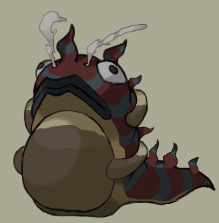
Mos-Quitoxe's, nov's and Birkal's stand out to me as cutemons; I love them! They are great as they are, and I'm glad you kept the cute eyebrows, Birkal :)

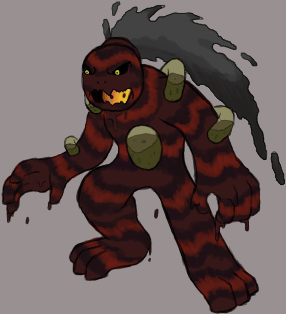
Cartoons! and nastyjungle's immediately gives me a 'woah, badass!' kind of impression, especially nj's. Would love to see Cartoon's fleshed out more.

Azul, your design stands out much more now that you refined it, but you could do a thing or two to make his fingers look a little less... suggestive. That's just me, though.

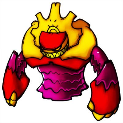
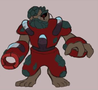
As for mine, I originally had a few, but in the end decided to go with the 'Evil Sun God' rather than the golem or the lolimon (lt's a terrible idea anyway)
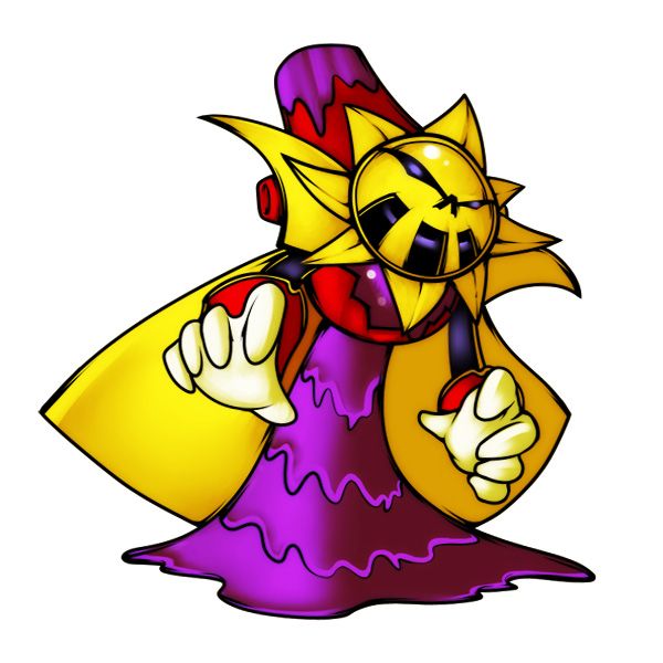


Was originally going to do a 'beaker'-like body, but nj pulled it off way better than I could.

And here is my other design, just for reference
 

Cretacerus

Survivor
is a Top Artist Alumnusis a Forum Moderator Alumnusis a Contributor Alumnusis a Top Smogon Media Contributor Alumnus
Reactions Contest Winner

Here's my idea for this CAP

Since its based on an axolotl it would be compatible with the dry skin ability, as well as a potential recovery move for acting as a special sponge

It's tail is ment to look a bit like its head, a reference to the gila monster
 

Texas Cloverleaf

This user has a custom title
is a Social Media Contributor Alumnusis a Forum Moderator Alumnusis a Community Contributor Alumnusis a Tiering Contributor Alumnusis a Contributor Alumnusis a Smogon Media Contributor Alumnusis a Battle Simulator Moderator Alumnus
Nastyjungle's design is incredibly badass, the only qualm I have with it atm is its similarity to Galvantula. If that could be adjusted slightly I think there'd be a winner on your hands.
 
My favorite designs so far are nastyjungles and yilks, i prefer yilks as it is more original and the couloring is phenomenal.
 
Mos-Quitoxe, I think I may have a crush on your design :3
RotationalBasis' one is cool too, though its smoke could look more hazardous/poisonous. Perhaps give it a green/red glow?
 

KoA

Sorry, I thought anteaters were real
is an Artist
Edited the tubes a bit to make them look more... organic I guess? Still fiddling with the body colors and goop patterning.

 
Yilx's is incredibly detailed and complex. I really like the theme of it, and so far its tied for my favorite design with MosQuitoxe's cutemon snail
 
Must say I adore aragonbird's camel. Too many OU Pokemon look fierce and powerful, we really need a nice herbivore in here. Nuclear reactros require water to cool the rods, so the Dry Skin concept could work wonderfully here. Full support behind that camel.

I also adore that little snail guy. SO sweet! With stuff like Celebi and Reuniclus in OU, I don't see anything wrong with the artwork. So yeah, putting my support behind these two.
 

Yilx

Sad
is a Top Artist Alumnusis a Smogon Discord Contributor Alumnus

Made a few changes from some suggestions. Thanks fate :)

Also finished the Golem as per sgtwoodsy's request...


I'm really leaning more towards the evil sun god dude myself though.
 
I was going to submit an artwork, but after looking at all these designs, I feel i've already lost.

Cartoons, AragornBird, NastyJungle and Yilx are the frontrunners right now.
 

Quanyails

On sabbatical!
is a Top Artist Alumnusis a Community Leader Alumnusis a Community Contributor Alumnus
Okaaay. Well. I've got recommendations to make more of a meaningful design (as expected), and Mos suggested something vehicular. So here's an alternate design (of course, haven't shaded, smoothed, etc), but is slightly more interesting. I feel like this design loses a bit of detail, but, well, do others like it?


Not sure if the puddles on the lower left constitute as 'props'.

I've thought of this creature holding onto its tail like an Ouroboros and wheeling off, leaving tire tracks in the sand or wherever it lives.

And for comparison, the first design, which I've edited to be smoother and touched up on stuff:


Onto comments!


  • CyzirVisheen: Looks very nice and quite fitting. Looks almost legendary, lol, but that's beside the point. I think its design is quite fine, and I'm curious on its color scheme. :P
  • meddle: The art style reminds me of LynxGriffin's All Heart series. Other than that, I'm getting a bit of a Steel-type vibe from it, but I can definitely see it as Fire/Poison. Maybe the eyes could be a little less layered and a little more lively.
  • Mos-Quitoxe: The name that's been in my mind for this design is 'Shellfire'. :P It's adorable, as people've mentioned before. I can see it becoming friends with Krilowatt.
  • KenZomg: The design works, portraying the two typings very well. Its simplicity works.
  • KoA: Cool design, I must say. I'm not too sure what it is--some golem?--but it works quite nicely. The fire and poison parts blend well together, instead of having them separate as some I've perceived of other people.
  • Azul: The growth on its head could be a bit simpler, in my opinion. The origin of the design might have something similar, though if the head's there, then it's kinda odd. The bottom design reminds me vaguely of a tornado, even though I can see well that it's Fire/Poison. A few bands of sorts around the 'core' might make it look more body-like. That is, if you alter the position of the head.
  • trulyElse: Your design reminds me of a previous CAP one, though it does need something to make it seem fantastic (as in, fantasy), because it's an upright salamander for now.
  • bluemon: Hrm... the mouth just seems out of place for that, but then again, I don't know what parts you draw from that mythological creature. Maybe the coloring will prove to me otherwise, but I don't see the 'poison' in it.
  • Doran Dragon: Chimeras. :D I think you did a nice job pokemon-ifying that creature, and, with its roots, providing a good design for its typing. I was thinking of making the head more draconic, maybe, to show the Fire-type side of it, but would that make the design too reptilian in total?
  • aragornbird: Ah, I like the chimera sketch. Fiery manes might be commonly used, but it'd work. The Gila monster is a simple, but effective design. The camel... well, lol. Amusing, though the existence of Camerupt deters me from that.
  • Cartoons!: Seeing the tail of your creature match the body more would be nice. Is there any explanation for such a contrasting tail to the body? (Yes, I know Gila monsters normally have fat tails, but the color? O_o)
  • Kwihll: I'm ambivalent. It shows the typings well, and it's got personality to it. It's good, but it's not wholesomely impressive.
  • Birkal: I can quite see this design in a pokemon game, albeit with slightly exaggerated roundness. The stick is a good addition, though the purple things on the end seem extraneous. If you'd like tips, what about more finger-like webbed digits or having the same color throat/stomach?
  • Nastyjungle: My goodness, this design caught my eye. It's definitely awesome, with the venomous burning skull motif. At first, I felt the fire was a bit contrived, but then I figured it works as some sort of fur or thematic addition. So yeah, nice job.
  • nov: Yeah, more of the Poison-type could be added to it. Maybe just recolor it so that it's not that red and orange. The spikes on the tail seem just 'there', unless they travel up the body. And the back legs; is it an amphibious lizard?
  • Okuu: Aw, the goat. Yes, I'd love to see that for the alternate typings, but no, not for this one. I figure some other animal would work for that bellow-like design you have. Maybe an elephant, if you'd like mammals, with its large body and pipe-like nose.
  • Eszett: O.o Well, reminded me of a gingerbread man at first. But no, that won't do.
  • Josia Richter: A description would be nice; otherwise, I think it fits Fire/Psychic or Fire/Ghost more than Fire/Poison. Sorry. :/
  • breh: Looks rather alienoid. The geometric aspects of it don't convey Fire or Poison to me, though, but instead, Steel. I'm also confused on which direction that design is facing. Maybe I'll figure it out when you color it.
  • RotationalBasis: KIWI. Nice of you to think of a flightless bird that ties in to Fire/Poison. I like the creativity! I do wish there was a little more of the Fire-type to it, but the smoke can work well enough for that. Oh, remember to make your background white for your final submission.
  • Lune: You've said it; it looks very much like a Rock-type pokemon more than a Poison-type one. Instead of those rocky plates, maybe smooth them out or make them scales and add some design (I'm not sure what, though) to make more of that Poison typing?
  • Yilx: A bit complex again... though the typing does shine through the details. It's quite unique as well, being some evil mage thingummy. Unique mostly because of how human and yet, inhuman it is.
  • Cretacerus: It's quite Fire-type looking, and lacking in any poison-type motifs. Also, I think that the actual style of the image would have to be improved for me to make more sense of the design, unless the stylization is meant to be something Mayincatec. In that case, ignore that. :P
  • MikaDo: Could you resize that image? ._. Not all of us have gigantic monitors. One thing I think'll deter people from voting on that is that we've already had that feminine pokemon in the form of Necturna, and I don't think everyone will be appealed with another right after.
  • SubwayJ: Maybe it those test tubes were included in the design itself (I vaguely recall a frog with pockets in its back, so stick tubes in that), it'd be stronger. Otherwise, that tube doesn't go with anything and just works for the creation, rather than the design, of the pokemon. Also, the frog itself is rather boring. Charge up some creativity! :)
 

erisia

Innovative new design!
is a Site Content Manager Alumnusis a Forum Moderator Alumnusis a Community Contributor Alumnusis a Top Contributor Alumnusis a Smogon Media Contributor Alumnus
SubwayJ, I like the idea of the test tube frog, but I get the feeling the design will be too busy to sprite effectively. If you can make it less complicated, it'd be pretty cool.
 
Quanyails, I like the second design a bit less than the 1st, but it's still really good... but I like the Tail in the second one a lot too.. o.o nontheless, full support to the snake!
 
Aragornbird's Gila monster is my favorite right now. It's simple, it looks good, and gets across the poison, fire, and dry skin/whatever really well.

I like Yilx's second one better than the first one, the evil looking golem. There's something about it that makes it seem awesome; maybe the coloring, or just the evil look to it.

I was doubtful of MosQitoxe's until I saw the second round of sketches he drew, and now I'm sold on his pokemon, too. Those are my three favorites, probably.

Will say I'm not hot on the cauldron one... I don't mean to be mean, but it seems like a very esoteric idea for a pokemon design, a la Vanilluxe or Garbador.
 
I am totally in love with Mos-Quitoxe's lava lamp cone snail. It's so cute :D (and I happen to utterly love shuckle and cone snails already)
Meddle's Cauldron is also great :)
Both of these Have the same problem as Trubbish and Vanillish, being based of distinctly human-made items. But now that people have got used to that a bit, I think more "manmade" pokemon are fine, they're already out there, no harm adding more. They really look like pokemon that could have actually been released on B/W.

The gila monsters and/or komodo dragons are also fantastic (I already love komodos too) and work so perfectly with poison/fire
KoA's sludgemon.. thing is also brilliant

Everyone here is so creative, and the art is wonderful. It's great to see :)
 

KoA

Sorry, I thought anteaters were real
is an Artist
Since Mr. Lava Golem man barely received much feedback, I decided to go and doodle up a couple more designs.

The first is kinda like a magma blaster dude, though he looks more like a Megaman boss lol


Second one is my new current favorite. I tried to shy away from the usual ferocity of my pictures and doodled up like a weird derp-frog-slug. I tried to blend in perfectly the two elements without one being overpowering. It mixes poisons and oils in its stomach and uses the power created through this process to both power up its body and attack.


Personally I'm liking the slugfrog more. Thoughts?
 

Birkal

We have the technology.
is a Top Artistis a Top CAP Contributoris a Top Smogon Media Contributoris a Site Content Manager Alumnusis a Battle Simulator Admin Alumnusis a Senior Staff Member Alumnusis a Community Contributor Alumnus
Birkal's design appeals to me the most for some reason. Maybe it's the dart gun...
Thanks! I'm working on colors a bit since I've gotten a bit of criticism that it's not "Fire-type" enough. I'm really trying to avoid open flames because of CAP3's ability to take on Water-types. So I did a few rough sketches of a few action shots in the image below:


On the left is it surviving in rain (and enjoying it too!), while the right is it swinging down from a branch to shoot some poison. I'm going to try to make the throat thing that frogs have more fire-like; that's where it stores its fire. I'm thinking about adding some facial paint or more flame-like looking spots. Any thoughts are appreciated! Here's the link to my previous post.
 

erisia

Innovative new design!
is a Site Content Manager Alumnusis a Forum Moderator Alumnusis a Community Contributor Alumnusis a Top Contributor Alumnusis a Smogon Media Contributor Alumnus
Since Mr. Lava Golem man barely received much feedback, I decided to go and doodle up a couple more designs. Thoughts?
My problem with the top one is it looks a combination of Magmortar, Golem and Regigigas. The slugfrog one is pretty interesting though, and you can adapt it to have Dry Skin, high HP, and other attributes relatively easily. Go with that imo.
 
I really like Cyrz manticore idea, I just love the manticore concept in general and I think it's one of the more "pokemon" looking ones but I am also in love w/ the lavalamp snail, and would support the Gila monster poke or the Quany's snake.
 
@Quan: I did plan to add ram horns to the head, but it didnt look that good. ill see about adding it when i change the head to more of a lion.

I also figured that i could let the background of the chimaera it'self provide most of the typing, but i can see if i cant add more fire.
 
Shitty colouring job - my budget won't accord me anything more sophisticated than MS Paint - but I've always thought a Bombardier Beetle pokemon would be good. I mean, a beetle that sprays liquid projectiles is pretty damn pokemon-like already if you ask me.

 
Attempt 2


I tried to make the frog INTO the vial this time, It turned out better.

Still looking for a way to reference fire type, any ideas?
 
Status
Not open for further replies.

Users Who Are Viewing This Thread (Users: 1, Guests: 0)

Top