CAP 14 CAP 3 - Art Submissions

Status
Not open for further replies.
meddle: The cauldron is really looking good now. I take back what I said at first. Personally, I like the two-in-one look, but I can see why it'd be a problem. You could make a decoy face on the cauldron, the way moths have decoy eyes on their wings.

bugmaniacbob: I'm seeing a lot of similarities to Charmeleon, more than quilava. But I'd really like to see the followup sketches, cause I think it could be really cool.

Yilx: You can't turn down all the people who want to see more of the golem now! :D
 
Just gonna throw this out there.

Seeing a how almost all existing fire types use red/orange as the majority of their color palette (and purple for poison, for that matter), going for some less-predictable colors would be nice. Some of the more toxic-looking greens in particular look great. Of course some splashes of red are fine, but if it's predominantly red/orange then it's just another face in the crowd.
 
I just thought I share some of the ideas I had
This is a sketch I drew for a design based off the hagfish.
The idea is that the hagfish coats itself in mucus, and this would supply the poison type. For the fire type I thought it would be neat if the mucus contained alkali metals, like lithium and potassium, which react spontaneously in the air and violently in the water. this could be the design counter for waters because as soon as they attack it a flame would erupt.

I think that say coating the #cap with a little alkali metal could have a cool result. not only would it produce a poison/fire type with unique coloring, but it wold also give some flavor explanation for why #cap would do well against/in rain
 
Mos-Quitoxe's design and concept are both by far my favorite. It has perfect synergy between the typing, the physiology and abilities of the cone snail, the pokemon's lore, and the potential attacks/abilities it may receive (love the concept art of its Dry Skin [although I think Water Absorb would be more fitting], Shell Smash, and ability to dogde). It also blows me away how it seems Mos-Quitoxe came up with it on the spot. Finally, I am personally a huge fan of cute, harmless, and/or otherwise somewhat simple pokemon (in terms of appearance) who are actually monsters when it comes to battling capabilities. I would very much like to see this concept succeed.

Other ones that I really enjoyed were NastyJungle's spider design and Azul's tubeworm idea. I would like to see NastyJungle expand on his by means of information as to what his pokemon is and how it behaves and lives. As for Azul, the pictures and concept are better every time he or she posts them, though I will miss the worm golem thought.

In any case, those were simply the top three I liked. Other mentions go to Lord of the Fireflies' desert bat and the anemone form of Fatecrashers', but really, this thread is full with great art and concepts from everyone. Keep at it, fellows~!
 

KoA

Sorry, I thought anteaters were real
is an Artist
After some revision, I've settled on what I'm gonna call my final color scheme. Made it so you can see his stomach better and see my original intention with using it as the basis of his design.


This design is derived a bit from a few forms of aquatic life, such as frogs and slugs, and flipped in a way they usually aren't associated with. In this case, the Pokemon is a being that boils toxins in a large exterior stomach sac with its high body heat. The toxins when heated to different temperatures can have a myriad of different properties, even igniting with enough heat applied. The energy created from the chemical reactions that take place within this pokemon is used to maintain power for the pokemon as well as provide the core for its attacks. The liquid is highly toxic though so the pokemon's bright coloring is a deterrent to would-be predators. Ingestion of these toxins can be fatal in even the smallest doses.

These pokemon also live close to water as they must soak on occasion to cool down their immensely hot cores, lest they overheat. When one enters water, it creates a natural steamy hot spring.


And some cute supporting material showing derp-slug at home in the water hunting prey:


:>
 
Color work on the old sketch, although I'm reworking the concept into a more stuck in tar. (not shown here)


edited to fit the rules while I work out a better scheme.

Tar, namely tar pits. Tarpits have trapped and contained hundreds over hundreds of creatures and brought them down into a destructive grave. Though for the likes of this creature, the tar pit is part of its life and it's sadly something it cannot escape since it will ever be reborn in its muck.
 

Yilx

Sad
is a Top Artist Alumnusis a Smogon Discord Contributor Alumnus

Dry Skin


Rollout (And also in case we get a bulky/high speed spread)

Fire Punch and Flamethrower

Alternate view of my Golem.

Haven't done feedback in a while.

MLaRF: I really dig the shade of maroon-purple you've given your salamander. It's a pretty much a solid design, except that you might want go give the backmost leg a shadow as it it placed father back in your picture.

Calad: I'd be sad at the loss of another potential cutemon if you don't finish this up :(

paintseagull: Again, I really dig the colour scheme. You might want to define how the 'globules' on his back look like more, though.

elcheeso: Very creative use of the 'head' to make him look like a tribal leader of some sorts.

SoIheardyoulikeSENTRET: Eek, badass!! Not much I can say about it, I think it's pretty much as good as it is already! Only thing I can say is to think twice about the gas mask and the colourscheme; they don't seem to go very well together, in my opinion.

Lou: My suggestion about the flame-like patterns still stands, although I really like what you have so far.

KoA: This is probably one of my favourites to win right now, alongside Mos-Quitoxe and...

fatecrashers: I prefer your spiked turtle, but the cute aesthetics the anemone pot gives off makes me smile with glee, too... if I had to pick one I'd pick the anemone, though.

meddle: You've come a long way with this one and your latest iteration of cauldron-grimermon is looking beefy. Good job!

LightlyLights: Your tar phoenix has lots of potential. First off, I'd watch out for how you did the 'wings'; I understand the effect you tried to go for, but they might not be in compilance with the submission rules. You could try more shades of red/orange/yellow on it, too.

bugmaniacbob: This one stands out from the rest of the reptiles with it's posture and mane, to me. I like it!


I think this pose, with the stinger more prominent and fangs visible, will hopefully solve that problem with the unclear poison typing. Also, added some shading to spines and tried to increase the amount on the back legs.

Bore meefdack!
Yilx - Golem looks glorious. I might suggest making the fingers more separate. Like how the red is used as a border for the yellow and purple.
Also you changed it on me in the middle of righting. That first shot looked suggestive until I read what it was. I'm so sorry! QnQ

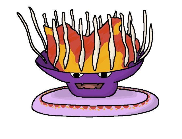
LightyLights - Love it, but the outline on the red part is hard to see. It might also be cool if you add some colour variation in the feathers, but it's your call.

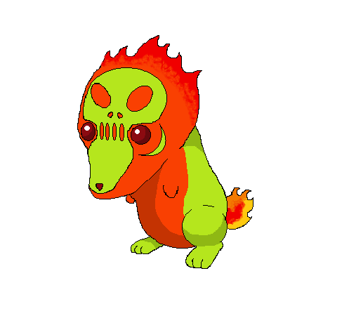
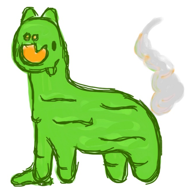
KoA - Too cute. Though smoke coming out of stage right nostril isn't really shaped like smoke.

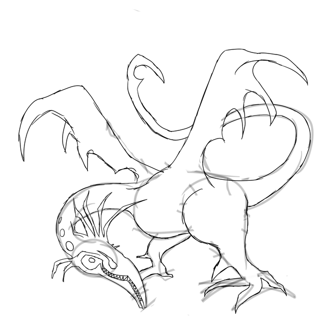
Quark - This is an awesome concept and drawing. Can't wait to see some colour up in that bitch.

Daenym - On your comment, I agree. That would be way cool to see. It is nice to see poisons have some red splashed in, and some purple added to the fire roster, so in that regard it's kinda nice separation, but I still think you've got a solid point.

SharkDiftry - Pretty nice, I'd like to see some detail or colouration breaking up all that bright orange. Also I like your name when it's letterflopped.

Flord of the Lies - Cool concept, though its cuteness may imply more of flying type than poison. Make it scary is what I'd say. Also, naming and pokedex entries come after the art is decided.

Meddle - I like it better now, but I'll have to agree with EvenSeagles' feedback. It's not as confusing, but I personally think it would benefit.

BugBaniacMob - I like it. I think you might want to have less of an outline where the head meets the fire, it makes it seem as if his entire head caves in and there's a torch inside it (assuming this isn't the case).

Ruckechoo777 - I'm kind of missing which species of coral or sea sponge it's supposed to represent. There are a lot of variations of ocean shit.

JubwayS - I actually liked the frog a lot better. This design feels quite boring, and without knowing the original inspiration, doesn't even suggest poison typing.

Rhasylum Apsody - Squeeeeeeeeeeeeeeeeeeeeeeeeeee! I love this guy with his little tentacles and monocle and moustache and it's adorable! I love it forever.
[/girlymoment]

CouisLypher - It's nice, but something about the colouring isn't that interesting. Maybe if you made the purple darker and the orange a bit more prominent, such as along the ends of the fins, it would look zeta cooler.

Azul - Adorable. I'd say purple or a lighter version of the blue. A darker purple would also probably work.

Cretacerus - Pretty solid, odd anti-aliasing but a bit of clean-up'll fix that.

CrateFashionFashers - Both are good. Hella lot o' spikes on the turtle. Anemone is in my opinion better, but it just feels a bit flat to me. Maybe if ya added in the yellow markings from the turtle.

Rosia Jichter - There's... a lot of red. With the fact that its dung kinda looks like molten rock, you can take this concept to space and halfway back again, but it'll need some work. I'd say making the whole body visible if there's any behind the molten dung. Also, you may want to separate the arms from those red cracks in the dung, unless he's got insanely long and twisty tentacles.

Chomz - I really can't see the connection. I'm sorry. Good designs, but I don't think they fit the demand.

ElyTruse - Thanks for the compliment! I think that design's cool, but if you gave it a more belly-down stance (a la google images) it would look more froglike and less Darmanitanlike.

cMAwesome - That's just damn cute. I have nothing else to say.

Furosto - Awesome, but I'd suggest letting it stand a bit lower like a scorpion really does. Also, it would be kind of hard for it to balance like that with only 2 legs positioned where they are.

Nagstantler - Like it. Colour that bitch.

Eszett - Really like it now. May want ta tone down the detail along the shell (I'd say just repeating the hexagonal pattern), and also in the bottom-right pic his head reminds me of Tepig (esp. in Tepig's Tasty Treat Toaster), so maybe if you made him breathe fire from his mouth instead.

Droran Dagon - For some reason, that colour scheme used that way just isn't fitting my jive. Maybe if you swapped the red and the purple around?

SoiherdyoulikeSENTRET - Pretty awesome. I don't really have any suggestions on it now.

Tkmn-Paicho321 - The frog idea's better in my opinion, but y'ave some competition with Birkal for the frog-with-a-pipe-they-put-in-their-mouth.

Collol - Cute. Chuckled aloud a bit. Though I feel you may have lost some liquid vapourizor to the frog.

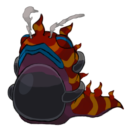
Elcheeso - Pretty nice, I just think the headpipes may benefit from pointing back a lot more.

7azon-Ph64 - I liked it a bit better in your older version, but that's just my opinion.

SaintPeagull - Solid. That's all there is to say, really.

1aliteAnd91 - It's cool, but it would be cooler if it didn't have such bulbous legs. Shoulders are awesome and I will hate everything forever if you change them.

OakJfJohto - Awesome. I think the green tongue fits best, but you may want to try a deeper blue as whale.

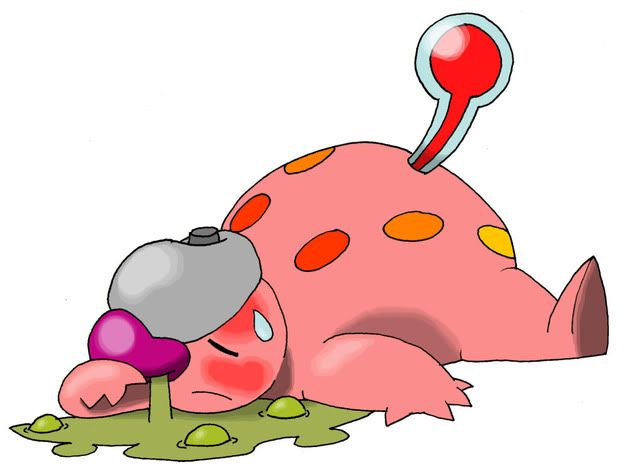
Calad - Change that thermometer's position, for the sake of that poor mon! Otherwise awesome and creative, but may need a bit more detail on the solid orange.

MLaRF - Stop being so awesome.
 
so i changed colors with my chimera. Im still tinkering with colors at this point. I want to know if it looks better brighter or darker.


Alt colors: http://marriland.com/oekakidoodle/pictures/MO_D_115177.png

also, some supporting material:
Flamethrower

Dry skin/Water Absorb - I have to explain this. Basically, the mane, which is made of toxic substances, absorbs water, which it can store and use it to use scald, or use it to spread poisons around via a mist such as haze or smokescreen. It also helps keep CaPmon 3 from growing too hot due to the thick toxic fur and red dry scales.


Sorry, the outlines are a little bit ugly, but it is my first artwork.

This salamander's skin is shriveled, it should refer to either Dry Skin or Drought. Its tail has toxic stings - this applys to it's toxic type. The body is filled with magma. You can see it if you look into its scars.
 
I'm back and now I know Photoshop... that's a deadly combo


Well here's my first attempt, it's a salamander if you didn't guess that already. I'm entering fairly late compared to other and so many of the other entries are so good (see Nastyjungle and Yilx of the top of my head) anyhow I hope you like it, tell me what you think.


I don't know what's happening with drought now~ 8S

Hope you enjoy!

nov: I think that it would be best to make the hair on the back of the head much bigger, to make the nose more bulbous and sonic the hedgehog-like, to give the poor thing some ears and to make the eyes less stare-ey (read: sclerae and pupils).


I feel like mine is terrible after Mos's concept art, but here's another idea of mine.

Many types of shrew are poisonous, so I thought why not? I incorporated the poison with the skull and green coloring, and the fire should be obvious.

Thoughts?
 
I like Steampowered's design, but as of now its illegal cuz the gas should have a distingishable outline and I dont really like the cloud looking things with V shapes on its body otherwise is really cool and original seeing as how its blue and stuff
 

Calad

Hero of the Blue Flames
is an Artist Alumnus
Thanks for all the comments!
So here is my design.

Fevermon.

v1


v2


It's a cute design [we haven't see cutemons here in CAP besides the Electric/water one], like a gimmick character.
It's also original. I made the "fever" concept to the fire [high temperature] /poison [illness] pokemon.
And finally, he needs a lot of water, so you clearly see those abilities here.

Sorry for my crappy english :)
 
I decided to scrap my Octopus-mon and decided to try again, this time using a Cassiopeia jellyfish, the upside-down jelly, as my basis.
 

Bughouse

Like ships in the night, you're passing me by
is a Site Content Manageris a Forum Moderator Alumnusis a CAP Contributor Alumnusis a Tiering Contributor Alumnusis a Contributor Alumnus
KoA: I must say, I hadn't been really been giving your whole concept much thought, as I wasn't into the whole slug-ish thing... but really, really good job.

Having just sat down and thought about stat spreads quite a bit, I've realized that CAP3 is likely going to end up quite bulky, especially physically bulky. Your art really suits that quite well. It's adorable in a weird way. And I really commend you for your work.

The only question I have is... will this be impossible for spriters to do in the color limit they have? It just looks like a lot of colors. Don't get me wrong, it doesn't look busy or overdone in anyway. Just curious if it's sprite-able in under 16.
 
Darn midterms in the way...
Anywho, a picture!


It's a radioactive llama. Her insides are burning with passion. The stumpy back legs are intentional. Her nostrils are up front, the eyes on on the side of her head (though I was thinking maybe she could go without...). That smoke is part of the design. Is it just me, or is GF lacking in fart jokes? Even stunky didn't have one, and it was just screaming for it!

As for the designs up already, LouisCyphre's definitely interests me in that I was originally going for the exact same concept (down to a smoke mustache!) but scratched it once I found out how difficult the lionfish spines were. But bravo for your excellent work! If I were to make any suggestion, it'd be the eyes. They're weird in that they are too complicated; if I were you, I'd use a simpler eye and showcase those wonderful spines! Also, the flames seem to blend too well into the scales, maybe green fire? Blue? Purple?

Koa, that slug is absolutely adorable! Though, is that oil in it's belly?... will it float upside down? It makes it even more adorable come to thing of it...
 
I had to post to say how much I like your concept LightlyLights. Just work on the colouring, particularly shading, and I think it could be a winner.
EDIT: Actually, having seen that Dry Skin beat Drought (I really should have checked the threads in the other order...), I'm not sure whether your concept really suits Dry Skin. Some sort of texturing on the tar and/or flames may be needed to address this.
 

Cretacerus

Survivor
is a Top Artist Alumnusis a Forum Moderator Alumnusis a Contributor Alumnusis a Top Smogon Media Contributor Alumnus
Reactions Contest Winner
LightlyLights:
Have you though about adding some flames to the design, refering to the ghost lights commonly seen in tar swamps. They might fit well on the bird body, giving it some more fire details

MLarF:
I would consider making the legs a bit smaller, to draw the focus more on the body. You could take salamence as example who looks similar, though the legs might still be thinner because youre design doesnt have that distinctive wings to balance them out

Steampowered:
I guess its based on a stegosaurus :) Anyway i would make the fire sail higher and more dominating, because youre current sprite lacks a striking focus in my opinion.

All three are awesome designs that would certainly deserve to win
 
Status
Not open for further replies.

Users Who Are Viewing This Thread (Users: 1, Guests: 0)

Top