
Ok, I have further elaborated on my previous concept:
I think it looks a lot better now.
It is supposed to be a enchanter of sand, that lives in deserts and controls the sand to use as attacks, shields, etc. it's kind of- backspace backspace backspace- It's impossibly hard to see, but it has a hole between the four claws on each hand, from which it can fire attacks.
Does it look interesting? should i try to make it look better, or should i scrap it and go for a new idea?
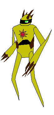


