


I'll get a full cut-sheet of sprites posted tomorrow. I think I was one of the laggards in getting my submissions posted...Is the 31st a good day to end submissions for you spriters, or is that not enough time to fine-tune your sprites? I don't mind either way.

-
The moderators of this forum can be found in the CAP forum staff directory.
-
Welcome to Smogon! Take a moment to read the Introduction to Smogon for a run-down on everything Smogon, and make sure you take some time to read the global rules.
-
Congrats to the winners of the 2023 Smog Awards!
CAP 6 CAP 6 - Part 15 - Sprite Submissions
- Thread starter darkie
- Start date
- Status
- Not open for further replies.


Here are all my sprites accumulated into one post. Any last fixes/suggestions before I submit them?

Okay, Chaoscrippler has my vote. Awesome animation, man.

Cartoons!: I used slightly different colours to fix the colour problem. I also changed some of the shading.


The first is Cartoons!' sprite, the second is the sprite edited by me.
I'm working on my own sprite as well; hopefully, I'll get it finished today.
EDIT:

Any comments?
EDIT2: Smoothed the eyes a bit:

EDIT3: Fixed a few outlines, and done a shiny colouring.


The first is Cartoons!' sprite, the second is the sprite edited by me.
I'm working on my own sprite as well; hopefully, I'll get it finished today.
EDIT:

Any comments?
EDIT2: Smoothed the eyes a bit:

EDIT3: Fixed a few outlines, and done a shiny colouring.


The hook tentacle is supposed to be twisting around from the back. And I was thinking about moving the sword limb; thanks for giving your opinion. I'm currently working on the back; I'll fix the front after I finish that.that looks good wichu, but why is he cutting off his own leg and whats whats with the hook sprouting out of thin air?
>_>
well besides those two limbs i love the pose
EDIT: For anyone working on backsprites, have you considered that the light source in D/P backsprites is from the centre of the field, not the upper left as in Advance? An example:


This far by shows a very clear picture of CAP6 and it looks like it's ready to fight with its pose. It clearly shows its features. gj. you have my vote for this.I went for a slightly different 'hat' design than everyone else on the backsprite.

EDIT: Changed the pose of the front sprite.


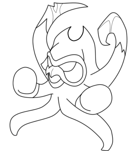
I just drew up my sprite pose. Ignore the lack of feet, I'm gonna add those in in Paint.
KoA just dropped his gloves.
http://i10.photobucket.com/albums/a110/kingofanime/pose.png
Edit: Also Darkie, I wouldn't mind a few days, just sayin'. :x
Edit 2: OK, fine tuned the pose in photoshop and this is what I'm going to be workling with in paint:
KoA just dropped his gloves.
http://i10.photobucket.com/albums/a110/kingofanime/pose.png
Edit: Also Darkie, I wouldn't mind a few days, just sayin'. :x
Edit 2: OK, fine tuned the pose in photoshop and this is what I'm going to be workling with in paint:

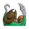
Darkie and Jimbo both pointed out that the position of the "lead glove" in my back sprite, is so close to the face that it looks like it might actually be part of the face. Here's the original back sprite, for reference:

Since the colors of the glove and the facemask are the same, I can see how some people might not realize the two objects are separate. So, I have experimented with moving around the lead glove to get it away from the face. Here are four alternatives:


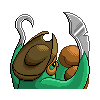
Are any of those better than the original?

Since the colors of the glove and the facemask are the same, I can see how some people might not realize the two objects are separate. So, I have experimented with moving around the lead glove to get it away from the face. Here are four alternatives:


Are any of those better than the original?


Chaos has my vote! It's amazing!
I changed the lead hand to one of the alternatives posted earlier. Now the face and gloves are separated. I also changed the hat to add some curvature that mimics the front sprite more. Hopefully this gets rid of the "cowboy hat look" that was commented earlier.


I find your submission brilliant, really. And the shiny color looks great, too!


Here are all my sprites accumulated into one post. Any last fixes/suggestions before I submit them?
However, you should make the backgrounds transparent, or ask someone to do it, because the rules say they have to be transparent.

KoA's pose looks amazing! So far I'm liking Doug's, Wyverii's and Choascrippler's.
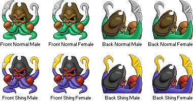
Here's my current submission cutsheet with all poses, genders, and colors:

- Status
- Not open for further replies.