CAP 8 CAP 8 - Part 15a - Sprite Submissions

Status
Not open for further replies.
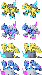
Alright, I've made some edits to the back sprite, and this is an update:


I made the necks shorter and thicker, the middle one have less zigs, the heads slightly bigger (do they need to be more?) and the left head closer to the others. How's this looking?


Fixed last minute pallette issues. Hopefully it's yellow enough for ya'll now. ;o
-Looks at Wyverii´s sprite, then AragoBird´s. then this- -_- you guys always have to make such a good job, dont you? lol. I know my join date is quite recent, but I have been a lurker for a long time, and I gotta admit, this CAP has had(in my opinion) the best sprites, seriously, it will be a really hard vote


Relevant, intelligent critiques appreciated.

Example:
KoA said:
The light source for back sprites comes from above and to the right of the Pokemon, not above and behind. If you want the light source to be the tail (not recommended), then everything needs a blue(normal)/purple(shiny) highlight.


Relevant, intelligent critiques appreciated.

Example:

The light source for back sprites comes from above and to the right of the Pokemon, not above and behind. If you want the light source to be the tail (not recommended), then everything needs a blue(normal)/purple(shiny) highlight.
First of all, let me congratulate you for the amazing color scheme of the shiny, I really loved it, and the lighting below the neck is simply beautiful, however, theres is a really small nit pick I have from the backsprite and, ironically, Im refering to the necks. You see, the left and midde one look a bit too high when compared to the one to the right, maybe lowering it a tiny bit would help, other than that, this is so far my favorite(sorry guys, but it is)
 

DougJustDoug

Knows the great enthusiasms
is a Site Content Manageris a Top Artistis a Programmeris a Forum Moderatoris a Top CAP Contributoris a Battle Simulator Admin Alumnusis a Smogon Discord Contributor Alumnusis a Top Tiering Contributor Alumnusis an Administrator Alumnus
Moderator
Here's a tweak to my front sprite, and my first version of back sprites.


On the back sprites, I got my inspiration from some of the ingame dragon backsprites, which only show the pokemon from the neck up. Several other spriters have shown the body and tail in the backsprite, so I thought I'd go with something a little different. Plus I totally LOVE the little lightning bolt eyebrows in Cyzir's original design. With this backsprite pose, I can really accentuate them.
The backsprite is amazing Doug. I'm still not 100% sure (too many good works out there guys... gimme a break^^) but you may very well have my vote. I was not persuaded at first (honestly I did not like at all your first version of the sprite) but this last is way better!
 
Doug: omg, your shinies are totally Kick-Ass Deluxe, love the fangs, and the back-pic stance. WoW. Not sure about the thunder surrounding the base of the neck, it looks like it's ON TOP of the cloud, in stead of IN the cloud...

HeadPunch: Bad thing for Doug, but your neck is totally SWEET. Small critic: The mouths of 2 heads are visible, but seem kind of, well empty. Not sure if it is solvable, but maybe a little dark accent to indicate a tongue?
 

joshe

the best
Here's a tweak to my front sprite, and my first version of back sprites.


On the back sprites, I got my inspiration from some of the ingame dragon backsprites, which only show the pokemon from the neck up. Several other spriters have shown the body and tail in the backsprite, so I thought I'd go with something a little different. Plus I totally LOVE the little lightning bolt eyebrows in Cyzir's original design. With this backsprite pose, I can really accentuate them.
I love this DJD. The back sprite is amazing, and the little lightning bolts make it look really cool, and it kinda looks like a salamence pose(if thats were you got it from ^_^). The front sprite is just as good.

I love these, and you should work your sprites in these poses, if you decide to change it.
 

franky

aka pimpdaddyfranky, aka frankydelaghetto, aka F, aka ef
is a Top Team Rater Alumnusis a Forum Moderator Alumnusis a Top Contributor Alumnus


Fixed last minute pallette issues. Hopefully it's yellow enough for ya'll now. ;o
I think this probably depicts the "cute dragon" people wanted. The eyes are on point with the picture.
 

Arkeis

(づ。◕‿‿◕。)づ
is a Top Artist Alumnusis a Community Leader Alumnus
Well, I made quite a few adjustments to the main sprite, including separating the heads, making the right foot slightly bigger, making the cloud slightly lighter, and changing the tail so that it matches the original artwork more.


The female version has swirly clouds, so swirl people and no-swirl people can both be happy.
 
I'm now torn: I like doug's backsprite a lot but Wyverii has made my favorite front sprite - are they voted for seperately?
Actually, I've just realized - all three candidates for leading this project have had an important input now, haven't they? Cyberzero for leading, Visheen for the art and Elevator Music for the concept.
 
How much longer will this be open for? I want to know how long I have to finish up my backsprites.

All of the entries so far are fantastic. There is definitely stiff competition this time around. Good luck to all.
 
Final Submission:

  • Far left head was moved down and right.
  • Open mouths now have shading.
  • Male and female differences. (males get longer claws)
Thank you, Gir! and Flamman, for your helpful comments.


I repositioned the feet on the front sprite so it doesn't look like its standing on a slope, and added some more texture to the cloud. Hopefully it doesn't look flat anymore. Also, sorted the back sprite, and reworked the shiny, which still looks a bit dodgy, so if I can find time I'll fiddle around with the colours a bit. Thoughts?


Just a bunch of shinies

Dunno if anybody noticed, but I have male/female differences. Female's tail is longer.

My favorite shiny is the cotton candy pink+ Pink eyebrows
 
Here's a tweak to my front sprite, and my first version of back sprites.


On the back sprites, I got my inspiration from some of the ingame dragon backsprites, which only show the pokemon from the neck up. Several other spriters have shown the body and tail in the backsprite, so I thought I'd go with something a little different. Plus I totally LOVE the little lightning bolt eyebrows in Cyzir's original design. With this backsprite pose, I can really accentuate them.
Now this is a winner.
 
Here's a tweak to my front sprite, and my first version of back sprites.


On the back sprites, I got my inspiration from some of the ingame dragon backsprites, which only show the pokemon from the neck up. Several other spriters have shown the body and tail in the backsprite, so I thought I'd go with something a little different. Plus I totally LOVE the little lightning bolt eyebrows in Cyzir's original design. With this backsprite pose, I can really accentuate them.
Love it, especially the backsprite. I do think that the left head does look rather odd staring straight like that. The three heads really make for some creative sprites, because there are so many combinations.

I'm now torn: I like doug's backsprite a lot but Wyverii has made my favorite front sprite - are they voted for seperately?
He's got a point. It would be kind of nice to vote for them separately, because the back and front sprites aren't exactly exclusive to the artist, are they?


Update on what I've done so far. I'll probably change the shiny colours though.
If this sprites win I insist on everyone nicknaming the Shiny "Chocolate Rain".

Honestly I have no criticism for any of the spriters here except "Holy crap that is awesome."
 
Well, I made quite a few adjustments to the main sprite, including separating the heads, making the right foot slightly bigger, making the cloud slightly lighter, and changing the tail so that it matches the original artwork more.


The female version has swirly clouds, so swirl people and no-swirl people can both be happy.
This. Is. Awesome.

If the shiny isn't going to be pink, you definitely have my vote right now.
 
Here's a tweak to my front sprite, and my first version of back sprites.


On the back sprites, I got my inspiration from some of the ingame dragon backsprites, which only show the pokemon from the neck up. Several other spriters have shown the body and tail in the backsprite, so I thought I'd go with something a little different. Plus I totally LOVE the little lightning bolt eyebrows in Cyzir's original design. With this backsprite pose, I can really accentuate them.
The back sprite is practically perfect, although the spikes on the head look very of "rounded" when compared to the front sprite and Original Artwork. And that fang looks slightly out of place in my opinion.
Others seem to like it though, so I guess that's just a personal preference.
I love the concept you made; with the body not showing.
It's a nice twist.

Like a couple others have mentioned, the left/lowest head on the front sprite still looks strange, in that pose.
 
I agree about voting for front and back sprites separately. I LOVE Doug's backsprite, but I think some other front sprites are better than his (even though his is really good), like Argornbird's.
 

DougJustDoug

Knows the great enthusiasms
is a Site Content Manageris a Top Artistis a Programmeris a Forum Moderatoris a Top CAP Contributoris a Battle Simulator Admin Alumnusis a Smogon Discord Contributor Alumnusis a Top Tiering Contributor Alumnusis an Administrator Alumnus
Moderator
Several people mentioned that the left head on my front sprite needed to look at the opponent, not straight ahead "into the camera". Once people mentioned it, I agree that it looked a little weird. I tweaked that head to make the pokemon look over at the opponent.


I think it looks better like that. It's amazing what a difference a few pixels can make!
 
Status
Not open for further replies.

Users Who Are Viewing This Thread (Users: 1, Guests: 0)

Top