


Tomohawk's official sprites will be the most visible pictures of Tomohawk that most players ever get to see! This is the thread in which we will begin deciding which sprites we will actually use.
This will be an Instant Runoff Voting poll, meaning you may vote for as many options as you like, in the order of preference. This means that order is all important for this poll--if I see that your post says "in no particular order", or something similar, it will be deleted and possibly infracted. The options for this poll are suntt123, Wyverii, DarthVader317, DougJustDoug, Doran Dragon, Ice-Cold Claws, wekhter, Energy Storm, Steampowered, and Mektar.
This will be an Instant Runoff Voting poll, meaning you may vote for as many options as you like, in the order of preference. This means that order is all important for this poll--if I see that your post says "in no particular order", or something similar, it will be deleted and possibly infracted. The options for this poll are suntt123, Wyverii, DarthVader317, DougJustDoug, Doran Dragon, Ice-Cold Claws, wekhter, Energy Storm, Steampowered, and Mektar.
Seeing as how there were no complaints to my last post....
This is my final submission:

Shiny:

Thanks very much for all the help guys!


Final Submission:

Well I think that's every bit of critique and polishing done now. Nothing left but to make it official. For reference I wanted to change the shiny sprite mostly because it was too close to another person's idea for comfort and the poor guy is getting it stolen enough as it is. I went with the muted shiny, except I made the skin a whitish colour (a rarity in shinys) instead of that sickly yellow.
I think the pose itself is good since I came upon the legs forward approach. It's a neutral enough pose for a flying Pokémon to have to be animated freely. It's got a similar amount of action as Braviary, Archeops or Fearow, etc. So it's interesting enough but not too dynamic. Flyers in general get a little more leeway since flying poses inherently look more action based than usual.
I also tried to make the colours bold, simple and clean as seen in 5th gen. Even within the 5th gen the previous generations of sprites due to their own precedents tend to have more highlights and other bits of shading trickery. Here there's none of that. I've made it feel as much like an actual 5th gen mon as I can do at this moment in time.
A lot of thanks to everybody who participated in helping shape this sprite. Big thanks go to Dusk, alchemator and everybody here that commented. Good luck to the other artists!

Final Submission:

The eye spot is smaller on the female sprites.

Final Submission
I intentionally did not make any subtle gender differences, since no other BW pokemon have them. It appears that Nintendo no longer makes small gender changes on new pokemon. I did not want to make any big gender changes (like Jellicent or Unfezant), so I'm only submitting the 4 sprites above.
Tomohawk was much harder to sprite than I expected. But I had fun working on it. I appreciate all the feedback I got in this thread. I always enjoy seeing the creativity other spriters bring to their sprites, and I think we have several good sprites to choose from.

Final Submission
Male--Female--Shiny Male--Shiny Female

Male Back--Female Back--Shiny Male Back--Shiny Female Back
Final Submission
The Sprite Submission Thread's Warning appeared!
Warning is exerting its Pressure!
Ice-cold Claws used Submission!

I, like DougJustDoug, did not make alternate gender sprites, since BW pokemon that do have them have really different designs and, you know, "drastic deviation from the selected art design is discouraged".
So...that's it! A really big thanks to all of you who supported me on my way, I swear I never would have made it here without the help.
To all the other spriters, great job. Every single one of you. I look forward to watching the voting.


Okay, thanks for everyone's suggestions again. I tried to take them all into consideration when finishing up. I'm still not 100% satisfied but I rarely am with pixel art and the deadline's fast approaching. Oh well. :> I chose not to do separate male/female sprites. This is the right file format, right?
Final Submission


Animated sprites:


Final Submission
I hope I'm not too late!


Also, Steampowered, your sprites need to be transparent.


Here
Wow!!!
I didn't notice the 24hour notice and now I'm scrambling
Good thing I did notice though. Anyways, lets get down to business


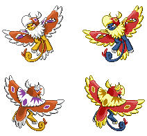
Well thank god I'm in time. Anyways you may be thinking that this is kind of weird. Seeing that almost all the fifth gen pokes have no gender differences it is a little bizarre. Well with fifth gen you either have big gender differences (Jellicient, Unfezant) or none at all and I decided to do big gender differences. Well go big or go home. Seeing as the gender difference is my big selling point I should probably explain the meaning behind them.
Tomohawk is a lion, male and female lions have some of the largest gender differences in the animal kingdom. Male lions have manes whereas females do not. But because Tomohawk has no mane, I decided to take off feathers from the chest instead.
Now I was told to possibly make the female have some sort of marking on the belly but it didn't look good
Thats all I can think of and may the best sprite win!
ps please ignore prev post


This poll will remain open for exactly 24 hours. Have fun!Boom:

May the best sprites win!


