CAP 12 CAP1 - Part 9 - (Sprite Submissions)

Status
Not open for further replies.
You're making this difficult...
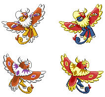
2 or 3!
I'm not just saying that too be different by the way, I just like those better XP.
Mmm. 4 could be good too. The blue one just looks weird and unnatural though.
Ice-cold Claws, take 1 or 2.
@Ice-cold Claws, 3 or 4
1 or 4,
2 or 3,
1 or 2,
3 or 4,
ARE YOU ALL TRYING TO BULLY ME T_T
At least Rafiki also said 4 would work...Does that mean 4 wins? Nah, I'll wait for one more vote...

UPDATE: Ok...with Lupus down there, 3 and 4 are top for the moment...guess I need a tiebreaker...
 

DougJustDoug

Knows the great enthusiasms
is a Site Content Manageris a Top Artistis a Programmeris a Forum Moderatoris a Top CAP Contributoris a Battle Simulator Admin Alumnusis a Smogon Discord Contributor Alumnusis a Top Tiering Contributor Alumnusis an Administrator Alumnus
Moderator
Final Submission

Final Submission


I intentionally did not make any subtle gender differences, since no other BW pokemon have them. It appears that Nintendo no longer makes small gender changes on new pokemon. I did not want to make any big gender changes (like Jellicent or Unfezant), so I'm only submitting the 4 sprites above.

Tomohawk was much harder to sprite than I expected. But I had fun working on it. I appreciate all the feedback I got in this thread. I always enjoy seeing the creativity other spriters bring to their sprites, and I think we have several good sprites to choose from.
 
@ Ice-Cold Claws

To break the tiebreaker, I'd say 4 as well. It looks the most right. As you said, 2 looks too evil, and 3 has too much white, making it harder to distinguish the body from the cloak. 1 is good too, but there's something kind of off with it that I can't place
 
@Ice-cold Claws, I think what might make this a bit easier would be to lighten up the black a TAD.
It is, well, a bit... TOO dark. It's a bit of a pure, DEEP dark as opposed to a duller one that is more natural in Pokemon colors.
I'd go for some sort or Zoroarky black or some other Pokemon from the Black or Gray color group.

The problem is some of the colors don't mesh well with the DARK black, while others just look sorta awesome- making it more preferencey. Almost every light color goes with dark black well, making it so people's opinion on the shiny part will be very random and pretty much just preference-based. In other words, you won't please everyone.

As you said with #4, you liked it because it looks more natural.
A more natural black might tie the sprite together better.
Just don't make it TOO dull... Or that may look odd.


By the way, if you're not looking to change the color of the black, my favorite is 4.
I find that shiny colors that aren't largely a shade of yellow or something similar look kinda off anyway.
 
Thank you to all who generously provided the tiebreaker(s). 4 is probably the final, but not until I've finished experimenting :]
m190049, I really appreciate the constructive crit, but question here: are you referring to Zoroark's bluish-black mane or the gray fur? I assume it's the gray, but...
Here's the bluish-black for 1 and 4. (I just think 2 is too dark and would look worse in a lighter black, and NijaSkills gave a good point on 3. Sorry, supporters of 2 and 3.) I see a subtle improvement in 1.

They're so subtle you almost can't see them, so I guess I'll work on Gray tonight (your midnight, if I'm not wrong).

EDIT: Ok.

1. The original number four.
2. Number four in Excadrill's dust-grey.
3. Number one in Excadrill's dust-grey.
4. A new discovery: Number one in Drilbur's purple/midnight-blue/whatever you call it (I'm slightly colorblind)!
Choose.

I can't believe I'm still not working on the backsprite, but argh.
 
Number one looks much better with the dull blue tone than it ever did with blacks and greys. Still though I feel like four better than one. The Excadrill's dust-grey looks decent on it but that grey almost could have just been a darkening/desaturation of the original colors. I feel like when Original Four and Excadrill Four are put next to the normal sprite, Original Four will make a better shiny.
 

SJCrew

Believer, going on a journey...
is a Tiering Contributor Alumnusis a Battle Simulator Moderator Alumnus
Doug's backsprite is probably the best one here, but the front's pose just isn't doing anything for me. Ice-cold Claws, however, is right on the friggin' money. Please please get that back sprite done before the submissions are closed. That front sprite is too perfect to go to waste.
 
Ah, I've been wanting to ask for some critique for a while now. I'm pretty unhappy with how my backsprite is looking right now. Hopefully I'll finish it before the deadline.


Suggestions would be very appreciated. It's not transparent because, er... I forgot. With and without the tail because I'm getting a little hung up on the tail placement.

Luckily, I think I'm done with my front sprite. I also did a animated version even though it's neither necessary nor useful. It made some excellent practice for new pixel animation technique, at least. It's not as complicated as actual gen V sprites, but I hope you guys get a kick out of it. :>

 
Wehket I love the sprite but I think the tail needs to be there, but it looks like it needs some shading done to it so it fits.
 
@wekhter: wow, that's really good. for tail placement, maybe have it lying on the ground behind him? Also, this might just be me, but the back seems a bit hunched. maybe lessen the hump a bit?
 
Posting here to show I got the messages, thank you Rafiki and thank you SJcrew.
Well then.

These shall be front sprites. As for the back...
I'm having exams these two weeks...
[INSERT DARTH VADER SCREAMING HERE]
I'm screwed. Don't worry, I'll do it no matter what.
 
Ice-cold Claws, I've got to say that's the best shiny I've seen so far, I love the colours on it. The pose is fabulous. Looking forward to the back sprites though tbh Exams are more important than a spriting comp :) good luck
 
Wekhter, you did a great job on the front sprite! I also like the animation! I'm looking forward to the backsprite.
 

reachzero

the pastor of disaster
is a Senior Staff Member Alumnusis a Top CAP Contributor Alumnusis a Tiering Contributor Alumnusis a Battle Simulator Moderator Alumnus
Although by the process I should really be locking this thread and putting up the poll, unfortunately we have very, very few final submissions at this point (four). Consequently, consider this a 24 hour warning. At this time tomorrow night, I will lock this thread, and put up the Sprite Poll.
 
You should definitely go with the tail, wekhtar. It not only mirrors the front sprite (although that could be changed), but it gives the back sprite a little more color and structure diversity to make it more exciting.
 

paintseagull

pink wingull
is a Top Artistis a Forum Moderator Alumnus
wekhter:

I think your back sprite is great, but maybe the reason you don't like it is because it looks a little unbalanced? I think you would see more of the left wing in the backsprite view based on the front sprite. Since it's impossible to explain I did a little redline to show what I mean, I hope that's ok!


The left redline is where I tried to picture the shape of the left wing as seen from the back. Then on the right I erased the structure to show what the outline would look like. Looks more balanced I think. Hope that helps a little!

Also, the tail looks good, maybe a pixel or two more yellow going into the feathers on the top side would work? not sure.

edit: I was just informed that in Gen5 front and back sprites are mirrored pixel for pixel. That might help you figure out the perspective also.
 

Oglemi

Borf
is a Forum Moderatoris a Top Contributoris a Tournament Director Alumnusis a Site Content Manager Alumnusis a Community Contributor Alumnusis a Researcher Alumnusis a Tiering Contributor Alumnusis a Top Smogon Media Contributor Alumnusis an Administrator Alumnusis a Top Dedicated Tournament Host Alumnus
If that's the shiny Doran, I love the colors. The sprite seems a little small and the tail a little big imo.
 
I was thinking of having that be the main colors, and in one of the referance pics, hes red instead of brown. The only thing that makes it seem small is the head am I right?
 

Oglemi

Borf
is a Forum Moderatoris a Top Contributoris a Tournament Director Alumnusis a Site Content Manager Alumnusis a Community Contributor Alumnusis a Researcher Alumnusis a Tiering Contributor Alumnusis a Top Smogon Media Contributor Alumnusis an Administrator Alumnusis a Top Dedicated Tournament Host Alumnus
Yeah the head is kind of puny.

And I really do like the colors, but I'm not a fan of the purple tufts unless they are for the shiny. I would stick with only white if those are going to be your main colors.
 
Status
Not open for further replies.

Users Who Are Viewing This Thread (Users: 1, Guests: 1)

Top