-
Welcome to Smeargle's Studio! Please be sure to review the studio rules. Feel also free to check out our hub to learn more about this place!Welcome to Smogon! Take a moment to read the Introduction to Smogon for a run-down on everything Smogon, and make sure you take some time to read the global rules.Congrats to the winners of the 2023 Smog Awards!
Parliament of Parchment
- Thread starter Andrew
- Start date
Well I guess it's time I got around to saying a few things since I always forget:
Bummer: how do i draw like you @_@
Magistrum : Thanks for the tips about brushes and your other kind words. I love your work and it's really nice to get compliments from someone of your caliber.
Hollymon : Im really glad you liked the drapion/darumka and genesect :D I think you're improving a lot as well and am excited to see how your art evolves. (also I'm *slowly* working on a painting of drapion/daru but don't expect it anytime soon :P)
pkblizzard : nice request. I'll get around to doing it soon and will prob make them cute ^.^ (although no garauntees, haha)
and here is a small update.
Asterat : yes.
pkblizzard : here is growlithe and houndour
edit: whoops didn't see that you wanted a sitting pose >:|Last edited:i read your story, I hope that things have gotten better since then.
I really like your new style especially the charizard looks really simple yet complicated at the same time :OHey man, you've had a pretty tough time, but hopefully that's getting better!
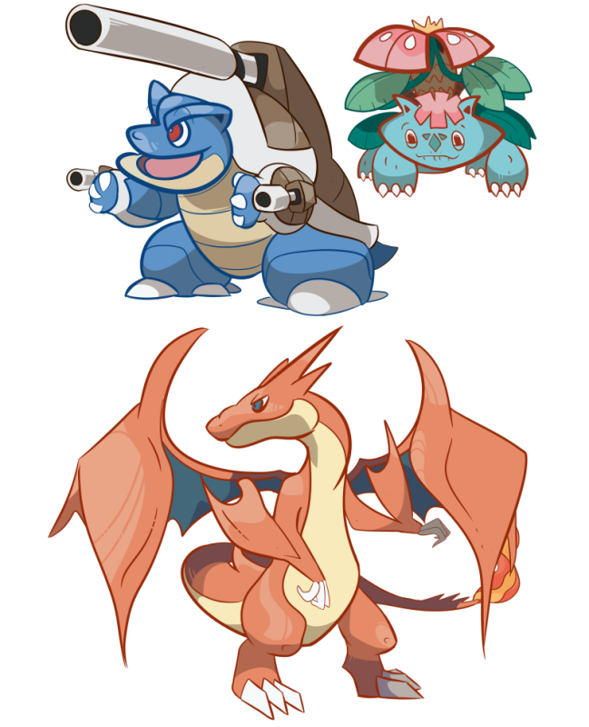
You're new style is pretty cool, but it can be kinda hit and miss cause of posing issues and the line thickness. Varying line thickness is cool, but it sometimes looks a bit odd like with venusaur's head and the differences in width on bunnelby. Sometimes the shapes and pose in general are a bit off (venusaur's head again, rhydon and abomasnow) and it might help to try and sketch the underlying shape to get the idea of how it works and find a natural position, and maybe spend a bit more time on this. However, most of them are really cool and well done; my favourites are mega charizard, the gyara/vaporeon pic and inkay. Keep it up :)Well, it is Smog Time, and here is my art for it:


and I happened to make a couple of alternate versions in the process that I still like but ended up getting changed:
well that is all for now...ty Ritter and freezenlight for the comments, tbh I feel slightly embarassed but that is the way things work I guess. :D The tips about line thickness and basic shapes are very very appreciated and you can hope to see some improvement in that area as time goes on! Not to set myself up for failure or anything tho. haha.... Idk what to say...just, thanks.
recent edit:
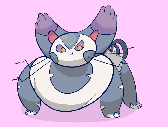
Well you didn't ask for it RitterCat , but i have decided to make a cute (read mischevious) Purugly for you!
Some of you may or may not be wondering, How do I do something like this? Well it is really simple. Here is my process:
Step 1: draw the rough draft including basic shapes and positioning like 4 or 5 times or however many times you want until you are somewhat satisfied. It helps if you have a message you are trying to send, but oftentimes I find myself just wanting to present a pokemon and not necessarily send a specific message. During this stage I draw quick and simple shapes. No need to spend time fixing it up yet.
Step 2: After you have drawn these rough drafts, choose one to your liking and either A. trace a final line art over it, trying to be mindful of being more clean, or B. just start erasing the loose ends. I find it doesnt really matter unless your rough is unusually sloppy, in which case you will find it more time saving to just draw a new one over it.
Step 3: after erasing the loose ends and connecting lines that didnt connect earlier, well I guess you want to make sure your shapes are fine. Which I mean, make small adjustments on things like legs ears and the like until they look more natural. If you find yourself wondering "why is this here, or why does this look like this" then maybe you should make a change.
Step 4: and step 4, shading, very simple for me lately b/c i have been trying to stick to the original art colors and basic forms. so yea. just follow the shapes you have already drawn and hopefully it will begin to show some depth and roundness or whatever.
Step 5: details. this step can really take place whenever, but you may find yourself thinking "i want to add a little extra flair" well let me tell you, TOO MUCH flair is definitely a bad thing so keep it simple :D I have trouble with this as i always want to add lots of little lines and dots and slashes, but then i look back at the big picture and it just doesnt make contextual sense. so add details where it matters and not where you might think it doesnt make sense.
Step 6: should I say? lately i have been pulling the saturation or the level value up a little after im done to make it pop more. Some of you may have noticed that many of my previous drawings are very desaturated and i am trying to build on this to make things that are a little more eye catching.
So if you find yourself thinking: well I already knew all of this, thanks Andrew for nothing, then I must say to you gj, you are more advanced than I. If you learned something, just a tidbit or a smidgen, then I'm glad you came. And if you are just somewhat bewildered and confused, then I suggest petting a kitty.
This is the end for now, so bon voyage :D
another edit: Im trying to paint an idyllic mountain trail in an aspen forest. At this point I don't really know what to do with it beside turn it into line art :|
Last edited:kirbyfanultrab:
 who deleted my pic? D:
--------> sky divin sheep.gif who deleted my pic? D: sky divin sheep.gif
------------->sky divin sheep.gif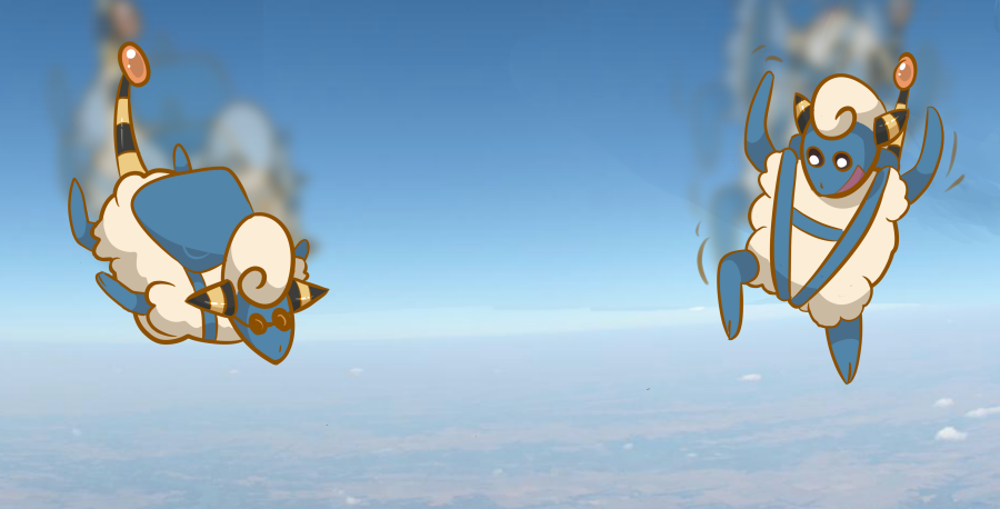
Edit: I post frequently so I will edit this in...I should really draw things out to add to the suspense. HAHA. EVERYTHING ALL THE TIME!!!
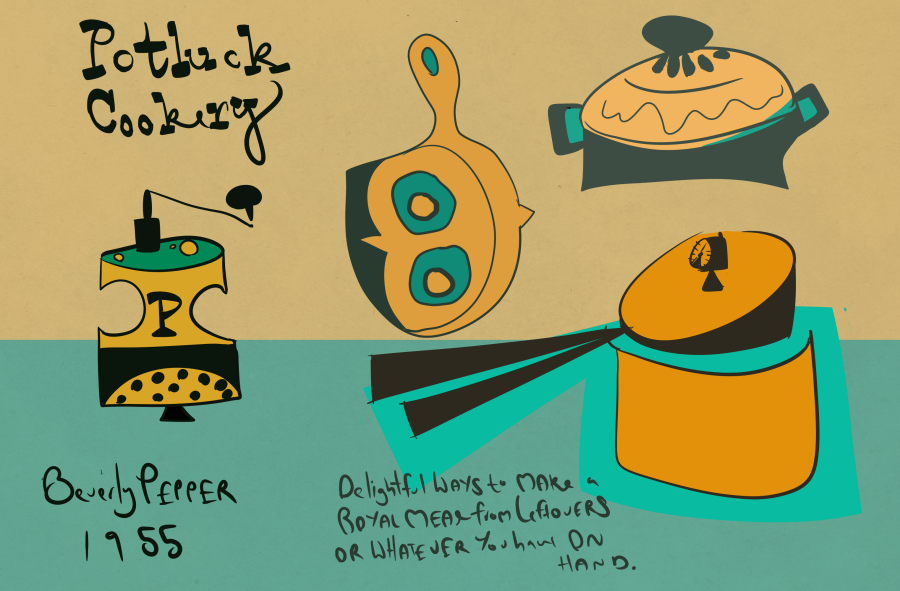
so my friend who is doing the embroidery project dropped off this cute little cookbook from 1955 and I jumped at the chance to draw some designs! I tried to emulate the style as faithfully as possible b/c it is just adorable :D
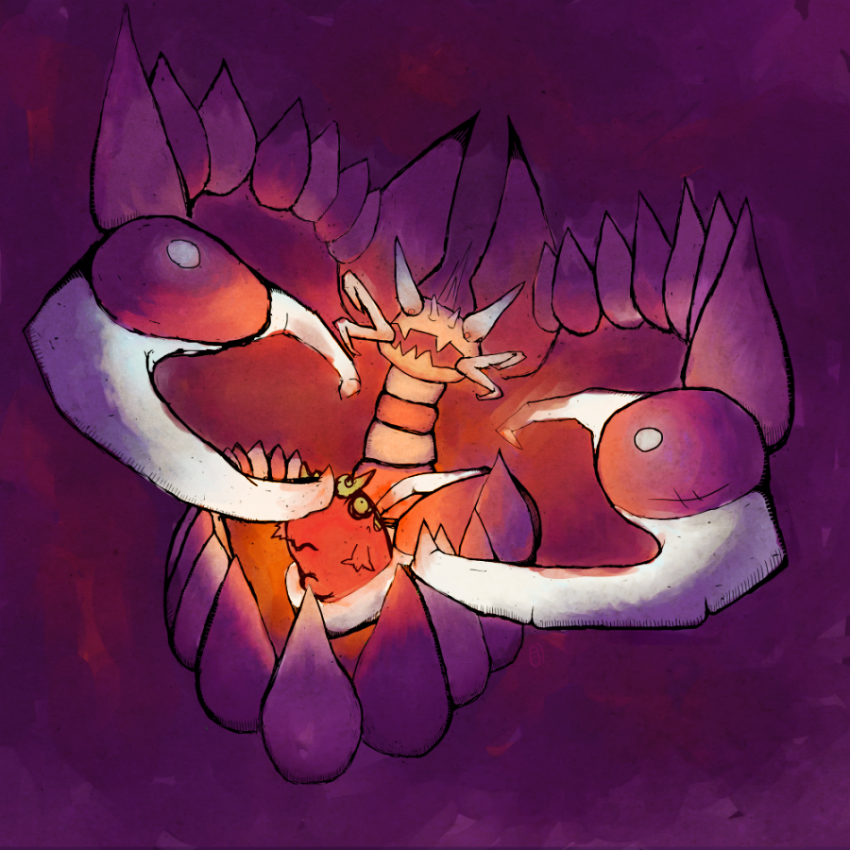
 Last edited:Wow! This is amazing, the perspective is fantastic, the purple and orange tones are exceptional and the piece is really engaging, with the claws coming right at me! You have such an incredible talent and a great artistic view of things - if I tried doing this it wouldn't urn out half as good!
Keep it up, I look forward to future artwork :DUPDATE UPDATE UPDATE UPDATE UPDATE UPDATE UPDATE UPDATE UPDATE UPDATE UPDATE UPDATE UPDATE UPDATE UPDATE UPDATE UPDATE UPDATE UPDATE UPDATE UPDATE UPDATE UPDATE UPDATE UPDATE UPDATE UPDATE UPDATE UPDATE UPDATE UPDATE UPDATE UPDATE UPDATE UPDATE UPDATE UPDATE UPDATE UPDATE UPDATE UPDATE UPDATE UPDATE UPDATE UPDATE UPDATE UPDATE UPDATE UPDATE UPDATE UPDATE UPDATE UPDATE UPDATE UPDATE UPDATE UPDATE UPDATE UPDATE UPDATE UPDATE UPDATE UPDATE UPDATE UPDATE
haha my drawing is quirky
Asterat : I was happy that you liked my drawing so I made another one :o


Hi. I will be critiquing my own artwork today as a dispassionate obverver. I hope you like it!
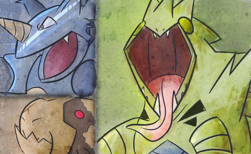
The Rock Pokemon: haha rock. THAT is why t-tar's tongue looks like KISS :| this was a quicky. Speaking of quicky, did anyone see the latest Cosmo? Cover article was '12 kinky quiches' >:X I swear aha ha
now that you're good and loosened up, let's get down to the nitty gritty. I heavily relied on texture for the feel of this piece. It really pulled the painting together. I set it on overlay which imo interacts nicely with colors and then scaled it down to abou 33% transparent. I'm not comfortable yet with doing a line art less painting so i keep my beloved lines. While the painting is unified position wise, the emotional value is not. its like 3 random dudes randomly doing things that dudes do. im as tired of writing this critique as i am at looking at it. lets move on
Cress/Landy Doubles
I rushed to get thru this. it was my second attempt, first being cress/conk, and i didnt feel too emotionally attached, still, it came out...acceptable. personally i think it is an abomonation to mankind.
cress/conk doubles
ahh, the beloved male/fighter female/helper duo. whats not to love? this i like despite it not being what was called for in the tourney. also i was experimenting with different overlays and textures, and i always feel that my first ones fiddling with something new are the best, b/c you know, beginners luck. so haha now i am in the stage of EHRMEGERD WHAT DO I DO WITH ALL THESE TOYZ!!!!1 COMBINE THEM ALL TOGETHERRRRRRRLast edited:Users Who Are Viewing This Thread (Users: 1, Guests: 0)
- ... and 1 more.