i make art! (now taking requests :) )

Sup? I have an Oil Painting:

Note: They are not gambling for real but more they are playing a nice card game.
It's my first oil painting, so yeah.
 
Hey buddy, this is some great stuff. I would say of all of it, your charcoal stuff is best. Looks really great, and would like to see more of it :)
 
The Gyarados is incredible! (They all are, really, just that's my fav)
Sorry for my late thank you, glad you like the Gyarados!

Anyways, I have some more stuff to show you!


Sorry about the random marks for some of my drawings. I totally forgot to clean up the marks.
 
I think there are occasionally perspective issues you need to work on, especially in that oil painting. You are looking down on the table at quite a steep angle, but are looking at the light as if from slightly below. I think a way to help with this is to imagine someone watching the scene from a particular position and work off what you would then visualise them seeing

Also in some of your drawings the shading is very nice, but in some it seems a bit wrong, especially in your Scrafty's legs. The insides of its legs seem to be shaded nicely at a distance from the edges, which is illogical; you would not have such dark shadows in those spots. Again, try and visualise a light source and how it hits the object, and observe how light works in real life too (you need lots of practise too; I'm guilty of bad shading all the time :P)
Alright, I do have trouble with my perspective but I'm glad I'm just a university student so I will work on my perspective. I struggle with 3 point perspective a lot so yeah. And as for shading, I shall work on that too. Likewise, the oil painting was a mere experiment so yeah. Thanks for your advice and I will improve! :)
 
Anyways, on my birthday, my friends got me tons of art supplies and one of them included Prismacolor Pencil Crayons. I had the markers but not the crayons. So here's some Pencil Crayon stuff:


I do enjoy these materials by a lot! ^^
Now a soft pastel drawing I quite enjoy:

And now, more digital stuff:

 
these drawings are cool. i really respect how you're receptive to criticism and are able to try and improve pieces that you already finished. your scrafty drawings in particular are cute too. :)

one thing i would focus on, if i were you, is your lineart. try to spend some time getting the strokes right so that your lines and shapes are smooth. also, take the time to clean up edges and corners, especially where two lines meet. for example, this is a bit sloppy, but it doesn't take more than a few seconds to erase and make sure lines don't just overlap like that.

i can't really explain every single thing about improving lineart, but i think volmise's tutorial set a few foundations that are good to know. i kind of highlighted some of these things here. a little cleanliness will go a long way.

like i said, these pieces are pretty neat, so i'm definitely looking forward to seeing more. :)
 
Thanks for the critique ium! I tend to struggle with lineart when it comes to digital art however in traditional drawings, my lines tend to be far more cleaner. But lineart has always been the first thing on my mind when I'm drawing so I will still keep that in mind. I tend to get overly lazy too and refuse to fix my mistakes (even though I find something wrong, you can tell in my shiny Hydreigon piece; they are some line overlaps in the head area). So, I shall take your advice and work on my lineart further (also, I'll stop being lazy :P)! :)
 
Apologizes for the double post but a couple more drawings:


So, I took ium's advice by working on my lineart (I'm so not used to drawing 2000 x 2000 but I managed I guess). The lineart seems a bit jagged imo (I can see this with Manectric's mane mostly) and also the resizing doesn't help either. I also find Manectric's pose a tad awkward (the back leg mostly looks out of proportion). Here are the original pieces full sized (they are big but also cleaner):

 
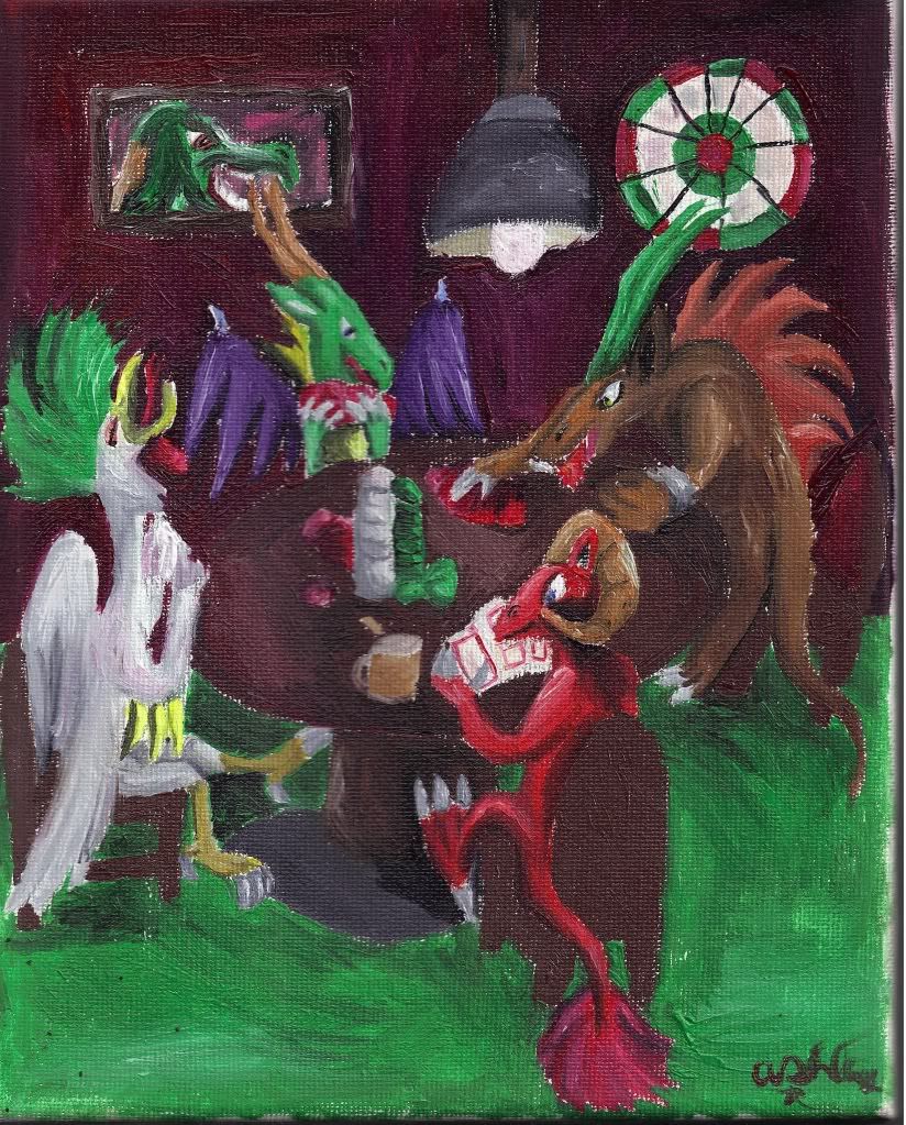
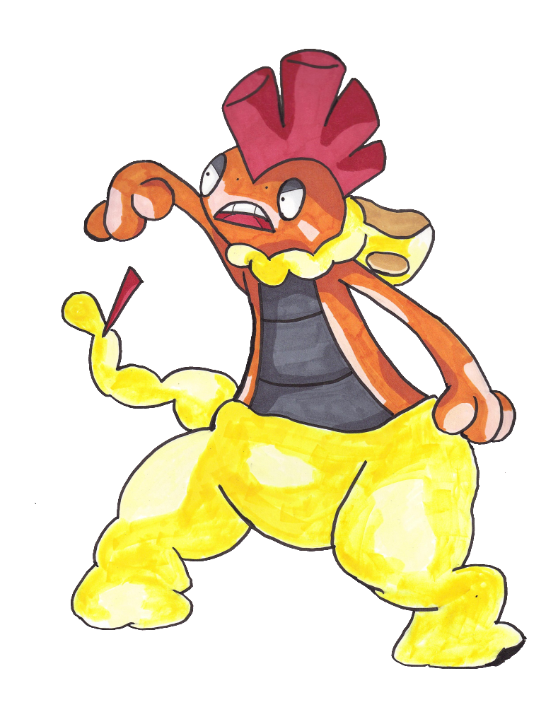
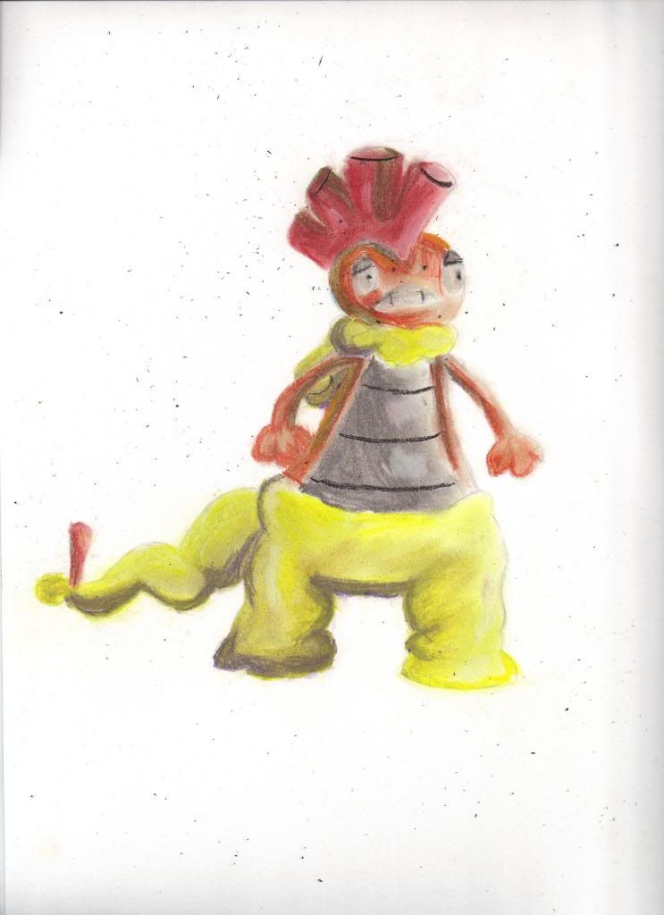
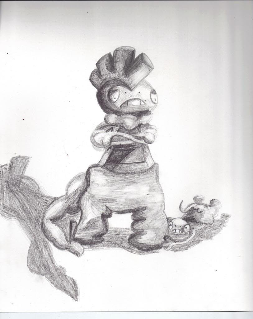
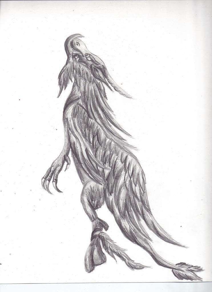
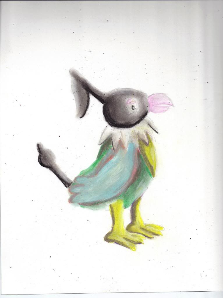
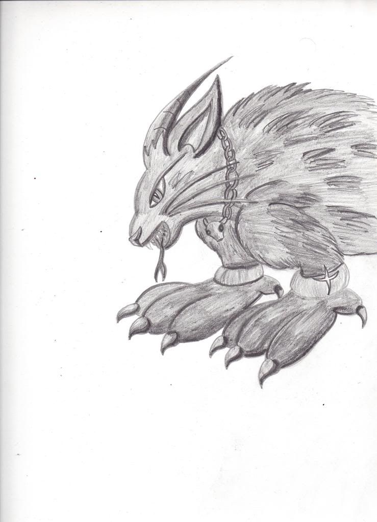
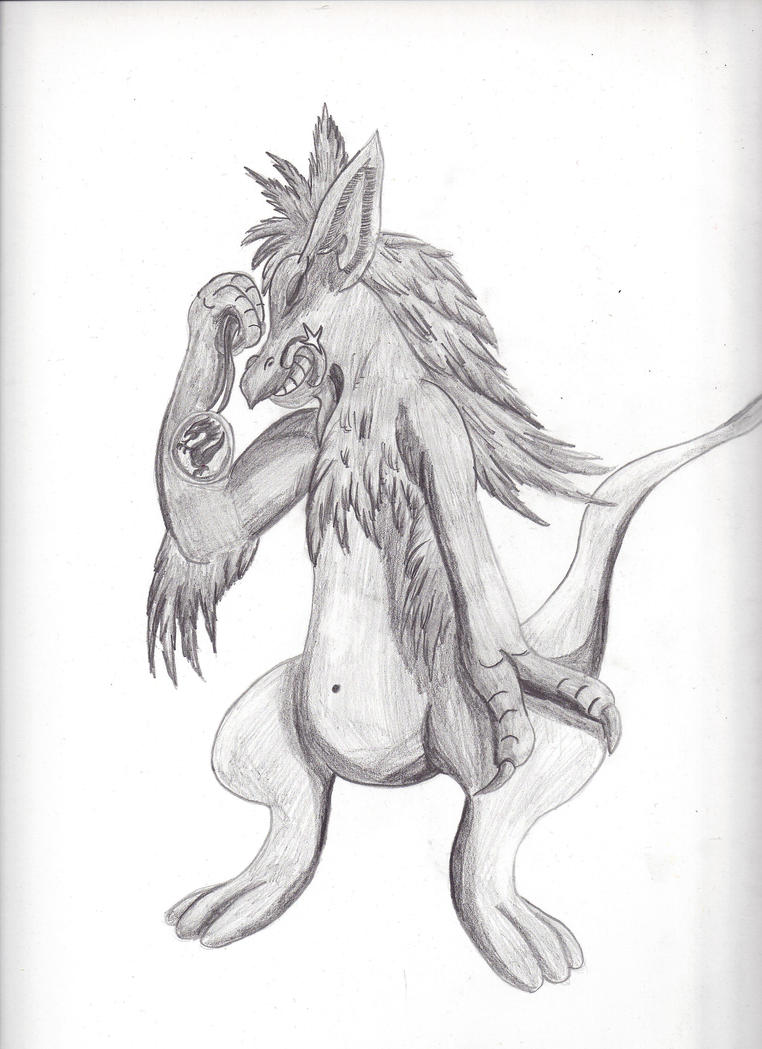
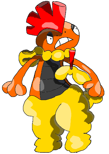
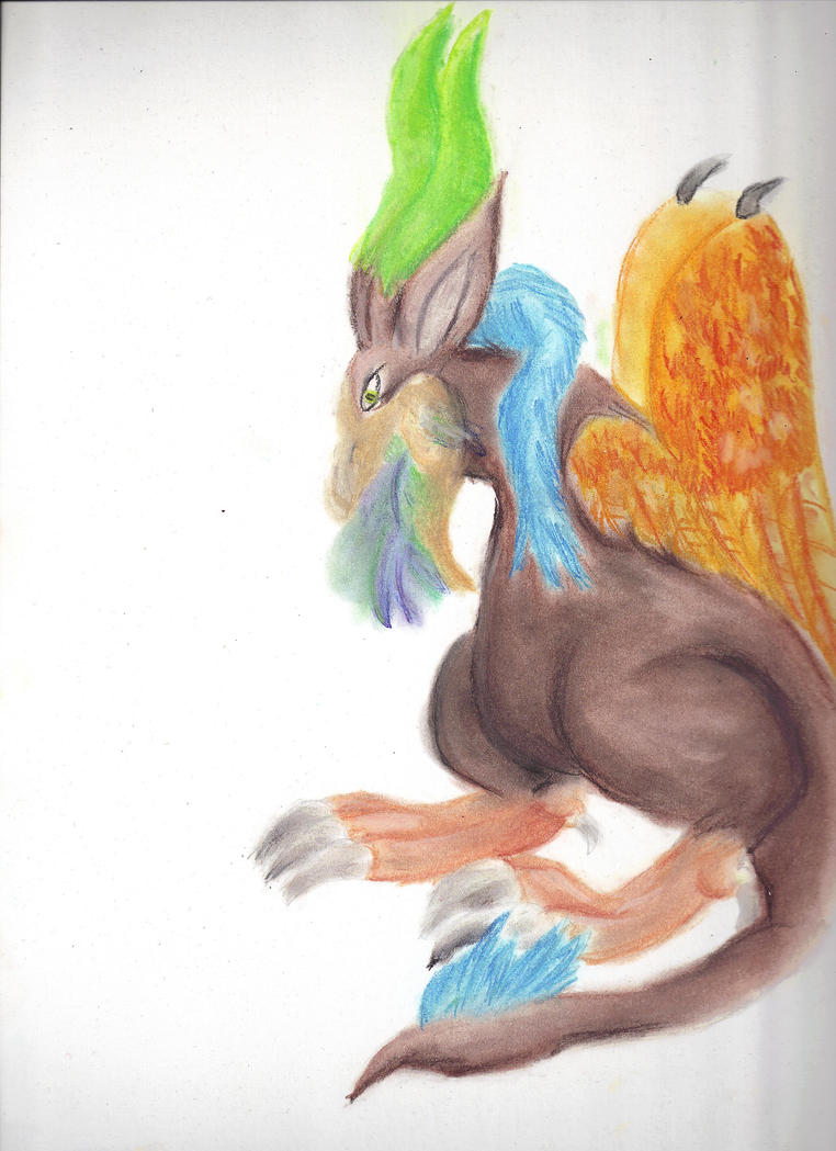
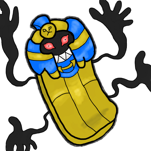
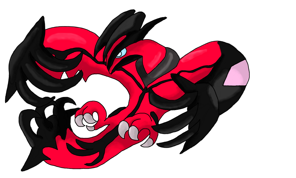
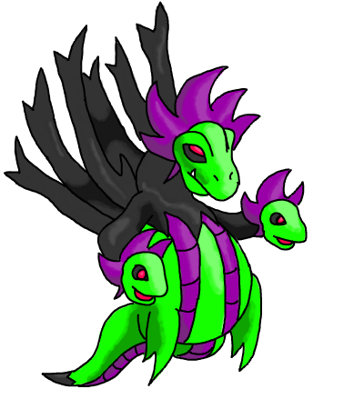
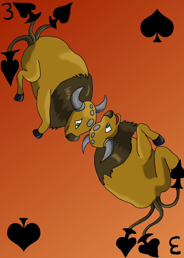
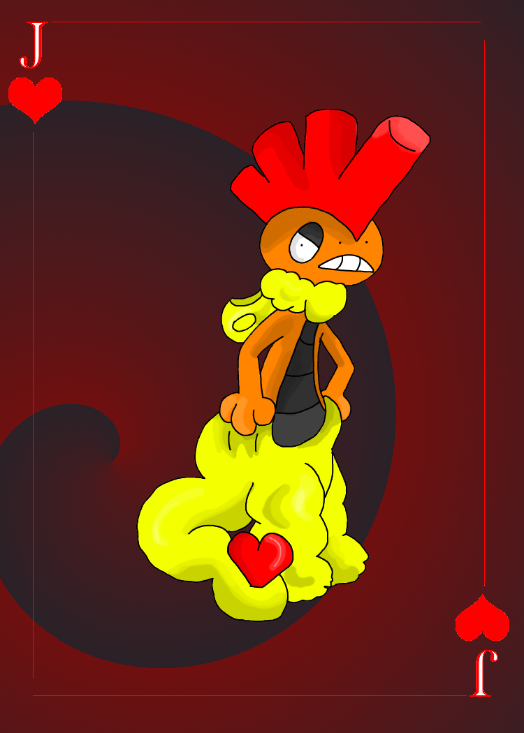
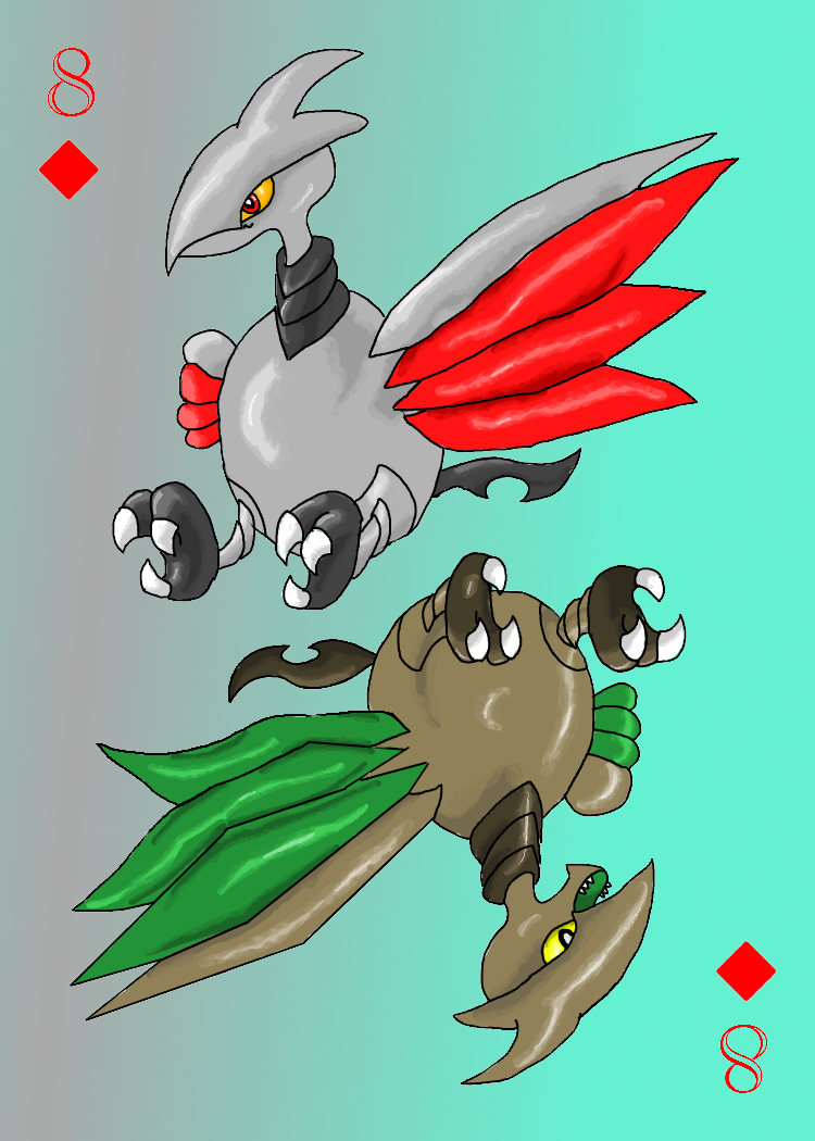
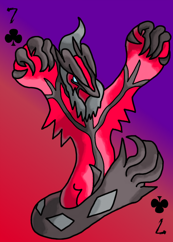
I think you could really benefit from practicing draw hands, feet, claws etc. I know, I know they're a nightmare but you really do need to nail them if you want to your art to stand out. I say this is nearly every critique, but my only advice is to go and look at an animal similar to what the pokemon (or subject) is based on, and draw from there. Or look to other people's art for reference.

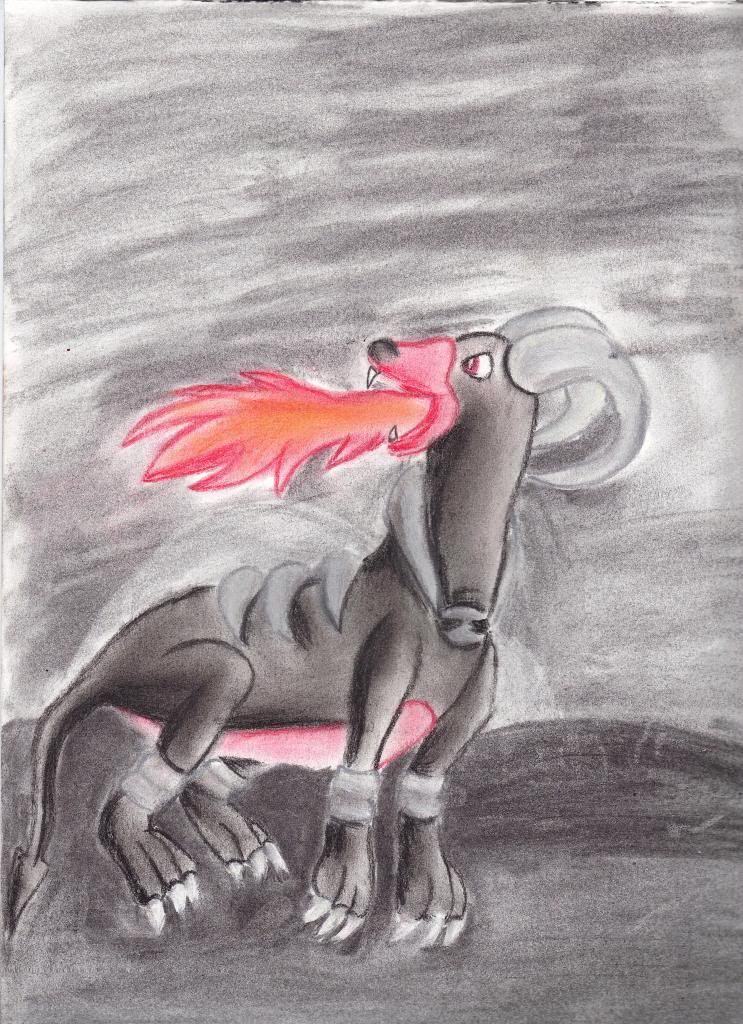
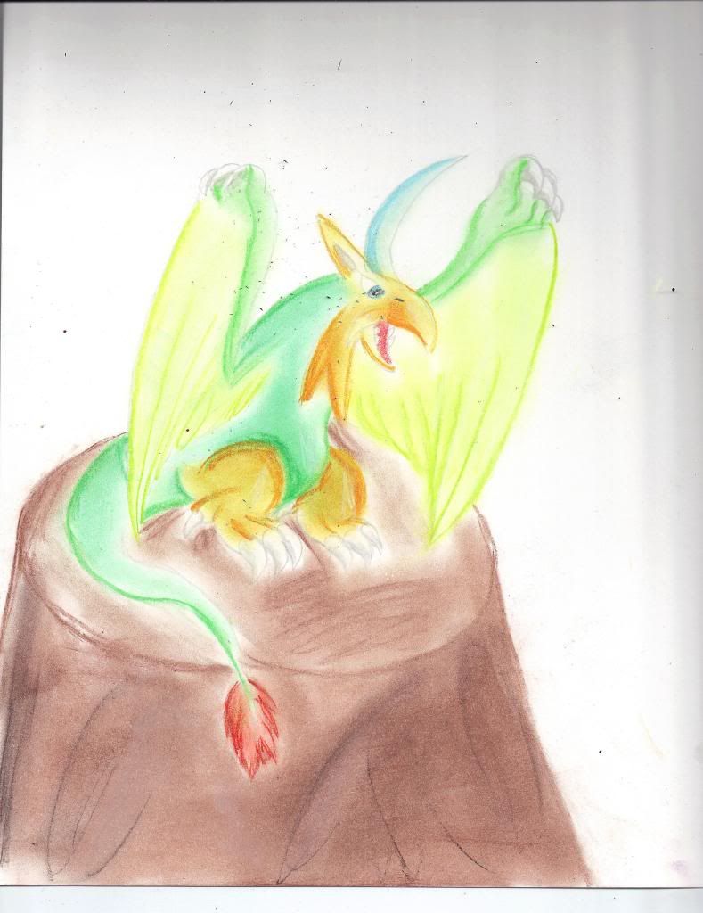
Try and keep your shading more smooth, since you're not using a fuzzy brush that means your shading needs to look really clean as well if you want it to look professional - this is especially noticeable when working on a smooth surface as light will just not reflect in a jagged manner from that sort of surface anyway. Look at this 
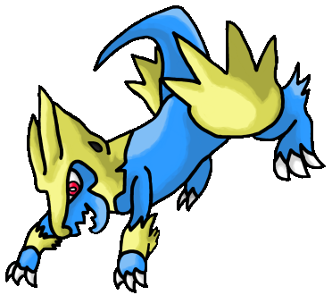
gliscor painting for reference, notice how the smooth shading makes the whole image look cleaner? This doesn't apply to all artwork, but I think it certainly lends itself to the sugimori-esque style of your work.

You lineart looks jagged around the edges, I'd suggest turning your pen pressure settings off if you have the option, and also (sorry I only use photoshop so I only know what to do from there) adjust the brush-tip shape settings in photoshop so that the spacing reads 1. This should help clear up the lineart a bit. Also drawing on a large canvas and scaling it down may help.

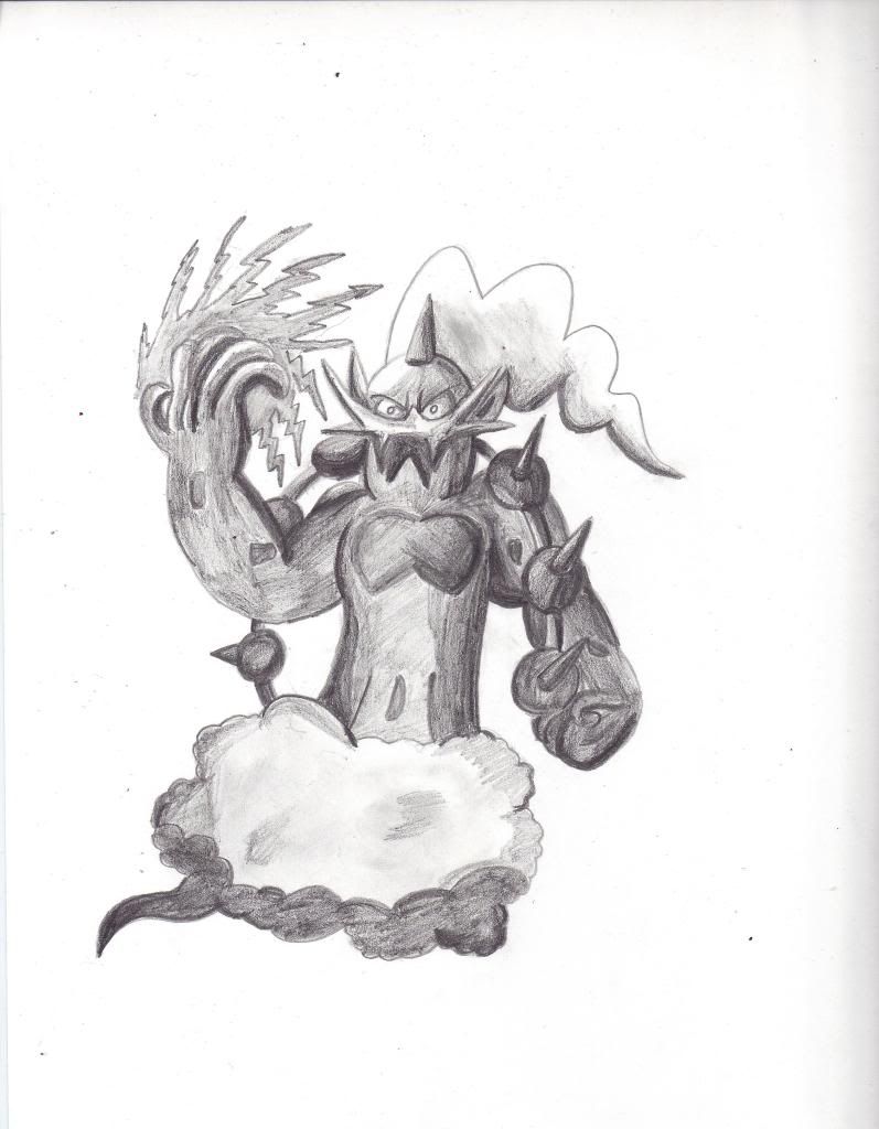
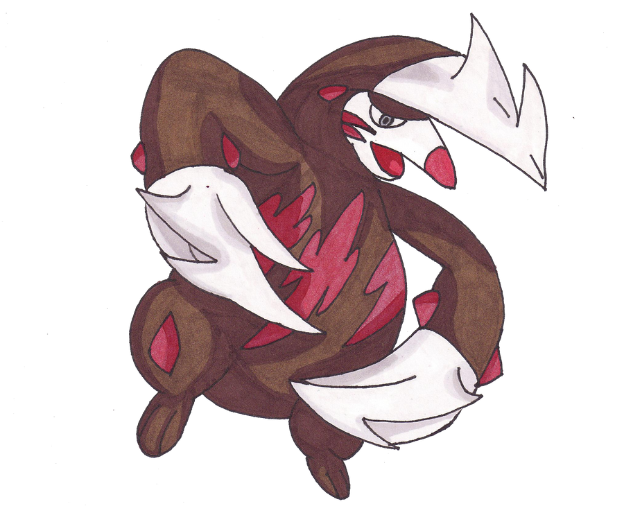
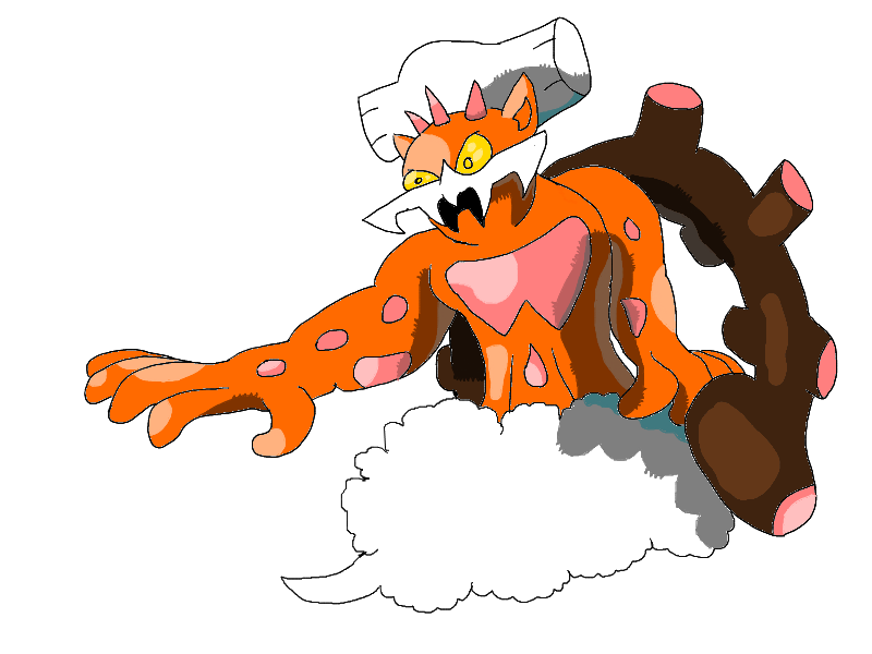
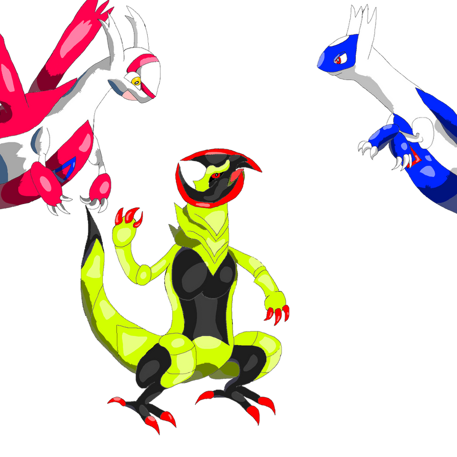
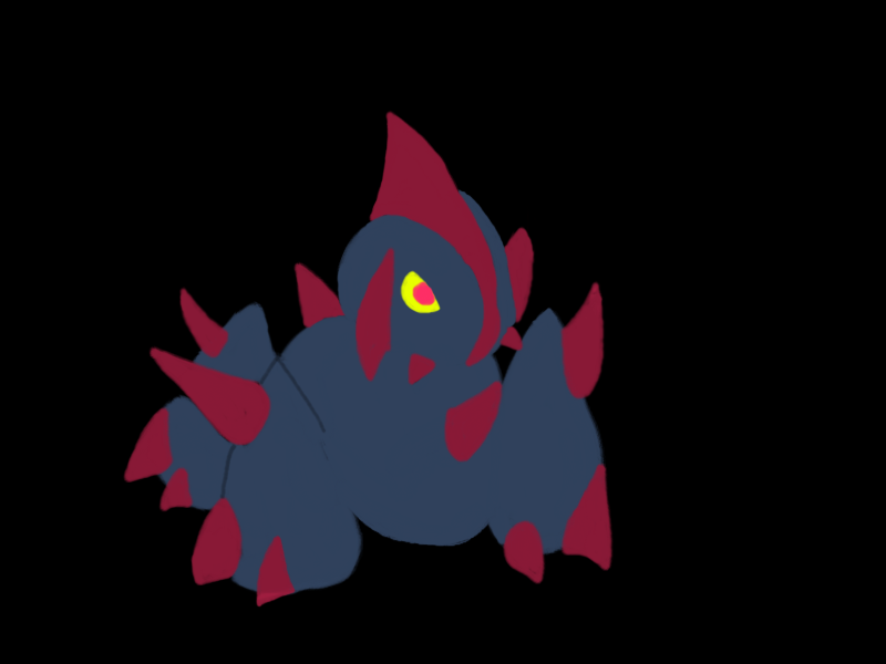
I actually like your MAC entry quite a lot, except for that blue line which shows the outline of the front leg. I don't think its necessary and it clashes with the style of the piece. Either remove it and fill it with the base blue colour (people will assume the leg is there anyway from the position of the spike) or erase the line and let the black background fill the outline.

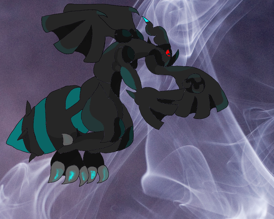
Some decent artwork here mate, and you deserve more comments. Hope you don't give up as I can understand how frustrating a lack of feedback can be! Keep at it!
 
@Juicy Fruit- Thanks for the feedback! Hands and feet tend to be quite hard to draw (if so the hardest to draw imo) but I am working on that and I'm also learning in my second year drawing.
I'll have to disagree with the shading part; I often try out the Sugimori-like style for my drawings and I don't think it's really necessary to keep the shading smooth/constant to make it more professional (but that's just me :p). Unless you want me to neaten up the overlaps then I can work on that. But many of my earlier drawings do have that smooth/constant shading.
As for lineart, I'm working on that! :) And I do draw on a 2000x2000 and a size 15 brush for the lineart but since I'm not really used to drawing on a bigger sized canvas and the fact that hands like to slip when drawing digitally, then yes my lines are really jagged (I can see that as well). I don't use Photoshop; my programs are Sumo Paint, Paint.NET, Corel PaintShop Pro and MS Paint (I only use MS Paint for pixel art and natural pencil art). I'll try adjusting the brush-tip settings.
And I thought adding that line (which I actually used the eraser tool for it) will help to show the leg and I'll see if removing it will remedy the problem. Or I can try to fill it in completely black.
And I do hope for more feedback like this! I really do like that people will take the time to help an artist improve! :D
 
so I heard you like scrafty? all your art is awesome, i wish i had time to learn how to draw
Yes, it's my favorite Pokémon actually (I find Scrafty utterly adorable and badass)! And as for learning how to draw, I would try to make a schedule and try to find balance between your work/school/whatever you may have and for any free time you have you can just sit down with a pencil and paper. Drawing takes practice and patience so if it's your first attempt at drawing, then do expect jittery and sloppy lineart. If that's the case, then don't worry about it and try again (my best advice is to not get frustrated about it). The more you draw, the better you will be (even if it takes 10 years just to improve your lineart, everyone is different and goes at a different pace). I do admit, I'm still trying to improve on my lineart and I'm a second year art major but my lineart has improved since last year. As for learning how to actually draw, work with shapes and build the figure by using circles, lines, squares. I know it sounds a tad vague but buying any book that teaches you how to draw (you can get it at any art store or even rent it from your library if they are available) should clear things up better. Another way to start is to buy tracing paper and to just trace the object to get a feel for drawing in general (I wouldn't rely on that too much as many artwork goes freehand). If you are comfortable with tracing, then do try freehand drawing out; like I said before don't be frustrated and have lots of patience and practice.
Hope that helps!
 

Users Who Are Viewing This Thread (Users: 1, Guests: 0)

Top