Smeargle Card Project

icepick

she brings the rain
is a Top Artist Alumnus
Um, is this open to everybody?

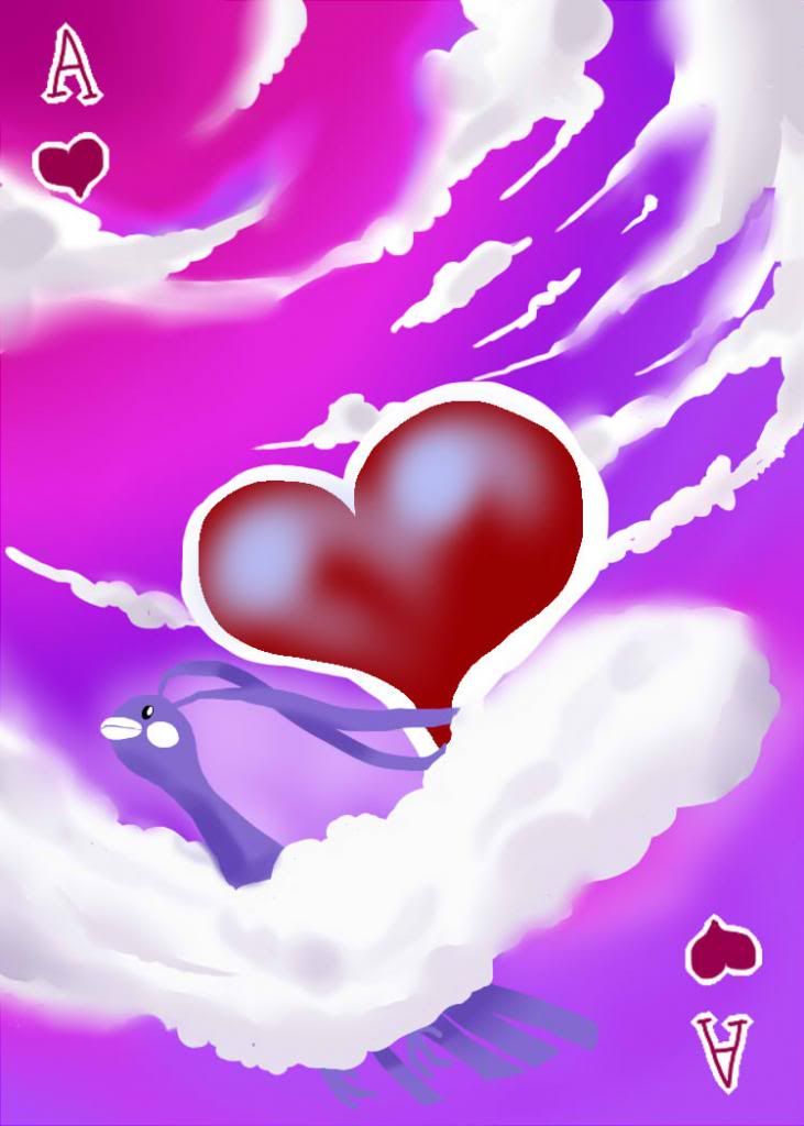
If it is, I want to try Ace of Hearts using Altaria please.
Yes, please join!

I'm still unsure over:

  • Font of the card's suit. I know we discussed this in IRC but I don't believe we came to a definite answer. Will a template be provided with the font, will the font be added on afterwards, I'm curious. As Birkal said, differing fonts aren't very good for a card player.
  • What goes on the back of the card. Is Zracknel going to do this, and if so, should we all come to an agreement on a certain picture or pattern for the back, or will you (icepick) choose what goes on the back?
  • Is there a quality check? As in, as I assume these cards are being sold, will some artwork be denied for having not enough quality? That would seem fair, since nobody wants to look at bad art on their playing cards.
  • Is their a set darkness for the background of the card art? What I mean by this is that it would look pretty weird seeing playing cards which are both dark and light. Your playing card, icepick, seems pretty dark, so should we follow that set darkness, or near enough to that set darkness?
1. I think right now, the best option would be to have everyone do their own text however they feel is best incorporated into their card. Once we have all the cards done, someone can format them with borders and text covering the artists' text, and at that point we can compare and decide. Or at that point we could have both options available, to suit those who want to play with the cards and those that just want to collect them.
2. Since Zracknel is interested, I'll leave it to him
3. The cards won't be sold, but rather the images will be available for people to independently print. I discussed this in IRC yesterday and there will not be quality check, though I encourage people to seek critique and advice in this thread.
4. There's no set darkness, these are art cards first, and playing cards second. However artists can consider practicality however they want.

Outside of what Bummer/Juicy said, I think the cards could probably be modified to have some sort of white (or whatever) border surrounding them so that they aren't too obviously red or black as well. Just in terms of making them not too obvious to other players or what have you... but maybe it won't be necessary. Who knows!
That's a fine idea, I would suggest people to leave a 1/8 inch bleed at the edges of the card where there are no important details so we can decide later if we want a border.

Not trying to manhandle this project or anything, but we had a great chat in #smeargle about this thread. We brainstormed that it might be a good idea to draw the cards without the symbols (A♤). Just the image of the Pokemon. Then, when we're all done, one person can come through and standardize them with borders, card numbers, and that kind of thing. The problem with all of us doing our own drawing of fonts and symbols is that it gets very difficult to read when you're looking at a large hand of cards. The site will standardize the cards for you if you like (example) but we in #smeargle thought that font was mad ugly and feel like we could do a much better job.

In shorter words, if people just draw the images, then one person can come through and make them all look the same at the end.
I covered most of this in my reply to eagle4, but the general approach I would like is to leave all options on the table until we have all the cards drawn, then experiment with formatting. For now though, we can have the artists make their own text.

[/LIST]orghghh I would love to give a try to making a card back if that's allowed... maybe I can reserve taking a swing at this? Something ornate, 2 colors, woodcut-esque, smeargle/pokeball/koffing themed?
Absolutely, though I would also love to see you do a card face as well
 

Alice

The worst taste in music
is traditional media allowed?

i may consider doing something with lilligant if so... >_>
 

icepick

she brings the rain
is a Top Artist Alumnus
is traditional media allowed?

i may consider doing something with lilligant if so... >_>
If you have a scanner or some other way to get a good quality pic, then certainly

or if you don't someone can probably mess with it in photoshop and get a good result
 

az

toddmoding
is a Community Contributoris an Artist Alumnusis a Community Leader Alumnusis a Smogon Media Contributor Alumnus
would love a two tone red checked ornate pokeball back design from you, zracknel!!
 
I'm still unsure over:
  • Is there a quality check? As in, as I assume these cards are being sold, will some artwork be denied for having not enough quality? That would seem fair, since nobody wants to look at bad art on their playing cards.
  • Is their a set darkness for the background of the card art? What I mean by this is that it would look pretty weird seeing playing cards which are both dark and light. Your playing card, icepick, seems pretty dark, so should we follow that set darkness, or near enough to that set darkness?
I'd rather a bit of quality check, just in case...

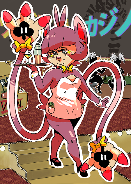
Also, for the darkness, I had a great idea of Cofagrigus (Jack of Clubs) being inside the Relic Castle, with the background fading out into darkness... I'll try and work on it, but since I'm not too skilled at using Paint (the program) solely for things like this, I might not be able to do it very well.
 

Bummer

Jamming to the beat
is a Top Artist Alumnusis a Senior Staff Member Alumnusis a Community Contributor Alumnusis a Top Smogon Media Contributor Alumnus
10 of clubs.


Edit: Another version, slightly different background and enhanced aura around club tree.

Edit 2: okay so this looks insanely dark on my work computer, so I'll work on lighting things up a bit later I will never be content with this image heh ugh

Edit 3: Brighter now.
 

az

toddmoding
is a Community Contributoris an Artist Alumnusis a Community Leader Alumnusis a Smogon Media Contributor Alumnus
how about portraying mewtwo in his sphere-firing pose? that way you can do what you've done with this fingers making the clubs sign, but twice over with one hand above the other, the lower hand the other way around

this way you can mirror the suite the way it would be in the corner of the card, and compositionally you won't have to worry about him being sorta stuck in a corner with the clubs sign slightly off centre

the concept of his digits as the clubs sign is fantastic
 
ium and bummer they're both absolutely fantastic, good job on those! And thanks for the response Icepick, although I do want to chat with you tomorrow or something (i need to sleep now) about some of your answers, since I don't agree with some of them.
 

Alice

The worst taste in music
If you have a scanner or some other way to get a good quality pic, then certainly

or if you don't someone can probably mess with it in photoshop and get a good result
I've got a scanner but I wouldn't mind someone else cleaning the picture with PS >_<

ok then I guess I pick 5 of hearts, lilligant


BTW is there a deadline or something? it may take me some time coz i'm busy with something else atm, probably a week more or less >_<
 

icepick

she brings the rain
is a Top Artist Alumnus
No deadlines, I'll check up on you if we start running out of cards.

Gonna have a shot at Darkrai for King of Diamonds, reserving it I guess even tho I kinda suck at art????
I think swaggersaurus already has KD reserved.
 
Hehe well, I'm done with mine. It was bluish-purple at first, but after looking at the comments, I messed around with the colour scheme so it became this. If you guys come to a decision about whether the heart/the font needs to be removed, I'll post a changed version.

[EDIT] I really have no idea why Photobucket keeps changing the size, so is it possible for you to download it from my Deviantart account?
http://snowpeashooters.deviantart.com/art/Altaria-Card-346373138?ga_submit=10%3A1357182059

And um, here's the smaller version:
 

icepick

she brings the rain
is a Top Artist Alumnus
Hehe well, I'm done with mine. It was bluish-purple at first, but after looking at the comments, I messed around with the colour scheme so it became this. If you guys come to a decision about whether the heart/the font needs to be removed, I'll post a changed version.

Um, this is the actual 750 by 1050 size...why is everyone else's smaller than this...?

Just a heads up, yours is 731 × 1024
Also if you guys can post a smaller version at 50%, that would be cool
 
i'll work on jack of diamonds l8r.

i might change my mind and do king of something, not sure.

chomper
 
If possible, I'd like to snag the King of Hearts! I have a excellent idea for a Ditto.

edit: Done...

 
By the way, I found a site that sells customised cards for $8 a deck (and $6 for shipping to both the US and Aus). Obviously not 100% sure on quality since I haven't used it before but hey, it's an option. Printer Studio
 

Users Who Are Viewing This Thread (Users: 1, Guests: 0)

Top